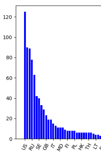
このようなファイルを棒グラフ化したいとする。。
US,125
NL,90
FR,89
X軸が文字列
Y軸が数字である。
このように書く。。
import numpy as np
import matplotlib.pyplot as plt
import pandas as pd
import sys
args = sys.argv

data = pd.read_csv(args[1], header = None)

df = pd.DataFrame(data)

X = df.iloc[:, 0]
X = X.astype(str)

Y = list(df.iloc[:, 1])

print(X)
print(Y)
plt.bar(X, Y, color='b', label="Total Population")

ticks =3
plt.xticks(np.arange(0, len(X), ticks), X[::ticks], rotation=60)
# plt.xticks(rotation=90)
plt.show()
ポイントは、
X = df.iloc[:, 0]
X = X.astype(str)
↑X軸が文字列なので
X軸の数字を少し間引きしている(3行ごと)
ticks =3
plt.xticks(np.arange(0, len(X), ticks), X[::ticks], rotation=60)