概要
Material Design Theming対応を各アプリで進めるのは、AndroidX対応と依存して難しいところはありますが、そもそも対応するとどういいのかみたいな情報があまりなかったので、同じことをするにしても新しいのだとどうよくなるのか?みたいな話を書きたいと思ってます。
Material Deisgnのライブラリで、MaterialButtonとか他にもStyleが入ってきて、今まで作ってきていたオレオレのshape drawable(XMLで作っていたDrawable系のファイルを纏めて指している)を作らなくてもだいたいの事ができるようになったよねという話です。
Material Themingとは?
MaterialDesignを、実際のアプリに合わせてカスタマイズできるように少しやわらかくしたもの。
MaterialThemingを実装した各プラットフォームごとの実装などをも提供されている
公式サイト:https://material.io/design/material-theming/
MaterialButton
MaterialDesign Guidline[^1]のボタンを実装したビュークラス。
material-designのライブラリの一部として提供されている。
実装は、AppCompatButtonをベースにしているが、ガイドラインの基本的な実装が入っておりかなり高機能。
Document: https://material.io/develop/android/components/material-button/
MaterialButton デフォルトで実装できるもの
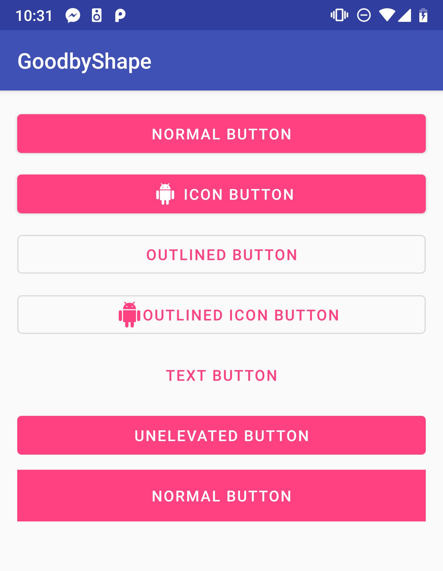
よく使うスタイル
| ボタン | スタイル |
|---|---|
| 角丸ボタン | @style/Widget.MaterialComponents.Button |
| アイコンボタン | @style/Widget.MaterialComponents.Button.Icon |
| テキストボタン | @style/Widget.MaterialComponents.Button.TextButton |
| 外枠ボタン | @style/Widget.MaterialComponents.Button.OutlinedButton |
MaterialButtonのよく使うプロパティ
| カテゴリ | property | 役割 |
|---|---|---|
| 大きさ | android:inset | タッチ領域内での大きさを変えられる。デフォルトで、topとbottomに4dpついている。 |
| アイコン | app:icon | アイコンを表示させられる。drawableLeftの上位互換。 |
| app:iconTint | アイコンの色を変えられる。modeも別で指定できる。 | |
| app:iconGravity | アイコンの位置をテキストに合わせるか、全体に合わせるか決められる。 | |
| app:iconPadding | アイコンとの距離を変えられる。 | |
| 背景 | app:backgroundTint | 背景の色を変えられる。modeも別で指定できる。 |
| 角 | app:cornerRadius | ボタンの角のRadiusを変えられる。 |
| 枠線 | app:strokeColor | 線の色を変えられる。 |
| app:strokeWidth | 太さを変えられる。 | |
| アニメーション | app:rippleColor | Rippleの色を変えられる。 |
| android:stateListAnimator | 押した時など、ステートごとのアニメーションを変えられる。 |
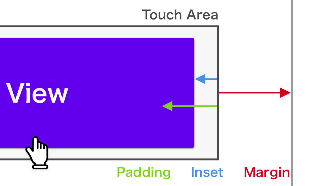
ビューのスペースの話
- margin : Viewの領域外とのスペース
- padding : View内のコンテンとのスペース(Buttonだと、TextなどコンテンツはViewによる)
- inset : Viewの領域とDrawableとのスペース※影は含まない
insetプロパティも、全部にきくわけじゃない?自作のdrawableなどでもInsetでないと効かないかもしれない 
まとめ
- MaterialButtonすごい
- だいたいはプロパティとスタイルで実装できる
- アニメーションとかもいい感じに付くので、できるだけスタイルとプロパティを使う
ところで、これどうやるの。。。?
実例ShrineShape : https://material.io/design/material-studies/shrine.html#shape
Welcome new shape :handshake:
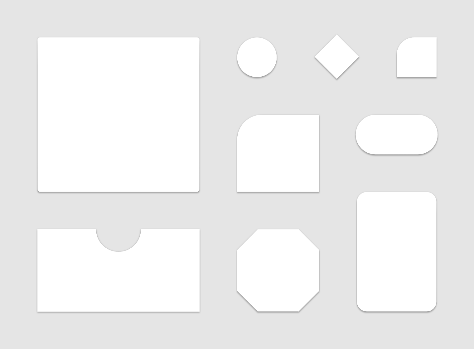
MaterialComponentのShapeの状況

RoadMap : https://github.com/material-components/material-components/blob/develop/ROADMAP.md
Experimentalでも使えるShape
BottomAppBarではすでに使われてる。使い方も、BottomAppBarを見た。
- MaterialShapeDrawable : 画像情報。色とかMaterialDesignっぽいものを指定できる。
- ShapePathModel : パス情報だけ管理してるモデル
- (Treatment)
- CornerTreatment : 角のパス整形ができる。
- EdgeTreatment : 辺のパス整形ができる。
使ってみた
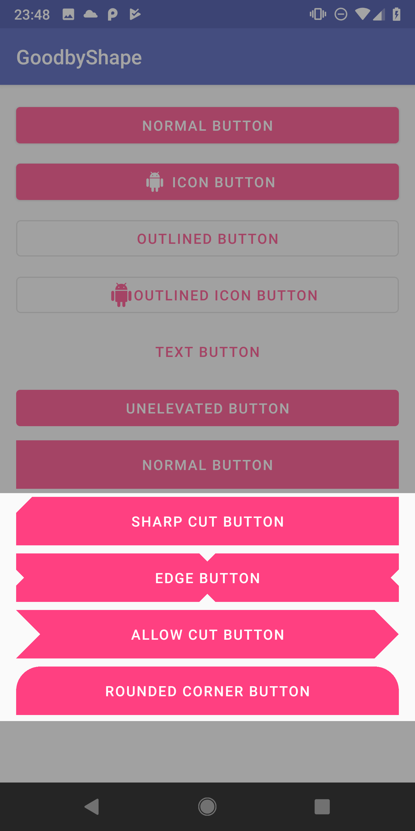
矢印ボタンの実際のコード
val shapePathModel = ShapePathModel().apply {
    // CutCornerTreatimentと、RoundedCornerTreatmentが用意されている
    val cornerTreatment = CutCornerTreatment(resources.getDimension(R.dimen.btn_half_cut_corner_size))
    topRightCorner = cornerTreatment
    bottomRightCorner = cornerTreatment
    // TriangleEdgeTreatmentが用意されていて、三角に切り抜ける。
    leftEdge = TriangleEdgeTreatment(resources.getDimension(R.dimen.btn_half_cut_corner_size), true)
}
val shapeDrawable = MaterialShapeDrawable(shapePathModel).apply {
    // MaterialButtonと同じ様な設定ができる
    setTint(ContextCompat.getColor(this@MainActivity, R.color.colorAccent))
}
// toRippleはExtension。インタラクションつけるのはかなり大変。
sharp_cut_button.background = shapeDrawable.toRipple()
問題は色々ある
- BackgroundのDrawableをコードで指定する必要がある
- コードで指定すると、InsetとかTintとか、steteList~~とか色々無視される
- 自作のCornerTreatmentとEdgeTreatmentを作るのは難しい
Comming Soonなもの
Styleで全体で、Cutにするかどうかなどを指定できるようになる?
MaterialDesignの話で、こういうShapeの計上などはアプリのブランドで一貫性をもたせないとダメだという話もあったので、Styleで設定できるのが自然そうです。
<style name="Theme.MyApp" parent="Theme.MaterialComponents.Light">
  ...
  <item name="cornerRadiusPrimary">8dp</item>
  <item name="cornerStylePrimary">cut</item>
  <item name="cornerRadiusSecondary">4dp</item>
  <item name="cornerStyleSecondary">cut</item>
  ...
</style>
まとめ
- ShapeのStyleでのサポートが待ち遠しい
- どうしてもカットしたかったら、MaterialShapeDrawableを使う
- アニメーションなど色々と難しいのでボタンで使用するなら、 自分でパス書き出してVectorDrawableの方が楽
おまけ
サンプルコードとか
GitHub:https://github.com/Reyurnible/android-shape-sample
MaterialShapeDrawableの例
private fun setSharpCutButton() {
    val shapePathModel = ShapePathModel().apply {
        topLeftCorner = CutCornerTreatment(resources.getDimension(R.dimen.btn_cut_corner_size))
    }
    val shapeDrawable = MaterialShapeDrawable(shapePathModel).apply {
        setTint(ContextCompat.getColor(this@MainActivity, R.color.colorAccent))
    }
    sharp_cut_button.background = shapeDrawable.toRipple()
}

private fun setEdgeButton() {
    val shapePathModel = ShapePathModel().apply {
        setAllEdges(TriangleEdgeTreatment(resources.getDimension(R.dimen.btn_cut_edge_size), true))
    }
    val shapeDrawable = MaterialShapeDrawable(shapePathModel).apply {
        setTint(ContextCompat.getColor(this@MainActivity, R.color.colorAccent))
    }
    edge_button.background = shapeDrawable.toRipple()
}

private fun setAllowCutButton() {
    val shapePathModel = ShapePathModel().apply {
        val cornerTreatment = CutCornerTreatment(resources.getDimension(R.dimen.btn_half_cut_corner_size))
        topRightCorner = cornerTreatment
        bottomRightCorner = cornerTreatment
        leftEdge = TriangleEdgeTreatment(resources.getDimension(R.dimen.btn_half_cut_corner_size), true)
    }
    val shapeDrawable = MaterialShapeDrawable(shapePathModel).apply {
        setTint(ContextCompat.getColor(this@MainActivity, R.color.colorAccent))
    }
    allow_cut_button.background =shapeDrawable.toRipple()
}

private fun setRoundedCornerButton() {
    val shapePathModel = ShapePathModel().apply {
        val cornerTreatment = RoundedCornerTreatment(resources.getDimension(R.dimen.btn_half_cut_corner_size))
        topLeftCorner = cornerTreatment
        topRightCorner = cornerTreatment
    }
    val shapeDrawable = MaterialShapeDrawable(shapePathModel).apply {
        setTint(ContextCompat.getColor(this@MainActivity, R.color.colorAccent))
    }
    rounded_corner_button.background = shapeDrawable.toRipple()
}

private fun Drawable.toRipple(): RippleDrawable =
        RippleDrawable(
                ContextCompat.getColorStateList(this@MainActivity, R.color.mtrl_btn_ripple_color),
                this,
                null
        )
Buttonのよく使う自作スタイル:
<!-- Buttons -->
<style name="Widget.AppTheme.Button" parent="Widget.MaterialComponents.Button" />

<style name="Widget.AppTheme.Button.Rectangle">
    <item name="android:insetLeft">0dp</item>
    <item name="android:insetRight">0dp</item>
    <item name="android:insetTop">0dp</item>
    <item name="android:insetBottom">0dp</item>
    <item name="cornerRadius">0dp</item>
</style>

<style name="Widget.AppTheme.Button.Rectangle.Rounded">
    <item name="cornerRadius">4dp</item>
</style>

<style name="Widget.AppTheme.Button.Rounded">
    <item name="android:insetLeft">@dimen/button_horizontal_inset</item>
    <item name="android:insetRight">@dimen/button_horizontal_inset</item>
    <item name="android:insetTop">@dimen/button_vertical_inset</item>
    <item name="android:insetBottom">@dimen/button_vertical_inset</item>
    <item name="android:minHeight">@dimen/view_size_normal</item>
    <item name="android:textStyle">bold</item>
    <item name="android:paddingStart">@dimen/button_rounded_horizontal_padding</item>
    <item name="android:paddingEnd">@dimen/button_rounded_horizontal_padding</item>
    <item name="cornerRadius">@dimen/button_rounded_radius</item>
</style>
stateListAnimatorの例:
<?xml version="1.0" encoding="utf-8"?>
<selector xmlns:android="http://schemas.android.com/apk/res/android"
    xmlns:tools="http://schemas.android.com/tools">

    <!-- Pressed viewAction -->
    <item
        android:state_enabled="true"
        android:state_pressed="true">
        <set>
            <objectAnimator
                android:duration="100"
                android:propertyName="translationZ"
                android:valueTo="2dp"
                android:valueType="floatType" />
            <objectAnimator
                android:duration="0"
                android:propertyName="elevation"
                android:valueTo="6dp"
                android:valueType="floatType" />
        </set>
    </item>

    <!-- Hover viewAction. This is triggered via mouse. -->
    <item
        android:state_enabled="true"
        android:state_hovered="true">
        <set>
            <objectAnimator
                android:duration="100"
                android:propertyName="translationZ"
                android:valueTo="2dp"
                android:valueType="floatType" />
            <objectAnimator
                android:duration="0"
                android:propertyName="elevation"
                android:valueTo="6dp"
                android:valueType="floatType" />
        </set>
    </item>

    <!-- Focused viewAction. This is triggered via keyboard. -->
    <item
        android:state_enabled="true"
        android:state_focused="true">
        <set>
            <objectAnimator
                android:duration="100"
                android:propertyName="translationZ"
                android:valueTo="2dp"
                android:valueType="floatType" />
            <objectAnimator
                android:duration="0"
                android:propertyName="elevation"
                android:valueTo="6dp"
                android:valueType="floatType" />
        </set>
    </item>

    <!-- Base viewAction (enabled, not pressed) -->
    <item android:state_enabled="true">
        <set>
            <objectAnimator
                android:duration="100"
                android:propertyName="translationZ"
                android:startDelay="100"
                android:valueTo="0dp"
                android:valueType="floatType"
                tools:ignore="UnusedAttribute" />
            <objectAnimator
                android:duration="0"
                android:propertyName="elevation"
                android:valueTo="6dp"
                android:valueType="floatType" />
        </set>
    </item>

    <!-- Disabled viewAction -->
    <item>
        <set>
            <objectAnimator
                android:duration="0"
                android:propertyName="translationZ"
                android:valueTo="0dp"
                android:valueType="floatType" />
            <objectAnimator
                android:duration="0"
                android:propertyName="elevation"
                android:valueTo="0dp"
                android:valueType="floatType" />
        </set>
    </item>

</selector>