おさらい
まず、入っているパッケージの一覧
devtools::session_info()
で得られます。そのためには{devtools}をインストールしてください
データの型や変数、等の確認
View(iris)
summary(iris)
str(iris)
勉強会でやったように、統計量や変数の型などが分かります。data.frameではView()でエクセルのようなシートがみられます。
dplyr
filter()
iris %>%
  dplyr::filter(Sepal.Length < 6) %>%
  print()
で条件に合う行の抽出をします。
比較演算子
iris %>%
  dplyr::filter(Sepal.Length < 6 & Petal.Length <= 2) %>%
  print()
こんな感じで& | や<,>,<=,>=,==,!=などで比較します。
select
iris %>%
  dplyr::select(.,contains("Sepal")) %>%
  print()
で条件に合う列の抽出
selectのヘルパー関数
iris %>%
  dplyr::select(.,contains("Width")) %>%
  print()
他にもends_with(),everything(),num_range(),one_of(),starts_with()等々いろいろあるので,
チートシート見てよろしく
行の順序を変更
昇順
iris %>%
  dplyr::arrange(.,Sepal.Length) %>%
  print()
降順
iris %>%
  dplyr::arrange(.,desc(Sepal.Length)) %>%
  print()
新しい列の追加dplyr::mutate()
Sepal.LengthとSepal.Widthの比(長さと幅の比)を追加しよう。Petalも
iris %>%
  mutate(Sepal_ratio = Sepal.Length/Sepal.Width,
         Petal_ratio = Petal.Length/Petal.Width) %>%
  print()
Species(品種)ごとに要約しよう!!
group_by()が重要です。
iris %>%
  dplyr::group_by(Species) %>%
  summarise_all(.,funs(mean,max,min))  %>%
  print()
summariseには min max median sd var IQRとかあるよ
他にもまだまだたくさんあります
正直、自分は使うものだけ覚えればいいと思うのでどんどん使ってみてください!!
パイプ演算子%>%について
%>%についてはいろいろな記事が概出なのでそちらを参考にしてください。
処理の後にprint()を入れるとその都度の結果を返してくれるので、慣れないうちは使うと便利です
ggplot2
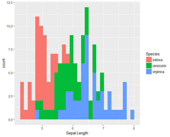
ヒストグラムgeom_histgram()
iris %$%
  ggplot(.,aes(x = Sepal.Length,fill = Species)) +
  geom_histogram()
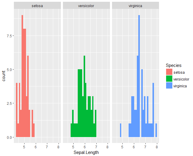
Species毎のヒストグラムはfacetを使う
iris %$%
  ggplot(.,aes(x = Sepal.Length,fill = Species)) +
  geom_histogram() +
  facet_wrap(~Species)
縦軸はcountじゃなくてfrequencyがいい!!
ylab()で変更可能(xlab()でx軸)
iris %$%
  ggplot(.,aes(x = Sepal.Length,fill = Species)) +
  geom_histogram() +
  facet_wrap(~Species) +
  ylab("frequency")

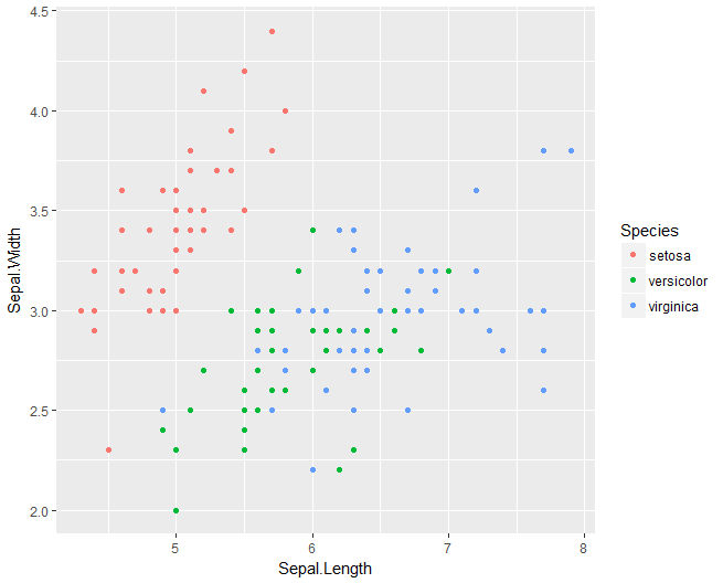
散布図geom_point()
iris %$%
  ggplot(.,aes(x = Sepal.Length,y = Sepal.Width,colour = Species)) +
  geom_point(size = rel(1.5))
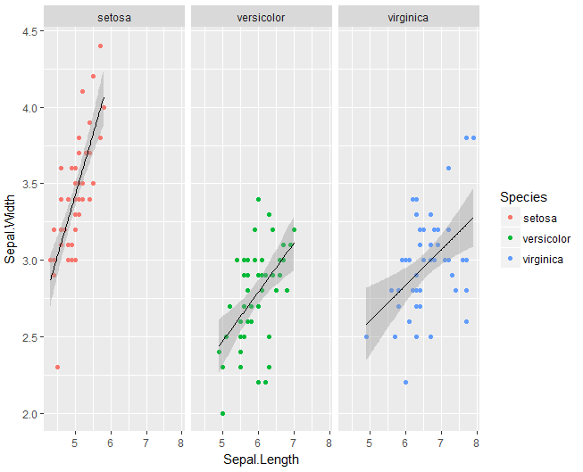
各Speciesの散布図+回帰線(geom_smooth())
iris %$%
  ggplot(.,aes(x = Sepal.Length,y = Sepal.Width,group = Species)) +
  geom_point(aes(colour = Species)) +
  geom_smooth(method = "lm",colour = "black",size = rel(0.6)) +
  facet_wrap(~Species)
Stat_summary()
fun.y()で縦軸の統計量を決める
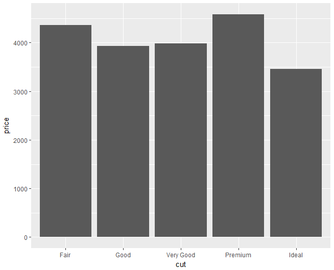
diamonds %$%
  ggplot(.,aes(x = cut, y = price)) +
  stat_summary(fun.y = mean, geom = "bar")
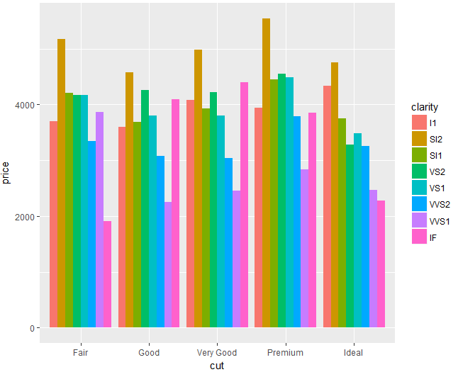
position = "dodge" でよけて色を付けると
diamonds %$%
  ggplot(.,aes(x = cut, y = price, fill = clarity)) +
  stat_summary(fun.y = mean, geom = "bar", position = "dodge")
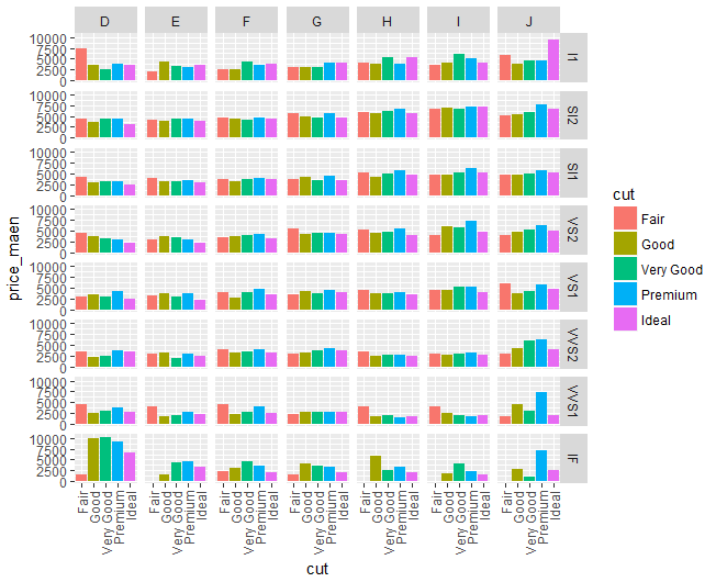
もっと!!cut毎のpriceの平均値をclarityとダイアモンドのcolorごとに!!!
diamonds %$%
  ggplot(.,aes(x = cut, y = price, fill = cut)) +
  stat_summary(fun.y = mean, geom = "bar") +
  ylab("price_maen") +
  facet_grid(clarity~color) +
  theme(axis.text.x = element_text(angle = 90,hjust = 1,vjust = 0.5))
箱ひげ図geom_boxplot()
平均値を白抜けのひし形で表示
iris %$%
  ggplot(.,aes(x = Species, y = Sepal.Length)) +
  geom_boxplot() +
  geom_jitter(position = position_jitter(),aes(colour = Species)) +
  stat_summary(fun.y = "mean",geom = "point", shape = 23, size = 3, fill = "white")
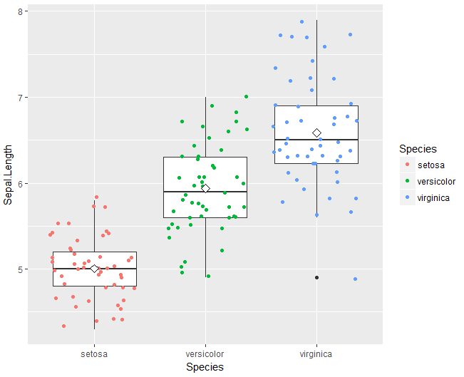
あまりきれいな図ではなくてごめんなさい。僕も頑張って綺麗な図を作れるように頑張ります。
最後に
大学卒業後もRをどんどん使う予定なのでよろしくお願いします。
初めての投稿なのでこれくらいでご容赦ください
ありがとうございました。