動機
とりあえずJetpack Composeがライブラリとして利用できるようになったみたいなので早速使い方勉強がてら触ろうとしてBottomNavigationBarを使おうとしてもなかったので、androidx.ui.material.Tabの実装パックってBottomNavigationBarを実装してみました。
BottomNavigationBarのコード(androidx.ui.material.Tabの改変コード)
ソースコードは以下。(ほとんどTabの実装を参考にしていじっただけなのでAOSPそのままのCopryrightにしておいたのですが、何か問題あったら教えていただければと思います、使いにくいので僕のCopyrightにしたほうがいいとかあれば)
/*
 * Copyright 2019 The Android Open Source Project
 *
 * Licensed under the Apache License, Version 2.0 (the "License");
 * you may not use this file except in compliance with the License.
 * You may obtain a copy of the License at
 *
 *      http://www.apache.org/licenses/LICENSE-2.0
 *
 * Unless required by applicable law or agreed to in writing, software
 * distributed under the License is distributed on an "AS IS" BASIS,
 * WITHOUT WARRANTIES OR CONDITIONS OF ANY KIND, either express or implied.
 * See the License for the specific language governing permissions and
 * limitations under the License.
 */

import androidx.animation.FastOutSlowInEasing
import androidx.animation.transitionDefinition
import androidx.compose.Composable
import androidx.compose.memo
import androidx.compose.state
import androidx.compose.unaryPlus
import androidx.ui.animation.PxPropKey
import androidx.ui.animation.Transition
import androidx.ui.core.*
import androidx.ui.foundation.ColoredRect
import androidx.ui.layout.Container
import androidx.ui.layout.FlexRow
import androidx.ui.layout.Padding
import androidx.ui.layout.Stack
import androidx.ui.material.*
import androidx.ui.material.TabRow
import androidx.ui.material.surface.Surface


@Suppress("USELESS_CAST")
@Composable
fun <T> BottomNavigationRow(
    items: List<T>,
    selectedIndex: Int,
    indicatorContainer: @Composable() (itemPositions: List<BottomNavigationRow.ItemPosition>) -> Unit = { tabPositions ->
        BottomNavigationRow.IndicatorContainer(tabPositions, selectedIndex) {
            TabRow.Indicator()
        }
    },
    tab: @Composable() (Int, T) -> Unit
) {
    Surface(color = +themeColor { primary }) {
        val divider = BottomNavigationRow.Divider

        val tabs = @Composable {
            items.forEachIndexed { index, item ->
                tab(index, item)
            }
        }

        WithExpandedWidth { width ->
            // androidx.ui.material.Tab.ktのTabRowのコードの条件分岐をなくした
            FixedBottomNavigationRow(width, items.size, tabs, divider, indicatorContainer)
        }
    }
}

@Composable
private fun FixedBottomNavigationRow(
    width: IntPx,
    tabCount: Int,
    tabs: @Composable() () -> Unit,
    divider: @Composable() () -> Unit,
    indicatorContainer: @Composable() (itemPositions: List<BottomNavigationRow.ItemPosition>) -> Unit
) {
    val tabWidth = width / tabCount

    val tabPositions = +memo(tabCount, tabWidth) {
        (0 until tabCount).map { index ->
            val left = (tabWidth * index)
            BottomNavigationRow.ItemPosition(left, tabWidth)
        }
    }

    Stack { // StackはFrameLayoutみたいに重ねられる
        aligned(Alignment.Center) {
            FlexRow {
                expanded(1f) {
                    tabs()
                }
            }
        }
        aligned(Alignment.BottomCenter) {
            divider()
        }
        positioned(0.dp, 0.dp, 0.dp, 0.dp) {
            indicatorContainer(tabPositions)
        }

    }
}

@Composable
private fun WithExpandedWidth(child: @Composable() (width: IntPx) -> Unit) {
    var widthState by +state { IntPx.Zero }
    Layout({ child(widthState) }) { measurables, constraints ->
        val width = constraints.maxWidth
        if (widthState != width) widthState = width
        val placeable = measurables.first().measure(constraints)
        val height = placeable.height

        layout(width, height) {
            placeable.place(IntPx.Zero, IntPx.Zero)
        }
    }
}


object BottomNavigationRow {
    private val IndicatorOffset = PxPropKey()

    data class ItemPosition internal constructor(val left: IntPx, val width: IntPx) {
        val right: IntPx get() = left + width
    }

    @Composable
    fun IndicatorContainer(
        itemPositions: List<ItemPosition>,
        selectedIndex: Int,
        indicator: @Composable() () -> Unit
    ) {
        val currentTabWidth = withDensity(+ambientDensity()) {
            itemPositions[selectedIndex].width.toDp()
        }
        // BottomLeftをTopLeftに変えてインジケータの位置が上付きになるようにした
        Container(expanded = true, alignment = Alignment.TopLeft) {
            IndicatorTransition(itemPositions, selectedIndex) { indicatorOffset ->
                Padding(left = withDensity(+ambientDensity()) { indicatorOffset.toDp() }) {
                    Container(width = currentTabWidth) {
                        indicator()
                    }
                }
            }
        }
    }

    @Composable
    fun Indicator() {
        ColoredRect(color = +themeColor { secondary }, height = IndicatorHeight)
    }

    @Composable
    internal fun IndicatorTransition(
        itemPositions: List<ItemPosition>,
        selectedIndex: Int,
        children: @Composable() (indicatorOffset: Px) -> Unit
    ) {
        val transitionDefinition = +memo(itemPositions) {
            transitionDefinition {
                state(selectedIndex) {
                    this[IndicatorOffset] = itemPositions[selectedIndex].left.toPx()
                }

                itemPositions.forEachIndexed { index, position ->
                    if (index != selectedIndex) {
                        state(index) {
                            this[IndicatorOffset] = position.left.toPx()
                        }
                    }
                }

                transition {
                    IndicatorOffset using tween {
                        duration = 250
                        easing = FastOutSlowInEasing
                    }
                }
            }
        }

        Transition(transitionDefinition, selectedIndex) { state ->
            children(state[IndicatorOffset])
        }
    }

    internal val Divider = @Composable {
        val onPrimary = +themeColor { onPrimary }
        Divider(color = (onPrimary.copy(alpha = DividerOpacity)))
    }
}


private val IndicatorHeight = 4.dp
private const val DividerOpacity = 0.12f
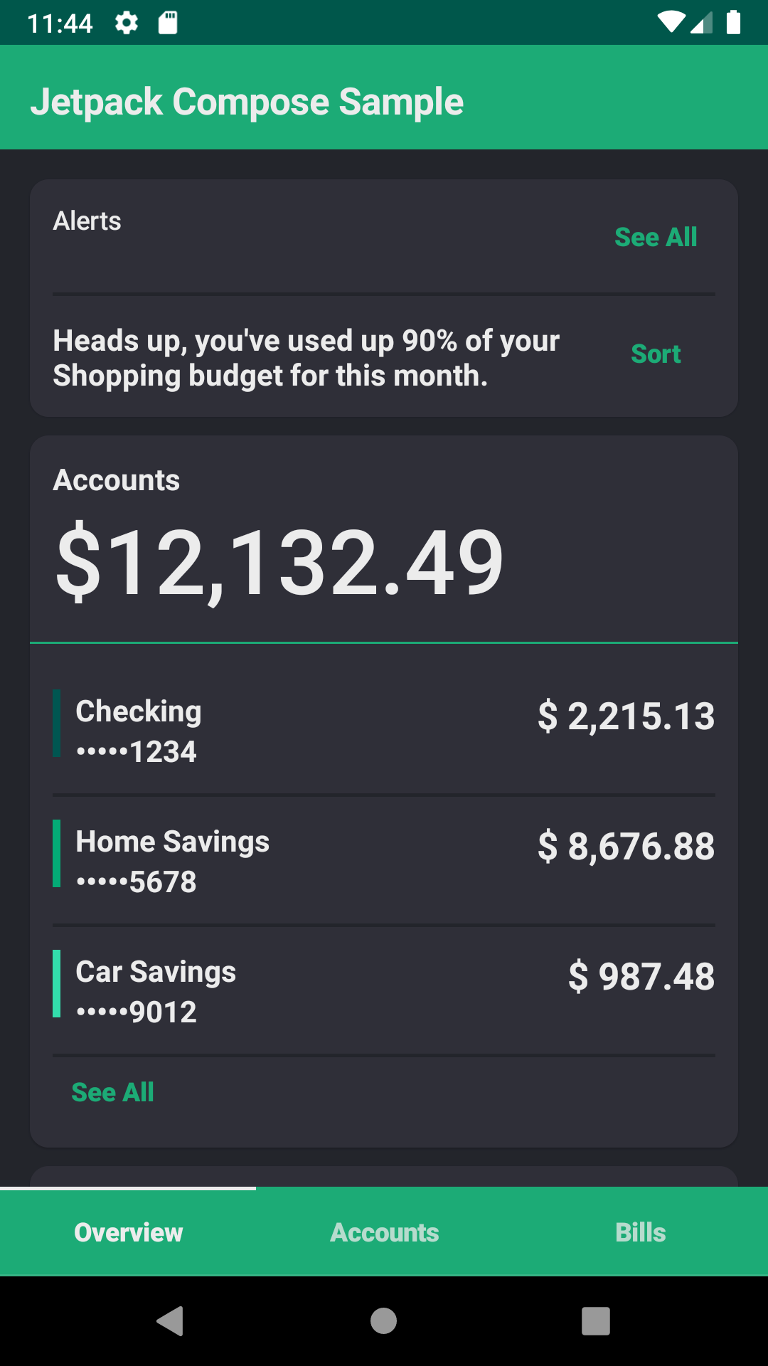
コメントで変更ポイントについて書いておきましたが、インジケータが上付きになるようにしたのと、メソッド名やObject名を変えたのと、スクロールできるタブの条件分岐部分から先を全部不採用にしただけで、ほとんど差がないです。
んで、それをrallyというパッケージに入ったJetpack Composeのサンプル(以下RallyAppと呼称)があるんですが、そいつに適用したらこんな感じです。(わかりやすいように適用前の画面も)
| before | after |
|---|---|
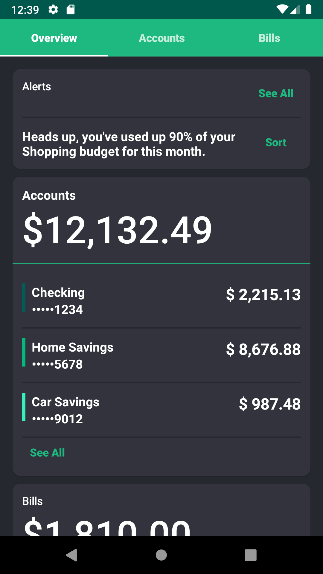 |
 |
BottomNavigationBarのあるアプリの実装コード
じゃぁ実際に利用する再利用可能なコードにしてみましょう。
Jetnewsのコードも参考にさせてもらって全体的に拡張しやすいようにコードを作ってみました。
- Activity
    override fun onCreate(savedInstanceState: Bundle?) {
        super.onCreate(savedInstanceState)
        setContent {
            MyApp()
        }
    }
- 状態管理(画面遷移)
sealed class Screen {
    object Overview : Screen()
    object Accounts : Screen()
    object Bills : Screen()
}

// Object(Singleton)なので回転に強い?
@Model
object MyAppStatus {
    // 画面遷移の管理がアプリを実装する側のコントロールに!!
    var currentScreen: Screen = Screen.Overview
}

fun navigateTo(destination: Screen) {
    MyAppStatus.currentScreen = destination
}
コメント書きましたが、画面遷移が実装側に委ねられたのは本当にすごい。単に今は無いだけかも?
- 主幹の実装
fun MyApp() {
    MyAppTheme { // MyAppThemeみたいな独自テーマを適用する場合はRallyAppのコードを参考に
        MyAppContent()
    }
}
// 後で引数渡す方法など考えたかったのでScreenをあえてenumで作らなかった。別にScreenをEnumで定義してもいいと思う。
val navNameMap = mapOf(Screen.Overview to "Overview", Screen.Accounts to "Accounts", Screen.Bills to "Bills")

@Composable
private fun MyAppContent() {
    FlexColumn {
        expanded(flex = 1.0f) {
            Scaffold(appBar = {
                TopAppBar(title = { Text("MyApp") })
            }){
                Crossfade(MyAppStatus.currentScreen) { screen ->
                    when (screen) {
                        is Screen.Overview -> OverviewScreen() // 各自が実装
                        is Screen.Accounts -> AccountsScreen()
                        is Screen.Notifications -> BillsScreen()
                    }
                } // -- CrossFade
            } // -- Scaffold
        } // -- expanded
        inflexible {
            BottomNavigation(itemNameMap = navNameMap,
                currentScreen = MyAppStatus.currentScreen,
                onSelected = { screen ->
                navigateTo(screen)
            })
        } // -- inflexible
    } // FlexColumn
}

fun BottomNavigation(itemNameMap: Map<Screen, String>, currentScreen: Screen, onSelected: (Screen) -> Unit) {
    val items = itemNameMap.keys.toList()
    BottomNavigationRow(items = items, selectedIndex = items.indexOf(currentScreen), indicatorContainer =  { tabPositions ->
        BottomNavigationRow.IndicatorContainer(tabPositions, items.indexOf(currentScreen)) {
            BottomNavigationRow.Indicator()
        }
    }) { i, screen ->
        Tab(text = navNameMap[screen], selected = items.indexOf(currentScreen) == i) {
            onSelected(screen)
        }
    }
}
関連コード
import androidx.compose.Composable
import androidx.compose.unaryPlus
import androidx.ui.layout.FlexColumn
import androidx.ui.material.surface.Surface
import androidx.ui.material.themeColor

fun Scaffold(appBar: @Composable() () -> Unit, children: @Composable() () -> Unit) {
    FlexColumn {
        inflexible {
            appBar()
        }
        expanded(flex = 1f) {
            Surface(color = +themeColor { background }) {
                children()
            }
        }
    }
}
build.gradle, app/build.gradle
Jetnewsを参考にしてください。
その他注意
- Manifestで設定するAppThemeが
styles.xmlに設定してあるとおもいますが、既存のActionBarが邪魔になると思うので任意の親テーマにあるNoActionBarを設定してください。
    <!-- Base application theme. -->
    <style name="AppTheme" parent="Theme.AppCompat.Light.NoActionBar">
        <!-- Customize your theme here. -->
        <item name="colorPrimary">@color/colorPrimary</item>
        <item name="colorPrimaryDark">@color/colorPrimaryDark</item>
        <item name="colorAccent">@color/colorAccent</item>
    </style>
Jetpack Composeを使ってみた感想
率直に言うと、まだ以前GoogleI/Oで紹介されていた(Youtube)ような機能の中では一部使えないものがある(?)し、既存のブログに上がっているサンプルは既に陳腐化していたり、ほとんど参考になるコードがないので、最初は手探りになります。
だけど既に、RallyAppのようなサンプルや公開されたコードがあるわけですから、実際に実機で動かせるコードはちょっとした試行錯誤で作れるはずです。(僕もそう思って個人的には個人開発はこっちでやろうと思っています)
わりと要領が分かって仕舞えば、思ったような実装をガリガリ書けるようになるはずだとも思っています。
またAOSPにあがっているJetpack Composeのサンプルコードも結構あるので、探してみれば自分が欲しかったものが見つかるかもしれませんし、既にAOSPでJavaで書かれたWidgetの実装コードよりはるかにJetpack Compose用に書かれたWidgetのコードは可読性が高く、それらを資産として自分で新しいものが作りやすいです。
- Jetpack ComposeのAOSPのコードの在り処(ここでSampleの実装が見れるので手元にDLしていろいろみてみるといいかも)
https://android.googlesource.com/platform/frameworks/support/+/refs/heads/androidx-master-dev/ui
今回、Jetpack Composeをさわってみた感触から言えるのは、以前のUIの実装に慣れているとはいえ、不具合が特にないならこっちで作りたくなるような、実装の自由さ、楽しさがJetpack Composeにはあると思います。おそらく致命的な問題がなければ、有用なアーキテクチャとともにJetpackと冠するのに遜色なく、今後色々なプロジェクトで取り入れられていくだろうと思うので、今勉強しても損になる事はなさそうだなと思いました。
特に実装を凝るよりまず、市場にアプリを出して実証実験をしていきたいと考えるような方達には人気が出そうな予感がします。
ただ、今後GoogleのMapを使うUIのあるサービスが増える気がしているので、そこらへんどうなるのか気になります。UIのパフォーマンスも気になりますね。
あといろんな人たちのいろんなコードがみたいので、Jetpack Composeの利用が簡単になってきたこの段階から活発になっていったらいいなと思います。
今後書きたい内容
今後Jetpack Composeについて、ちょくちょく何か出せたらと思っています。
どちらかと言うとこまかなAPIの説明をするよりは動くコードを載せて行こうかと思っています。
以下が今後予定している内容です
- Layoutの紹介?(他の人が書きそうなのでいらないか?)
- Cookbook的にUIの簡単なパターンを網羅(小出しか一気にやるかは未定、どんなUIをいれていくか詰めている最中)
- より簡単にアプリをつくっていく何か(やっていく中でおすそわけしたいTipsが出れば)
- SwiftUIと一緒につくるみたいな何か(個人PJでの学びもかねて)
- ViewModelを適用したパターンの実装 (ViewModelと共存できるだけで、今回のStatus.ktを持つようなスタイルでは意味ないかな?)
反響があれば説明が下手でも、よりガンガンコード載せていく気力がわくようになると思うので、応援よろしくお願いします!
※指摘やご意見など承っております!おきがるにどぞ!