皆さん、こんにちは!Python Advent Calender2023の6日目担当の小川英幸(X: ogawahideyuki)です。
データから洞察を得る過程で、その発見を他の人と共有し、さらなるインサイトを得ることは非常に価値があります。そのような役割を検討した際に、既存のツールでは物足りない一方、「アプリを一から作るのは大変だな…」と感じたことはありませんか?
ここで登場するのがData Appsです。Pythonだけで手軽にデータアプリを作成できるこれらのツールは、データ分析者にとって強力な味方。特にStreamlit、Dash、Panelを、簡単に使えるフレームワークとして、私は注目し、活用しています。
Streamlitのページでは最初に次のようにあります。「Streamlitは、データスクリプトを数分で共有可能なウェブアプリに変える。全てPythonで。フロントエンドの経験は不要です。」
Streamlit turns data scripts into shareable web apps in minutes.
All in pure Python. No front‑end experience required.
本記事では、最近はチャットアプリがどれだけ早く作れるかを競争している感があるこれらですが、そんなData Appsを紹介・使い分けのアイデアを紹介します。
開発環境
Python 3.10.6
dash 2.14.2
panel 1.3.4
streamlit 1.29.0
pandas 2.1.3
記事のモチベーション
今回の記事を各モチベーションは、最近Techplayさんにて出版記念セミナーを開催させていただいた際に、Panelの紹介をしていると、「以前Dashを使われていませんでしたっけ?」というような質問をいただきました。
Dashに関しては、「Pythonインタラクティブ・データビジュアライゼーション入門(朝倉書店 2019/12)」で執筆し、Panelに関しては「Pythonデータ分析ハンズオンセミナー(日経BP 2023/8)」でとりあげました。Streamlitは残念ながら執筆機会はないのですが、会社の製品のプロトタイプを作って公開してみたりしています。
なので、その辺りのツールの使い分けが紹介できると良いと思ったのがモチベーションです。
そんなモチベーションの中、執筆用に調査していると、Streamlitのサイトに面白いブログがあったので、生成AIにアプリケーションのコードを生成させるということも試すことになりました。なのでとっ散らかった感が強いですが、アドベントカレンダーというお祭り感の強い記事なので良いかなと、そのまま掲載しています。
それぞれのフレームワークの概要
初めにそれぞれのフレームワークの概要を見てみましょう。それぞれのウェブサイトからChatGPTに概要をまとめてもらったので、フレームワーク作成者の意図が組み込まれた概要になっていると思います。
あと、注意点としてはこれらはData Appsな観点から見られがちですが、基本的には簡単にフロントエンドが作れるフレームワークとして便利な面もあるという点は、覚えておいて損はない概念だと思います。
Streamlit
公式ドキュメント: https://streamlit.io/
githubのスター数: 28800
概要: StreamlitはPythonで数分でウェブアプリに変換するツールです。フロントエンド経験は不要で、簡単なインストール手順があります。コードの自動更新やウィジェットの簡単追加、即座のデプロイが可能です。
Dash
公式ドキュメント: https://dash.plotly.com/
githubのスター数: 19700
概要:DashはPlotlyのオープンソースPythonフレームワークで、インタラクティブなデータ視覚化ウェブアプリ作成に特化しています。コールバック、コンポーネントライブラリ、Databricks統合などが含まれます。
Panel
公式ドキュメント: https://panel.holoviz.org/
githubのスター数: 3300
概要: PanelはPythonライブラリで、パワフルなツールやアプリの構築が可能です。PyDataエコシステムを利用し、リアクティブAPIとコールバックAPIを提供します。開発者は好みのエディターやノートブックで作業できます。
同じアプリを作ってコード比較
いろいろ語るよりも、とりあえず同じアプリを作ったコードを見てみましょう。これを書くために記事を読んでいたらStreamlitのブログにGPT-4を使ってアプリを開発するという記事がありました。おもしろい!生成AI元年ということで、ChatGPTに似たような機能を持つアプリを開発させてみます。
追加で指示は必要でしたが、次のような感じで、大体同じ機能を持つ(ちょっと外見は違うけど)アプリがそれぞれのフレームワークで作成できました。
参考記事:
Take your Streamlit apps to the next level with GPT-4: https://blog.streamlit.io/take-your-streamlit-apps-to-the-next-level-with-gpt-4/
与えたプロンプトなど
アプリ作成には、記事と同じく文章での指示と画像をChatGPTに渡しました。指示が参考記事よりは少ないと思います。
プロンプト
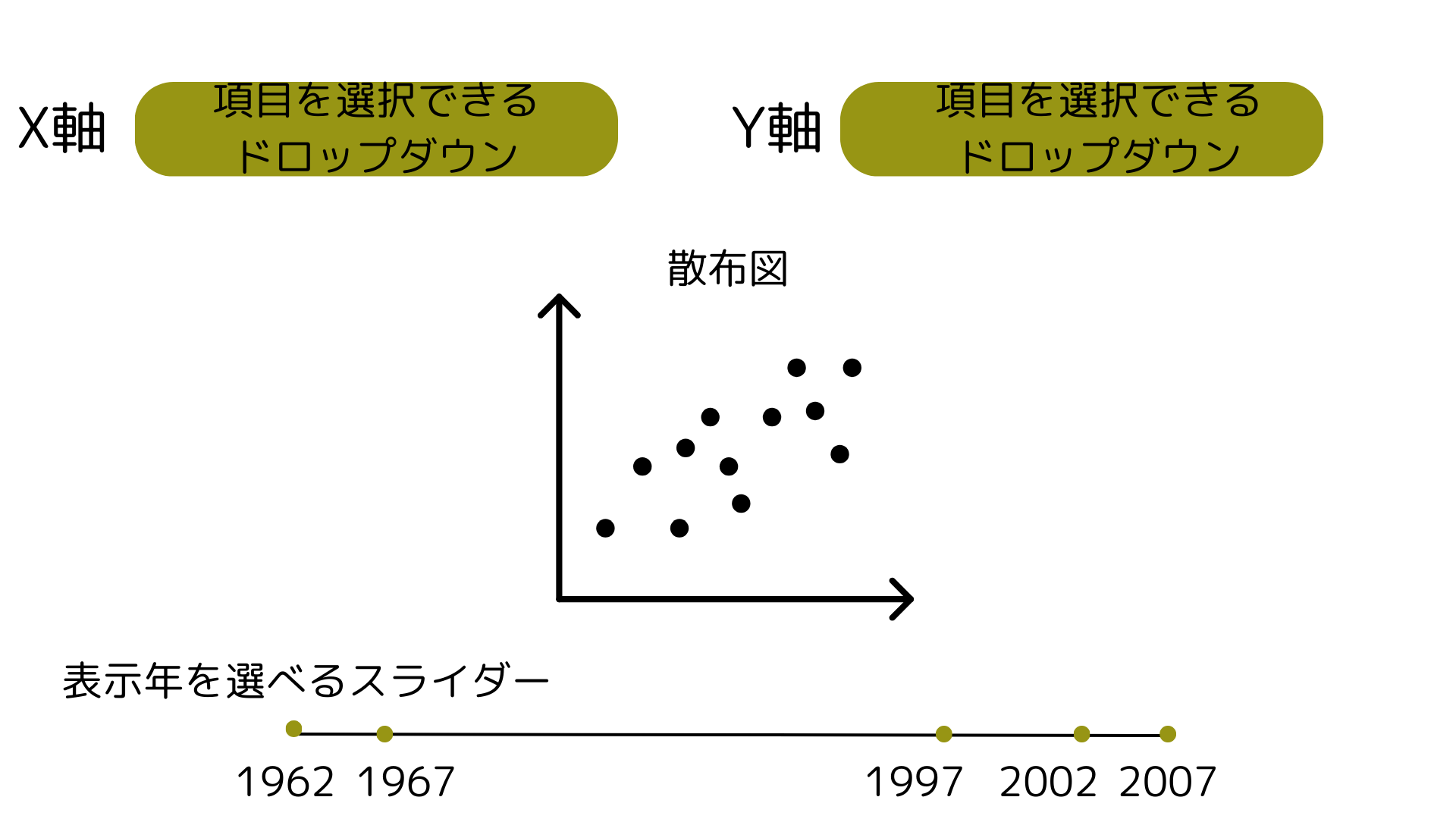
plotlyのdata.gapminderのデータを使って、散布図を作成するアプリケーションを{framework_name}で作ってください。概要は次の画像を参考にしてください。
画像
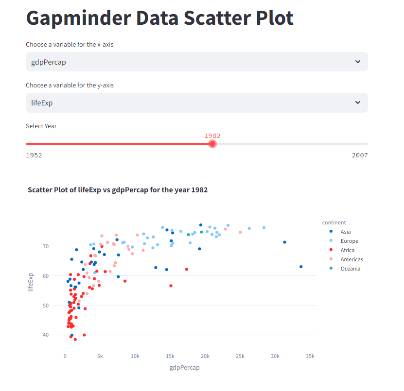
Streamlit
作成コード streamlit_app.py
import streamlit as st
import pandas as pd
import plotly.express as px

# Load the Gapminder data using the new caching function
@st.cache_data
def load_data():
    df = px.data.gapminder()
    return df

df = load_data()

# Streamlit user interface
st.title("Gapminder Data Scatter Plot")

# User selects x and y axes
x_axis_options = df.select_dtypes(include=[float, int]).columns.tolist()  # Numeric columns for the axes
x_axis = st.selectbox("Choose a variable for the x-axis", x_axis_options, index=x_axis_options.index("gdpPercap"))
y_axis = st.selectbox("Choose a variable for the y-axis", x_axis_options, index=x_axis_options.index("lifeExp"))

# User selects year with a slider in increments of 5 years
min_year = int(df['year'].min())
max_year = int(df['year'].max())
year_step = 5
year = st.slider("Select Year", min_year, max_year, step=year_step, value=min_year)

# Filtering the data by the selected year
df_year = df[df['year'] == year]

# Create the scatter plot for the selected year
fig = px.scatter(df_year, x=x_axis, y=y_axis,
                 hover_data=['country', 'continent'],
                 color='continent',
                 title=f"Scatter Plot of {y_axis} vs {x_axis} for the year {year}")

# Display the plot
st.plotly_chart(fig)
実行
$ python -m streamlit run streamlit_app.py
アプリの外見
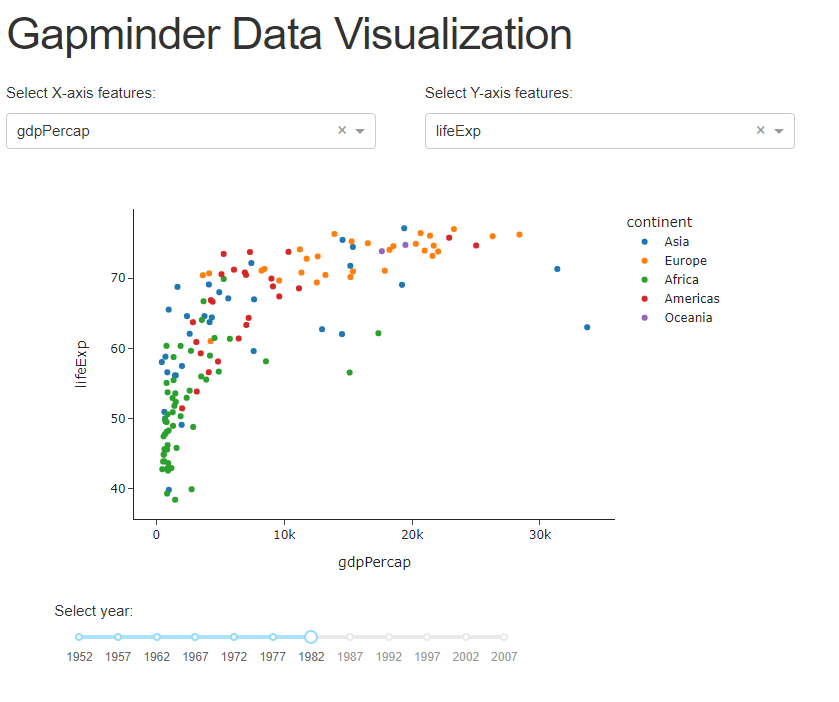
Dash
作成コード dash_app.py
# Import required libraries
import dash
from dash import dcc, html
from dash.dependencies import Input, Output
import plotly.express as px

# Define external stylesheet
external_stylesheets = ['https://codepen.io/chriddyp/pen/bWLwgP.css']

# Initialize the Dash application with external stylesheets
app = dash.Dash(__name__, external_stylesheets=external_stylesheets)

# Load the Gapminder dataset
df_gapminder = px.data.gapminder()

# Available options for the dropdown
available_indicators = ['lifeExp', 'pop', 'gdpPercap']

# Define the layout of the application
app.layout = html.Div([
    html.H1('Gapminder Data Visualization', className='title'),

    html.Div([
        html.Div([
            html.P('Select X-axis features:', className='control_label'),
            dcc.Dropdown(
                id='xaxis-column',
                options=[{'label': i, 'value': i} for i in available_indicators],
                value='gdpPercap',
                className='dcc_control'
            )
        ],
        className='pretty_container four columns'),

        html.Div([
            html.P('Select Y-axis features:', className='control_label'),
            dcc.Dropdown(
                id='yaxis-column',
                options=[{'label': i, 'value': i} for i in available_indicators],
                value='lifeExp',
                className='dcc_control'
            )
        ],
        className='pretty_container four columns')
    ], className='row'),

    html.Div([
        dcc.Graph(id='scatter-plot')
    ], className='pretty_container seven columns'),

    html.Div([
        html.P('Select year:', className='control_label'),
        dcc.Slider(
            id='year-slider',
            min=df_gapminder['year'].min(),
            max=df_gapminder['year'].max(),
            value=df_gapminder['year'].min(),
            marks={str(year): str(year) for year in df_gapminder['year'].unique()},
            step=None,
            className='dcc_control'
        )
    ], className='pretty_container five columns'),

], className='mainContainer')

# Callback to update the scatter plot
@app.callback(
    Output('scatter-plot', 'figure'),
    [Input('xaxis-column', 'value'),
     Input('yaxis-column', 'value'),
     Input('year-slider', 'value')]
)
def update_figure(xaxis_column_name, yaxis_column_name, year_value):
    dff = df_gapminder[df_gapminder['year'] == year_value]

    fig = px.scatter(dff,
                     x=xaxis_column_name,
                     y=yaxis_column_name,
                     color='continent',  # Coloring by continent
                     template="simple_white")

    fig.update_xaxes(title=xaxis_column_name)
    fig.update_yaxes(title=yaxis_column_name)
    fig.update_layout(transition_duration=500)

    return fig

# Run the application
if __name__ == '__main__':
    app.run_server(debug=True)
実行
$ python dash_app.py
アプリの外見
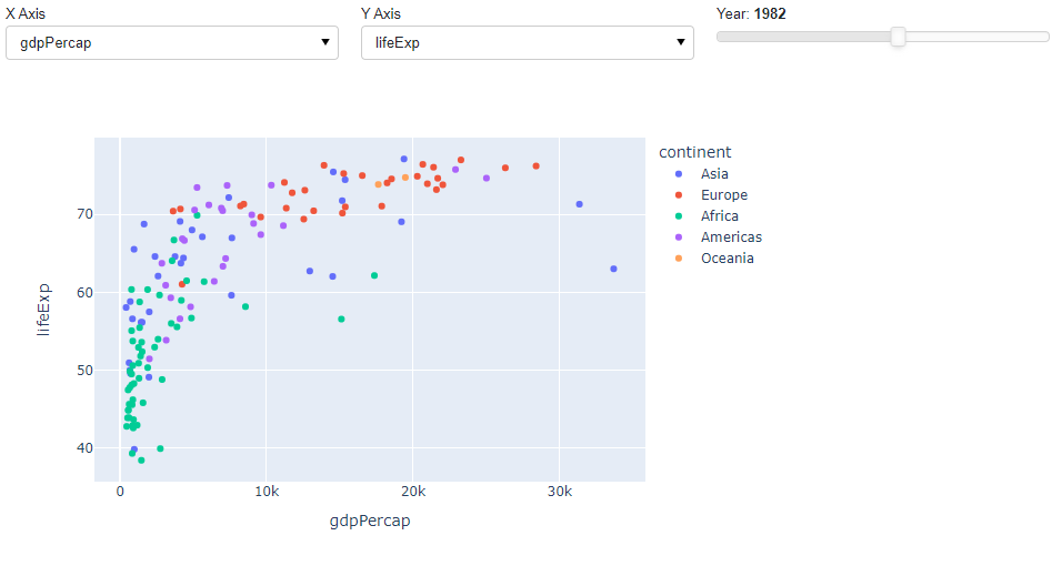
Panel
作成コード dash_app.py
import panel as pn
import plotly.express as px

# Load the Gapminder dataset from Plotly
gapminder_df = px.data.gapminder()

# Create a function to generate the scatter plot
def create_scatter(x_axis, y_axis, year):
    # Filter the data for the selected year
    filtered_data = gapminder_df[gapminder_df['year'] == year]

    # Create the scatter plot
    fig = px.scatter(filtered_data, x=x_axis, y=y_axis,
                     color='continent',
                     hover_name='country', size_max=55)

    return fig

# Widgets for the X and Y axes selection
x_axis_select = pn.widgets.Select(name='X Axis', options=['gdpPercap', 'lifeExp', 'pop'])
y_axis_select = pn.widgets.Select(name='Y Axis', options=['gdpPercap', 'lifeExp', 'pop'])

# Slider for the year selection
year_slider = pn.widgets.IntSlider(name='Year', start=1952, end=2007, step=5, value=1952)

# Reactive function to update the plot based on widgets' values
@pn.depends(x_axis_select.param.value, y_axis_select.param.value, year_slider.param.value)
def update_plot(x_axis, y_axis, year):
    return create_scatter(x_axis, y_axis, year)

# Create a Panel layout
layout = pn.Column(pn.Row(x_axis_select, y_axis_select, year_slider), update_plot)

# Serve the Panel app
layout.servable()
実行
$ python -m panel serve panel_app.py --show --autoreload
アプリの外見
コード観察
実現しているアプリが微妙に違うため、単純比較はできませんが、それぞれのフレームワークの特徴を表したコードとなっていると思います。以下はそれぞれ一口コメント。
- Streamlitに関しては、シンプルにツールを組み合わせて、それを直接使えるダイナミックさが表れている。
- Dashに関しては、コード量はほかに比べて倍以上となるが、ツールの配置など詳細な配置が設定できる。
- Panelに関しては、関数を作ってツールを組み合わせて動かすので、やっていることが明確になる
使い分けアイデア
これらのツールをどう使い分けるか?というアイデアを共有します。
Jupyterでの共有
まず私の分析環境は(多分多くの方もそうだと思います)、Jupyterです。なので、分析をさっさとこなし、これどう思う?とか相談したい場合、Jupyterで渡したりするのが簡単です。
この場合、Panelを使うのが良いと考えています。PanelはJupyter上でも追加のコンポーネントなしで容易に使えます。
ちなみに「Pythonデータ分析ハンズオンセミナー」はプログラミング初学者の方向けにColab環境を使って作業するため、動的なビジュアライゼーションにPanelを使いました。
ちなみにstreamlit, DashにもそれぞれJupyter上で動かすライブラリがあります。streamlitに関してはこれからどう発展するのかなぁとみている感じ、Dashに関しては、こういう用途で使うには、ちょっと記述量が多いかなぁ・・・という感想です。
https://github.com/ddobrinskiy/streamlit-jupyter
https://dash.plotly.com/dash-in-jupyter
ちなみに過去のJupyterDash紹介記事
https://qiita.com/OgawaHideyuki/items/725f4ffd93ffb0d30b6c
分析結果のプレゼンなど
チーム内での共有、お客さんへのプレゼンみたいなのはStreamlitが良いのではないかと思っています。このデータを見たいって無理を言うCXO対応もこれで安心(かもしれません)。
ここはPanelでもよいと思いますが、なんかStreamlitを使ってしまう私がいます。
プレゼンで少しややこしい動作をさせたい場合、PanelやDashの出番か??
Dashの出番は?
はい。Dashの出番は上のような局面でもっと詳細な設定を求める際に活躍できるでしょう。例えば次のリンク先にあるような、散布図をマウスホバーして、別のグラフを動かすようなことが容易にできるのは強みかなと思います。
あと、私としてはReactとの懸け橋にDashはお勧めかなぁと思っています。Reactはすごい難しいけど、Dashは結構簡単。でも、最近のフロント作成には覚えておいて損はない概念が結構理解できる。そんな感覚を持っています。この辺りはお手軽感というよりも、自分の今後のキャリアを考えながら手に入れる能力の選択のような気もしています。この辺り上手く言語化したいところではあるけど、いまいちできていません。
あと、その辺りを考え出すといっそReactでいいとか、Next.jsでとかいろいろ思い浮かぶけど、多くの可能性の中から自分で決めていろいろ試してみると分かることはたくさんあるので、なんでも選んでやってみるのは尊いと思います。
まとめ
この記事では3つのData Appsと呼ばれるものを作るフレームワークを比較観察しました。筆者の感覚的には用途別に使えるツールを使えばよいという感じで、これら3つもうまく仕事において使い分けられると良いでしょう。
ツールは学習コストもあり、絞ることも重要ですが、間口を広げて新しいツールを試すことも重要です。ちょっと試してみるのは、今回の生成AIによるコード生成のように楽しめるものです(残念ながら画像を使ったため、URL共有が出来ませんでした)。
また、個人の将来のキャリアを考えた際にどのような技能を手に入れたいか、それにつながるかというのも、活用するライブラリ選定に入れておくと面白いかも知れません。