こんにちは!現在スタートアップでFlutterエンジニアをしているAosanoriと申します!
アプリをおしゃれにしたり、UI/UXを上げたりするためにはアニメーションが不可欠ですが作るのは手間がかかりますよね!
そこで今回は皆さんの手間を少しでも減らせればと思い、リッチなアニメーションを使ったボタンをまとめて紹介していこうと思います!
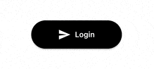
1. 王道!ローディングボタン
最初はSNSの認証などで使えそうなローデングボタンです!
また認証が成功したかどうか一目でわかるのでUXは向上すると思います!処理が進んでいるかがユーザーにとってわかるので離脱ユーザーを減らせることができます!
import 'package:progress_state_button/iconed_button.dart';
import 'package:progress_state_button/progress_button.dart';

ProgressButton.icon(
  iconedButtons: {
    ButtonState.idle: const IconedButton(
        text: "Login",
        icon: Icon(Icons.send,color:Colors.white),
        color: Colors.black),
    ButtonState.loading: const IconedButton(
        text: "Loading", color: Colors.black),
    ButtonState.fail: IconedButton(
        text: "Failed",
        icon: const Icon(Icons.cancel, color: Colors.white),
        color: Colors.red.shade300),
    ButtonState.success: IconedButton(
        text: "Success",
        icon: const Icon(
          Icons.check_circle,
          color: Colors.white,
        ),
        color: Colors.green.shade400)
  },
  onPressed: () async => onPressedProgressButton(),
  state: progressButtonState,
)
2. 心が満ちる!いいねボタン
2つ目はいいねボタンです!
ハートに動きがあるので思わず押したくなりますね!またここで使われているLottieというパッケージはアニメーションを用いたコンポーネントの作成を容易にしてくれるのでおすすめです!

import 'package:lottie/lottie.dart';

class FavoriteButton extends StatefulWidget {
  const FavoriteButton({Key? key}) : super(key: key);
  @override
  FavoriteButtonState createState() => FavoriteButtonState();
}

class FavoriteButtonState extends State<FavoriteButton>
    with TickerProviderStateMixin {
  late final AnimationController _controller;

  @override
  void initState() {
    super.initState();

    _controller = AnimationController(vsync: this);
  }

  @override
  void dispose() {
    _controller.dispose();
    super.dispose();
  }

  @override
  Widget build(BuildContext context) {
    return FloatingActionButton(
      onPressed: () {
        if (_controller.isCompleted) {
          _controller.reset();
        } else {
          _controller.forward();
        }
      },
      backgroundColor: Colors.white,
      child: Lottie.network(
        'https://assets1.lottiefiles.com/packages/lf20_ADzN7G.json',
        controller: _controller,
        repeat: true,
        onLoaded: (composition) {
          _controller.duration = composition.duration;
        },
      ),
    );
  }
}
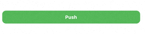
3. 柔らかそう!弾むボタン
お次は弾むボタンです!
HapticFeedbackと組み合わせることでユーザーのアクションに対してフィードバックがあるのでUXの向上につながると思います!
import 'package:spring_button/spring_button.dart';

Container(
  height: 60,
  child: SpringButton(
    SpringButtonType.WithOpacity,
    Padding(
      padding: const EdgeInsets.all(12.5),
      child: Container(
        decoration: const BoxDecoration(
          color: Colors.green,
          borderRadius: BorderRadius.all(Radius.circular(10.0)),
        ),
        child: const Center(
          child: Text(
            'Push',
            style: TextStyle(
              color: Colors.white,
              fontWeight: FontWeight.bold,
              fontSize: 12.5,
            ),
          ),
        ),
      ),
    ),
    onTapDown: (_) {},
    onLongPress: null,
    onLongPressEnd: null,
  ),
)
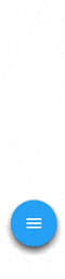
4. 縦に伸びるFloatingActionButton
今度は縦に伸びるFloatingActionButtonです!
画面を必要な時にしか占有しないのがいいですね!
class FancyFab extends StatefulWidget {
  final Function() onPressed;
  final String tooltip;
  final IconData icon;

  const FancyFab({required this.onPressed, required this.tooltip, required this.icon,Key? key,}):super(key: key);

  @override
  _FancyFabState createState() => _FancyFabState();
}

class _FancyFabState extends State<FancyFab>
    with SingleTickerProviderStateMixin {
  bool isOpened = false;
  late AnimationController _animationController;
  late Animation<Color?> _buttonColor;
  late Animation<double> _animateIcon;
  late Animation<double> _translateButton;
  final _curve = Curves.easeOut;
  final _fabHeight = 56.0;

  @override
  initState() {
    /* アニメーション初期化 */
    _animationController =
        AnimationController(vsync: this, duration: const Duration(milliseconds: 500))
          ..addListener(() {
            setState(() {});
          });
    _animateIcon =
        Tween<double>(begin: 0.0, end: 1.0).animate(_animationController);
    /* ボタンの色の変わり方を定義 */
    _buttonColor = ColorTween(
      begin: Colors.blue,
      end: Colors.red,
    ).animate(CurvedAnimation(
      parent: _animationController,
      curve: const Interval(
        0.00,
        1.00,
        curve: Curves.linear,
      ),
    ),);
    /* 浮き出てくるボタン浮き出方を定義 */
    _translateButton = Tween<double>(
      begin: _fabHeight,
      end: -14.0,
    ).animate(CurvedAnimation(
      parent: _animationController,
      curve: Interval(
        0.0,
        0.75,
        curve: _curve,
      ),
    ));
    super.initState();
  }

  @override
  dispose() {
    _animationController.dispose();
    super.dispose();
  }

  // アニメーションを走らす
  void animate() {
    if (!isOpened) {
      _animationController.forward();
    } else {
      _animationController.reverse();
    }
    isOpened = !isOpened;
  }

  Widget add() {
    return const FloatingActionButton(
      onPressed: null,
      tooltip: 'Add',
      child: Icon(Icons.add),
    );
  }

  Widget image() {
    return const FloatingActionButton(
      onPressed: null,
      tooltip: 'Image',
      child: Icon(Icons.image),
    );
  }

  Widget inbox() {
    return const FloatingActionButton(
      onPressed: null,
      tooltip: 'Inbox',
      child: Icon(Icons.inbox),
    );
  }

  Widget toggle() {
    return FloatingActionButton(
      backgroundColor: _buttonColor.value,
      onPressed: animate,
      tooltip: 'Toggle',
      child: AnimatedIcon(
        icon: AnimatedIcons.menu_close,
        progress: _animateIcon,
      ),
    );
  }

  @override
  Widget build(BuildContext context) {
    return Column(
      mainAxisAlignment: MainAxisAlignment.end,
      children: <Widget>[
        Transform(
          transform: Matrix4.translationValues(
            0.0,
            _translateButton.value * 3.0,
            0.0,
          ),
          child: add(),
        ),
        Transform(
          transform: Matrix4.translationValues(
            0.0,
            _translateButton.value * 2.0,
            0.0,
          ),
          child: image(),
        ),
        Transform(
          transform: Matrix4.translationValues(
            0.0,
            _translateButton.value,
            0.0,
          ),
          child: inbox(),
        ),
        toggle(),
      ],
    );
  }
}
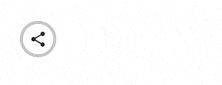
5. 伸びる!共有ボタン
5つ目は横に伸びる共有ボタンです!
これもボタンで画面を占有させたくない時に使えそうです!
class ShareButton extends StatefulWidget {
  const ShareButton({Key? key}) : super(key: key);
  @override
  _ShareButtonState createState() => _ShareButtonState();
}

class _ShareButtonState extends State<ShareButton> {
  bool isOpen = false;

  _toggleShare() {
    setState(() {
      isOpen = !isOpen;
    });
  }

  @override
  Widget build(BuildContext context) {
    return Stack(
      children: [
        AnimatedContainer(
          duration: const Duration(milliseconds: 350),
          curve: Curves.fastOutSlowIn,
          width: isOpen ? 240 : 48,
          height: 48,
          decoration: ShapeDecoration(
            color: Colors.grey[400],
            shape: const StadiumBorder(),
          ),
        ),
        Container(
          width: 40,
          margin: const EdgeInsets.only(left: 4),
          decoration: const BoxDecoration(
            color: Colors.white,
            shape: BoxShape.circle,
          ),
          child: AnimatedCrossFade(
            duration: const Duration(milliseconds: 450),
            firstChild: IconButton(
              icon: const Icon(Icons.share),
              onPressed: () => _toggleShare(),
            ),
            secondChild: IconButton(
              icon: const Icon(Icons.close),
              onPressed: () => _toggleShare(),
            ),
            crossFadeState:
                !isOpen ? CrossFadeState.showFirst : CrossFadeState.showSecond,
          ),
        ),
        AnimatedOpacity(
          duration: const Duration(milliseconds: 450),
          opacity: isOpen ? 1 : 0,
          child: Container(
            width: 240,
            padding: const EdgeInsets.only(left: 40),
            child: Row(
              mainAxisAlignment: MainAxisAlignment.spaceAround,
              children: [
                IconButton(
                  icon: const Icon(Icons.copy),
                  onPressed: () {},
                ),
                IconButton(
                  icon: const Icon(Icons.ios_share),
                  onPressed: () {},
                ),
                IconButton(
                  icon: const Icon(Icons.iso_sharp),
                  onPressed: () {},
                ),
              ],
            ),
          ),
        ),
      ],
    );
  }
}
6. トグルスイッチ
最後はトグルスイッチです!
スイッチなのでユーザーに二択で選ばせる場合や設定画面に用いるとよさそうです。また直感的でかつ操作が簡単なのでユーザーの操作ミスを減らせると思います!

FlutterSwitch(
  width: 125.0,
  height: 55.0,
  valueFontSize: 25.0,
  toggleSize: 45.0,
  value: status,
  borderRadius: 30.0,
  padding: 8.0,
  showOnOff: true,
  onToggle: (val) {
    setState(
      () {
        status = val;
      },
    );
  },
)
最後に
いかがだったでしょうか!アニメーションを使ったコンポーネントはアプリにアクセント加えることができアプリをよりおしゃれにできるだけでなくUI/UXも上がるのでアプリの活性化にも役に立つのでしつこくない程度に積極的に使っていきたい所です!
質問やアドバイス等ありましたらコメントしていただけると幸いです!
あとTwitterもやってるのでフォローお願いします!
駄文ですがここまで読んでいただきありがとうございました!
参考