WPFで、ボタンのホバー時の背景色を変更するのに良い感じの方法を見つけたので、忘れないように書いておきます。
はじめに
ボタンに画像を表示
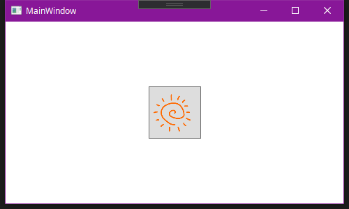 |
|---|
コード
<Window x:Class="sample_button.MainWindow"
        xmlns="http://schemas.microsoft.com/winfx/2006/xaml/presentation"
        xmlns:x="http://schemas.microsoft.com/winfx/2006/xaml"
        xmlns:d="http://schemas.microsoft.com/expression/blend/2008"
        xmlns:mc="http://schemas.openxmlformats.org/markup-compatibility/2006"
        xmlns:local="clr-namespace:sample_button"
        mc:Ignorable="d"
        Title="MainWindow" Height="300" Width="500">

    <Grid>
        <Button x:Name="btn" HorizontalAlignment="Center" VerticalAlignment="Center" Width="75" Height="75">
            <Image x:Name="btn_img" Source="images/sun.png" Margin="5"></Image>
        </Button>

    </Grid>
</Window>
やっぱりこういうのが簡単にできるのはいいですよね、でもボタンのデフォルトの背景色が残っちゃってるので、まだちょっと残念な感じです。背景色を変えてみましょう。
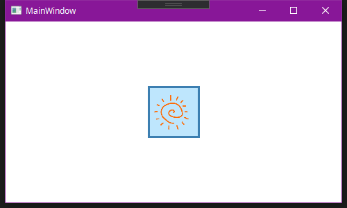
ボタンの背景色を変更
 |
|---|
コード
<Window x:Class="sample_button.MainWindow"
        xmlns="http://schemas.microsoft.com/winfx/2006/xaml/presentation"
        xmlns:x="http://schemas.microsoft.com/winfx/2006/xaml"
        xmlns:d="http://schemas.microsoft.com/expression/blend/2008"
        xmlns:mc="http://schemas.openxmlformats.org/markup-compatibility/2006"
        xmlns:local="clr-namespace:sample_button"
        mc:Ignorable="d"
        Title="MainWindow" Height="300" Width="500">

    <Grid>
        <Button x:Name="btn" HorizontalAlignment="Center" VerticalAlignment="Center" Width="75" Height="75" Background="#FF94CEFF" BorderBrush="Blue" BorderThickness="3">
            <Image x:Name="btn_img" Source="images/sun.png" Margin="5"></Image>
        </Button>

    </Grid>
</Window>
できました。
ホバー時は夕方にする
ここからが本題ですが、ホバー時には夕方っぽく、背景をオレンジ色にしてみたいと思います。
追加したコード
<Window.Resources>

    <Style TargetType="{x:Type Button}">
        <Style.Triggers>
            <Trigger Property="IsMouseOver" Value="true">
                <Setter Property="Background" Value="#FFFFE488"></Setter>
                <Setter Property="BorderBrush" Value="Red"></Setter>
            </Trigger>
        </Style.Triggers>
    </Style>

</Window.Resources>
すべてのコード
<Window x:Class="sample_button.MainWindow"
        xmlns="http://schemas.microsoft.com/winfx/2006/xaml/presentation"
        xmlns:x="http://schemas.microsoft.com/winfx/2006/xaml"
        xmlns:d="http://schemas.microsoft.com/expression/blend/2008"
        xmlns:mc="http://schemas.openxmlformats.org/markup-compatibility/2006"
        xmlns:local="clr-namespace:sample_button"
        mc:Ignorable="d"
        Title="MainWindow" Height="300" Width="500">

    <Window.Resources>

        <Style TargetType="{x:Type Button}">
            <Style.Triggers>
                <Trigger Property="IsMouseOver" Value="true">
                    <Setter Property="Background" Value="#FFFFE488"></Setter>
                    <Setter Property="BorderBrush" Value="Red"></Setter>
                </Trigger>
            </Style.Triggers>
        </Style>

    </Window.Resources>

    <Grid>
        <Button x:Name="btn" HorizontalAlignment="Center" VerticalAlignment="Center" Width="75" Height="75" Background="#FF94CEFF" BorderBrush="Blue" BorderThickness="3">
            <Image x:Name="btn_img" Source="images/sun.png" Margin="5"></Image>
        </Button>

    </Grid>
</Window>
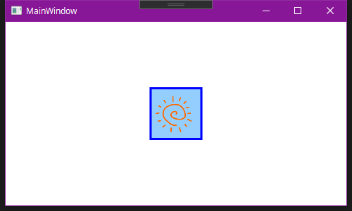
 |
|---|
デフォルトのまま、全く変わっていないことが分かります。
この場合、ControlTemplateを用いて、ボタンのスタイルを書き換える必要があります。
ControlTemplateを追加
まずは、ホバーは置いておいて、ボタンのスタイルを作り直します。
<Window x:Class="sample_button.MainWindow"
        xmlns="http://schemas.microsoft.com/winfx/2006/xaml/presentation"
        xmlns:x="http://schemas.microsoft.com/winfx/2006/xaml"
        xmlns:d="http://schemas.microsoft.com/expression/blend/2008"
        xmlns:mc="http://schemas.openxmlformats.org/markup-compatibility/2006"
        xmlns:local="clr-namespace:sample_button"
        mc:Ignorable="d"
        Title="MainWindow" Height="300" Width="500">

    <Window.Resources>

        <ControlTemplate x:Key="buttonControlTemplate" TargetType="Button">
            <Grid>
                <Rectangle Fill="#FF94CEFF"/>
                <Border BorderBrush="Blue" BorderThickness="3"></Border>
                <ContentPresenter HorizontalAlignment="Center"
                          VerticalAlignment="Center"/>
            </Grid>
        </ControlTemplate>

        <Style TargetType="{x:Type Button}">
            <Setter Property="Template" Value="{StaticResource buttonControlTemplate}"/>
        </Style>

    </Window.Resources>

    <Grid>
        <Button x:Name="btn" HorizontalAlignment="Center" VerticalAlignment="Center" Width="75" Height="75">
            <Image x:Name="btn_img" Source="images/sun.png" Margin="5"></Image>
        </Button>

    </Grid>
</Window>
 |
|---|
Button要素に、ControlTemplateとしてbuttonControlTemplateをあてています。今はButtonが1つしかないので、タグに直書きしてもいいのですが、後々この方が見やすいので、こうします。
タグ内で背景色を定義するのではなく、ボタンのスタイルを作り直し、背景を#FF94CEFFで埋めます。
ちなみに、ContentPresenterを書いておかないと、画像が表示されません。
また、ImageのMarginが若干効いていないように見えますが、これはBorderで詰まったのが原因なので、ButtonのBorderの3pxを考慮して、Margin=8とすると、元通りになります。
 |
|---|
この状態では、マウスホバー時に背景色の変化は無くなります。
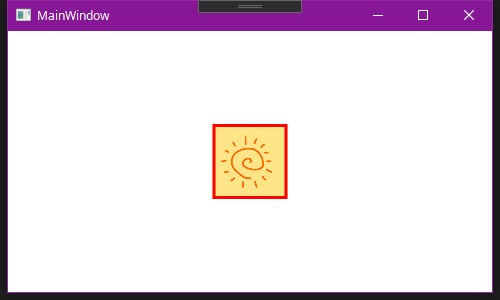
ホバー時のControlTemplateを追加
ここからは、調べるといくつか方法が出てきましたが、ホバー用にもう一つControlTemplateを追加するのが、一番簡単だと思います。
<Window x:Class="sample_button.MainWindow"
        xmlns="http://schemas.microsoft.com/winfx/2006/xaml/presentation"
        xmlns:x="http://schemas.microsoft.com/winfx/2006/xaml"
        xmlns:d="http://schemas.microsoft.com/expression/blend/2008"
        xmlns:mc="http://schemas.openxmlformats.org/markup-compatibility/2006"
        xmlns:local="clr-namespace:sample_button"
        mc:Ignorable="d"
        Title="MainWindow" Height="300" Width="500">

    <Window.Resources>

        <ControlTemplate x:Key="buttonControlTemplate" TargetType="Button">
            <Grid>
                <Rectangle Fill="#FF94CEFF"/>
                <Border BorderBrush="Blue" BorderThickness="3"></Border>
                <ContentPresenter HorizontalAlignment="Center"
                          VerticalAlignment="Center"/>
            </Grid>
        </ControlTemplate>

        <ControlTemplate x:Key="buttonHoverControlTemplate" TargetType="Button">
            <Grid>
                <Rectangle Fill="#FFFFE488"/>
                <Border BorderBrush="Red" BorderThickness="3"></Border>
                <ContentPresenter HorizontalAlignment="Center"
                          VerticalAlignment="Center"/>
            </Grid>
        </ControlTemplate>

        <Style TargetType="{x:Type Button}">
            <Setter Property="Template" Value="{StaticResource buttonControlTemplate}"/>

            <Style.Triggers>
                <Trigger Property="IsMouseOver" Value="true">
                    <Setter Property="Template" Value="{StaticResource buttonHoverControlTemplate}"/>
                </Trigger>
            </Style.Triggers>
        </Style>

    </Window.Resources>

    <Grid>
        <Button x:Name="btn" HorizontalAlignment="Center" VerticalAlignment="Center" Width="75" Height="75">
            <Image x:Name="btn_img" Source="images/sun.png" Margin="8"></Image>
        </Button>

    </Grid>
</Window>
ホバー時に適用するControlTemplateとして、新しくbuttonHoverControlTemplateを用意し、Style.Triggersを使用して、ホバー時にControlTemplateを付け替えます。
 |
|---|
ホバー時に、しっかりと背景色が変わるようになりました!