先日、vue2.0の環境でさまざまなグラフを表現するためのライブラリを選定する機会があったので、備忘録として残しておきます。
今回検討したライブラリ
1.Chart.js
2.ApexChart
3.HighCharts
4.D3.js
Chart.js
Chart.js
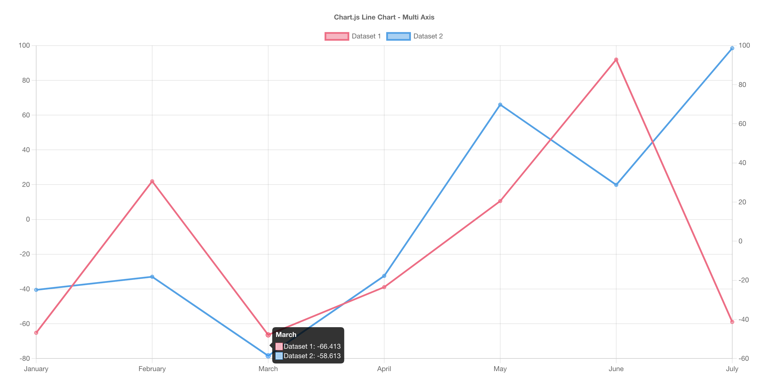
一番有名?なライブラリ
細かい設定を入れずとも綺麗なグラフを出力してくれる。
利点
- GitHub上のスターの数、Fork数などから今回のライブラリではトップクラスの人気を持っていることが窺える
- Web上のナレッジもかなり多く、Qiita上でも多数の有益な情報を発見可能
欠点
- 標準的な見た目としては後に紹介するものよりやや簡素
- 描写方式がCanvasであるため、CSSによって後から一部分に手を加えにくい
- 公式サイトでは仕様を一通り記載しているが、完成コードがやや少ない感がある
- 仕様外の実装をしようとすると想定以上に工数を持っていかれる可能性あり(マウスホバー時のツールチップのデザイン変更等)
サンプルコード
サンプル
<canvas id="myChart" width="400" height="400"></canvas>
<script>
const ctx = document.getElementById('myChart').getContext('2d');
const myChart = new Chart(ctx, {
    type: 'bar',
    data: {
        labels: ['Red', 'Blue', 'Yellow', 'Green', 'Purple', 'Orange'],
        datasets: [{
            label: '# of Votes',
            data: [12, 19, 3, 5, 2, 3],
            backgroundColor: [
                'rgba(255, 99, 132, 0.2)',
                'rgba(54, 162, 235, 0.2)',
                'rgba(255, 206, 86, 0.2)',
                'rgba(75, 192, 192, 0.2)',
                'rgba(153, 102, 255, 0.2)',
                'rgba(255, 159, 64, 0.2)'
            ],
            borderColor: [
                'rgba(255, 99, 132, 1)',
                'rgba(54, 162, 235, 1)',
                'rgba(255, 206, 86, 1)',
                'rgba(75, 192, 192, 1)',
                'rgba(153, 102, 255, 1)',
                'rgba(255, 159, 64, 1)'
            ],
            borderWidth: 1
        }]
    },
    options: {
        scales: {
            y: {
                beginAtZero: true
            }
        }
    }
});
</script>
ApexChart

おそらくChart.jsに次ぐ人気を誇る無料ライブラリ
標準機能でズームやグラフデータのダウンロード等の機能を付加しやすい
利点
- GitHub上のスターの数、Fork数などから今回のライブラリでは(Chart.jsに次ぎ)トップクラスの人気を持っていることが窺える
- Web上のナレッジも多め(だが、Chart.jsと比較すると日本語の情報が少ない傾向)
- 上記に記載の通り、標準で機能が多いため必要な機能のカスタマイズはしやすい(任意の部分に基準線を引いたりする等はChart.jsと比較して簡単)
- 標準でリッチな見た目にしやすい
- 複数のグラフの組み合わせ例や応用的な記法についても公式にいくつかサンプルコードが載っている
- SVG形式での描写なためCSS等で後から変化させやすい
欠点
- 標準で機能が多い分、ライブラリ自体のファイルサイズがやや多め
- JST周りの時刻の仕様など、知らなければ躓きやすいポイントがいくつか存在する
サンプルコード
サンプル
var options = {
  chart: {
    type: 'line'
  },
  series: [{
    name: 'sales',
    data: [30,40,35,50,49,60,70,91,125]
  }],
  xaxis: {
    categories: [1991,1992,1993,1994,1995,1996,1997, 1998,1999]
  }
}

var chart = new ApexCharts(document.querySelector("#chart"), options);

chart.render();
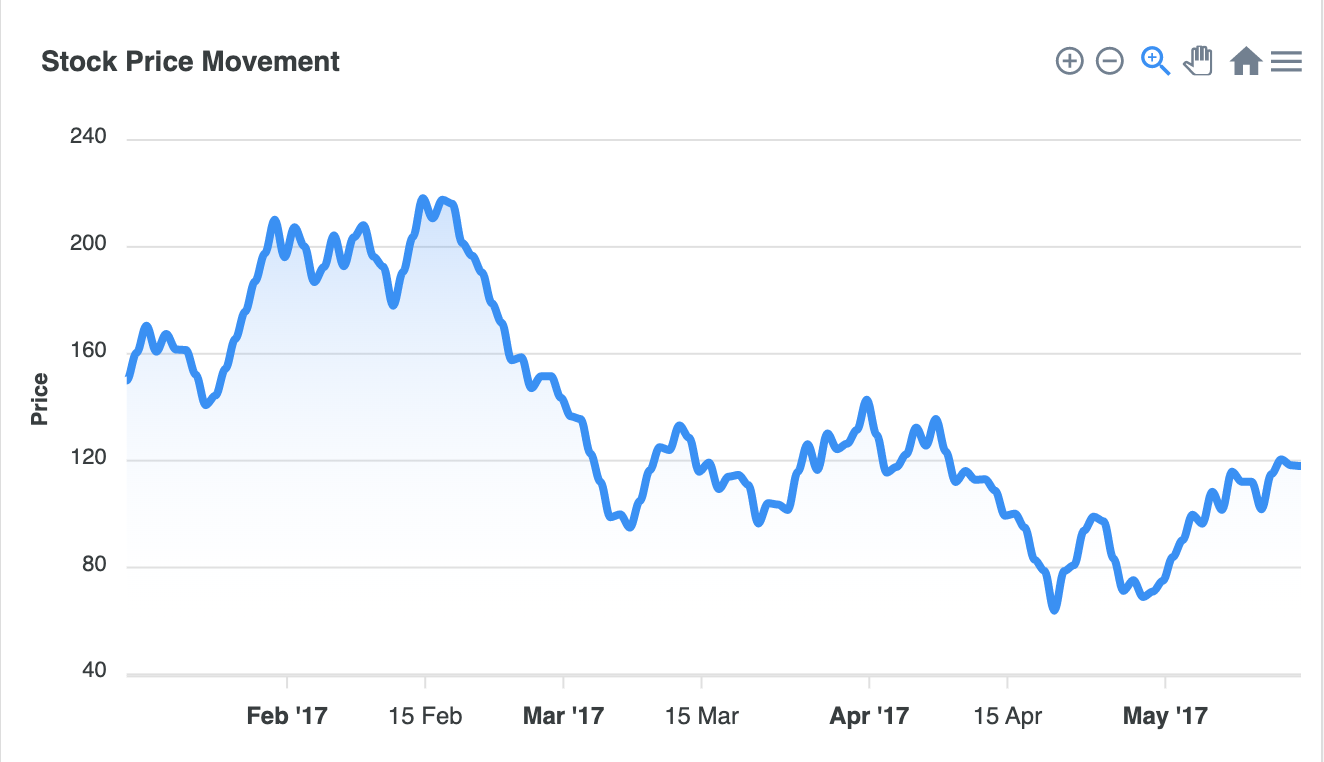
HighCharts
HighCharts


上記二点と違い商用利用は有料だが、標準的なデザインのセンス等が光る
利点
- Web上のナレッジがやや多く、Qiita上でも有益な情報をいくつか発見可能
- 商用の場合1年間のアドバンスユーザーライセンスも付与されるため、かなり手厚いサポートを受けることが可能(電話対応や緊急Hotfix等)
- 標準でのデザインはかなり完成されており、機能も申し分ないほどに充実している
欠点
- 有料なため、予算の厳しいプロジェクトでは採用を見送られる可能性がある(20デベロッパーライセンスで$535+初年度のみアドバンスサポート付)
サンプルコード
サンプル
Highcharts.getJSON(
  'https://cdn.jsdelivr.net/gh/highcharts/highcharts@v7.0.0/samples/data/usdeur.json',
  function (data) {

    Highcharts.chart('container', {
      chart: {
        zoomType: 'x'
      },
      title: {
        text: 'USD to EUR exchange rate over time'
      },
      subtitle: {
        text: document.ontouchstart === undefined ?
          'Click and drag in the plot area to zoom in' : 'Pinch the chart to zoom in'
      },
      xAxis: {
        type: 'datetime'
      },
      yAxis: {
        title: {
          text: 'Exchange rate'
        }
      },
      legend: {
        enabled: false
      },
      plotOptions: {
        area: {
          fillColor: {
            linearGradient: {
              x1: 0,
              y1: 0,
              x2: 0,
              y2: 1
            },
            stops: [
              [0, Highcharts.getOptions().colors[0]],
              [1, Highcharts.color(Highcharts.getOptions().colors[0]).setOpacity(0).get('rgba')]
            ]
          },
          marker: {
            radius: 2
          },
          lineWidth: 1,
          states: {
            hover: {
              lineWidth: 1
            }
          },
          threshold: null
        }
      },

      series: [{
        type: 'area',
        name: 'USD to EUR',
        data: data
      }]
    });
  }
);
D3.js

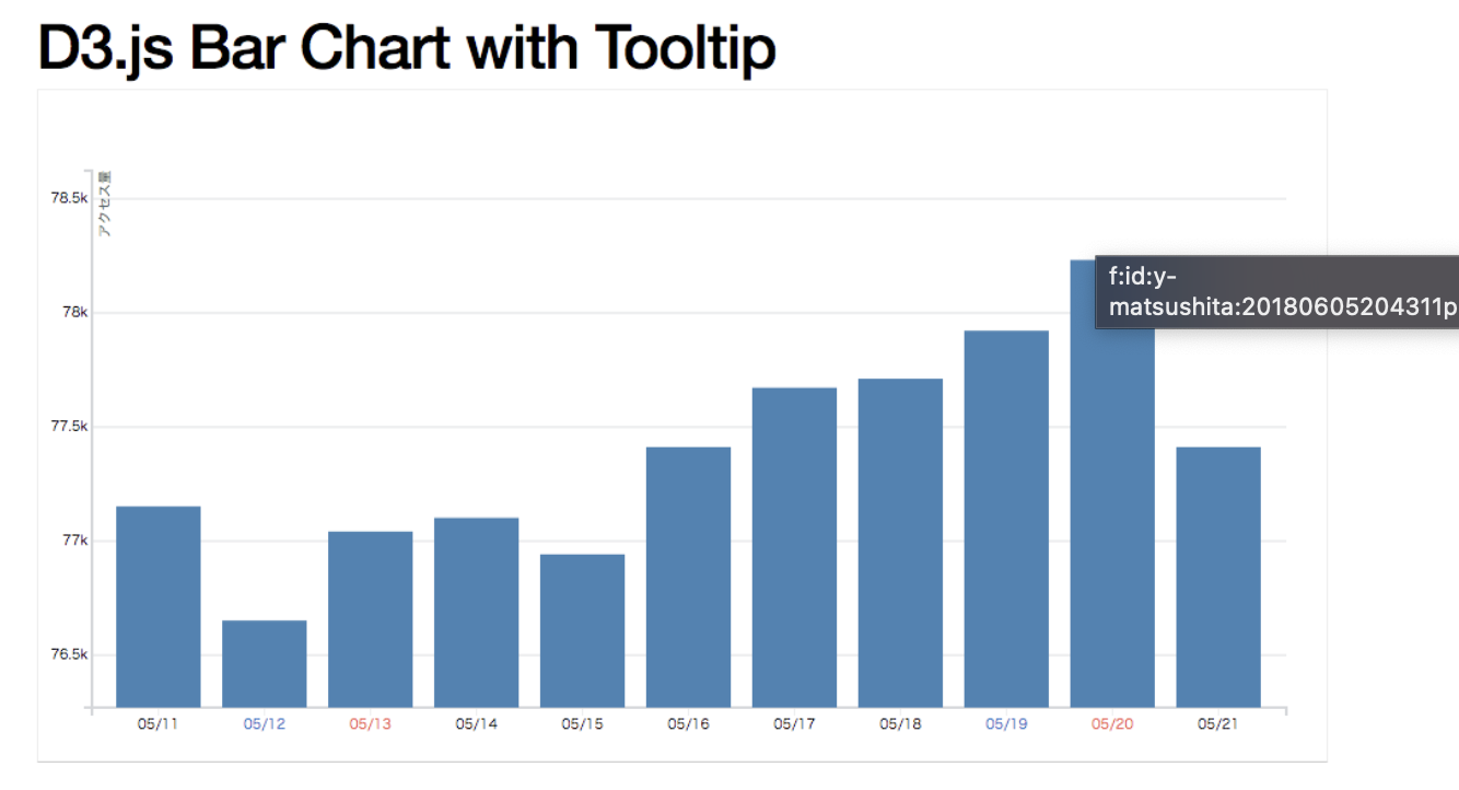
利点
- 高機能(これは下記の賛否にもつながってくるが、グラフ以外の部分でも活用できる可能性はあるかもしれない
- 非常にカスタマイズの幅が広い
欠点
- D3自体はグラフライブラリではないため、グラフに特化した他のライブラリと比較するとあまり描きやすくはない
- 学習コストがやや高い
- 上記点より、開発スピード的にはやや遅くなる可能性がある?
- C3‘は‘上記の欠点がなく書きやすいが、そのぶん拡張性を失ってしまっている
- 標準ではやや見た目が簡素
サンプルコード
サンプル
// Copyright 2021 Observable, Inc.
// Released under the ISC license.
// https://observablehq.com/@d3/bollinger-bands
function BollingerChart(data, {
  x = ([x]) => x, // given d in data, returns the (temporal) x-value
  y = ([, y]) => y, // given d in data, returns the (quantitative) y-value
  N = 20, // number of periods for rolling mean
  K = 2, // number of standard deviations to offset each band
  curve = d3.curveLinear, // method of interpolation between points
  marginTop = 20, // top margin, in pixels
  marginRight = 30, // right margin, in pixels
  marginBottom = 30, // bottom margin, in pixels
  marginLeft = 40, // left margin, in pixels
  width = 640, // outer width, in pixels
  height = 400, // outer height, in pixels
  xDomain, // [xmin, xmax]
  xRange = [marginLeft, width - marginRight], // [left, right]
  yDomain, // [ymin, ymax]
  yRange = [height - marginBottom, marginTop], // [bottom, top]
  yFormat, // a format specifier string for the y-axis
  yLabel, // a label for the y-axis
  colors = ["#aaa", "green", "blue", "red"], // color of the 4 lines
  strokeWidth = 1.5, // width of lines, in pixels
  strokeLinecap = "round", // stroke line cap of lines
  strokeLinejoin = "round" // stroke line join of lines
} = {}) {
  // Compute values.
  const X = d3.map(data, x);
  const Y = d3.map(data, y);
  const I = d3.range(X.length);

  // Compute default domains.
  if (xDomain === undefined) xDomain = d3.extent(X);
  if (yDomain === undefined) yDomain = [0, d3.max(Y)];

  // Construct scales and axes.
  const xScale = d3.scaleUtc(xDomain, xRange);
  const yScale = d3.scaleLinear(yDomain, yRange);
  const xAxis = d3.axisBottom(xScale).ticks(width / 80).tickSizeOuter(0);
  const yAxis = d3.axisLeft(yScale).ticks(null, yFormat);

  // Construct a line generator.
  const line = d3.line()
      .defined((y, i) => !isNaN(X[i]) && !isNaN(y))
      .curve(curve)
      .x((y, i) => xScale(X[i]))
      .y((y, i) => yScale(y));

  function bollinger(N, K) {
    return values => {
      let i = 0;
      let sum = 0;
      let sum2 = 0;
      const Y = new Float64Array(values.length).fill(NaN);
      for (let n = Math.min(N - 1, values.length); i < n; ++i) {
        const value = values[i];
        sum += value, sum2 += value ** 2;
      }
      for (let n = values.length; i < n; ++i) {
        const value = values[i];
        sum += value, sum2 += value ** 2;
        const mean = sum / N;
        const deviation = Math.sqrt((sum2 - sum ** 2 / N) / (N - 1));
        Y[i] = mean + deviation * K;
        const value0 = values[i - N + 1];
        sum -= value0, sum2 -= value0 ** 2;
      }
      return Y;
    };
  }

  const svg = d3.create("svg")
      .attr("width", width)
      .attr("height", height)
      .attr("viewBox", [0, 0, width, height])
      .attr("style", "max-width: 100%; height: auto; height: intrinsic; overflow: visible;");

  svg.append("g")
      .attr("transform", `translate(0,${height - marginBottom})`)
      .call(xAxis);

  svg.append("g")
      .attr("transform", `translate(${marginLeft},0)`)
      .call(yAxis)
      .call(g => g.select(".domain").remove())
      .call(g => g.selectAll(".tick line").clone()
          .attr("x2", width - marginLeft - marginRight)
          .attr("stroke-opacity", 0.1))
      .call(g => g.append("text")
          .attr("x", -marginLeft)
          .attr("y", 10)
          .attr("fill", "currentColor")
          .attr("text-anchor", "start")
          .text(yLabel));

  svg.append("g")
      .attr("fill", "none")
      .attr("stroke-width", strokeWidth)
      .attr("stroke-linejoin", strokeLinejoin)
      .attr("stroke-linecap", strokeLinecap)
    .selectAll()
    .data([Y, ...[-K, 0, +K].map(K => bollinger(N, K)(Y))])
    .join("path")
      .attr("stroke", (d, i) => colors[i])
      .attr("d", line);

  return svg.node();
}
結論
無料ライセンスであればApexChart、有料でもよければ HighChartsが良さそう?