Warning! この記事は特に「データをグラフにしてみた」以上の情報を含みません。
データの出所
John Hopkins大学のCenter for Systems Science and Engineeringがまとめてくれている、各国の感染者数などの人数をcsvにしてまとめたもの。
https://github.com/CSSEGISandData/COVID-19
matplotlibで可視化する
import numpy as np
import matplotlib.pyplot as plt
import pandas as pd

# pandasでCSVデータ読む。
data = pd.read_csv('COVID-19/csse_covid_19_data/csse_covid_19_time_series/time_series_19-covid-Confirmed.csv')
confirmed = [0] * (len(data.columns) - 4)
days_from_22_Jan_20 = np.arange(0, len(data.columns) - 4, 1)

# データを加工する
for i in range(0, len(data), 1):
	if (data.iloc[i][1] == "Japan"):
		print(str(data.iloc[i][0]) + " of " + data.iloc[i][1])
		for day in range(4, len(data.columns), 1):
			confirmed[day - 4] += data.iloc[i][day]
print(days_from_22_Jan_20)
print(confirmed)

# matplotlibに流し込む
fig = plt.figure(1, figsize=(1.6180 * 4, 4))
axes = fig.add_subplot(111)
axes.set_xlabel("days from 22, Jan, 2020")
axes.set_ylabel("Comfirmed (JP)")
plt.grid()
axes.plot(days_from_22_Jan_20, confirmed, "o-", color="orange")
plt.show()
出てくるもの
こんなの(2020年3月10日現在)。
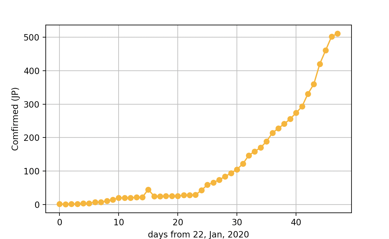
で?
横軸25-40程度は線形で伸びている様な気がするんだが、41-あたりからちょっと違う線に乗ったように見える。
これが傾きが大きくなった直線なのか、ロジスティックなのかはちょっとまだわかんない。
そもそも何故上がったのやら。
((こいつ「データをグラフにしてみた」以上の情報を含まないとか書いておきながらやっぱりデータ見て考えはじめましたよやっぱり好きなんすねぇ!))
来るかもしれないコメント
- 他の国のデータみたい → 11行目のJapanをUSとかMainland Chinaとかにして、どうぞ。
- グラフの見た目がダサいんだが? → 自分で奇麗にして、どうぞ。
- 横軸日時にして → 日本銀行券で3000円くらいくれればやります!