次回 https://qiita.com/Naoya_Study/items/851f4032fb6e2a5cd5ed
コロナウイルスの感染拡大に伴い、色々な組織が感染状況を可視化するかっこいいダッシュボードを公開しています。
例1 WHO Novel Coronavirus (COVID-19) Situation

例2 [厚生労働省 新型コロナウイルス感染症 国内事例] (https://mhlw-gis.maps.arcgis.com/apps/opsdashboard/index.html#/c2ac63d9dd05406dab7407b5053d108e)

例3 東洋経済ONLINE 新型コロナウイルス国内感染の状況

かっこいいですね!こんなのを自分で作れるようになりたいです。
最終目標は、Pythonのビジュアライズ特化型のデータフレームDashを利用して上記例のようなダッシュボードを作成することです。
今回は、その事前準備として可視化ライブラリPlotlyを利用して作図していきたいと思います。
コードぐちゃぐちゃなのは許してください。
1. 利用データ
日本国内の感染状データとして東洋経済オンラインが公開しているものを使用します。
https://github.com/kaz-ogiwara/covid19/
import requests
import io
import pandas as pd
import re
import numpy as np
import plotly.express as px
import plotly.graph_objects as go
from datetime import datetime as dt
url = 'https://raw.githubusercontent.com/kaz-ogiwara/covid19/master/data/individuals.csv'
res = requests.get(url).content
df = pd.read_csv(io.StringIO(res.decode('utf-8')), header=0, index_col=0)
データはこのような形式です。
| 新No. | 旧No. | 確定年 | 確定月 | 確定日 | 年代 | 性別 | 居住地1 | 居住地2 |
|---|---|---|---|---|---|---|---|---|
| 1 | 1 | 2020 | 1 | 15 | 30代 | 男 | 神奈川県 | |
| 2 | 2 | 2020 | 1 | 24 | 40代 | 男 | 中国(武漢市) | |
| 3 | 3 | 2020 | 1 | 25 | 30代 | 女 | 中国(武漢市) | |
| 4 | 4 | 2020 | 1 | 26 | 40代 | 男 | 中国(武漢市) | |
| 5 | 5 | 2020 | 1 | 28 | 40代 | 男 | 中国(武漢市) | |
| 6 | 6 | 2020 | 1 | 28 | 60代 | 男 | 奈良県 |
ご覧の通り、中国在住の方のデータも含まれていますが、今回は国内に限定するので除外します。
def Get_Df():

    url = 'https://raw.githubusercontent.com/kaz-ogiwara/covid19/master/data/individuals.csv'
    res = requests.get(url).content
    df = pd.read_csv(io.StringIO(res.decode('utf-8')), header=0, index_col=0)

    pattern = r'中国(...)'
    df['China'] = np.nan
    for i in range (1, len(df)+1):
        if re.match(pattern, df['居住地1'][i]):
            df['China'][i] = "T"
        else:
            df['China'][i] = "F"
    df = df[df["China"] != "T"].reset_index()

    return df
| Index. | 新No. | 旧No. | 確定年 | 確定月 | 確定日 | 年代 | 性別 | 居住地1 | 居住地2 | China |
|---|---|---|---|---|---|---|---|---|---|---|
| 0 | 1 | 1 | 2020 | 1 | 15 | 30代 | 男 | 神奈川県 | NaN | F |
| 1 | 6 | 6 | 2020 | 1 | 28 | 60代 | 男 | 奈良県 | NaN | F |
| 2 | 8 | 8 | 2020 | 1 | 29 | 40代 | 女 | 大阪府 | NaN | F |
| 3 | 9 | 10 | 2020 | 1 | 30 | 50代 | 男 | 三重県 | NaN | F |
| 4 | 11 | 12 | 2020 | 1 | 30 | 20代 | 女 | 京都府 | NaN | F |
2.都道府県ごとの累積感染者数(水平棒グラフ)
def Graph_Pref():

    df = Get_Df()
    df_count_by_place = df.groupby('居住地1').count().sort_values('China')
    fig = px.bar(
        df_count_by_place,
        x="China",
        y=df_count_by_place.index,
        # orientationをhorizonalにすることで横型の棒グラフになる
        orientation='h',
        width=800,
        height=1000,
        )
    fig.update_layout(
        title="感染が報告されている都道府県",
        xaxis_title="感染者数",
        yaxis_title="",
     # templateを指定するだけで勝手に黒を基調としたグラフになる
        template="plotly_dark",
        )
    fig.show()

Plotlyでは勝手にインタラクティブかつおしゃれな図を作ってくれます。
3.地図上に散布図を描く
続いて都道府県別の感染者数を日本地図上に散布図としてプロットしていきたいと思います。
そのために、まず各都道府県の県庁所在地の緯度経度情報を取得し、東洋経済オンライン様のcsvデータと結合します。
都道府県庁所在地 緯度経度データはみんなの知識 ちょっと便利帳様のものを使用しました。
緯度経度の必要なデータだけを抽出し、pandasのmergeを使用し結合します。
def Df_Merge():

    df = Get_Df()
    df_count_by_place = df.groupby('居住地1').count().sort_values('China')
    df_latlon = pd.read_excel("https://www.benricho.org/chimei/latlng_data.xls", header=4)
    df_latlon = df_latlon.drop(df_latlon.columns[[0,2,3,4,7]], axis=1).rename(columns={'Unnamed: 1': '居住地1'})
    df_latlon = df_latlon.head(47)
    df_merge = pd.merge(df_count_by_place, df_latlon, on='居住地1')
    return df_merge
| index | 居住地1 | 新No. | 旧No. | 確定年 | 確定月 | 確定日 | 年代 | 性別 | 居住地2 | China | 緯度 | 経度 |
|---|---|---|---|---|---|---|---|---|---|---|---|---|
| 0 | 岐阜県 | 1 | 1 | 1 | 1 | 1 | 1 | 1 | 0 | 1 | 35.39111 | 136.72222 |
| 1 | 愛媛県 | 1 | 1 | 1 | 1 | 1 | 1 | 1 | 0 | 1 | 33.84167 | 132.76611 |
| 2 | 広島県 | 1 | 1 | 1 | 1 | 1 | 1 | 1 | 0 | 1 | 34.39639 | 132.45944 |
| 3 | 佐賀県 | 1 | 1 | 1 | 1 | 1 | 1 | 1 | 0 | 1 | 33.24944 | 130.29889 |
| 4 | 秋田県 | 1 | 1 | 1 | 1 | 1 | 1 | 1 | 0 | 1 | 39.71861 | 140.10250 |
| 5 | 山口県 | 1 | 1 | 1 | 1 | 1 | 1 | 1 | 0 | 1 | 34.18583 | 131.47139 |
上記データフレームを使用して地図上にプロットしていきます。
def Graph_JapMap():
    df_merge = Df_Merge()
    df_merge['text'] = np.nan
    for i in range (len(df_merge)):
        df_merge['text'][i] = df_merge['居住地1'][i] + ' : ' + str(df_merge['China'][i]) + '人'

    fig = go.Figure(data=go.Scattergeo(
        lat = df_merge["緯度"],
        lon = df_merge["経度"],
        mode = 'markers',
        marker = dict(
                color = 'red',
                size = df_merge['China']/5+6,
                opacity = 0.8,
                reversescale = True,
                autocolorscale = False
                ),
        hovertext = df_merge['text'],
        hoverinfo="text",
    ))
    fig.update_layout(
        width=700,
        height=500,
        template="plotly_dark",
        title={
            'text': "感染者分布",
            'font':{
                'size':25
            },
            'y':0.9,
            'x':0.5,
            'xanchor': 'center',
            'yanchor': 'top'},
        margin = {
            'b':3,
            'l':3,
            'r':3,
            't':3
            },
        geo = dict(
            resolution = 50,
            landcolor = 'rgb(204, 204, 204)',
            coastlinewidth = 1,
            lataxis = dict(
                range = [28, 47],
            ),
            lonaxis = dict(
                range = [125, 150],
            ),
        )
    )
    fig.show()

これは画像ですがオンライン上行うとプロットにカーソルを合わせると具体的な感染者数が表示されクールです。ぜひ試してみてください。
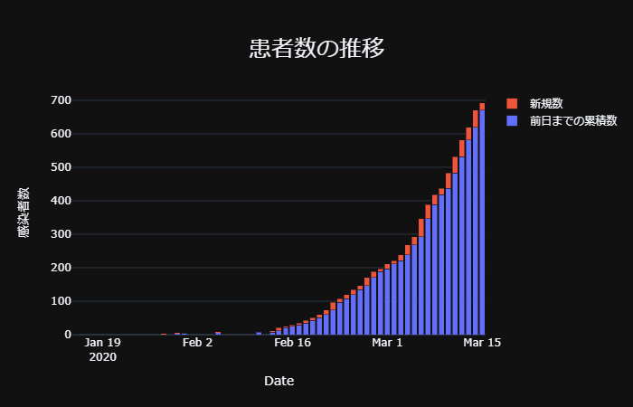
4.感染者数推移(積み上げ棒グラフ)
続いては感染者数推移の棒グラフです。
これまでと同様に初めにpandasでデータを変形します。
def Df_Count_by_Date():

    df = Get_Df()
    df['date'] = np.nan
    for i in range (len(df)):
        tstr = "2020-" + str(df['確定月'][i]) + "-" + str(df['確定日'][i])
        tdatetime = dt.strptime(tstr, '%Y-%m-%d')
        df['date'][i] = tdatetime

    df_count_by_date = df.groupby("date").count()

    df_count_by_date["total"] = np.nan
    df_count_by_date['gap'] = np.nan
    df_count_by_date["total"][0] = df_count_by_date["China"][0]
    df_count_by_date["gap"][0] = 0

    for i in range (1, len(df_count_by_date)):
        df_count_by_date["total"][i] = df_count_by_date['total'][i-1] + df_count_by_date['China'][i]
        df_count_by_date['gap'][i] = df_count_by_date['total'][i] - df_count_by_date['China'][i]
    df_count_by_date['total'] = df_count_by_date['total'].astype('int')
    df_count_by_date['gap'] = df_count_by_date['gap'].astype('int')

    return df_count_by_date
def Graph_total():

    df_count_by_date = Df_Count_by_Date()

    fig = go.Figure(data=[
        go.Bar(
            name='前日までの累積数',
            x=df_count_by_date.index,
            y=df_count_by_date['gap'],
            ),
        go.Bar(
            name='新規数',
            x=df_count_by_date.index,
            y=df_count_by_date['China']
            )
    ])
    # Change the bar mode
    fig.update_layout(
        barmode='stack',
        template="plotly_dark",
        title={
            'text': "患者数の推移",
            'font':{
                'size':25
                },
            'y':0.9,
            'x':0.5,
            'xanchor': 'center',
            'yanchor': 'top'
            },
        xaxis_title="Date",
        yaxis_title="感染者数",
        )
    fig.show()
5.世界地図にプロット
Plotlyのscattergeoでは国を3桁のISOコードで認識しているので、country codeをネット上から拝借し、pandasでマージします。
| INDEX | COUNTRY | Confirmed | Deaths | ISO CODES | code | size |
|---|---|---|---|---|---|---|
| 0 | China | 81049 | 3230 | CN / CHN | CHN | 82049.0 |
| 1 | Italy | 27980 | 2158 | IT / ITA | ITA | 28980.0 |
| 2 | Iran | 14991 | 853 | IR / IRN | IRN | 15991.0 |
| 3 | South Korea | 8236 | 75 | KR / KOR | KOR | 9236.0 |
| 4 | Spain | 7948 | 342 | ES / ESP | ESP | 8948.0 |
fig = px.scatter_geo(
        df_globe_merge,
        locations="code",
        color='Deaths',
        hover_name="COUNTRY",
        size="size",
        projection="natural earth"
        )
fig.update_layout(
        width=700,
        height=500,
        template="plotly_dark",
        title={
            'text': "感染者分布",
            'font':{
                'size':25
            },
            'y':0.9,
            'x':0.5,
            'xanchor': 'center',
            'yanchor': 'top'},
        geo = dict(
            resolution = 50,
            landcolor = 'rgb(204, 204, 204)',
            coastlinewidth = 1,
            ),
        margin = {
            'b':3,
            'l':3,
            'r':3,
            't':3
        })
fig.show()

塗りつぶし方式もできます。
fig = px.choropleth(
    df_globe_merge,
    locations="code",
    color='Confirmed',
    hover_name="COUNTRY",
    color_continuous_scale=px.colors.sequential.GnBu
    )
fig.update_layout(
        width=700,
        height=500,
        template="plotly_dark",
        title={
            'text': "感染者分布",
            'font':{
                'size':25
            },
            'y':0.9,
            'x':0.5,
            'xanchor': 'center',
            'yanchor': 'top'},
        geo = dict(
            resolution = 50,
            landcolor = 'rgb(204, 204, 204)',
            coastlinewidth = 0.1,
            ),
        margin = {
            'b':3,
            'l':3,
            'r':3,
            't':3
        }
    )
fig.show()

カラースケールは
color_continuous_scale=px.colors.sequential.GnBuのGnBUで変化します。
色一覧https://plot.ly/python/builtin-colorscales/
Dashのための書き換えを行っていたんですが、plotly.expressで可視化だと上手くいかなかったため、plotly.graph_objectを用いた作図も行いました。
fig = go.Figure(
    data=go.Choropleth(
        locations = df_globe_merge['code'],
        z = df_globe_merge['Confirmed'],
        text = df_globe_merge['COUNTRY'],
        colorscale = 'Plasma',
        marker_line_color='darkgray',
        marker_line_width=0.5,
        colorbar_title = '感染者数',
    )
)
fig.update_layout(
    template="plotly_dark",
    width=700,
    height=500,
    title={
        'text': "感染者分布",
        'font':{
             'size':25
            },
        'y':0.9,
        'x':0.5,
        'xanchor': 'center',
        'yanchor': 'top'},
    geo=dict(
        projection_type='equirectangular'
    )
)

fig.show()

カラースケールをGnBuからPlasmaに変えた以外見た目はほとんど同じですね。
データ変形、可視化準備が出来たら、これらをDashに反映させていきたいと思います(次回)