Material 3 Expressive の実装例の紹介シリーズです。
今回は新たに追加されたコンポーネントである Button group を紹介します。
(androidx.compose.material3:material3:1.4.0-alpha15 時点での内容になります。)
Button group とは
複数のボタンをグループ化し、ボタンの種類、幅、色を自由に組み合わせることで優先度であったり状態を視覚的に関連付けるコンポーネントです。
Standard と Connected の 2 パターンがあります。
また Expressive では Segmented button が Deprecated になり、置き換え先がこの Button group になっています。
実装
ButtonGroup
標準で ButtonGroup が用意されています。
コンテンツ部分には clickableItem、toggleableItem、customItem の関数が用意されています。
標準の ButtonGroup ではボタン押下時のインタラクションの適用であったり、画面に入りきらないとき省略する機能があります。
ButtonGroup(
    overflowIndicator = { menuState ->
        FilledIconButton(
            onClick = {
                if (menuState.isExpanded) {
                    menuState.dismiss()
                } else {
                    menuState.show()
                }
            }
        ) {
            Icon(
                painter = painterResource(R.drawable.ic_more),
                contentDescription = "More options"
            )
        }
    },
) {
    clickableItem(
        onClick = {},
        label = "Edit"
    )
    clickableItem(
        onClick = {},
        icon = {
            Icon(
                painter = painterResource(R.drawable.ic_edit),
                contentDescription = null
            )
        },
        label = "Edit"
    )
    toggleableItem(
        checked = isChecked,
        onCheckedChange = { isChecked = it },
        label = "Favorited"
    )
    customItem(
        buttonGroupContent = {
            val interactionSource = remember {  MutableInteractionSource() }
            OutlinedIconButton(
                onClick = {},
                interactionSource = interactionSource,
                modifier = Modifier.animateWidth(interactionSource),
            ) {
                Icon(painterResource(R.drawable.ic_add), contentDescription = "Add")
            }
        },
        menuContent = {
            DropdownMenuItem(
                text = {
                    Text("Add")
                },
                onClick = {},
                leadingIcon = {
                    Icon(painterResource(R.drawable.ic_add), contentDescription = null)
                }
            )
        }
    )
}
| 標準 | Overflow時 |
|---|---|
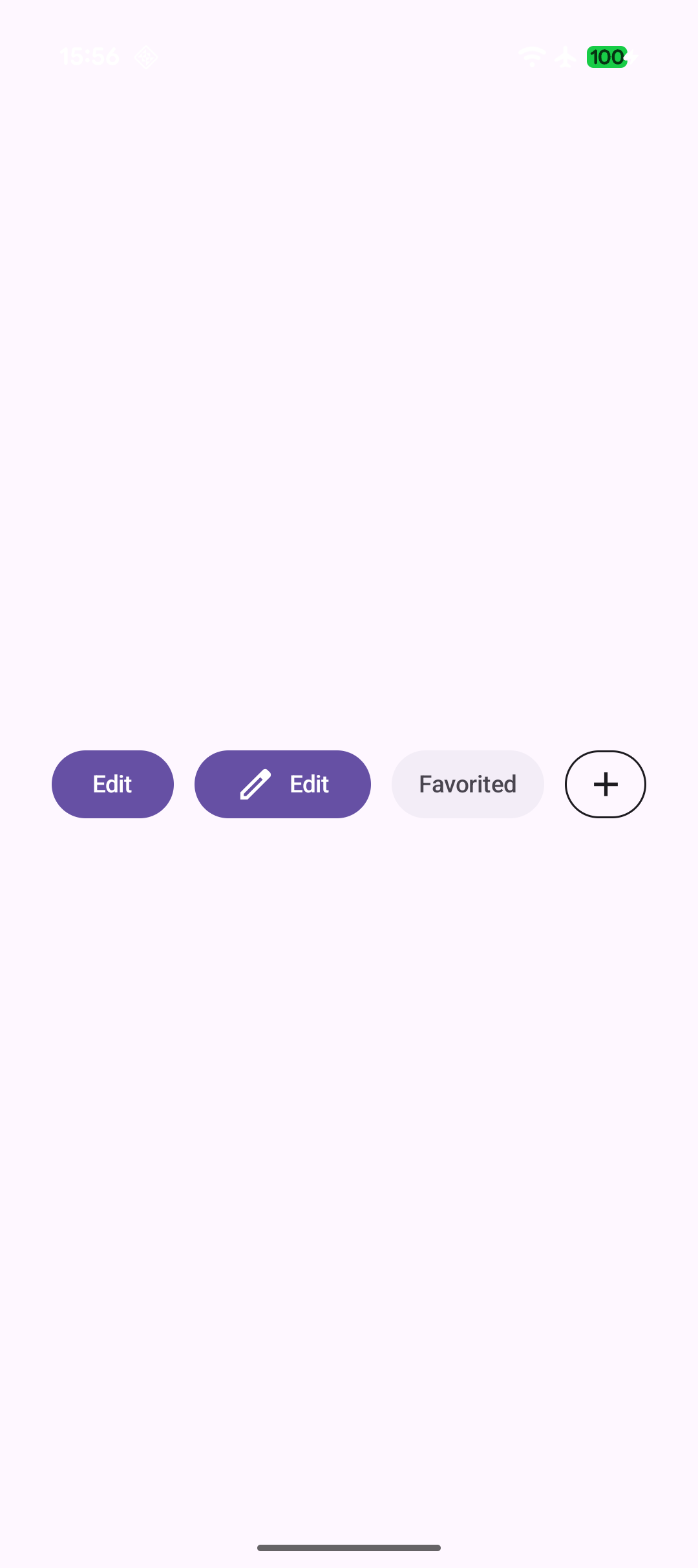 |
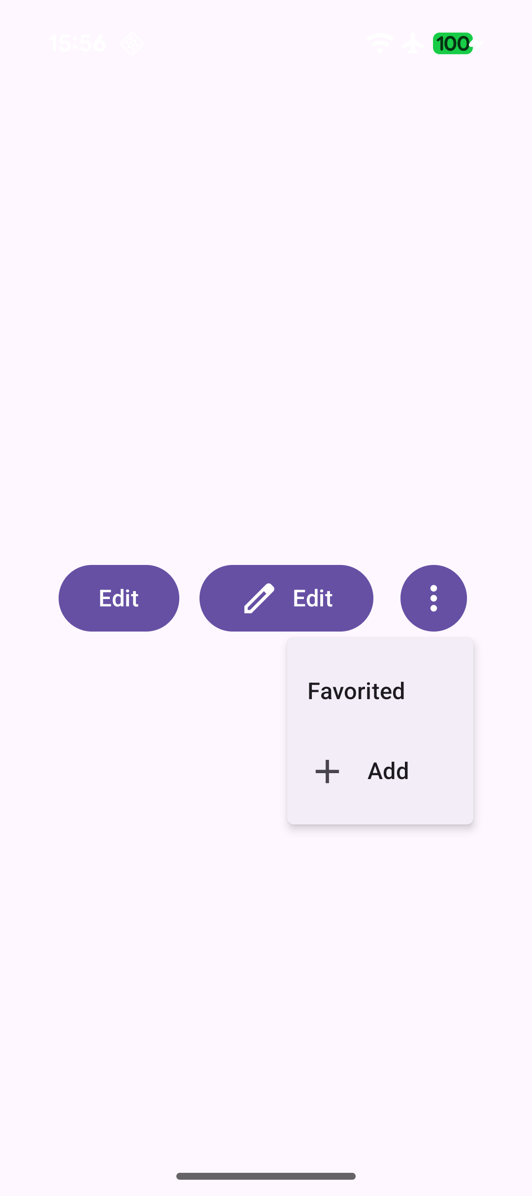 |
Connected button group
Connected button group は ButtonGroup のような標準の実装は現時点で用意されていないため実装する必要があります。
Connected button group の Shape のみ標準で用意されているのでそれを適用する形になります。
Row(
    horizontalArrangement = Arrangement.spacedBy(ButtonGroupDefaults.ConnectedSpaceBetween),
) {
    options.forEachIndexed { index, option ->
        ToggleButton(
            checked = selectedIndex == index,
            onCheckedChange = { selectedIndex = index },
            modifier = Modifier.semantics { role = Role.RadioButton },
            shapes =
                when (index) {
                    0 -> ButtonGroupDefaults.connectedLeadingButtonShapes()
                    options.lastIndex -> ButtonGroupDefaults.connectedTrailingButtonShapes()
                    else -> ButtonGroupDefaults.connectedMiddleButtonShapes()
                }
        ) {
            Icon(
                painter = painterResource(option.icon),
                contentDescription = null
            )
            Spacer(Modifier.size(ToggleButtonDefaults.IconSpacing))
            Text(option.label)
        }
    }
}
