2023/6/30 v0.31.4-beta までの変更内容を記事にも反映させました
2022/11/28 v0.27.1 までの変更内容を記事にも反映させました
2022/4/29 v0.23.1、0.24.7-alpha までの変更内容を記事にも反映させました
2021/8/5 v0.16.0 で追加されたライブラリを追加しました
Jetpack Compose を使うプロジェクトでは使うことになるであろう Accompanist とは何なのか、Accompanist は何ができるのかを書いていこうと思います。(v0.31.4-beta 時点)
Accompanist とは?
Accompanist は、Jetpack Compose で一部の API を使いやすくしたり、Android View にある機能を Compose でも使えるようにしたライブラリのグループです。
将来的には Jetpack の方でより良い形で実装された後に Accompanist からは非推奨になります。
Accompanist は複数あるライブラリのグループで、以下のライブラリがあります。
プロジェクトで使用している Jetpack Compose のバージョンで利用するライブラリのバージョンが異なるので確認しましょう。
https://google.github.io/accompanist/#compose-versions
| Library | package |
|---|---|
| System UI Controller | com.google.accompanist:accompanist-systemuicontroller:<version> |
| AppCompat Theme Adapter | com.google.accompanist:accompanist-appcompat-theme:<version> |
| Pager Indicator | com.google.accompanist:accompanist-pager-indicators:<version> |
| Permissions | com.google.accompanist:accompanist-permissions:<version> |
| Placeholder | com.google.accompanist:accompanist-placeholder:<version> com.google.accompanist:accompanist-placeholder-material:<version> |
| Flow Layouts(soon to be deprecated) | com.google.accompanist:accompanist-flowlayout:<version> |
| Navigation Animation(soon to be deprecated) | com.google.accompanist:accompanist-navigation-animation:<version> |
| Navigation Material | com.google.accompanist:accompanist-navigation-material:<version> |
| Drawable Painter | com.google.accompanist:accompanist-drawablepainter:<version> |
| WebView | com.google.accompanist:accompanist-webview:<version> |
| Adaptive | com.google.accompanist:accompanist-adaptive:<version> |
| Pager(deprecated) | com.google.accompanist:accompanist-pager:<version> |
| Inset(deprecated) | com.google.accompanist:accompanist-insets:<version> com.google.accompanist:accompanist-insets-ui:<version> |
| Swipe to Refresh(deprecated) | com.google.accompanist:accompanist-swiperefresh:<version> |
これらの中から必要なライブラリだけ選択してプロジェクトで使用することができます。
Accompanist のライブラリのユースケース
System UI Controller
- StatusBar や NavigationBar を制御しやすくしたライブラリ
- StatusBar や NavigationBar の色や表示・非表示を変更できる
- Android 8.1 を境目に StatusBar の色が自動で適用される

val systemUiController = rememberSystemUiController()
val useDarkIcons = MaterialTheme.colors.isLight

SideEffect {
    // Update all of the system bar colors to be transparent, and use
    // dark icons if we're in light theme
    systemUiController.setSystemBarsColor(
        color = Color.Transparent,
        darkIcons = useDarkIcons
    )

    // setStatusBarsColor() and setNavigationBarsColor() also exist
}
AppCompat Theme Adapter
- AppCompat の XML Theme を Jetpack Compose の Theme に変換するライブラリ
- Material Component の XML Theme を変換するライブラリは MDC-Android Compose Theme Adapter が提供されている
- AppCompat の Theme に定義されている色が以下のように MaterialTheme color に割り当てられる
| MaterialTheme color | AppCompat attribute |
|---|---|
| primary | colorPrimary |
| primaryVariant | colorPrimaryDark |
| onPrimary | Calculated black/white |
| secondary | colorAccent |
| secondaryVariant | colorAccent |
| onSecondary | Calculated black/white |
| surface | Default |
| onSurface | android:textColorPrimary, else calculated black/white |
| background | android:colorBackground |
| onBackground | android:textColorPrimary, else calculated black/white |
| error | colorError |
| onError | Calculated black/white |
Permissions
- Permission を Jetpack Compose で扱いやすくしたライブラリ
@Composable
fun FeatureThatRequiresCameraPermission(
    navigateToSettingsScreen: () -> Unit
) {
    // Track if the user doesn't want to see the rationale any more.
    var doNotShowRationale by rememberSaveable { mutableStateOf(false) }

    val cameraPermissionState = rememberPermissionState(android.Manifest.permission.CAMERA)
    PermissionRequired(
        permissionState = cameraPermissionState,
        permissionNotGrantedContent = {
            if (doNotShowRationale) {
                Text("Feature not available")
            } else {
                Column {
                    Text("The camera is important for this app. Please grant the permission.")
                    Spacer(modifier = Modifier.height(8.dp))
                    Row {
                        Button(onClick = { cameraPermissionState.launchPermissionRequest() }) {
                            Text("Ok!")
                        }
                        Spacer(Modifier.width(8.dp))
                        Button(onClick = { doNotShowRationale = true }) {
                            Text("Nope")
                        }
                    }
                }
            }
        },
        permissionNotAvailableContent = {
            PermissionDenied(navigateToSettingsScreen)
        }
    ) {
        Text("Camera permission Granted")
    }
}
Placeholder
- コンテンツが読み込み中の Placeholder を表示できるライブラリ

Text(
    text = "Content to display after content has loaded",
    modifier = Modifier
        .padding(16.dp)
        .placeholder(visible = true)
)
Flow Layouts
- Jetpack Compose 1.4.0 から Flow Layouts の機能が foundation のライブラリに含まれるようになったが、1.4.0 時点では foundation の方で機能が足りない部分があるために移行できない可能性がある。
- 1.5.0 では置き換え可能な状態になるので、そのタイミングで Deprecated になる予定。
- Jetpack Compose で Flexbox のようなレイアウトができるライブラリ

FlowRow {
    // row contents
}

FlowColumn {
    // column contents
}
Navigation Animation
- Jetpack Compose 1.5.0 + androidx.navigation.compose 2.7.0-alpha01 から Navigation Animation の機能が公式にサポートされるので、Deprecated になる予定。
- Navigation Compose での遷移アニメーションを実装しやすくしたライブラリ
val navController = rememberAnimatedNavController()
AnimatedNavHost(navController, startDestination = "Blue") {
    composable(
        "Blue",
        enterTransition = { initial, _ ->
            when (initial.destination.route) {
                "Red" ->
                    slideInHorizontally(initialOffsetX = { 1000 }, animationSpec = tween(700))
                else -> null
            }
        },
        exitTransition = { _, target ->
            when (target.destination.route) {
                "Red" ->
                    slideOutHorizontally(targetOffsetX = { -1000 }, animationSpec = tween(700))
                else -> null
            }
        },
        popEnterTransition = { initial, _ ->
            when (initial.destination.route) {
                "Red" ->
                    slideInHorizontally(initialOffsetX = { -1000 }, animationSpec = tween(700))
                else -> null
            }
        },
        popExitTransition = { _, target ->
            when (target.destination.route) {
                "Red" ->
                    slideOutHorizontally(targetOffsetX = { 1000 }, animationSpec = tween(700))
                else -> null
            }
        }
    ) { BlueScreen(navController) }
    composable(
        "Red",
        ...
    )
}
Navigation Material
- Navigation Compose で BottomSheet への遷移を実装できるライブラリ
val navController = rememberNavController()
val bottomSheetNavigator = rememberBottomSheetNavigator()
navController.navigatorProvider += bottomSheetNavigator
ModalBottomSheetLayout(bottomSheetNavigator) {
    NavHost(navController, Destinations.Home) {
       composable(route = "home") {
           ...
       }
       bottomSheet(route = "sheet") {
           Text("This is a cool bottom sheet!")
       }
    }
}
Drawable Painter
- Android の Drawable リソースを Painter として利用できるライブラリ
val drawable = AppCompatResources.getDrawable(LocalContext.current, R.drawable.rectangle)

Image(
    painter = rememberDrawablePainter(drawable = drawable),
    contentDescription = "content description",
)
WebView
-
WebViewを Jetpack Compose でも使えるようにしたラッパーライブラリ
val state = rememberWebViewState("https://example.com")

WebView(
    state,
    onCreated = { it.settings.javaScriptEnabled = true },
)
Adaptive
- Foldable や大きい画面対応のユーティリティ系の実装を提供するライブラリ
val displayFeatures = calculateDisplayFeatures(this)

TwoPane(
    first = {
        Card {
            Box(
                contentAlignment = Alignment.Center,
                modifier = Modifier.fillMaxSize()
            ) {
                Text("First")
            }
        }
    },
    second = {
        Card {
            Box(
                contentAlignment = Alignment.Center,
                modifier = Modifier.fillMaxSize()
            ) {
                Text("Second")
            }
        }
    },
    strategy = TwoPaneStrategy { density, layoutDirection, layoutCoordinates ->
        if (layoutCoordinates.size.height >= layoutCoordinates.size.width) {
            VerticalTwoPaneStrategy(splitFraction = 0.75f)
        } else {
            HorizontalTwoPaneStrategy(splitFraction = 0.75f)
        }.calculateSplitResult(density, layoutDirection, layoutCoordinates)
    },
    displayFeatures = displayFeatures,
)
| Phone | Foldable |
|---|---|
 |
 |
Deprecated になったライブラリ
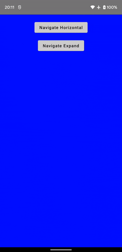
Pager
- ⚠️ Jetpack Compose 1.4.0 から Pager の機能が foundation のライブラリに含まれるようになったので、こちらのライブラリは Deprecated になった
- Deprecated に合わせてマイグレーションガイドも用意されている
- ただし、Pager Indicator は Deprecated にはなっていない
- Android View の
ViewPagerのようなレイアウトができるライブラリ - 横向きだけでなく縦向きの表示や無限にスワイプもできる
- Tab 連携やインジケータのサポートまでされている
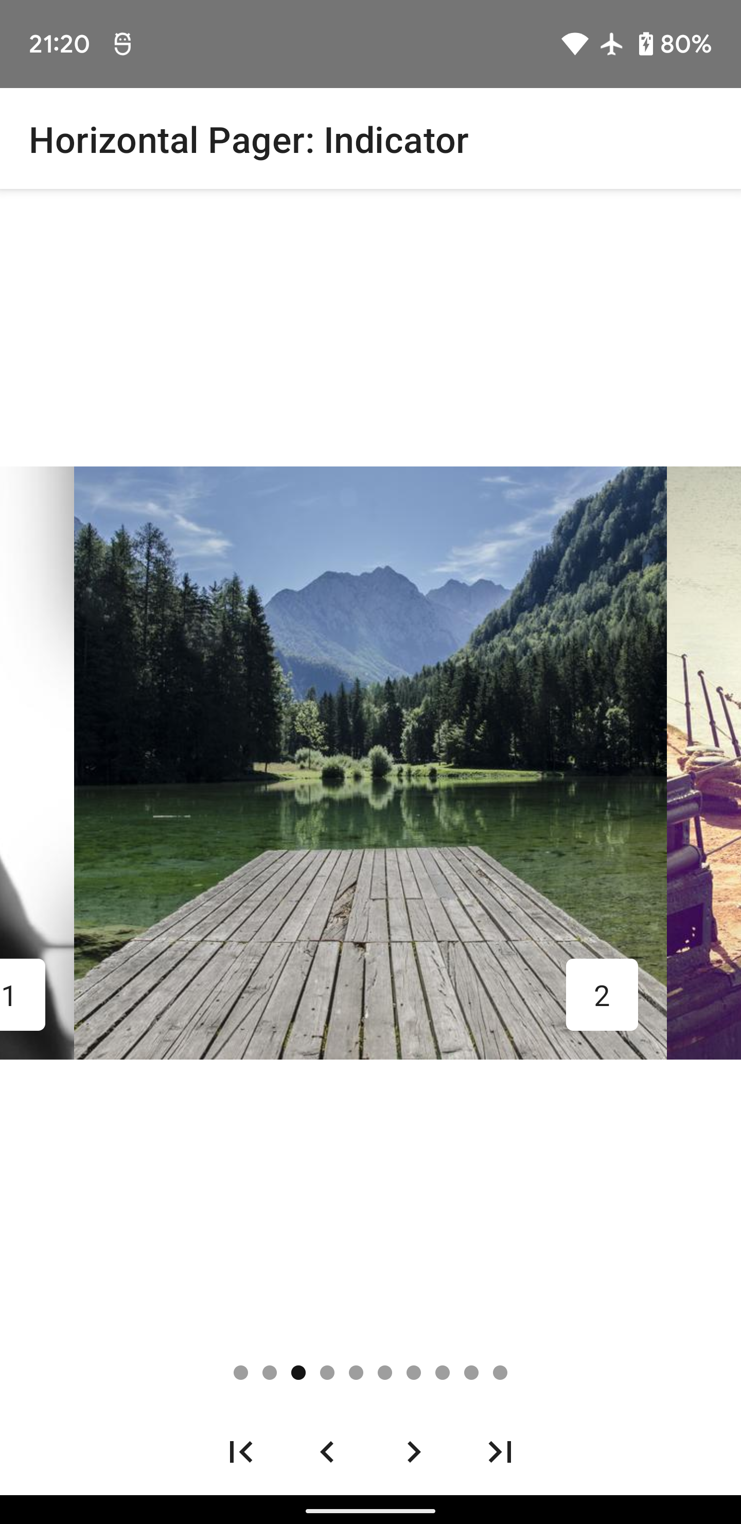
val pagerState = rememberPagerState(pageCount = 10)

HorizontalPager(state = pagerState) { page ->
    // Our page content
    Text(
        text = "Page: $page",
        modifier = Modifier.fillMaxWidth()
    )
}
Inset
- ⚠️ Jetpack Compose 1.2.0 から Inset の機能が foundation のライブラリに含まれるようになったので、こちらのライブラリは Deprecated になった
- Deprecated に合わせてマイグレーションガイドも用意されている
- WindowInsets を Jetpack Compose で扱いやすくしたライブラリで Edge to Edge 対応で使用することになる
- また、Experimental ではあるものの IME Animation も対応できる
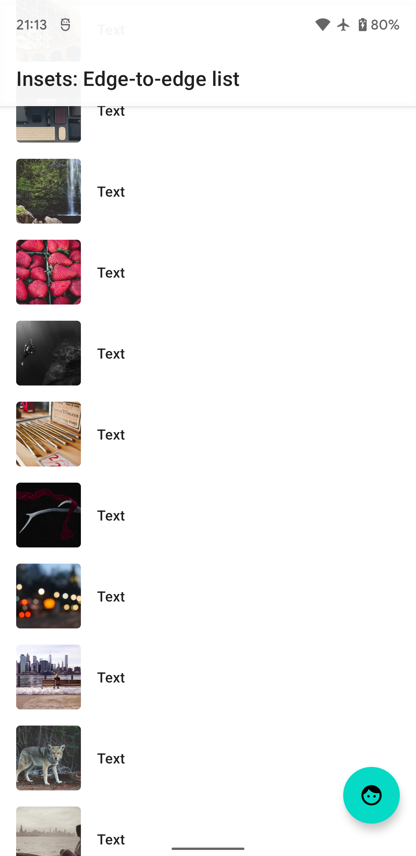
Scaffold(
    topBar = {
        // We use TopAppBar from accompanist-insets-ui which allows us to provide
        // content padding matching the system bars insets.
        TopAppBar(
            title = { Text(stringResource(R.string.insets_title_list)) },
            backgroundColor = MaterialTheme.colors.surface.copy(alpha = 0.9f),
            contentPadding = rememberInsetsPaddingValues(
                LocalWindowInsets.current.statusBars,
                applyBottom = false,
            ),
        )
    },
    bottomBar = {
        // We add a spacer as a bottom bar, which is the same height as
        // the navigation bar
        Spacer(Modifier.navigationBarsHeight().fillMaxWidth())
    },
) { contentPadding ->
    // We apply the contentPadding passed to us from the Scaffold
    Box(Modifier.padding(contentPadding)) {
        // content
    }
}
Swipe to Refresh
- ⚠️ Jetpack Compose 1.3.0 から Swipe to Refresh の機能が material のライブラリに含まれるようになったので、こちらのライブラリは Deprecated になった
- Deprecated に合わせてマイグレーションガイドも用意されていたり、移行の記事を別途書いています
- Android View の
SwipeRefreshLayoutのような Pull to Refresh ができるライブラリ
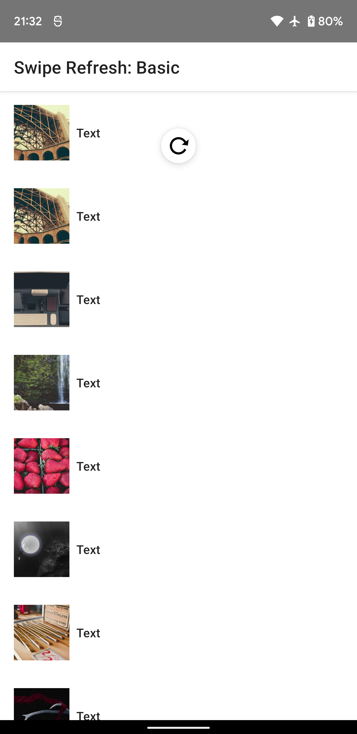
val viewModel: MyViewModel = viewModel()
val isRefreshing by viewModel.isRefreshing.collectAsState()

SwipeRefresh(
    state = rememberSwipeRefreshState(isRefreshing),
    onRefresh = { viewModel.refresh() },
) {
    LazyColumn {
        items(30) { index ->
            // TODO: list items
        }
    }
}
ImageLoader
- coil を使用した画像読み込みも元々は Accompanist にあったが
coil のライブラリで提供されるようになった
Image(
    painter = rememberImagePainter("https://www.example.com/image.jpg"),
    contentDescription = null,
    modifier = Modifier.size(128.dp)
)