Jetpack Compose の Material 3 のライブラリ 1.4.0 に追加されそうなコンポーネントのメモです。
これを書いている時点 (2024/9/7) では 1.4.0 は Snapshot でのみ使用可能で、実際に Stable のタイミングでは変更されている可能性があるので、使用前には公式のドキュメントを参照してください。(気が向いたら更新しておきますが)
Button Group
Segmented Button に近しい、ボタンをグループ化するコンポーネントです。
Segmented Button との使い分けは不明ですが、Segmented Button と同様に Single select or Multi select の実装が可能です。

ButtonGroup {
    val options = listOf("A", "B", "C", "D")
    val checked = remember { mutableStateListOf(false, false, false, false) }
    val modifiers =
        listOf(
            Modifier.weight(1.5f),
            Modifier.weight(1f),
            Modifier.width(90.dp),
            Modifier.weight(1f)
        )
    options.fastForEachIndexed { index, label ->
        ToggleButton(
            checked = checked[index],
            onCheckedChange = { checked[index] = it },
            modifier = modifiers[index]
        ) {
            Text(label)
        }
    }
}
Floating Action Button Menu
Floating Action Button から複数のアクションを展開するボタンです。

val items = listOf(
    Icons.AutoMirrored.Filled.Message to "Reply",
    Icons.Filled.People to "Reply all",
    Icons.Filled.Contacts to "Forward",
    Icons.Filled.Snooze to "Snooze",
    Icons.Filled.Archive to "Archive",
    Icons.AutoMirrored.Filled.Label to "Label",
)

var fabMenuExpanded by rememberSaveable { mutableStateOf(false) }

BackHandler(fabMenuExpanded) { fabMenuExpanded = false }

FloatingActionButtonMenu(
    expanded = fabMenuExpanded,
    button = {
        ToggleFloatingActionButton(
            modifier =
                Modifier.animateFloatingActionButton(
                    visible = fabVisible || fabMenuExpanded,
                    alignment = Alignment.BottomEnd
                ),
            checked = fabMenuExpanded,
            onCheckedChange = { fabMenuExpanded = !fabMenuExpanded }
        ) {
            val imageVector by remember {
                derivedStateOf {
                    if (checkedProgress > 0.5f) Icons.Filled.Close else Icons.Filled.Add
                }
            }
            Icon(
                painter = rememberVectorPainter(imageVector),
                contentDescription = null,
                modifier = Modifier.animateIcon({ checkedProgress })
            )
        }
    }
) {
    items.forEachIndexed { i, item ->
        FloatingActionButtonMenuItem(
            onClick = { fabMenuExpanded = false },
            icon = { Icon(item.first, contentDescription = null) },
            text = { Text(text = item.second) },
        )
    }
}
Floating App Bar
Bottom App Bar の Floating バージョンです。(not Navigation Bar,| Navigation Rail)

おそらく大画面用?の縦バージョンもあります。

また、表示・非表示のアニメーションも折りたたむパターンと非表示にするパターンがあります。
| Expandable | Scrollable |
|---|---|
 |
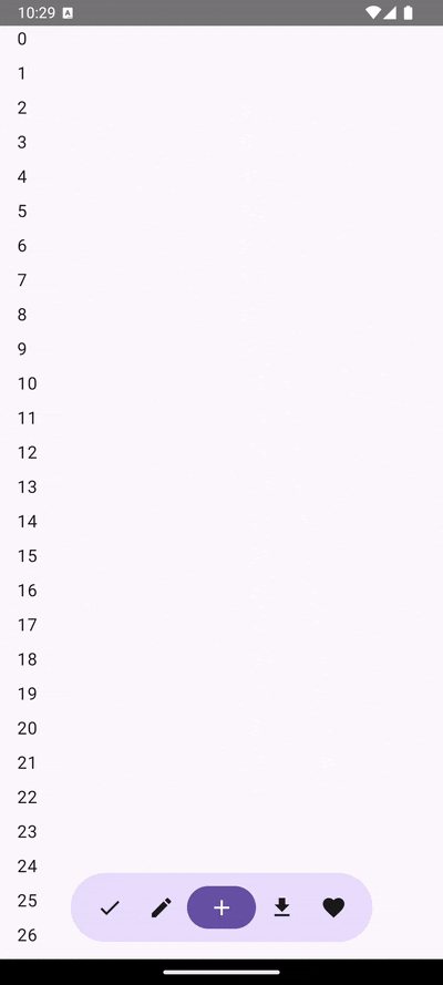 |
HorizontalFloatingAppBar(
    expanded = expanded || isTouchExplorationEnabled,
    leadingContent = {
        IconButton(onClick = { /* doSomething() */ }) {
            Icon(Icons.Filled.Check, contentDescription = "Localized description")
        }
        IconButton(onClick = { /* doSomething() */ }) {
            Icon(Icons.Filled.Edit, contentDescription = "Localized description")
        }
    },
    trailingContent = {
        IconButton(onClick = { /* doSomething() */ }) {
            Icon(Icons.Filled.Download, contentDescription = "Localized description")
        }
        IconButton(onClick = { /* doSomething() */ }) {
            Icon(Icons.Filled.Favorite, contentDescription = "Localized description")
        }
    },
    content = {
        FilledIconButton(
            modifier = Modifier.width(64.dp),
            onClick = { /* doSomething() */ }
        ) {
            Icon(Icons.Filled.Add, contentDescription = "Localized description")
        }
    },
)
ContainedLoadingIndicator
MaterialShapes をアニメーションさせる Loading Indicator です。
デフォルトでは以下の Shapes がループするようになっています。
- MaterialShapes.SoftBurst
- MaterialShapes.Cookie9Sided
- MaterialShapes.Pentagon
- MaterialShapes.Pill
- MaterialShapes.Sunny
- MaterialShapes.Cookie4Sided
- MaterialShapes.Oval

ContainedLoadingIndicator()
WavyProgressIndicator
波のようなエフェクトのインジケータです。

CircularWavyProgressIndicator()
LinearWavyProgressIndicator()
WideNavigationRail
NavigationRail を拡張したバージョンです。
タブレットやデスクトップのような大画面で使用します。

WideNavigationRail にはレスポンシブに拡張/折りたたむパターンと、Modal で表示するパターンが存在します。
| Responsive | Modal |
|---|---|
 |
 |
var selectedItem by remember { mutableIntStateOf(0) }
val items = listOf("Home", "Search", "Settings")
val selectedIcons = listOf(Icons.Filled.Home, Icons.Filled.Favorite, Icons.Filled.Star)
val unselectedIcons =
    listOf(Icons.Outlined.Home, Icons.Outlined.FavoriteBorder, Icons.Outlined.StarBorder)
WideNavigationRail(expanded = true) {
    items.forEachIndexed { index, item ->
        WideNavigationRailItem(
            railExpanded = true,
            icon = {
                Icon(
                    if (selectedItem == index) selectedIcons[index] else unselectedIcons[index],
                    contentDescription = null
                )
            },
            label = { Text(item) },
            selected = selectedItem == index,
            onClick = { selectedItem = index }
        )
    }
}
Split Button
先頭にメインのアクション、末尾にメインのアクションに関連する別のアクションを配置できるボタンです。

var checked by remember { mutableStateOf(false) }
SplitButton(
    leadingButton = {
        SplitButtonDefaults.LeadingButton(
            onClick = { /* Do Nothing */ },
        ) {
            Icon(
                Icons.Filled.Edit,
                modifier = Modifier.size(SplitButtonDefaults.LeadingIconSize),
                contentDescription = "Localized description",
            )
            Spacer(Modifier.size(ButtonDefaults.IconSpacing))
            Text("My Button")
        }
    },
    trailingButton = {
        SplitButtonDefaults.TrailingButton(
            onClick = { checked = !checked },
            checked = checked,
            modifier = Modifier.semantics {
                stateDescription = if (checked) "Checked" else "Unchecked"
                contentDescription = "Toggle Button"
            },
        ) {
            Icon(
                Icons.Filled.KeyboardArrowDown,
                modifier = Modifier.size(SplitButtonDefaults.TrailingIconSize),
                contentDescription = "Localized description"
            )
        }
    }
)
多くのコンポーネントが追加されてきており、近々 Material Design 3 のガイドラインの方にも大きなアップデートがありそうですね。