簡単に以下のコードでpandasのヒストグラムが描けることは知っていた、
df.hist(bins=100) で、plt.show()とすれば、100個の区間に分けて頻度分布を描画する
または、df.hist(bins=100).plot()で、plt.show()で描画できる。
しかし、もう少しいろいろ追加しようとして、調べたが適切な記事が無いのでまとめておく。
まず、numpyでの正規分布の生成
numpy.random.normal
そして、ほぼ完成形は以下のとおり
まず、使うlibは以下のとおり、
また、dataとして、numpyで正規分布を生成。
pandasのSeriesとして、pandasデータを作成する。
import numpy as np
import pandas as pd
import matplotlib.pyplot as plt

data = np.random.normal(loc=15.0, scale=20.0, size=1000) #loc = 中心 scale = 標準偏差 size = deta数

df = pd.Series(data)
このとき、pandasのヒストグラムは以下のように描ける。
一応、pandasでの解説が以下にあるが、軸labelや描画範囲の指定の仕方は理解できなかった。
※dataの引数での指定はできるが、以下のセンスでは出来ないようだ
【参考】
pandas.DataFrame.hist
ということで、コードは以下の通りで、欲しいグラフが描けた。
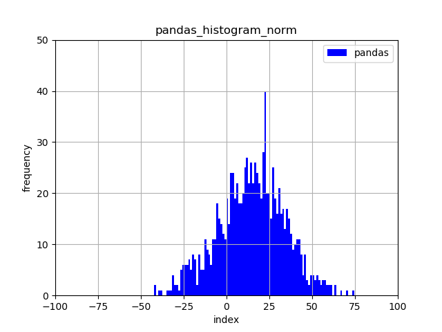
df.hist(bins=100, color = "blue", grid =True, label = 'pandas')
plt.ylim(0,50)
plt.ylabel('frequency')
plt.xlim(-100, 100)
plt.xlabel('index')
plt.legend()
plt.title('pandas_histgram_norm')
plt.savefig("pandas_hist.png")
plt.show()
plt.close()
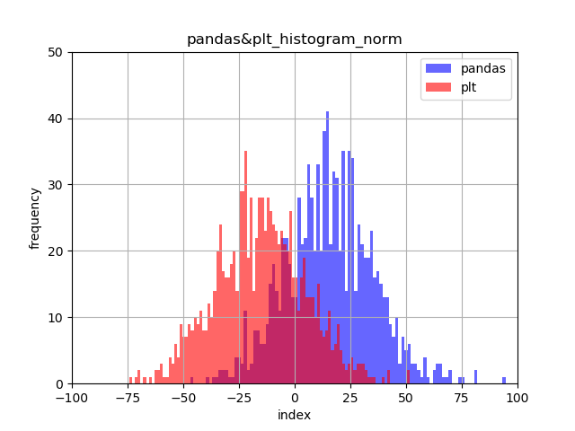
一方、同じようにpandasデータを渡してやれば、matplotlibでも以下のように同じ絵が描画できる。

plt.xlim(-100, 100)
plt.ylim(0,50)
plt.ylabel('frequency')
plt.xlabel('index')
plt.grid()
plt.title('plt_histgram_norm')
plt.hist(df,bins = 100, color = "red", label='plt')
plt.legend()
plt.savefig("plt_hist.png")
plt.show()
そして、以下のように二種類のグラフを重ねて描画できる。
【参考】
matplotlib / seaborn を利用してヒストグラムを描く方法
data = np.random.normal(loc=15.0, scale=20.0, size=1000) #loc = 中心 scale = 標準偏差 size = deta数
df = pd.Series(data)

df.hist(bins=100, color = "blue", grid =True, label = 'pandas', alpha=0.6)
plt.ylim(0,50)
plt.ylabel('frequency')
plt.xlim(-100, 100)
plt.xlabel('index')
plt.title('pandas&plt_histgram_norm')

data2 = np.random.normal(loc=-15.0, scale=20.0, size=1000)
df2 = pd.Series(data2)

plt.hist(df2,bins = 100, color = "red", label='plt', alpha=0.6)
plt.legend()
plt.savefig("pandas&plt_hist.png")
plt.show()
最後に上記参考のデータを重畳する例をseabornでなく、描画する。
※もちろん、同じように描画することもできる
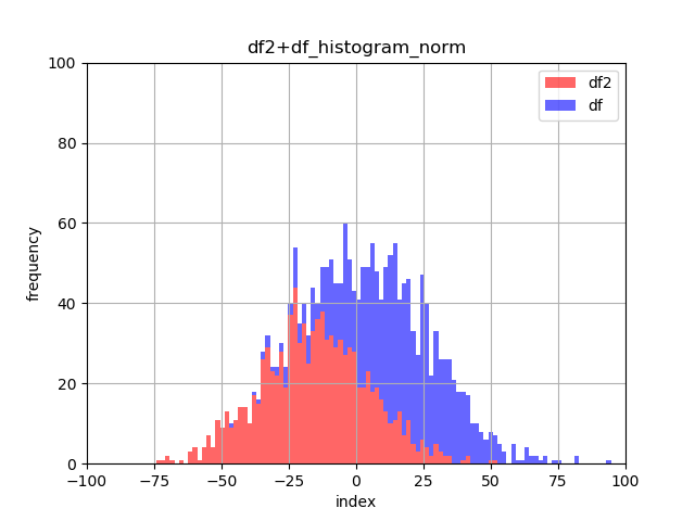
plt.title('df2+df_histgram_norm')
plt.ylim(0,100)
plt.ylabel('frequency')
plt.xlim(-100, 100)
plt.xlabel('index')
plt.grid()
plt.hist([df2, df], bins=100, stacked=True,color = ["red","blue"], label = ['df2','df'], alpha=0.6)
plt.legend()
plt.savefig("pandas+plt_hist.png")
plt.show()
まとめ
・pandasとmatplotlibでそれぞれヒストグラムが描けた
・透過率を導入すると、2種類の分布を同時描画出来た
・2種類の分布の合成分布を描画出来た