音声アプリを作ろうとすると、グラフを動的に書きたくなった。そして、配置も工夫したいということでmatplotlibの使い方の基本を押さえることとした。
qiitaにも参考のような記事があり、ほぼまんまですが、動的というところが少し新しいかもです。
【参考】
①matplotlibでのプロットの基本
②matplotlib基礎 | figureやaxesでのグラフのレイアウト
やったこと
・グラフを書く
・動的グラフを書く
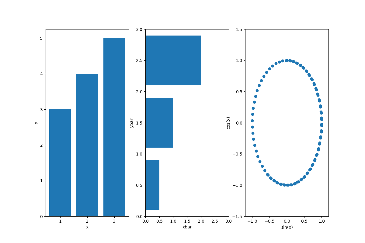
・グラフを書く
import matplotlib.pyplot as plt
import numpy as np

# データ生成
x = np.linspace(0, 10, 100)
y1 = np.sin(x)
y2 = np.cos(x)

# プロット領域(Figure, Axes)の初期化
plt.figure(figsize=(12, 8))
fig1=plt.subplot(131) #配置は参考②のとおり
fig2=plt.subplot(132)
fig3=plt.subplot(133)

# 棒グラフの作成
fig1.bar([1,2,3],[3,4,5])
fig1.set_xlabel("x")
fig1.set_ylabel("y")
fig2.barh([0.5,1.5,2.5],[0.5,1,2])
fig2.set_xlabel("xbar")
fig2.set_ylabel("ybar")
fig2.set_xlim(0,3)
fig2.set_ylim(0,3)
fig3.scatter(y1, y2)
plt.xlabel("sin(x)") #pltのときはset_無しでplt.xlabelと記載
plt.ylabel("cos(x)")
plt.xlim(-1.2,1.2)  #pltのときはset無しでplt.xlimと記載
plt.ylim(-1.5,1.5)
# fig3.set_xlabel("sin(x)") #もちろんこっちが正解だけど、上のようにも書ける
# fig3.set_ylabel("cos(x)")
plt.show()
・動的グラフを書く
import matplotlib.pyplot as plt
import numpy as np

# プロット領域(Figure, Axes)の初期化
fig = plt.figure()
ax1 = fig.add_subplot(221)
ax2 = fig.add_subplot(222)
ax3 = fig.add_subplot(224)
ax1.axis([-1.2, 1.2, -1.2, 1.2])

# 棒グラフの作成
s = 1
while True:
    # ax1-3を削除する.ただし、ax1を残すと軌跡が見える
    #fig.delaxes(ax1)
    fig.delaxes(ax2)
    fig.delaxes(ax3)
    #plt.pause(0.01) #これ入れるとちかちかする
    #ax1 = fig.add_subplot(221)
    ax2 = fig.add_subplot(222)
    ax3 = fig.add_subplot(224)
    #ax1.axis([-1.2, 1.2, -1.2, 1.2])
    ax2.axis([-2.2, 2.2, -2.2, 2.2])
    ax3.axis([-1.2, 1.2, -1.2, 1.2])
    y1 = np.sin(s/10)*np.exp(-s/1000) #減衰振動にしてみる
    y2 = np.cos(s/10)*np.exp(-s/1000)
    y3 = np.sin(s/10)  #ゆっくりスムーズに動かしたいときは100とかで割る
    y4 = np.cos(s/10)
    ax1.scatter(y1, y2)
    ax2.scatter(y1+y4, y2+y3) #リサじゅーっぽいアプリにした
    ax3.scatter(y4, y3)
    plt.pause(0.001) #表示時間は短くすると動きは速い
    s += 1
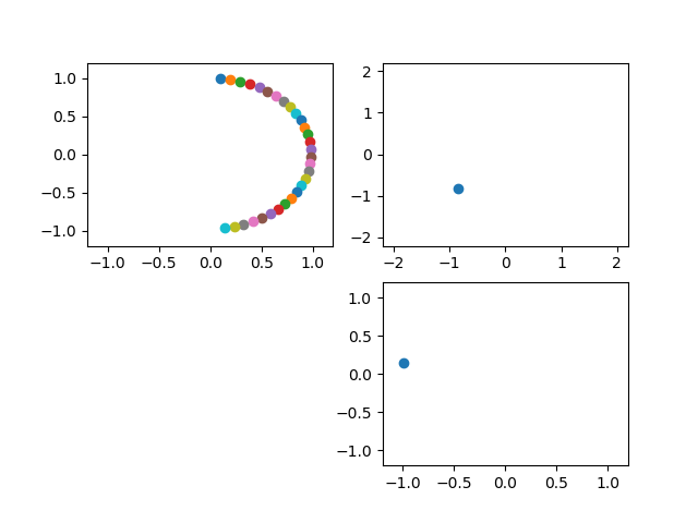
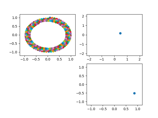
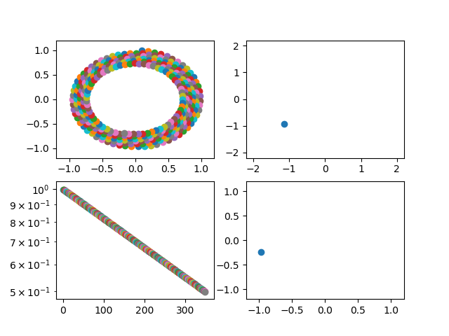
上記は動いている途中のシーンを保存しています。
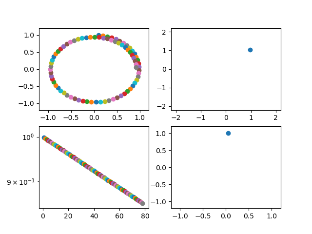
import matplotlib.pyplot as plt
import numpy as np

# プロット領域(Figure, Axes)の初期化
fig = plt.figure()
ax1 = fig.add_subplot(221)
ax2 = fig.add_subplot(222)
ax3 = fig.add_subplot(224)
ax4 = fig.add_subplot(223) #追記
ax1.axis([-1.2, 1.2, -1.2, 1.2])

# 棒グラフの作成
s = 1
while True:
    # ax1-3を削除する
    #fig.delaxes(ax1)
    fig.delaxes(ax2)
    fig.delaxes(ax3)
    #plt.pause(0.01) #これ入れるとちかちかする
    #ax1 = fig.add_subplot(221)
    ax2 = fig.add_subplot(222)
    ax3 = fig.add_subplot(224)
    #ax1.axis([-1.2, 1.2, -1.2, 1.2])
    ax2.axis([-2.2, 2.2, -2.2, 2.2])
    ax3.axis([-1.2, 1.2, -1.2, 1.2])
    y1 = np.sin(s/10)*np.exp(-s/1000)
    y2 = np.cos(s/10)*np.exp(-s/1000)
    y3 = np.sin(s/10)
    y4 = np.cos(s/10)
    ax1.scatter(y1, y2)
    ax2.scatter(y1+y4, y2+y3)
    ax3.scatter(y4, y3)
    ax4.scatter(s,y1*y1+y2*y2) #追記
    ax4.set_yscale("log")#y軸のscale追記
    plt.pause(0.001)
    s += 1
x-軸もy-軸も、動的に変化していく。
まとめ
・matplotlibの表記方法がゆらぎがあって迷うので、まとめておいた
・動的なグラフを作成してみた
・ああ、すっきりした