この記事では Part1 と Part2 で作成した地図を一枚にまとめたものを作成します。
foliumというというPythonライブラリを使い、新型コロナウイルスのデータをビジュアライゼーションします。
folium は JavaScript の leaflet.js という地図ライブラリを Pythonライブラリにしたもので、データを地図上に可視化することができます。
前提環境
- Ubuntu
- Jupyter Notebook
- Python3
folium導入
Python3
pip install folium
Anaconda Prompt
conda install -c conda-forge folium
# Anacondaを利用したインストール方法
ライブラリインポート
一括でインポートさせていただきます。
Python3
import geopandas as gpd
from shapely.geometry import Point
import pyproj
import pandas as pd
import numpy as np
import re
import matplotlib.pyplot as plt
import folium
from folium.plugins import MiniMap
データ準備
新規陽性者数の推移(日別)
以下のリンクから CSV をダウンロードすることができます。
出典:厚生労働省オープンデータ
人口10万人当たり新規陽性者数
以下のリンクから CSV をダウンロードすることができます。
出典:厚生労働省オープンデータ
都道府県のポリゴンデータ
出典:地図蔵 様
データの読み込み
新規陽性者数の推移(日別)
Python3
covid19 = "https://covid19.mhlw.go.jp/public/opendata/newly_confirmed_cases_daily.csv"
df_newly = pd.read_csv(covid19, encoding='utf-8', index_col='Date')
# index_col='Date' で、Date 列(カラム)をインデックスに設定します。
# encoding='utf-8' で、utf-8 でエンコードします。
人口10万人当たり新規陽性者数
Python3
per_100_thousand = "https://covid19.mhlw.go.jp/public/opendata/newly_confirmed_cases_per_100_thousand_population_daily.csv"
df_per_100_thousand = pd.read_csv(per_100_thousand, encoding='utf-8', index_col='Date')
# index_col='Date' で、Date 列(カラム)をインデックスに設定します。
# encoding='utf-8' で、utf-8 でエンコードします。
都道府県のポリゴンデータ
Python3
prefectures = 'https://japonyol.net/editor/article/prefectures.geojson'
gdf_prefectures = gpd.read_file(prefectures)
Webから直接読み込む方法が、何かと便利だと思います。パス(ファイルが保存されているアドレス)の設定は Windows と Unix 系(Macなど)では異なるので面倒です。
DataFrameの加工
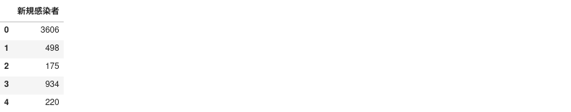
①新規陽性者数の推移(日別)の加工
Python3
df_newly.drop(columns='ALL', inplace=True)
df_newly = df_newly.T
df_newly = pd.DataFrame(df_newly.iloc[:, len(df_newly.columns)-1])
df_newly = df_newly.reset_index()
df_newly.columns = ['index','新規感染者'] #カラム名を変更しておく
df_newly.drop(columns='index', inplace=True)
df_newly.head()
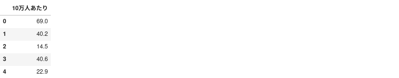
②人口10万人当たり新規陽性者数の加工
Python3
df_per_100_thousand.drop(columns='ALL', inplace=True)
df_per_100_thousand = df_per_100_thousand.T
df_per_100_thousand = pd.DataFrame(df_per_100_thousand.iloc[:, len(df_per_100_thousand.columns)-1])
df_per_100_thousand.columns = ['10万人あたり'] #カラム名を変更しておく
df_per_100_thousand = df_per_100_thousand.reset_index()
df_per_100_thousand.drop(columns='index', inplace=True)
df_per_100_thousand.head()
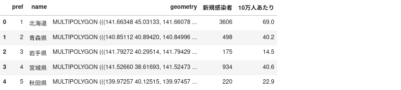
①②とポリゴンデータの連結
Python3
gdf_prefectures = pd.concat([gdf_prefectures, df_newly, df_per_100_thousand], axis=1)
gdf_prefectures.head()
描画
Python3
bins01 = list(df_newly["新規感染者"].quantile([0, 0.125, 0.25, 0.375, 0.5, 0.625, 0.75, 0.875, 1]))
bins02 = list(df_per_100_thousand["10万人あたり"].quantile([0, 0.125, 0.25, 0.375, 0.5, 0.625, 0.75, 0.875, 1]))
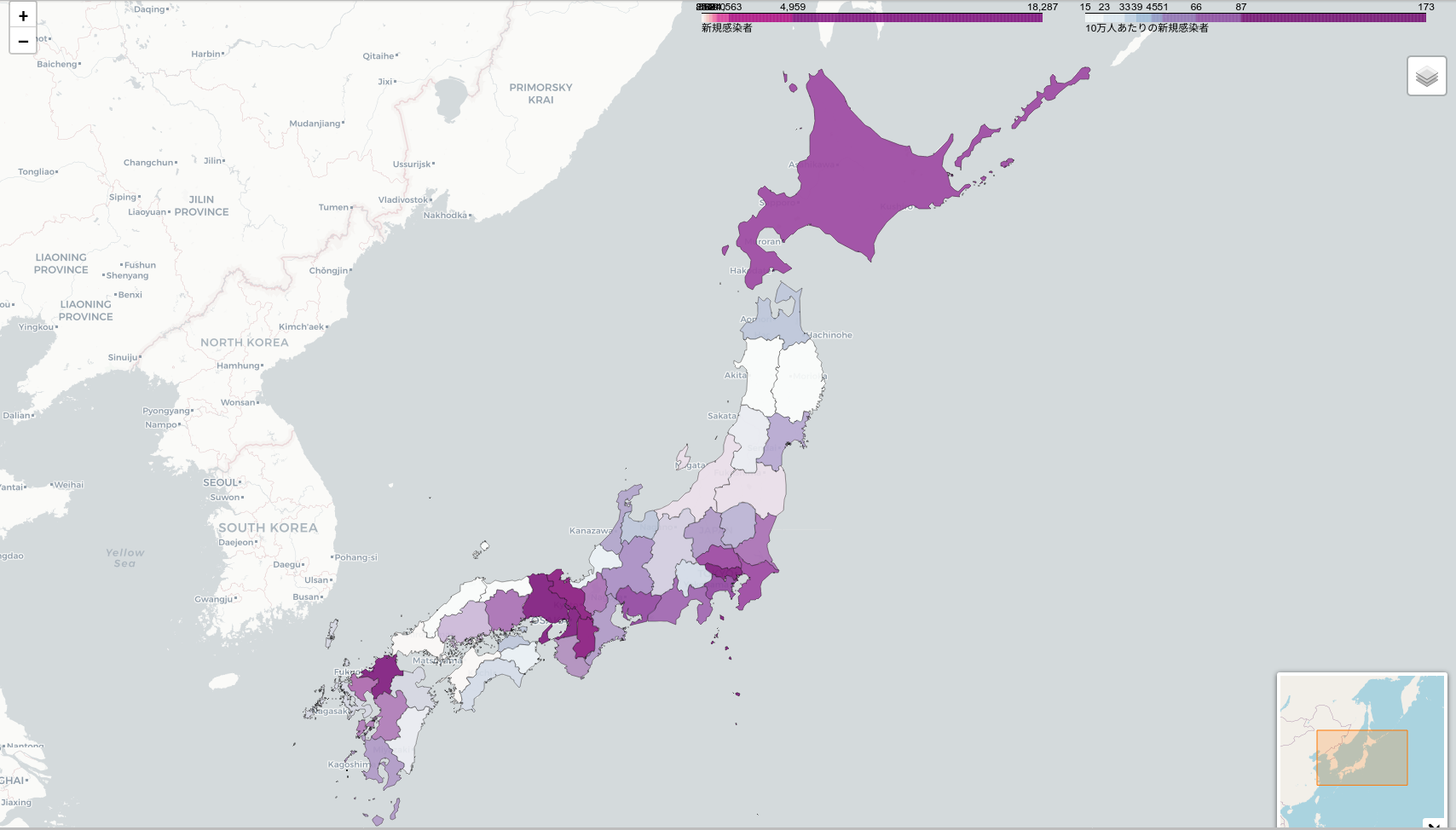
covid19_choropleth = folium.Map(location=[39, 140], tiles='cartodbpositron',zoom_start=5)
#covid19_choropleth = folium.Map(location=[39, 140], tiles='cartodbpositron', zoom_start=5,tiles=None)
folium.Choropleth(
geo_data=gdf_prefectures,
data=gdf_prefectures,
columns=['pref', '新規感染者'],
key_on="feature.properties.pref",
fill_color= "RdPu" ,
name="新規感染者",
fill_opacity=0.7,
line_opacity=0.2,
legend_name='新規感染者',
bins=bins01,
reset=True,
#highlight=True
).add_to(covid19_choropleth)
folium.Choropleth(
geo_data=gdf_prefectures,
data=gdf_prefectures,
columns=['pref', '10万人あたり'],
key_on="feature.properties.pref",
fill_color= "BuPu" ,
name="10万人あたり",
fill_opacity=0.7,
line_opacity=0.2,
legend_name='10万人あたりの新規感染者',
bins=bins02,
reset=True,
#highlight=True
).add_to(covid19_choropleth)
style_function = lambda x: {'fillColor': '#ffffff',
'color':'#000000',
'fillOpacity': 0.1,
'weight': 0.1}
highlight_function = lambda x: {'fillColor': '#000000',
'color':'#000000',
'fillOpacity': 0.50,
'weight': 0.1}
NIL = folium.features.GeoJson(
gdf_prefectures,
style_function=style_function,
control=False,
highlight_function=highlight_function,
tooltip=folium.features.GeoJsonTooltip(
fields=['name','新規感染者','10万人あたり'],
aliases=['都道府県 : ','新規感染者 : ','10万人あたりの新規感染者 : '],
style=("background-color: white; color: #333333; font-family: arial; font-size: 12px; padding: 10px;")
)
)
minimap = folium.plugins.MiniMap(toggle_display=True, width=200, height=200, zoom_level_offset=-4)
covid19_choropleth.add_child(minimap)
covid19_choropleth.add_child(NIL)
#covid19_choropleth.add_child(per_100)
folium.LayerControl().add_to(covid19_choropleth)
covid19_choropleth.keep_in_front(NIL)
covid19_choropleth.save("covid19.html")
covid19_choropleth
#色パレットは、‘BuGn’, ‘BuPu’, ‘GnBu’, ‘OrRd’, ‘PuBu’, ‘PuBuGn’, ‘PuRd’, ‘RdPu’, ‘YlGn’, ‘YlGnBu’, ‘YlOrBr’, and ‘YlOrRd’から選びます。
完成図
総集編
Python3
import geopandas as gpd
from shapely.geometry import Point
import pyproj
import pandas as pd
import numpy as np
import re
import matplotlib.pyplot as plt
import folium
from folium.plugins import MiniMap


covid19 = "https://covid19.mhlw.go.jp/public/opendata/newly_confirmed_cases_daily.csv"
df_newly = pd.read_csv(covid19, encoding='utf-8', index_col='Date')
# index_col='Date' で、Date 列(カラム)をインデックスに設定します。
# encoding='utf-8' で、utf-8 でエンコードします。

per_100_thousand = "https://covid19.mhlw.go.jp/public/opendata/newly_confirmed_cases_per_100_thousand_population_daily.csv"
df_per_100_thousand = pd.read_csv(per_100_thousand, encoding='utf-8', index_col='Date')
# index_col='Date' で、Date 列(カラム)をインデックスに設定します。
# encoding='utf-8' で、utf-8 でエンコードします。

prefectures = 'https://japonyol.net/editor/article/prefectures.geojson'
gdf_prefectures = gpd.read_file(prefectures)


df_newly.drop(columns='ALL', inplace=True)
df_newly = df_newly.T
df_newly = pd.DataFrame(df_newly.iloc[:, len(df_newly.columns)-1])
df_newly = df_newly.reset_index()
df_newly.columns = ['index','新規感染者'] #カラム名を変更しておく
df_newly.drop(columns='index', inplace=True)

df_per_100_thousand.drop(columns='ALL', inplace=True)
df_per_100_thousand = df_per_100_thousand.T
df_per_100_thousand = pd.DataFrame(df_per_100_thousand.iloc[:, len(df_per_100_thousand.columns)-1])
df_per_100_thousand.columns = ['10万人あたり'] #カラム名を変更しておく
df_per_100_thousand = df_per_100_thousand.reset_index()
df_per_100_thousand.drop(columns='index', inplace=True)

gdf_prefectures = pd.concat([gdf_prefectures, df_newly, df_per_100_thousand], axis=1)


bins01 = list(df_newly["新規感染者"].quantile([0, 0.125, 0.25, 0.375, 0.5, 0.625, 0.75, 0.875, 1]))
bins02 = list(df_per_100_thousand["10万人あたり"].quantile([0, 0.125, 0.25, 0.375, 0.5, 0.625, 0.75, 0.875, 1]))
covid19_choropleth = folium.Map(location=[39, 140],  tiles='cartodbpositron',zoom_start=5)
#covid19_choropleth = folium.Map(location=[39, 140], tiles='cartodbpositron', zoom_start=5,tiles=None)

folium.Choropleth(
    geo_data=gdf_prefectures,
    data=gdf_prefectures,
    columns=['pref', '新規感染者'],
    key_on="feature.properties.pref",
    fill_color= "RdPu" ,
    name="新規感染者",
    fill_opacity=0.7,
    line_opacity=0.2,
    legend_name='新規感染者',
    bins=bins01,
    reset=True,
    #highlight=True
).add_to(covid19_choropleth)

folium.Choropleth(
    geo_data=gdf_prefectures,
    data=gdf_prefectures,
    columns=['pref', '10万人あたり'],
    key_on="feature.properties.pref",
    fill_color= "BuPu" ,
    name="10万人あたり",
    fill_opacity=0.7,
    line_opacity=0.2,
    legend_name='10万人あたりの新規感染者',
    bins=bins02,
    reset=True,
    #highlight=True
).add_to(covid19_choropleth)

style_function = lambda x: {'fillColor': '#ffffff',
                            'color':'#000000',
                            'fillOpacity': 0.1,
                            'weight': 0.1}
highlight_function = lambda x: {'fillColor': '#000000',
                                'color':'#000000',
                                'fillOpacity': 0.50,
                                'weight': 0.1}


NIL = folium.features.GeoJson(
    gdf_prefectures,
    style_function=style_function,
    control=False,
    highlight_function=highlight_function,
    tooltip=folium.features.GeoJsonTooltip(
        fields=['name','新規感染者','10万人あたり'],
        aliases=['都道府県   : ','新規感染者   : ','10万人あたりの新規感染者   : '],
        style=("background-color: white; color: #333333; font-family: arial; font-size: 12px; padding: 10px;")
    )
)


minimap = folium.plugins.MiniMap(toggle_display=True, width=200, height=200, zoom_level_offset=-4)
covid19_choropleth.add_child(minimap)

covid19_choropleth.add_child(NIL)
#covid19_choropleth.add_child(per_100)

folium.LayerControl().add_to(covid19_choropleth)

covid19_choropleth.keep_in_front(NIL)

covid19_choropleth.save("covid19.html")

covid19_choropleth
参考リンク集
英語の勉強をしたい方向けドキュメント
ドキュメント-folium
厚生労働省のオープンデータ
参考文献