はじめに
SwiftUI での開発できてますか?
私は業務ではまだまだ触れていないです😓
なので個人開発のアプリで取り入れてみたり,
このデザインいいなって思った画面を実際に作ってみたり,
的な感じで空き時間見つけて少しずつ触っています。
iOS 14 以上だとある程度ストレスなく(マジ?)開発できるようになりましたね。
今回は,最近サンプル実装したものをネタに書いてみようと思います。
難しい実装はないので気楽に見ていただけたら幸いです。
今回作るもの
実装イメージ
NavigationBar に表示された Tab と
コンテンツのページングが連動するサンプルアプリを作ります。
Tab 部分はスクロール可能になっていて,
コンテンツ部分のページングにより対応する Tab が
画面中央にアニメーションありで移動して表示されます。
GIF アニメだとこんな感じです。
| ページ追加・ページング | Tab 側の選択 |
|---|---|
 |
 |
右下の FAB タップで Tab(ページ)を増やせるようにして
日本の本みたいに左にめくっていく感じです。
特別な実装はしていないのでコンテンツ側の実装は省きます。
テーマは東京メトロ丸ノ内線です。
趣味をサンプルアプリに落とし込むのはモチベーションアップには最適です!
この記事では駅名を配列に入れた [String] をデータとして利用します。
サンプルコード
サンプルコードの方では
駅のアイコン画像名,駅名,駅の WEBサイトリンクを
モデルとして使いまわしています。
GitHub にプッシュしていますので気になる方はご覧ください。
コードは綺麗ではないです🙄リポジトリ名もなんだかなぁ。
開発環境
- Xcode 13
- iOS 14 以上
- SwiftUI(2+)
実装ポイント
-
toolBarmodifier とToolBarItem ScrollViewReader-
TabViewのPageIndexViewStyle -
section(駅選択状態)の扱い
実装
順番に作っていきます。
各項目の最後に実行結果を折り畳みで用意していますので必要に応じてご覧ください。
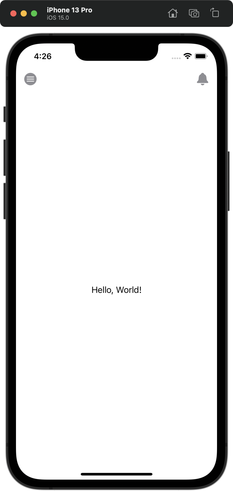
左右の NavigationBar のボタン
今回は NavigationBar の左右にボタンを配置してみます。
左側がハンバーガメニュ用,右側をお知らせベル用のボタンにします。
アイコンは SF Symbols1 を積極的に使ってます。(どうしてもない場合は探すor作る)
navigationBarItems2 というモディファイアがあったのですが
今では Deprecated になっています。
代わりに iOS 14 から利用可能になった
toolBar モディファイアと ToolBarItem3 を用います。
placement に配置位置を指定し,label の中で Button の実装をします。
今回の記事ではアクション処理は省きますが,
Push 遷移の場合は代わりに NavigationLink を実装すればいいですね。
モーダル遷移する場合は,@State な Bool 値を切り替える処理ですね。
長くなるので ViewModifier として切り出しました。
.modifier(ToolBarViewModifier()) を NavigationView 内で利用すればいいですね。
struct TopContentView: View {
    var body: some View {
        NavigationView {
            Text("Hello, World!")
                .navigationBarTitleDisplayMode(.inline)
                .modifier(ToolBarViewModifier())
        }
    }
}
struct ToolBarViewModifier: ViewModifier {
     func body(content: Content) -> some View {
         content
             .toolbar {
                 ToolbarItem(placement: .navigationBarLeading) {
                     Button {
                     } label: {
                         Image(systemName: "line.horizontal.3.circle.fill")
                             .resizable()
                             .scaledToFit()
                             .frame(width:24.0, height: 24.0)
                             .foregroundColor(.gray)
                     }
                 }
                 ToolbarItem(placement: .navigationBarTrailing) {
                     Button {
                     } label: {
                         Image(systemName: "bell.fill")
                             .resizable()
                             .scaledToFit()
                             .frame(width: 24.0, height: 24.0)
                             .foregroundColor(.gray)
                     }
                 }
             }
     }
 }
ここまでの実行結果
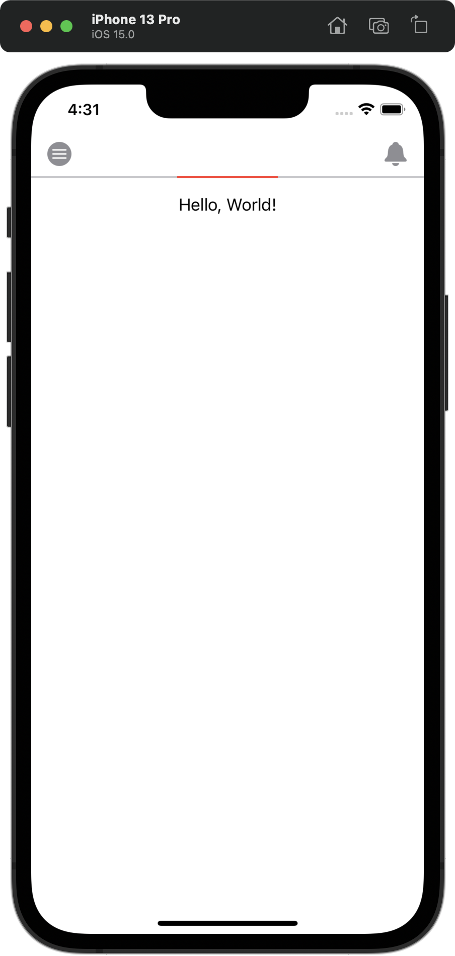
NavigationBar の下のラインと赤いバー
横線を実装する場合,Divider を利用することが多いですが,
今回は Rectangle を利用して線と赤いバーを ZStack で重ねてみます。
GitHub の方では矢印付きのバーを画像で利用していますが
矢印部分がはみ出るのでその分コンテンツのスクロール開始位置が
ずれてしまうので説明の都合上この実装で進めます。
struct TopBarSliderView: View {
    var body: some View {
        ZStack(alignment: .top) {
            Rectangle()
                .fill(Color.gray.opacity(0.5))
                .frame(maxWidth: .infinity)   // 画面いっぱい
                .frame(height: 2.0)
            Rectangle()
                .fill(Color.red)
                .frame(width: 100.0, height: 2.0) // 100ptで固定
        }
    }
}
VStack を利用してラインとバー部分とコンテンツ部分を表示できるようにします。
struct TopContentView: View {
    var body: some View {
        NavigationView {
            VStack(spacing: .zero) {
                TopBarSliderView()
                Text("Hello, World!")
                    .padding()
                Spacer()
            }
            .navigationBarTitleDisplayMode(.inline)
            .modifier(ToolBarViewModifier())
        }
    }
}
ここまでの実行結果
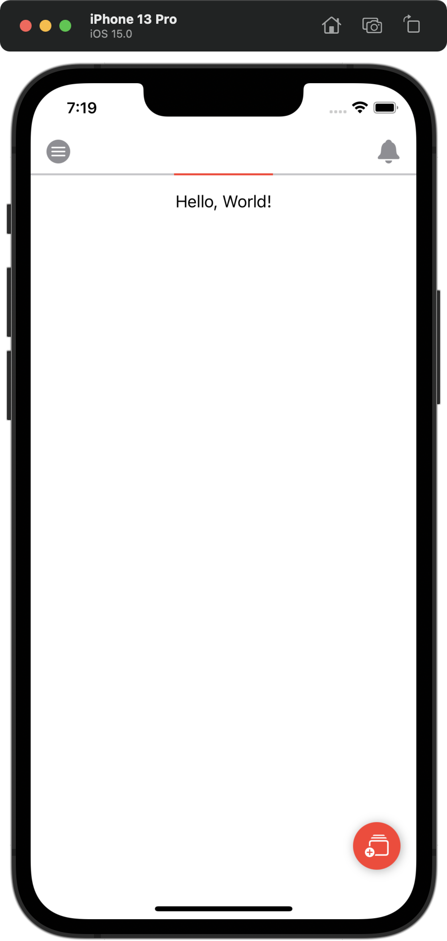
右下のフローティングアクションボタン(FAB)実装
Button 自体は特別な実装はありません。
struct FloatingButtonView: View {
     var body: some View {
         Button {
         } label: {
             Image(systemName: "rectangle.stack.badge.plus")
                 .resizable()
                 .scaledToFit()
                 .frame(width: 24.0, height: 24.0)
                 .foregroundColor(.white)
                 .padding(.all, 12.0)
                 .background(Color.red)
                 .cornerRadius(24.0)
                 .shadow(color: .black.opacity(0.3),
                         radius: 5.0,
                         x: 1.0, y: 1.0)
         }
     }
 }
FAB はコンテンツ画面とは独立したものにしたいので,ZStack を用います。
alignment を bottomTrailing にして右下に表示させます。
また,下と右のマージンを取りたいので offset を使ってずらしています。
(ZStack でラップする View がふたつでいいならこれでいいんですけどね・・・)
struct TopContentView: View {
     var body: some View {
         NavigationView {
             ZStack(alignment: .bottomTrailing) {
                 VStack(spacing: .zero) {
                     TopBarSliderView()
                     Text("Hello, World!")
                         .padding()
                     Spacer()
                 }
                 FloatingButtonView()
                     .offset(x: -16.0, y: -16.0)
             }
             .navigationBarTitleDisplayMode(.inline)
             .modifier(ToolBarViewModifier())
        }
    }
}
ここまでの実行結果
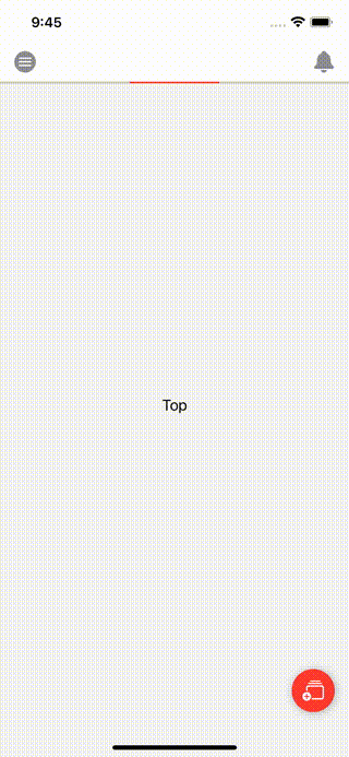
コンテンツ部分とページング
ページングは今回は TabView を使います。
TabView は SwiftUI 初期からありました。
用途は文字通り UIKit での UITabBarController 的な使い方です。
iOS 14 から PageTabViewStyle が追加されました。
UIPageViewController 的なページングが可能な UI が実現できます。
使い方は,tabViewStyle の設定を PageTabViewStyle にするだけです。
TabView の中で表示させたい View を書いていきます。
そうするとページングするとそれぞれの View が表示されます。
indexDisplayMode は automatic,always,never の3種類があります。
これは,UIKit での UIPageControl,つまり現在の index を示す UI の表示モードです。
今回は不要なので never を使います。
struct PageContentView: View {

     @State private var selection = 0
     @State private var items = ["Top", "hoge"]

     var body: some View {
         TabView(selection: $selection) {
             ForEach(0..<items.count) { index in
                 Text(items.reversed()[index])
                     .tag(index)
             }
         }
         .background(Color.gray.opacity(0.1))
         .tabViewStyle(PageTabViewStyle(indexDisplayMode: .never))
         .onAppear {
             // 初期表示が TOP になるように
             selection = items.count - 1
         }
     }
 }
ページングは初期設定だと右側にコンテンツが増えていきますが
今回は逆でかつ初期の index が ページ数 - 1 になるため
配列を逆順にして .onAppear で画面表示時に初期値を更新しています。
selection がページの index と対応しています。
よって,.tag を付与して Text を紐づけています。
TopContentView に追加します。
struct TopContentView: View {
     var body: some View {
         NavigationView {
             ZStack(alignment: .bottomTrailing) {
                 VStack(spacing: .zero) {
                     TopBarSliderView()
                     PageContentView()   // 追加
                 }
                 FloatingButtonView()
                     .offset(x: -16.0, y: -16.0)
             }
             .navigationBarTitleDisplayMode(.inline)
             .modifier(ToolBarViewModifier())
        }
    }
}
ここまでの実行結果
FAB タップ処理
右下の FAB をタップしてページを追加する処理を実装します。
駅名の文字列を順番に格納する配列を定義しておきます。
タップ時にひとつずつ items 配列に格納していく処理になります。
let marunouchi = ["荻窪", "南阿佐ヶ谷", .... , "方南町"]
親ビュー(TopContentView)を介して各子ビューに値の変化を伝えるようにします。
よって,ボタン側で selection が更新されるので @Binding をつけます。
同じく配列も更新されるので @Binding を付与して TopContentView に伝えます。
FloatingButtonView を下記のように書き換えます。
struct FloatingButtonView: View {

    @Binding var selection: Int   // ボタンが値を更新する
    @Binding var items: [String]  // ボタンが値を更新する
    @State private var counter = 0

    var body: some View {
        Button {
            addNewValue()  // ボタンのアクション追加
        } label: {
            Image(systemName: "rectangle.stack.badge.plus")
                .resizable()
                .scaledToFit()
                .frame(width: 24.0, height: 24.0)
                .foregroundColor(.white)
                .padding(.all, 12.0)
                .background(Color.red)
                .cornerRadius(24.0)
                .shadow(color: .black.opacity(0.3),
                        radius: 5.0,
                        x: 1.0, y: 1.0)
         }
    }

    /// 新しい駅を追加していく 方南町まで格納したら何もしない selection をトップにする
    private func addNewValue() {
        guard counter < marunouchi.count else { return }
        items.append(marunouchi[counter])
        counter += 1
        selection = items.count - 1
    }
}
次に PageContentView も書き換えます。
ページングによって selection が更新されるので @Binding をつけます。
一方 items の配列の方はこの View によって変更されることはないので
let で宣言して値渡しで大丈夫ですね。
struct PageContentView: View {

    @Binding var selection: Int  // ページングで値が変更される
    let items: [String]          // 変更されないのでただの値渡し

    var body: some View {
        TabView(selection: $selection) {
            ForEach(items.indices, id: \.self) { index in
                Text(items.reversed()[index])
                    .tag(index)
            }
        }
        .background(Color.gray.opacity(0.1))
        .tabViewStyle(PageTabViewStyle(indexDisplayMode: .never))
        .onAppear {
            selection = items.count - 1
        }
    }
}
最後に,TopContentView を書き換えます。
PageContentView と FloatingButtonView の引数部分です。
struct TopContentView: View {

    @State private var selection = 0
    @State private var items = ["Top"]

    var body: some View {
        NavigationView {
            ZStack(alignment: .bottomTrailing) {
                VStack(spacing: .zero) {
                    TopBarSliderView()
                    PageContentView(selection: $selection,
                                    items: items)
                }
                FloatingButtonView(selection: $selection,
                                   items: $items)
                    .offset(x: -16.0, y: -16.0)
            }
            .navigationBarTitleDisplayMode(.inline)
            .modifier(ToolBarViewModifier())
        }
    }
}
ここまでの実行結果

NavigationBar の Tab 部分
スクロール可能な Tab の実装,ここからが今回の本題です。
SwiftUI では NavigationBar 部分に容易にアクセスできるため比較的実装しやすいです。
同じく ToolBarItem を使います。
placement を principal にします。
プロダクトロゴ画像表示もロゴ+文字列とかも楽に実装できますね。
ToolbarItem(placement: .principal) {
    // View の実装
}
ここで実装イメージですが下記になります。
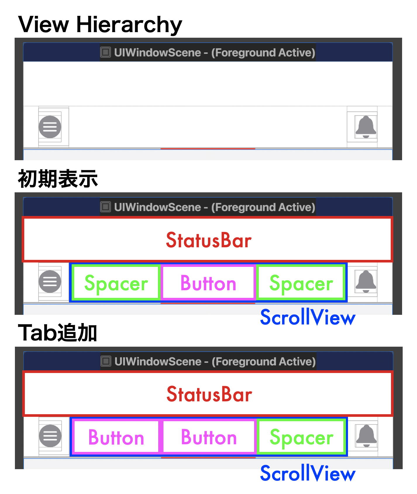
青枠部分が実装で使えます。UIKit だと扱い面倒だった気がするので嬉しい?
ScrollView に HStack で Tab となるボタンを追加していきます。
この際,初期表示では中央に TOP 用の Tab を表示させるため,
Spacer を使って調整します。
絵的には簡単そうなのですが Spacer の width の計算が難しかったです。
端末によって画面左右端と ToolBarItem のマージンが違います。
UIKit でいうところの directionalLayoutMargins の
leading, trailing で取れるやつです。
この 16pt or 20pt ってどうやって取得するんだ?
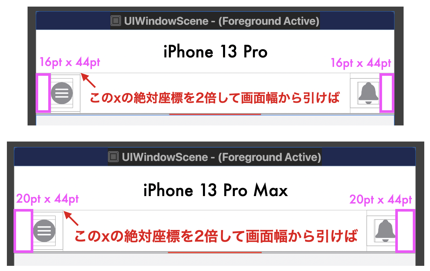
結構調べたのですが取得できそうになかったので発送の転換をして,
ScrollView の x の絶対座標を取得して (画面幅 - x座標 * 2 - Tab幅) / 2で OK かなと。
座標の絶対値は GeometryReader 使えば取れます。
private let tabButtonSize: CGSize = CGSize(width: 100.0, height: 44.0)

GeometryReader { geometryProxy in
    ScrollView(.horizontal, showsIndicators: false) {
        HStack(spacing: .zero) {
            Spacer()
                .frame(width: spacerWidth(geometryProxy.frame(in: .global).origin.x)
            Button
                .frame(width: tabButtonSize.width, height: tabButtonSize.height)
            Spacer()
                .frame(width: spacerWidth(geometryProxy.frame(in: .global).origin.x)
        }
    }
}

// 端末によって異なる Spacer 幅を計算
private func spacerWidth(_ viewOriginX: CGFloat) -> CGFloat {
    return (UIScreen.main.bounds.width - (viewOriginX * 2) - tabButtonSize.width) / 2
}
TOP Tab は丸ノ内線のロゴ,それ以外の駅は駅名を表示させるようにします。
Tab のタップで駅の選択状態は変更され,一方配列は変更されないので
それを踏まえると実装は下記のようになりました。
長いので折りたたみ
struct ToolBarViewModifier: ViewModifier {

    @Binding var selection: Int  // Tabのタップで選択状態が変化
    let items: [String]          // このビューで配列に変更はないので値渡し
    private let tabButtonSize: CGSize = CGSize(width: 100.0, height: 44.0)

    func body(content: Content) -> some View {
        content
            .toolbar {
                ToolbarItem(placement: .navigationBarLeading) {
                    Button {
                    } label: {
                        Image(systemName: "line.horizontal.3.circle.fill")
                            .resizable()
                            .scaledToFit()
                            .frame(width:24.0, height: 32.0)
                            .foregroundColor(.gray)
                    }
                }
                ToolbarItem(placement: .navigationBarTrailing) {
                    Button {
                    } label: {
                        Image(systemName: "bell.fill")
                            .resizable()
                            .scaledToFit()
                            .frame(width: 24.0, height: 24.0)
                            .foregroundColor(.gray)
                    }
                }
                ToolbarItem(placement: .principal) {
                    GeometryReader { geometryProxy in
                        ScrollView(.horizontal, showsIndicators: false) {
                            HStack(spacing: .zero) {
                                Spacer()
                                    .frame(width: spacerWidth(geometryProxy.frame(in: .global).origin.x))
                                ForEach(items.reversed().indices, id: \.self) { index in
                                    Button {
                                        // Tab タップで選択状態を更新
                                        selection = index
                                    } label: {
                                        if index == items.count - 1 {
                                            Image("02_Marunouchi")
                                                .resizable()
                                                .scaledToFit()
                                                .frame(width: 30.0, height: 30.0)
                                        } else {
                                            Text(items.reversed()[index])
                                                .font(.subheadline)
                                                .fontWeight(selection == index ? .semibold: .regular)
                                                .foregroundColor(selection == index ? .primary: .gray)
                                                .id(index)
                                        }
                                    }
                                    .frame(width: tabButtonSize.width, height: tabButtonSize.height)
                                }
                                Spacer()
                                    .frame(width: spacerWidth(geometryProxy.frame(in: .global).origin.x))
                            }
                        }
                    }
                }
            }
    }

    private func spacerWidth(_ viewOriginX: CGFloat) -> CGFloat {
        return (UIScreen.main.bounds.width - (viewOriginX * 2) - tabButtonSize.width) / 2
    }
}
struct TopContentView: View {

    @State private var selection = 0
    @State private var items = ["Top"]

    var body: some View {
        NavigationView {
            ZStack(alignment: .bottomTrailing) {
                VStack(spacing: .zero) {
                    TopBarSliderView()
                    PageContentView(selection: $selection,
                                    items: items)
                }
                FloatingButtonView(selection: $selection,
                                   items: $items)
                    .offset(x: -16.0, y: -16.0)
            }
            .navigationBarTitleDisplayMode(.inline)
            .modifier(ToolBarViewModifier(selection: $selection,
                                          items: items)) // 引数追加
        }
    }
}
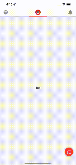
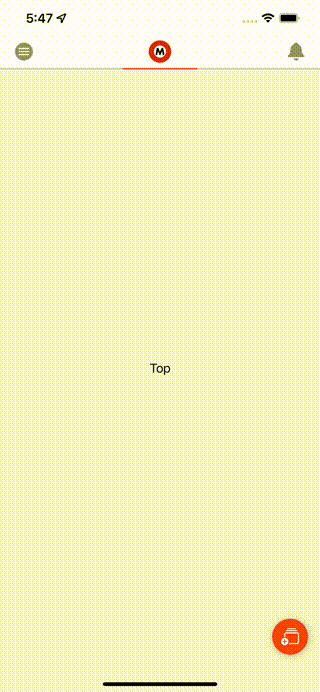
ここまでの実行結果は下記の通りです。
FAB のタップで Tab もページも増えています。
ページングで Tab の選択状態も更新されています。
Tab のタップでコンテンツ側も変更できています。
Tab を中央に表示させる
ページングしたとき,Tab をタップしたときに Tab を中央に表示させたい。
スクロールを制御するには iOS 14 以降で使える ScrollViewReader4 を利用します。
ScrollViewProxy インスタンスが取得できるので
Proxy の scrollTo(_:anchor:) で該当の id にスクロールさせることができます。
id はここでは selection に該当し,
anchor は中央に移動させたいので center を指定します。
Tab タップ時,ページングによって selection の値が変わった際に
スクロールさせる処理を書くとざっくり下記のような感じになります。
@Binding var selection: Int

ScrollViewReader { scrollProxy in
    ScrollView(.horizontal, showsIndicators: false) {
        HStack(spacing: .zero) {
            // 省略
            ForEach(items.reversed().indices, id: \.self) { index in
                Button {
                    selection = index
                    // Tab タップで選択状態が変わったらアニメーションありで中央に表示
                    withAnimation {
                        scrollProxy.scrollTo(selection, anchor: .center)
                    }
                } label: {
                    // 省略
                }
            }
            // 省略
        }
        // 選択状態が変わったらアニメーションありで中央に表示
        .onChange(of: selection) { _ in
            withAnimation {
                scrollProxy.scrollTo(selection, anchor: .center)
            }
        }
    }
}
最終コードはこちら
struct ToolBarViewModifier: ViewModifier {

    @Binding var selection: Int
    let items: [String]
    private let tabButtonSize: CGSize = CGSize(width: 100.0, height: 44.0)

    func body(content: Content) -> some View {
        content
            .toolbar {
                ToolbarItem(placement: .navigationBarLeading) {
                    Button {
                    } label: {
                        Image(systemName: "line.horizontal.3.circle.fill")
                            .resizable()
                            .scaledToFit()
                            .frame(width:24.0, height: 32.0)
                            .foregroundColor(.gray)
                    }
                }
                ToolbarItem(placement: .navigationBarTrailing) {
                    Button {
                    } label: {
                        Image(systemName: "bell.fill")
                            .resizable()
                            .scaledToFit()
                            .frame(width: 24.0, height: 24.0)
                            .foregroundColor(.gray)
                    }
                }
                ToolbarItem(placement: .principal) {
                    GeometryReader { geometryProxy in
                        ScrollViewReader { scrollProxy in
                            ScrollView(.horizontal, showsIndicators: false) {
                                HStack(spacing: .zero) {
                                    Spacer()
                                        .frame(width: spacerWidth(geometryProxy.frame(in: .global).origin.x))
                                    ForEach(items.reversed().indices, id: \.self) { index in
                                        Button {
                                            selection = index
                                            withAnimation {
                                                scrollProxy.scrollTo(selection, anchor: .center)
                                            }
                                        } label: {
                                            if index == items.count - 1 {
                                                Image("02_Marunouchi")
                                                    .resizable()
                                                    .scaledToFit()
                                                    .frame(width: 30.0, height: 30.0)
                                            } else {
                                                Text(items.reversed()[index])
                                                    .font(.subheadline)
                                                    .fontWeight(selection == index ? .semibold: .regular)
                                                    .foregroundColor(selection == index ? .primary: .gray)
                                                    .id(index)
                                            }
                                        }
                                        .frame(width: tabButtonSize.width, height: tabButtonSize.height)
                                    }
                                    Spacer()
                                        .frame(width: spacerWidth(geometryProxy.frame(in: .global).origin.x))
                                }
                                .onChange(of: selection) { _ in
                                    withAnimation {
                                        scrollProxy.scrollTo(selection, anchor: .center)
                                    }
                                }
                            }

                        }
                    }
                }
            }
    }

    private func spacerWidth(_ viewOriginX: CGFloat) -> CGFloat {
        return (UIScreen.main.bounds.width - (viewOriginX * 2) - tabButtonSize.width) / 2
    }
}
最後に Tab タップしたときでもページングのアニメーションをつけるために 1行追加します。
struct PageContentView: View {

    @Binding var selection: Int
    let items: [String]

    var body: some View {
        TabView(selection: $selection) {
            ForEach(items.indices, id: \.self) { index in
                Text(items.reversed()[index])
                    .tag(index)
            }
        }
        .background(Color.gray.opacity(0.1))
        .tabViewStyle(PageTabViewStyle(indexDisplayMode: .never))
        .animation(.linear(duration: 0.3))   // Tab タップされたときもページングさせたい
        .onAppear {
            selection = items.count - 1
        }
    }
}
最終結果
思った通りの実装が実現できました🎉
おわりに
今回は,NavigationBar に表示された Scrollable な Tab と
コンテンツのページングが連動するサンプル実装について書きました。
SwiftUI は NavigationBar の領域が使いやすいなぁと思いました。
ScrollViewReader 使ったの初めてで,
iOS 14 からだいたいの実装はできるようになったなと改めて感じました。
Tab の制御も UIKit より扱いやすいですよね。
来年は,もっと SwiftUI 使って色々な画面作ってみようと思います。
そして,(iOS 13 サポートを切って)業務でそろそろ本格的に使いたいです🙄
乱文でしたがご覧いただきありがとうございました🙇♂️
SwiftUI って実装を言葉で説明するの難しい😇