Edge to Edgeとは
Android 10の情報が出始めてからEdge to Edgeという単語が聞かれるようになりましたが、平たく言うとアプリのコンテンツを表示する領域をStatusBarやNavigationBarのところまで拡大しようという感じです
参考:
- https://developer.android.com/guide/navigation/gesturenav
- https://medium.com/androiddevelopers/gesture-navigation-going-edge-to-edge-812f62e4e83e
アプリのコンテンツ領域を拡大するという仕組みはAPI 21や部分的にはそれ以前からあり、最近になってEdge to Edgeと呼ばれるようになったという感じです
ちなみに、自分は透過UIとかいう呼び方をしていました。以前にQiitaでStatusBarに色を付けてNavigationBarを透明にしてCoordinatorLayoutを使おうとしたらハマったという記事を書いた頃からEdge to EdgeみたいなUIに挑戦してきました
この記事ではEdge to EdgeなUIを実現するための基本的な仕組みとその仕組みを応用したUI集みたいなものを載せます。Android 10的にはGesture Navigationのほうについても触れたほうがいいですが、自分はそこに関して経験がないため他の人に譲ります
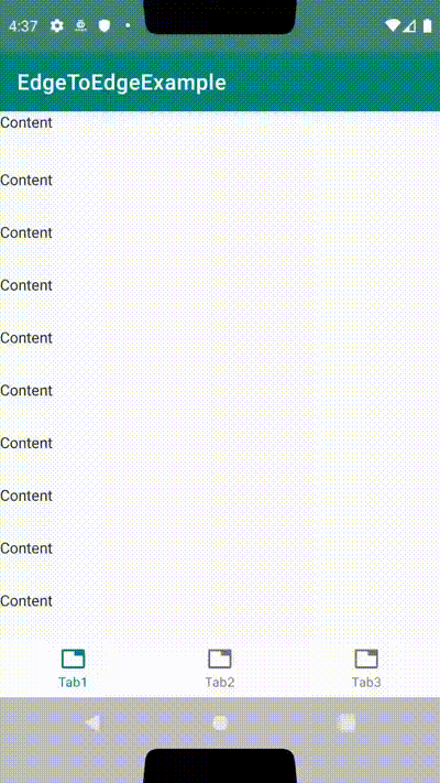
最初に作るもの

↑のようにStatusBarとNavigationBarの下までスクロールする(=コンテンツ領域が拡大されてる)画面を作ります
build.gradleの用意
implementation 'androidx.appcompat:appcompat:1.1.0'
implementation 'androidx.core:core-ktx:1.1.0'
implementation 'androidx.fragment:fragment:1.2.0-rc02'
implementation 'androidx.coordinatorlayout:coordinatorlayout:1.0.0'
implementation 'com.google.android.material:material:1.0.0'
今回はAndroidXを使用します。SupportLibraryのままのプロジェクトで使用する場合は適切な依存を追加してください
また、この依存では最初に作るもの以外で使う依存も含まれています
スタイルの用意
ToolBar(ActionBar)をスクロールさせるために標準搭載のActionBarではなくAndroidXのToolbarを使用します
<resources>
    <style name="AppTheme.NoActionBar" parent="Theme.MaterialComponents.Light.NoActionBar">
        <item name="colorPrimary">@color/colorPrimary</item>
        <item name="colorPrimaryDark">@color/colorPrimaryDark</item>
        <item name="colorAccent">@color/colorAccent</item>
    </style>
</resources>
Toolbarを使用するためにNoActionBarなスタイルを用意します。これをAndroidManifest.xmlでApplication ThemeまたはActivity Themeに設定してください
拡張関数の用意
package net.meilcli.etee.extensions

import android.app.Activity
import androidx.annotation.ColorInt
import android.view.View.SYSTEM_UI_FLAG_LAYOUT_FULLSCREEN as systemUiFlagLayoutFullScreen
import android.view.View.SYSTEM_UI_FLAG_LAYOUT_HIDE_NAVIGATION as systemUiFlagLayoutHideNavigation
import android.view.View.SYSTEM_UI_FLAG_LAYOUT_STABLE as systemUiFlagLayoutStable

fun Activity.setTranslucentStatusBarLayout(@ColorInt statusBarColor: Int) {
    window.decorView.systemUiVisibility = window.decorView.systemUiVisibility or
            systemUiFlagLayoutStable or
            systemUiFlagLayoutFullScreen

    window.statusBarColor = statusBarColor
}

fun Activity.setTranslucentStatusAndNavigationBarLayout(
    @ColorInt statusBarColor: Int,
    @ColorInt navigationBarColor: Int
) {
    window.decorView.systemUiVisibility = window.decorView.systemUiVisibility or
            systemUiFlagLayoutStable or
            systemUiFlagLayoutFullScreen or
            systemUiFlagLayoutHideNavigation

    window.statusBarColor = statusBarColor
    window.navigationBarColor = navigationBarColor
}
Edge to Edgeをする上で、コード側でsystemUiVisibilityのフラグを変更する必要があります。今回は何個かサンプルを作るため拡張関数として定義しました。また、色の設定もできるようにしています
setTranslucentStatusBarLayoutは使っていませんがサンプルとしておいています
この拡張関数を各Activityで呼び出すことでStatusBarやNavigationBarの領域までアプリケーションのコンテンツ領域を拡大することができます。また、拡大するだけではStatusBarやNavigationBarの下のコンテンツが見えないので、透明や半透明を設定しておきましょう
今回のサンプルでは半透明として<color name="translucent">#80808080</color>を定義し、これを指定します
レイアウトの用意
<?xml version="1.0" encoding="utf-8"?>
<androidx.coordinatorlayout.widget.CoordinatorLayout xmlns:android="http://schemas.android.com/apk/res/android"
    xmlns:app="http://schemas.android.com/apk/res-auto"
    android:layout_width="match_parent"
    android:layout_height="match_parent">

    <com.google.android.material.appbar.AppBarLayout
        android:id="@+id/appBarLayout"
        android:layout_width="match_parent"
        android:layout_height="wrap_content">

        <!-- set StatusBar's height to layout_height on code -->
        <Space
            android:id="@+id/statusBarMargin"
            android:layout_width="match_parent"
            android:layout_height="0dp"
            app:layout_scrollFlags="scroll" />

        <androidx.appcompat.widget.Toolbar
            android:layout_width="match_parent"
            android:layout_height="wrap_content"
            app:layout_scrollFlags="scroll"
            app:title="Simple" />

    </com.google.android.material.appbar.AppBarLayout>

    <!-- set NavigationBar's height to paddingBottom on code -->
    <androidx.core.widget.NestedScrollView
        android:id="@+id/scrollView"
        android:layout_width="match_parent"
        android:layout_height="match_parent"
        android:clipChildren="false"
        android:clipToPadding="false"
        app:layout_behavior="@string/appbar_scrolling_view_behavior">

        <TextView
            android:layout_width="match_parent"
            android:layout_height="wrap_content"
            android:lineSpacingMultiplier="3"
            android:text="@string/content"
            android:textAppearance="@style/TextAppearance.AppCompat.Body1" />
    </androidx.core.widget.NestedScrollView>

</androidx.coordinatorlayout.widget.CoordinatorLayout>
最初に見せたgifアニメーションのようにToolbarをスクロールで隠すようにするにはCoodinatorLayoutを使うことになります。ただし、標準のViewだけだとlayout.xmlのみでEdge to Edgeに対応することはできないため、StatusBarやNavigationBarの高さ分領域を空けるのはコード側で指定することになります
その他の諸属性については後ほど説明を入れときます
Activityの用意
package net.meilcli.etee.simple

import android.os.Bundle
import androidx.appcompat.app.AppCompatActivity
import androidx.core.content.ContextCompat
import androidx.core.view.ViewCompat
import androidx.core.view.updateLayoutParams
import androidx.core.view.updatePadding
import kotlinx.android.synthetic.main.activity_simple.*
import net.meilcli.etee.R
import net.meilcli.etee.extensions.setTranslucentStatusAndNavigationBarLayout

class SimpleActivity : AppCompatActivity() {

    override fun onCreate(savedInstanceState: Bundle?) {
        super.onCreate(savedInstanceState)

        setContentView(R.layout.activity_simple)

        setTranslucentStatusAndNavigationBarLayout(
            ContextCompat.getColor(this, R.color.translucent),
            ContextCompat.getColor(this, R.color.translucent)
        )
        fitsStatusBar()
        fitsNavigationBar()
    }

    private fun fitsStatusBar() {
        ViewCompat.setOnApplyWindowInsetsListener(statusBarMargin) { _, inset ->
            statusBarMargin.updateLayoutParams {
                height = inset.systemWindowInsetTop
            }
            return@setOnApplyWindowInsetsListener inset
        }
    }

    private fun fitsNavigationBar() {
        val defaultScrollViewPaddingBottom = scrollView.paddingBottom
        ViewCompat.setOnApplyWindowInsetsListener(scrollView) { _, inset ->
            scrollView.updatePadding(bottom = defaultScrollViewPaddingBottom + inset.systemWindowInsetBottom)
            return@setOnApplyWindowInsetsListener inset
        }
    }
}
Activityでは用意していた拡張関数を呼び出しアプリのコンテンツ領域をStatusBarとNavigationBarの部分まで拡張します。そしてsetOnApplyWindowInsetsListenerを使って拡張されたコンテンツ領域に対応できるようにします
setOnApplyWindowInsetsListenerの第2引数にはWindowInsets(ここでは正確に言うとWindowInsetsCompat)が渡されてきます。このWindowInsetsのsystemWindowInset**に上下左右のシステム領域の幅(=StatusBarの高さ, NavigationBarの高さ)が格納されてます
そのため、それらを使ってレイアウトに対してPaddingや高さをコード側で設定してあげることでEdge to Edgeに対応できるわけです
サンプルのコードではandroidx.core:core-ktxに定義されてるupdateLayoutParams拡張関数とupdatePadding拡張関数を使用していますが、この拡張関数を使用せずに愚直に記述しても問題はありません
ソースコード
- build.gradle
- styles.xml
- AndroidManifest.xml
- ActivityExtensions.kt
- activity_simple.xml
- SimpleActivity.kt
関連API
System UI Visibility
参考: Control the system UI visibility[公式リファレンス]
-
View.SYSTEM_UI_FLAG_LAYOUT_STABLE
- API 16で追加
- SYSTEM_UI_FLAG_HIDE_NAVIGATIONなどを設定するときに一緒に設定するおまじない(このフラグがあったほうがいいというのはドキュメントからわかりますが実際のところどうなのというのはわからないです、詳しい人教えて下さい🙏)
-
View.SYSTEM_UI_FLAG_LAYOUT_FULLSCREEN
- API 16で追加
- これを設定するとStatusBarのところまでアプリのコンテンツ領域を拡大する
-
View.SYSTEM_UI_FLAG_LAYOUT_HIDE_NAVIGATION
- API 16で追加
- これを設定するとNavigationBarのところまでアプリのコンテンツ領域を拡大する
-
View.SYSTEM_UI_FLAG_LIGHT_STATUS_BAR
- API 23で追加
-
android:windowLightStatusBarをコード側で設定するときに使う
-
View.SYSTEM_UI_FLAG_LIGHT_NAVIGATION_BAR
- API 26で追加
-
android:windowLightNavigationBarをコード側で設定するときに使う
これらをwindow.decorView.systemUiVisibilityにビット演算を用いてフラグを設定することで有効になります
StatusBarとNavigationBar
-
android:windowTranslucentStatus
- API 19で追加
- このAPIを使えばAPI 19から透過UIを実現できるように思われますが、バージョン分岐が激しくなるので使わないほうがいいと思います
-
android:windowTranslucentNavigation
- API 19で追加
- このAPIを使えばAPI 19から透過UIを実現できるように思われますが、バージョン分岐が激しくなるので使わないほうがいいと思います
-
Window.setStatusBarColor
- API 21で追加
-
android:statusBarColor
- API 21で追加
-
Window.setNavigationBarColor
- API 21で追加
-
android:navigationBarColor
- API 21で追加
-
android:windowLightStatusBar
- API 23で追加
- アイコンや文字の色をLightテーマ向けにします
-
android:windowLightNavigationBar
- API 27で追加
- アイコンや文字の色をLightテーマ向けにします
-
View.SYSTEM_UI_FLAG_LIGHT_NAVIGATION_BARを使うとAPI 26から設定できる様子
-
Window.setNavigationBarDividerColor
- API 28で追加
-
android:navigationBarDividerColor
- API 27で追加
onApplyWindowInsets
StatusBarやNavigationBarの高さを取得するのはWindowInsetsを見ればいいですが、WindowInsetsを見るには何個かの方法があります
-
View.onApplyWindowInsets
- API 20で追加
- CustomViewのときはこっちのほうがよさそう(こなみ)
-
View.setOnApplyWindowInsetsListener
- API 20で追加
- Viewに対してリスナーを登録する
-
ViewCompat.setOnApplyWindowInsetsListener
- View.setOnApplyWindowInsetsListenerのCompat版
- 通常はこっちを使えばいいと思います
- コメントを見る限りではAPI 21以降でsetOnApplyWindowInsetsListenerするらしいけどAPI 20は…?
ここで興味深いのはonApplyWindowInsetsは返り値としてWindowsInsets(Compat)を返す必要があるというところです。これはWindowInsetsには消費という概念があるからのようですが、これをKotlinのコードで表すとちょっと違和感が出るかもしれません
ViewCompat.setOnApplyWindowInsetsListener(statusBarMargin) { _, inset ->
    inset
}
Kotlinではラムダ式の最後に評価された値が返却されるという仕様があるため、このようにも書けます
ViewCompat.setOnApplyWindowInsetsListener(statusBarMargin) { _, inset ->
    return@setOnApplyWindowInsetsListener inset
}
自分は違和感が少し出るので、ここではreturnを明示的に行っています
WindowInsetsには前述の通りCompat版も含めて2種類ありますが、どちらも変わらないかと思います。StatusBarやNavigationBarの高さなどのSystem領域はSystemWindowInset**で取得します
fitsSystemWindows
-
android:fitsSystemWindows
- API 1からある様子
-
View.setFitsSystemWindows
- API 14で追加
    public WindowInsets onApplyWindowInsets(WindowInsets insets) {
        if ((mPrivateFlags3 & PFLAG3_FITTING_SYSTEM_WINDOWS) == 0) {
            if (fitSystemWindows(insets.getSystemWindowInsetsAsRect())) {
                return insets.consumeSystemWindowInsets();
            }
        } else {
            if (fitSystemWindowsInt(insets.getSystemWindowInsetsAsRect())) {
                return insets.consumeSystemWindowInsets();
            }
        }
        return insets;
    }
https://android.googlesource.com/platform/frameworks/base/+/master/core/java/android/view/View.java
fitsSystemWindowsを設定すると何が起こるのかを追っていくと、onApplyWindowInsetsを使っていそうだなということがわかります。ここをさらに追っていくとViewの内部でPaddingにInsetsを足している様子でした
Edge to EdgeではfitsSystemWindowsがやってくれることを各開発者が画面ごとに個別にWindowInsetsに対応するコードを実装することで実現するということになります
paddingとlayout_margin
Androidアプリ開発してる人なら誰もが使ったことあるであろうpaddingとlayout_marginですが、それらの特性を理解しておくとEdge to Edge対応がしやすくなります
<ViewGroup>
    <View />
</ViewGroup>
(構造を表すための疑似コードです)
Viewを配置するには親となるViewGroupが存在することになります。通常ViewGroupとしてはLinearLayoutやFrameLayoutやConstraintLayoutなどの****Layoutといった感じの名前のものを使用します
これらのViewGroupにはLayoutParamsというものが存在します。それぞれのViewGroupで子のViewを配置するためなどに使われる属性で、xml的にはlayout_***といった属性であることが多いです
その一例としてlayout_marginが存在するわけです。またViewGroupが扱えるLayoutParamsはそれぞれのViewGroupで異なるためlayout_marginが存在しないViewGroupもありえます
たとえば、図のところでViewGroupがlayout_marginに対応している場合にViewに対してlayout_marginを指定すると親となるViewGroupでlayout_marginの値通りにViewを配置しようとします
一方で、paddingのほうはViewの属性です。そのため実装がちゃんとされていればどのようなViewでも扱うことができます。そしてView自体の属性のため、paddingとして指定した分Viewの領域が大きくなります(正確にはlayout_widthやlayout_heightなど次第)
違いをまとめるとlayout_marginは親のViewGroupがViewをどのように配置するかの情報で、paddingはViewがコンテンツをどのように表示するかの情報です。これらのことからEdge to Edgeではコンテンツに対する変化としてpaddingの属性を使うことが多いかと思います
clipChildrenとclipToPadding
参考: Androidで子Viewを親Viewからはみ出して表示 - Qiita
通常はViewGroupは領域外の子のViewを描画しません。通常はそのような動作で問題ありませんが、Edge to EdgeかつCoordinatorLayoutを使用する場合にViewGroupの領域外を描画させる必要が出てくることがあります
そのときにはandroid:clipChildrenとandroid:clipToPaddingをfalseでViewGroupに指定してあげましょう
なお、CoordinatorLayout + RecyclerViewの場合にclipChildrenとclipToPaddingが効かない場合があります(RecyclerViewが領域外と判断して描画を諦める, 事象が発生したときにどういったロジックで発生したのか確認する時間がなかったので詳細は不明)
その場合はlayout_marginにマイナスの数値を指定しViewの配置をずらして、paddingにその分プラスの数値を指定してViewの領域を増やすことでlayout.xmlの基本構造を変えずに動的にEdge to Edgeに対応させることができます(このあたりのシビアなレイアウトになったらトライ&エラーという感じに頑張ってください、ひょっとしたらこのアプローチよりよりスマートな方法があるかもしれませんがもしあったら教えて下さい)
layout_scrollFlags
CoodinatorLayoutとその中で利用するAppBarLayoutの組み合わせではlayout_scrollFlagsを使ってスクロール時の挙動を設定することができます
各値の解説は他の方に譲りますが、AppBarLayoutはLinearLayoutを継承していて、ChildViewは垂直方向に上から下に配置されていきます。ここでlayout_scrollFlagsでスクロールできると指定したChildViewの上部にあるChildViewもスクロールできるものである必要があることには注意してください
Emulator

Android 9からかAndroid 10からか忘れましたが、EmulatorでStatusBarとNavigationBarのCutOutをエミュレートすることができるようになりました。WindowInsetsを利用してEdge to Edgeに対応していれば気にする必要はないと思いますが気になる場合はこの機能で検証するといいでしょう
UI集
固定ヘッダー

CoordinatorLayoutとAppBarLayoutを使ってると地味に難しいのが特定の要素を固定配置することですねw
<?xml version="1.0" encoding="utf-8"?>
<FrameLayout xmlns:android="http://schemas.android.com/apk/res/android"
    xmlns:app="http://schemas.android.com/apk/res-auto"
    android:layout_width="match_parent"
    android:layout_height="match_parent">

    <androidx.coordinatorlayout.widget.CoordinatorLayout
        android:layout_width="match_parent"
        android:layout_height="match_parent"
        android:clipChildren="false">

        <com.google.android.material.appbar.AppBarLayout
            android:id="@+id/appBarLayout"
            android:layout_width="match_parent"
            android:layout_height="wrap_content">

            <!-- set StatusBar's height to layout_height on code -->
            <Space
                android:id="@+id/statusBarMargin"
                android:layout_width="match_parent"
                android:layout_height="0dp"
                app:layout_scrollFlags="scroll" />

            <!-- prepare Header's height -->
            <Space
                android:layout_width="match_parent"
                android:layout_height="40dp"
                app:layout_scrollFlags="scroll" />

            <TextView
                android:layout_width="match_parent"
                android:layout_height="wrap_content"
                android:lineSpacingMultiplier="3"
                android:text="@string/header_item"
                android:textAppearance="@style/TextAppearance.AppCompat.Title"
                app:layout_scrollFlags="scroll" />
        </com.google.android.material.appbar.AppBarLayout>

        <!-- set NavigationBar's height to paddingBottom on code -->
        <androidx.core.widget.NestedScrollView
            android:id="@+id/scrollView"
            android:layout_width="match_parent"
            android:layout_height="match_parent"
            android:clipChildren="false"
            android:clipToPadding="false"
            app:layout_behavior="@string/appbar_scrolling_view_behavior">

            <TextView
                android:layout_width="match_parent"
                android:layout_height="wrap_content"
                android:lineSpacingMultiplier="3"
                android:text="@string/content"
                android:textAppearance="@style/TextAppearance.AppCompat.Body1" />
        </androidx.core.widget.NestedScrollView>

    </androidx.coordinatorlayout.widget.CoordinatorLayout>

    <!-- set StatusBar's height layout_marginTop on code -->
    <TextView
        android:id="@+id/header"
        android:layout_width="match_parent"
        android:layout_height="40dp"
        android:gravity="center"
        android:paddingStart="8dp"
        android:paddingEnd="8dp"
        android:text="@string/header"
        android:textAppearance="@style/TextAppearance.AppCompat.Title" />

</FrameLayout>
そういった場合はCoordinatorLayoutの上位に他のLayoutを設けて、CoordinatorLayout内でその分スペースを空ければいいです
ソース:
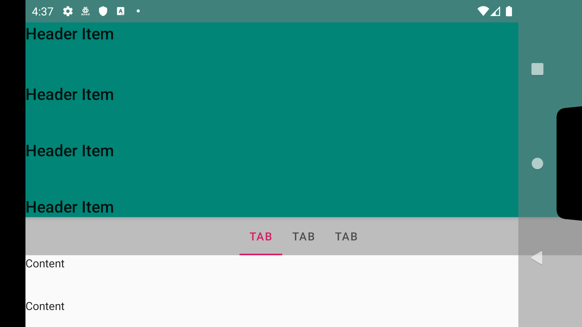
Stickyヘッダー

要素のスクロールに追従するけどもStatusBarの下でスクロールを止めたいみたいなレイアウトはいくつか実現方法があると思いますが、layout_anchorを使う方法を紹介します
<?xml version="1.0" encoding="utf-8"?>
<androidx.coordinatorlayout.widget.CoordinatorLayout xmlns:android="http://schemas.android.com/apk/res/android"
    xmlns:app="http://schemas.android.com/apk/res-auto"
    android:layout_width="match_parent"
    android:layout_height="match_parent">

    <com.google.android.material.appbar.AppBarLayout
        android:id="@+id/appBarLayout"
        android:layout_width="match_parent"
        android:layout_height="wrap_content">

        <!-- set StatusBar's height to layout_height on code -->
        <Space
            android:id="@+id/statusBarMargin"
            android:layout_width="match_parent"
            android:layout_height="0dp"
            app:layout_scrollFlags="scroll" />

        <TextView
            android:layout_width="match_parent"
            android:layout_height="wrap_content"
            android:lineSpacingMultiplier="3"
            android:text="@string/header_item"
            android:textAppearance="@style/TextAppearance.AppCompat.Title"
            app:layout_scrollFlags="scroll" />
    </com.google.android.material.appbar.AppBarLayout>

    <!-- set TabLayout's height to paddingTop on code -->
    <!-- set NavigationBar's height to paddingBottom on code -->
    <androidx.core.widget.NestedScrollView
        android:id="@+id/scrollView"
        android:layout_width="match_parent"
        android:layout_height="match_parent"
        android:clipChildren="false"
        android:clipToPadding="false"
        app:layout_behavior="@string/appbar_scrolling_view_behavior">

        <TextView
            android:layout_width="match_parent"
            android:layout_height="wrap_content"
            android:lineSpacingMultiplier="3"
            android:text="@string/content"
            android:textAppearance="@style/TextAppearance.AppCompat.Body1" />
    </androidx.core.widget.NestedScrollView>

    <!-- set StatusBar's height to layout_marginTop on code -->
    <com.google.android.material.tabs.TabLayout
        android:id="@+id/tabLayout"
        android:layout_width="match_parent"
        android:layout_height="wrap_content"
        android:layout_gravity="bottom"
        android:background="@color/translucent"
        app:layout_anchor="@id/appBarLayout"
        app:layout_anchorGravity="bottom">

        <com.google.android.material.tabs.TabItem
            android:layout_width="wrap_content"
            android:layout_height="wrap_content"
            android:text="@string/tab" />

        <com.google.android.material.tabs.TabItem
            android:layout_width="wrap_content"
            android:layout_height="wrap_content"
            android:text="@string/tab" />

        <com.google.android.material.tabs.TabItem
            android:layout_width="wrap_content"
            android:layout_height="wrap_content"
            android:text="@string/tab" />

    </com.google.android.material.tabs.TabLayout>

</androidx.coordinatorlayout.widget.CoordinatorLayout>
package net.meilcli.etee.sticky

import android.os.Bundle
import android.view.ViewGroup
import androidx.appcompat.app.AppCompatActivity
import androidx.core.content.ContextCompat
import androidx.core.view.ViewCompat
import androidx.core.view.updateLayoutParams
import androidx.core.view.updatePadding
import kotlinx.android.synthetic.main.activity_sticky.*
import net.meilcli.etee.R
import net.meilcli.etee.extensions.setTranslucentStatusAndNavigationBarLayout

class StickyActivity : AppCompatActivity() {

    private val defaultScrollViewPaddingTop by lazy { scrollView.paddingTop }
    private var scrollViewPaddingTopByTabLayout = 0

    override fun onCreate(savedInstanceState: Bundle?) {
        super.onCreate(savedInstanceState)

        setContentView(R.layout.activity_sticky)

        setTranslucentStatusAndNavigationBarLayout(
            ContextCompat.getColor(this, R.color.translucent),
            ContextCompat.getColor(this, R.color.translucent)
        )
        fitsStatusBar()
        fitsNavigationBar()
        fitsTabLayout()
    }


    private fun fitsStatusBar() {
        ViewCompat.setOnApplyWindowInsetsListener(statusBarMargin) { _, inset ->
            statusBarMargin.updateLayoutParams {
                height = inset.systemWindowInsetTop
            }
            return@setOnApplyWindowInsetsListener inset
        }

        ViewCompat.setOnApplyWindowInsetsListener(tabLayout) { _, inset ->
            tabLayout.updateLayoutParams<ViewGroup.MarginLayoutParams> {
                topMargin = inset.systemWindowInsetTop
            }
            return@setOnApplyWindowInsetsListener inset
        }
    }

    private fun fitsNavigationBar() {
        val defaultScrollViewPaddingBottom = scrollView.paddingBottom
        ViewCompat.setOnApplyWindowInsetsListener(scrollView) { _, inset ->
            scrollView.updatePadding(bottom = defaultScrollViewPaddingBottom + inset.systemWindowInsetBottom)
            return@setOnApplyWindowInsetsListener inset
        }
    }

    private fun fitsTabLayout() {
        tabLayout.addOnLayoutChangeListener { _, _, _, _, _, _, _, _, _ ->
            scrollViewPaddingTopByTabLayout = tabLayout.height
            setScrollViewPadding()
        }
    }

    private fun setScrollViewPadding() {
        scrollView.updatePadding(top = defaultScrollViewPaddingTop + scrollViewPaddingTopByTabLayout)
    }
}
少しコード側でレイアウト調整する箇所が多くなってしまいますが、ほとんどの場合ではこのようなコードでいいと思います(画面回転とかでのActivity再生成あたりがチョット怪しい)
ただ、このコードでは端末を横向きにした場合にTabLayoutの背景色とNavigationBarの背景色が重なってしまうので横向きで表示できるアプリはPaddingを調整する必要があります
    private fun fitsTabLayout() {
        ViewCompat.setOnApplyWindowInsetsListener(tabLayout) { _, inset ->
            tabLayout.updateLayoutParams<ViewGroup.MarginLayoutParams> {
                topMargin = inset.systemWindowInsetTop
                rightMargin = inset.systemWindowInsetRight
            }
            return@setOnApplyWindowInsetsListener inset
        }
        tabLayout.addOnLayoutChangeListener { _, _, _, _, _, _, _, _, _ ->
            scrollViewPaddingTopByTabLayout = tabLayout.height
            setScrollViewPadding()
        }
    }
rightMarginを追加するだけでいいので対応は簡単です
| 横向き未対応 | 横向き対応 |
|---|---|
 |
 |
ソース:
BottomNavigation
最近はBottomNavigationなアプリが流行ってきている感あるので、BottomNavigationの場合のサンプルも作りました
BottomNavigationでEdge to Edgeをする場合はCoordinatorLayoutのBehaviorを用意するところから始まります(既存のもので都合がいいものがあったら教えてくれるとうれC)
package net.meilcli.etee.navigation

import android.content.Context
import android.util.AttributeSet
import android.view.View
import androidx.coordinatorlayout.widget.CoordinatorLayout
import androidx.core.view.ViewCompat
import com.google.android.material.bottomnavigation.BottomNavigationView
import kotlin.math.max
import kotlin.math.min

class BottomNavigationBehavior(
    context: Context?,
    attrs: AttributeSet?
) : CoordinatorLayout.Behavior<BottomNavigationView>(context, attrs) {

    override fun onStartNestedScroll(
        coordinatorLayout: CoordinatorLayout,
        child: BottomNavigationView,
        directTargetChild: View,
        target: View,
        axes: Int,
        type: Int
    ): Boolean {
        return axes == ViewCompat.SCROLL_AXIS_VERTICAL
    }

    override fun onNestedPreScroll(
        coordinatorLayout: CoordinatorLayout,
        child: BottomNavigationView,
        target: View,
        dx: Int,
        dy: Int,
        consumed: IntArray,
        type: Int
    ) {
        super.onNestedPreScroll(coordinatorLayout, child, target, dx, dy, consumed, type)
        child.translationY = max(0F, min(child.height.toFloat(), child.translationY + dy))
    }
}
<?xml version="1.0" encoding="utf-8"?>
<androidx.coordinatorlayout.widget.CoordinatorLayout xmlns:android="http://schemas.android.com/apk/res/android"
    xmlns:app="http://schemas.android.com/apk/res-auto"
    xmlns:tools="http://schemas.android.com/tools"
    android:layout_width="match_parent"
    android:layout_height="match_parent"
    tools:context=".navigation.NavigationActivity">

    <com.google.android.material.appbar.AppBarLayout
        android:id="@+id/appBar"
        android:layout_width="match_parent"
        android:layout_height="wrap_content"
        android:elevation="4dp"
        android:theme="@style/AppTheme.AppBarOverlay">

        <!-- set StatusBar's height to layout_height on code -->
        <Space
            android:id="@+id/statusBarSpace"
            android:layout_width="match_parent"
            android:layout_height="wrap_content"
            app:layout_scrollFlags="scroll|enterAlways" />

        <androidx.appcompat.widget.Toolbar
            android:id="@+id/toolbar"
            android:layout_width="match_parent"
            android:layout_height="wrap_content"
            app:layout_scrollFlags="scroll|enterAlways"
            app:popupTheme="@style/AppTheme.PopupOverlay"
            app:title="@string/app_name" />
    </com.google.android.material.appbar.AppBarLayout>

    <androidx.fragment.app.FragmentContainerView
        android:id="@+id/container"
        android:layout_width="match_parent"
        android:layout_height="match_parent"
        android:layout_above="@id/bottomNavigation"
        app:layout_behavior="@string/appbar_scrolling_view_behavior" />

    <!-- set NavigationBar's height to paddingBottom on code -->
    <com.google.android.material.bottomnavigation.BottomNavigationView
        android:id="@+id/bottomNavigation"
        android:layout_width="match_parent"
        android:layout_height="wrap_content"
        android:layout_alignParentBottom="true"
        android:layout_gravity="bottom"
        app:layout_behavior=".navigation.BottomNavigationBehavior"
        app:menu="@menu/menu_navigation" />

</androidx.coordinatorlayout.widget.CoordinatorLayout>
BottomNavigationでは各タブをFragmentで表現するので、Fragmentを格納するViewGroupが必要になりますがAndroidXを使ってる場合はFragmentContainerViewを使うようにしてください(onApplyWindowInsetsが伝搬しない事象に遭遇する可能性がある)(バージョンはなるべく新しいものを使ったほうがよさげ)
package net.meilcli.etee.navigation

import android.os.Bundle
import androidx.appcompat.app.AppCompatActivity
import androidx.core.content.ContextCompat
import androidx.core.view.ViewCompat
import androidx.core.view.updateLayoutParams
import androidx.core.view.updatePadding
import androidx.fragment.app.Fragment
import kotlinx.android.synthetic.main.activity_navigation.*
import net.meilcli.etee.R
import net.meilcli.etee.extensions.setTranslucentStatusAndNavigationBarLayout

class NavigationActivity : AppCompatActivity() {

    companion object {

        /* 略 */
    }

    override fun onCreate(savedInstanceState: Bundle?) {
        super.onCreate(savedInstanceState)
        setContentView(R.layout.activity_navigation)

        setTranslucentStatusAndNavigationBarLayout(
            ContextCompat.getColor(
                this,
                R.color.translucent
            ), ContextCompat.getColor(this, R.color.translucent)
        )
        fitsStatusBar()
        fitsNavigationBar()

        setupBottomNavigation()
    }

    private fun fitsStatusBar() {
        ViewCompat.setOnApplyWindowInsetsListener(statusBarSpace) { _, insets ->
            statusBarSpace.updateLayoutParams {
                height = insets.systemWindowInsetTop
            }
            return@setOnApplyWindowInsetsListener insets
        }
    }

    private fun fitsNavigationBar() {
        ViewCompat.setOnApplyWindowInsetsListener(bottomNavigation) { _, insets ->
            bottomNavigation.updatePadding(bottom = bottomNavigation.paddingBottom + insets.systemWindowInsetBottom)
            return@setOnApplyWindowInsetsListener insets
        }
    }

    private fun setupBottomNavigation() {
        /* 略 */
    }
}
<?xml version="1.0" encoding="utf-8"?>
<FrameLayout xmlns:android="http://schemas.android.com/apk/res/android"
    android:layout_width="match_parent"
    android:layout_height="match_parent">

    <!-- set NavigationBar's height to paddingBottom on code -->
    <androidx.core.widget.NestedScrollView
        android:id="@+id/scrollView"
        android:layout_width="match_parent"
        android:layout_height="match_parent"
        android:clipChildren="false"
        android:clipToPadding="false">

        <TextView
            android:layout_width="match_parent"
            android:layout_height="wrap_content"
            android:lineSpacingMultiplier="3"
            android:text="@string/content"
            android:textAppearance="@style/TextAppearance.AppCompat.Body1" />
    </androidx.core.widget.NestedScrollView>
</FrameLayout>
package net.meilcli.etee.navigation

import android.os.Bundle
import android.view.LayoutInflater
import android.view.View
import android.view.ViewGroup
import androidx.core.view.ViewCompat
import androidx.core.view.updatePadding
import androidx.fragment.app.Fragment
import kotlinx.android.synthetic.main.fragment_navigation.*
import net.meilcli.etee.R

class NavigationFragment : Fragment() {

    override fun onCreateView(
        inflater: LayoutInflater,
        container: ViewGroup?,
        savedInstanceState: Bundle?
    ): View? {
        return inflater.inflate(R.layout.fragment_navigation, container, false)
    }

    override fun onViewCreated(view: View, savedInstanceState: Bundle?) {
        super.onViewCreated(view, savedInstanceState)

        fitsNavigationBar()
    }

    private fun fitsNavigationBar() {
        val defaultScrollViewPaddingBottom = scrollView.paddingBottom
        ViewCompat.setOnApplyWindowInsetsListener(scrollView) { _, insets ->
            scrollView.updatePadding(bottom = defaultScrollViewPaddingBottom + insets.systemWindowInsetBottom)
            return@setOnApplyWindowInsetsListener insets
        }
    }
}
Fragmentを使う場合はActivityとFragment双方にEdge to Edgeの処理を記述することになるので、どこからどこまでをActivityが担当するのかという点が悩みどころになってしまいます。BottomNavigationの場合はレイアウトの都合でどこをFragmentにするかがすぐに決まりますがSingle FragmentなActivityの場合は考えどころですね🤔
ソース:
- BottomNavigationBehavior.kt
- activity_navigation.xml
- NavigationActivity.kt
- fragment_navigation.xml
- NavigationFragment.kt
- styles.xml
おわりに
この記事はフェンリル デザインとテクノロジー Advent Calendar 2019の7日目の記事です
今まではQiita含めアドベントカレンダーに参加することはなかったんですが社内で募集があってせっかくだし参加してみようかな🤔、カレンダーの記事がデザイン系のものばかりだし自分はEdge to Edgeにしておこうかな🤔、最近需要ありそうだしせっかくだからQiitaに投稿しようかな🤔、という感じでQiitaに投稿してます
Qiitaのアドベントカレンダーのほうに参加してなくてなんかごめんなさい(?)ということで
あと、サンプルのリポジトリーはこれです: https://github.com/MeilCli/EdgeToEdgeExample