はじめに
アプリ開発をしていて、必ずFormは使用しますが、使い方を忘れてしまうのと、プロジェクトや実装者ごとに使い方が異なるなという印象なので、使い方を整理したいと思いました。
Formの設計
今回のサンプルでは以下のような設計としています。
lib
  ├ add_book_page.dart // Formを表示するページ
  │    └ book_form.dart // FormのWidget
  │       ├ app_text_field_form_field.dart // アプリで使用する汎用的なTextField
  │       ├ app_dropdown_menu_field.dart // アプリで使用する汎用的なDropdownMenu
  │       └ app_select_date_field.dart // アプリで使用する汎用的な日付選択UI
  ├ book_form_data.dart // Formのデータをまとめたクラス
  └ publisher.dart // AppDropdownMenuFieldに表示する選択肢
コードと解説
解説はコードのコメントに直接書いたので、コメントを読んでいただければと思います。
ページ
add_book_page.dart
class AddBookPage extends StatelessWidget {
const AddBookPage({super.key});
@override
Widget build(BuildContext context) {
return Scaffold(
appBar: AppBar(
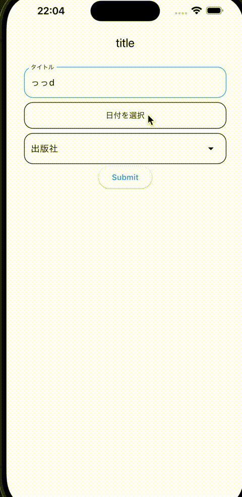
title: const Text('title'),
),
body: SafeArea(
child: Center(
child: BookForm(
// データを追加する用途でBookFormを使用
// データを編集する用途の場合は、初期値を渡せるようにしている
initialValue: null,
// フォームに項目を入力し、送信ボタンを押下した時のイベント
// データの追加と編集で、別々の処理となるため、使用側から渡せるようにしている
onSubmit: (data) {
print("onSubmit");
print("bookName: ${data.bookName}");
print("purchaseDate: ${data.purchaseDate}");
print("publisher: ${data.publisher}");
},
),
),
),
);
}
}
フォーム
データクラスのコードも載せておきます。
book_form_data.dart
class BookFormData {
  BookFormData({
    required this.bookName,
    required this.purchaseDate,
    required this.publisher,
  });
  final String bookName;
  final DateTime purchaseDate;
  final Publisher publisher;
}
book_form.dart
class BookForm extends StatefulWidget {
const BookForm({
super.key,
this.initialValue,
this.onSubmit,
});
final BookFormData? initialValue;
final Function(BookFormData)? onSubmit;
@override
State<BookForm> createState() => _BookFormState();
}
class _BookFormState extends State<BookForm> {
@override
Widget build(BuildContext context) {
// FormのKeyと、各入力項目のキーを生成
// 入力項目が増えれば、増えていきます
final formKey = GlobalKey<FormState>();
final bookNameFieldKey = GlobalKey<FormFieldState<String>>();
final selectDateFieldKey = GlobalKey<FormFieldState<DateTime>>();
final publisherFieldKey = GlobalKey<FormFieldState<Publisher>>();
// Formでは、Columnなどで入力項目を表示するのと
// Validatorの実装がメインになります。
return Form(
key: formKey,
child: Padding(
padding: const EdgeInsets.symmetric(
horizontal: 32,
),
child: Column(
children: [
const SizedBox(
height: 16,
),
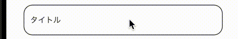
AppTextFormField(
fieldKey: bookNameFieldKey,
hint: 'Flutter実践開発',
label: 'タイトル',
validator: (value) {
if (value?.isEmpty ?? true) {
return "必須です";
}
return null;
},
),
const SizedBox(
height: 8,
),
AppSelectDateField(
fieldKey: selectDateFieldKey,
label: "購入日",
validator: (value) {
if (value == null) {
return "購入日を選択してください";
}
return null;
},
),
const SizedBox(
height: 8,
),
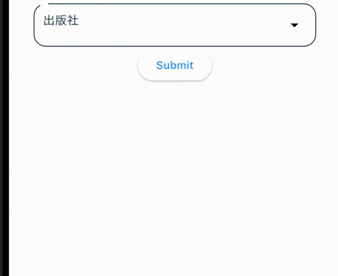
AppDropdownMenuField<Publisher>(
menuList: Publisher.values,
fieldKey: publisherFieldKey,
getDisplayLabel: (publisher) {
return publisher.label;
},
label: "出版社",
validator: (value) {
if (value == null) {
return "出版社を選択してください";
}
return null;
},
),
ElevatedButton(
onPressed: () {
if (!formKey.currentState!.validate()) {
return;
}
widget.onSubmit?.call(
BookFormData(
bookName: bookNameFieldKey.currentState!.value!,
purchaseDate: selectDateFieldKey.currentState!.value!,
publisher: publisherFieldKey.currentState!.value!,
),
);
},
child: const Text("Submit"),
),
],
),
),
);
}
}
Form内では、Widgetの見た目に関する実装はせず、別Widgetにした方が良いと思います。
サンプルコードでは、ElevatedButtonをそのまま使ってますが、このボタンもカスタマイズするなら別Widgetにするのが良いですね。
各フォームフィールド
TextField、DropdownMenu、日付選択UIのみ記載していますが、別途追加していきたい気持ちです。
TextField
class AppTextFormField extends StatelessWidget {
  const AppTextFormField({
    super.key,
    this.fieldKey,
    this.label,
    this.hint,
    this.initialValue,
    this.validator,
  });
  // super.keyを使うとエラーになるため、FormField用のKeyを定義
  final Key? fieldKey;
  final String? label;
  final String? hint;
  final String? initialValue;
  final String? Function(String?)? validator;

  @override
  Widget build(BuildContext context) {
    final borderStyle = OutlineInputBorder(
      borderRadius: BorderRadius.circular(16),
      borderSide: const BorderSide(
        width: 1,
      ),
    );
    return TextFormField(
      key: fieldKey,
      initialValue: initialValue,
      validator: validator,
      decoration: InputDecoration(
        border: borderStyle,
        focusedBorder: borderStyle.copyWith(
          borderSide: const BorderSide(
            color: Colors.blue,
            width: 1,
          ),
        ),
        enabledBorder: borderStyle,
        errorBorder: borderStyle.copyWith(
          borderSide: const BorderSide(
            color: Colors.red,
          ),
        ),
        labelStyle: Theme.of(context).textTheme.bodyMedium,
        labelText: label,
        hintText: hint,
        hintStyle: Theme.of(context).textTheme.bodyMedium!.copyWith(
              color: Colors.black26,
            ),
      ),
    );
  }
}
DropdownMenu
ドロップダウンの項目用の列挙型です。
publiser.dart
enum Publisher {
  kodansha("講談社"),
  kadokawa("KADOKAWA");

  const Publisher(this.label);
  final String label;
}
app_drop_down_menu_field.dart
// ジェネリックを使用することで、汎用的に使えるようにしています。
class AppDropdownMenuField<T> extends StatelessWidget {
  const AppDropdownMenuField({
    super.key,
    required this.menuList,
    this.initialSelection,
    required this.fieldKey,
    required this.label,
    this.hint,
    required this.getDisplayLabel,
    this.validator,
  });
  final List<T> menuList;
  final T? initialSelection;
  final GlobalKey<FormFieldState<T>> fieldKey;
  final String label;
  final String? hint;
  final String? Function(T?)? validator;
  // 項目の表示名を取得するメソッドを使用する側から指定できるようにしています
  // これで柔軟に表示名を変更できます
  final String Function(T) getDisplayLabel;

  @override
  Widget build(BuildContext context) {
    return FormField<T>(
      key: fieldKey,
      autovalidateMode: AutovalidateMode.onUserInteraction,
      initialValue: initialSelection,
      builder: (state) {
        return DropdownMenu<T>(
          initialSelection: initialSelection,
          width: double.infinity,
          inputDecorationTheme: InputDecorationTheme(
            enabledBorder: OutlineInputBorder(
              borderSide: BorderSide(
                color: state.hasError ? Colors.red : Colors.black,
                width: 1,
              ),
              borderRadius: const BorderRadius.all(Radius.circular(16)),
            ),
            focusedBorder: OutlineInputBorder(
              borderRadius: BorderRadius.circular(16),
              borderSide: const BorderSide(
                color: Colors.blue,
                width: 1,
              ),
            ),
            hintStyle: Theme.of(context).textTheme.bodyMedium!.copyWith(
                  color: Colors.black26,
                ),
          ),
          requestFocusOnTap: true,
          errorText: state.errorText,
          label: Text(label),
          hintText: hint,
          onSelected: (T? value) {
            if (value == null) {
              return;
            }

            state.didChange(value);
          },
          dropdownMenuEntries: menuList.map<DropdownMenuEntry<T>>((T e) {
            return DropdownMenuEntry<T>(
              value: e,
              label: getDisplayLabel(e),
            );
          }).toList(),
        );
      },
      validator: validator,
    );
  }
}
日付選択UI
class AppSelectDateField extends StatelessWidget {
  const AppSelectDateField({
    super.key,
    this.fieldKey,
    this.label,
    this.initialValue,
    this.validator,
  });

  final GlobalKey<FormFieldState<DateTime>>? fieldKey;
  final String? label;
  final DateTime? initialValue;
  final String? Function(DateTime?)? validator;

  @override
  Widget build(BuildContext context) {
    return FormField<DateTime>(
      key: fieldKey,
      autovalidateMode: AutovalidateMode.onUserInteraction,
      builder: (state) {
        return OutlinedButton(
          onPressed: () async {
            final selectedDate = await showDatePicker(
              context: context,
              firstDate: DateTime(
                1900,
                1,
                1,
              ),
              lastDate: DateTime(
                3000,
                1,
                1,
              ),
            );

            // 未選択状態を考慮してないので、
            // ここは要件に応じて変更が必要です
            if (selectedDate == null) {
              return;
            }

            state.didChange(selectedDate);
          },
          style: OutlinedButton.styleFrom(
            foregroundColor: state.hasError ? Colors.red : Colors.black,
            side: BorderSide(
              color: state.hasError ? Colors.red : Colors.black,
              width: 1,
            ),
            shape: RoundedRectangleBorder(
              borderRadius: BorderRadius.circular(16),
            ),
          ),
          child: SizedBox(
            width: double.infinity,
            height: 48,
            child: Align(
              alignment: Alignment.center,
              child: Text(
                state.value?.toString() ?? "日付を選択",
              ),
            ),
          ),
        );
      },
      initialValue: initialValue,
      validator: validator,
    );
  }
}