CSS逆引きSwiftUIチートシートです。必ずしもCSSとSwiftUIのコードが同じものでないことにご留意ください。
また、初学者のため、間違いや追加すべきものがあればぜひご指摘お願いします🙏
背景色 background-color
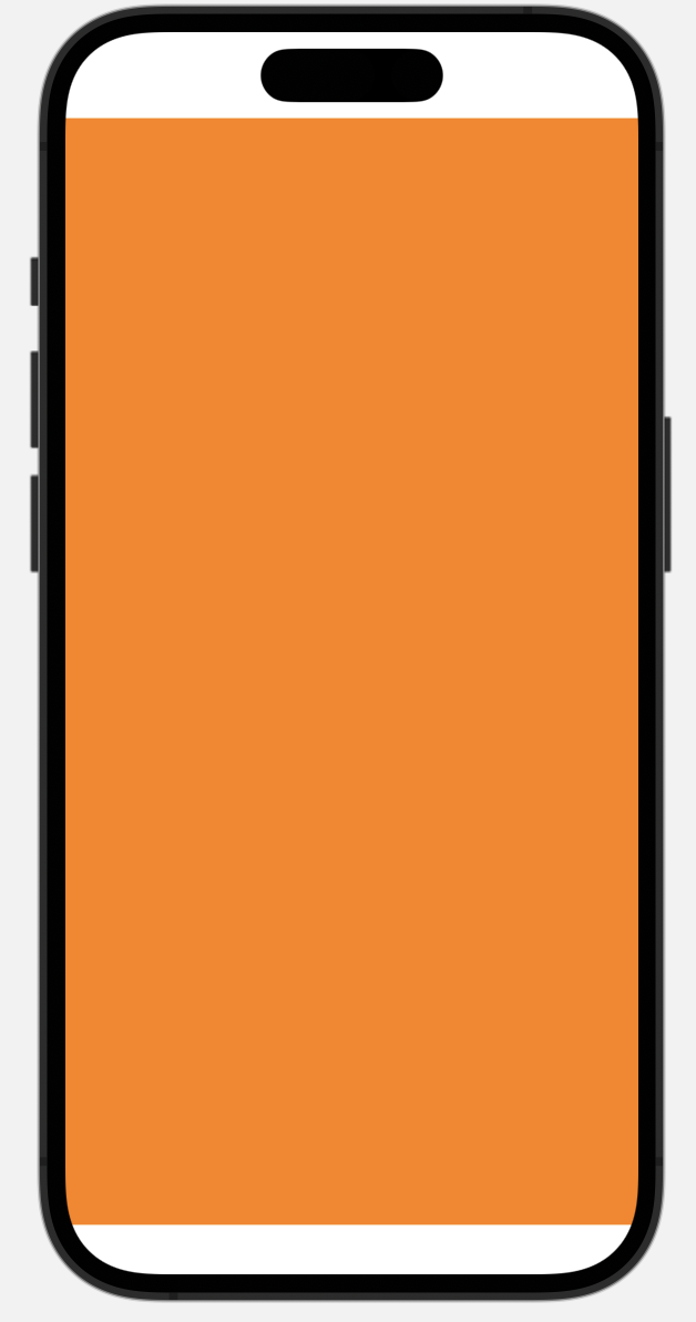
struct SampleView: View {
    var body: some View {
        ZStack {
            Color(.orange)
            Text("")
        }
    }
}
セーフエリアまで表示領域を広げる:
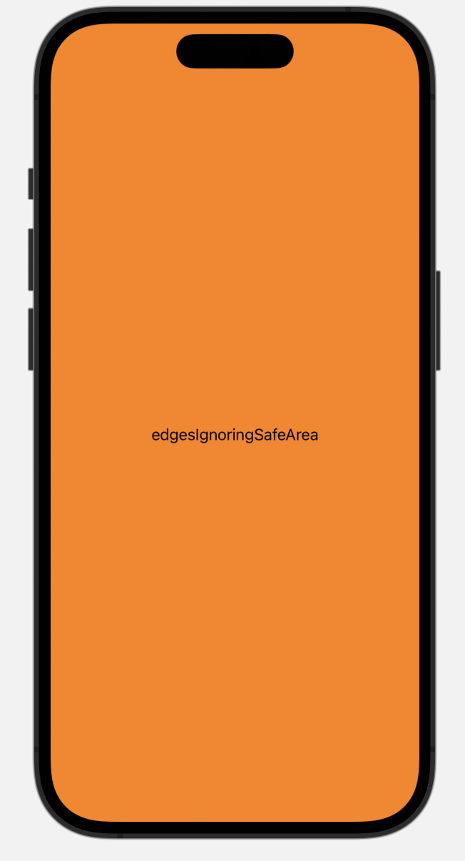
.edgesIgnoringSafeAreaを使う。
var body: some View {
        ZStack {
            Color(.orange)
                .edgesIgnoringSafeArea(.all)
            Text("edgesIgnoringSafeArea")
        }
    }
.edgesIgnoringSafeArea(.all) で上下余白
.edgesIgnoringSafeArea(.top)で上側だけ
.edgesIgnoringSafeArea(.bottom)で下側だけ
塗りつぶすことができる。
色
デフォルトカラー
(Color.色)
例
.background(Color.yellow)
色は下記より選択
HEXコードを使用する場合:
(hex: 0x0077FF)
例
Color(hex: 0x0077FF)
RGB値を使用する場合:
Color(red: 0.5, green: 0.75, blue: 1.0)
グラデーション
線型グラデーション linear-gradient()

LinearGradient
 var body: some View {
        // 線形グラデーション(青→黒)を生成
        LinearGradient(gradient: Gradient(colors: [.blue, .black]), startPoint: .leading, endPoint: .trailing)
            .ignoresSafeArea()      // フレームサイズをセーフエリア外まで広げる
    }
放射状グラデーション radial-gradient()
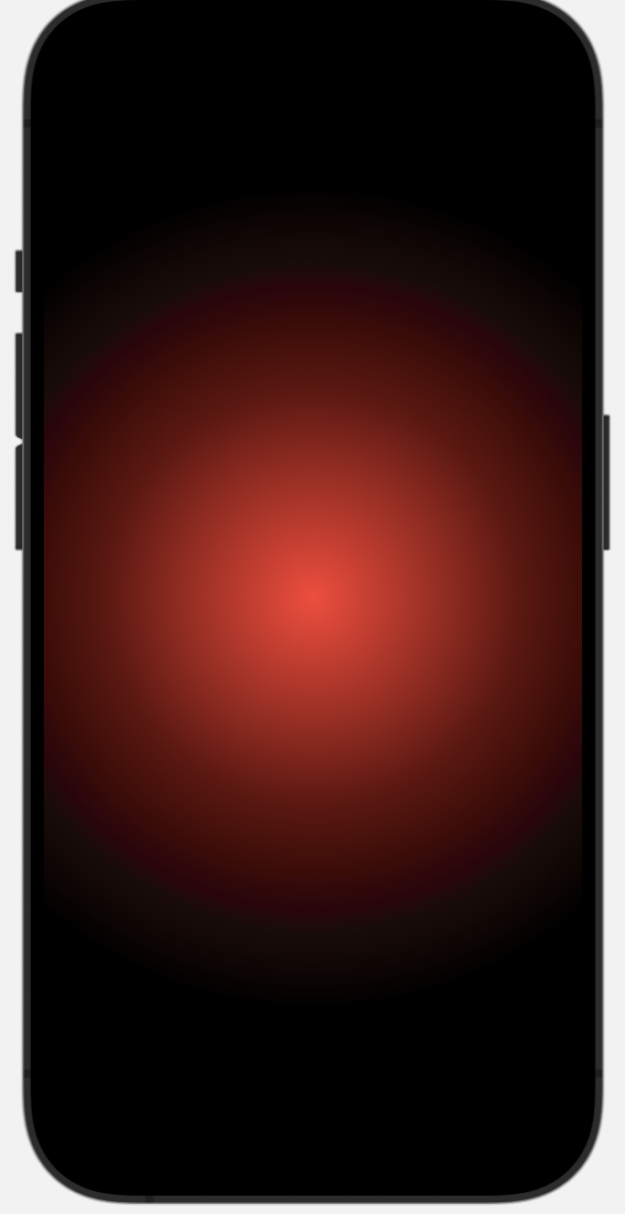
RadialGradient
var body: some View {
        // 放射状グラデーション(赤→黒)を生成
        RadialGradient(gradient: Gradient(colors: [.red, .black]), center: .center, startRadius: 1, endRadius: 300)
            .ignoresSafeArea()      // フレームサイズをセーフエリア外まで広げる
    }
円すい状グラデーション conic-gradient()
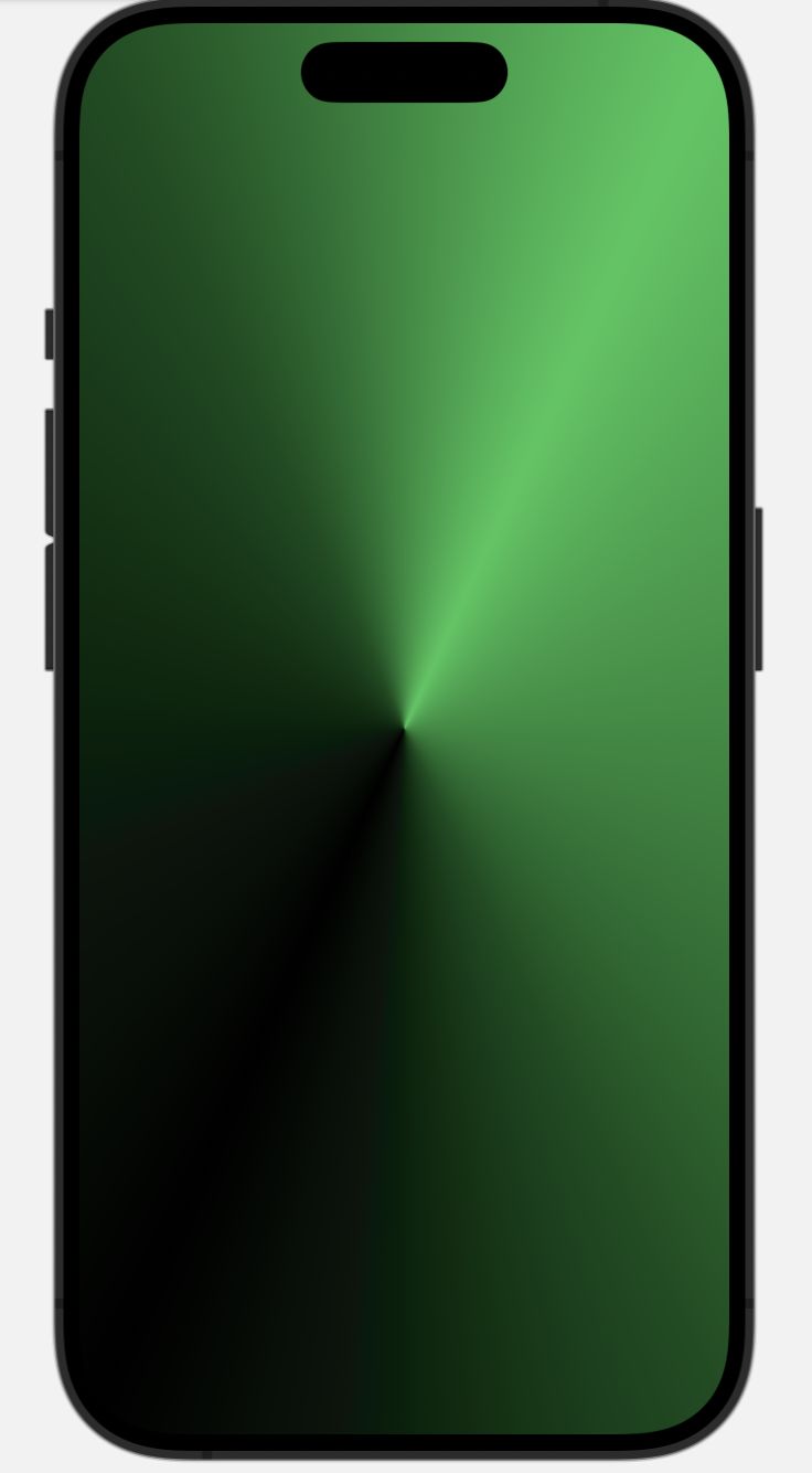
LinearGradient
var body: some View {
        // 円すい状グラデーション(緑→黒→緑)を生成
        AngularGradient(gradient: Gradient(colors: [.green, .black, .green]), center: .center, angle: .degrees(-45))
            .ignoresSafeArea()      // フレームサイズをセーフエリア外まで広げる
    }
上記コードは下記ブログから参照させて頂きました。その他グラデーションも掲載されています↓
文字 font
色 color
.foregroundColor()
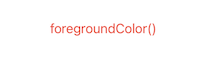
Text("foregroundColor()")
                .foregroundColor(.red)
色の種類については色の項を参照↓
サイズ font-size
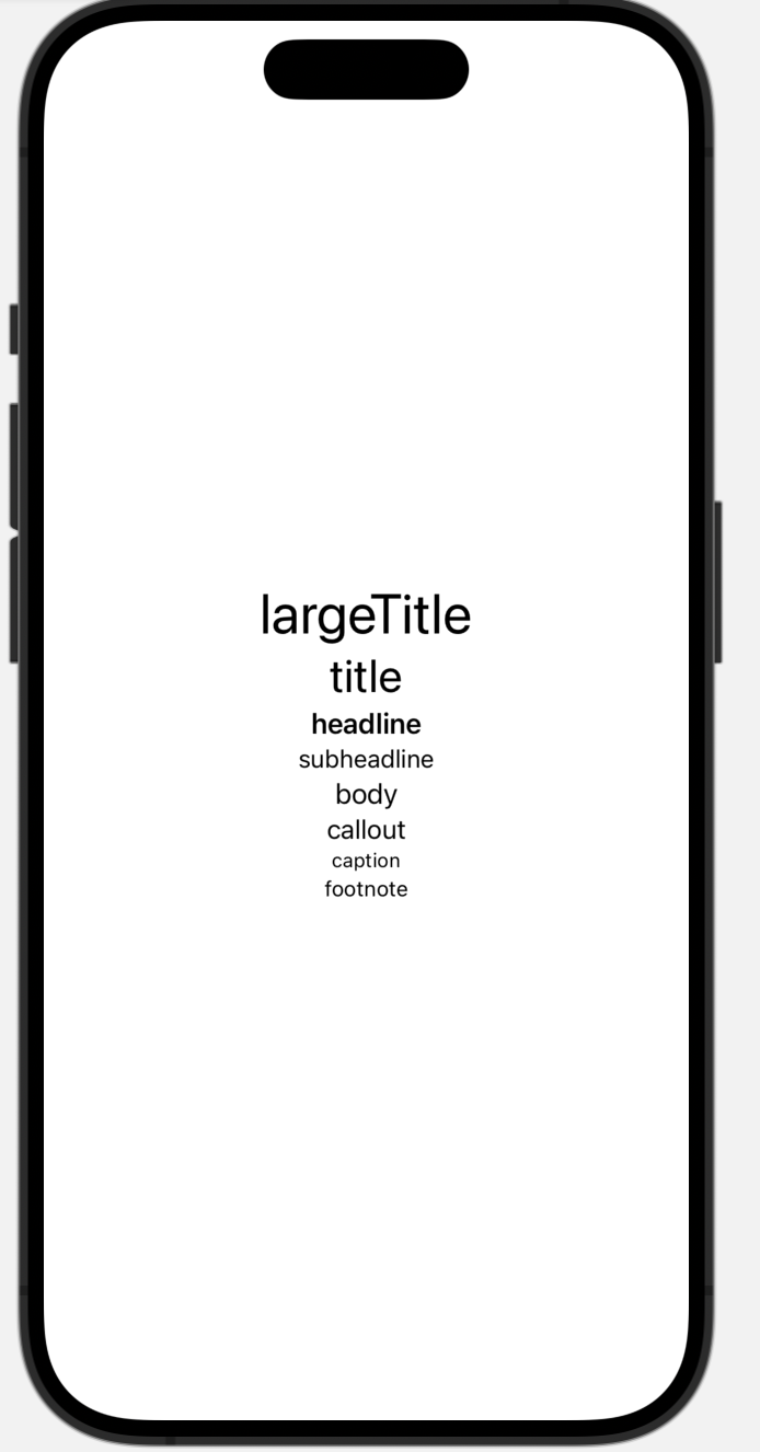
.font()
Text("largeTitle").font(.largeTitle)   // 大きなタイトル
Text("title").font(.title)             // タイトル
Text("headline").font(.headline)       // 見出し
Text("subheadline").font(.subheadline) // 小見出し
Text("body").font(.body)               // 本文
Text("callout").font(.callout)         // 吹き出し
Text("caption").font(.caption)         // キャプション
Text("footnote").font(.footnote)       // 注釈
スタイル font-style
太さ font-weight

.fontWeight()
Text("black").fontWeight(.black)
Text("bold").fontWeight(.bold)
Text("heavy").fontWeight(.heavy)
Text("light").fontWeight(.light)
Text("medium").fontWeight(.medium)
Text("regular").fontWeight(.regular)
Text("semibold").fontWeight(.semibold)
Text("thin").fontWeight(.thin)
Text("ultraLight").fontWeight(.ultraLight)
文字装飾
線 text-decoration-line
アンダーライン underline
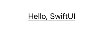
.underline()
例
Text("Hello, SwiftUI")
                .underline()
オーバーライン overline
取り消し線 line-through

.strikethrough()
例
Text("Hello, SwiftUI")
     .strikethrough()
レイアウト
横並び flex-direction row + justify-content center
HStack
縦並び flex-direction column + justify-content center
VStack
要素を重ねて表示 absolute z-index
ZStack
余白
border領域の内側に余白を取る padding
border領域の外側に余白を取る Margin
無し。
HTMLレイアウトにおいては1つのオブジェクトに対してPaddingとMarginは1つずつしか設定できません。しかし、SwiftUIにはそのような制約はなく、Paddingを幾つでも設定できます。(borderも幾つでも設定できます。)そのためMarginという概念が不要になるわけです。これがSwiftUIにおけるPaddingの特徴です。
形
線
四角

Rectangle() //四角
    .foregroundColor(.blue) //色
    .frame(width: 200, height: 200) //サイズ
丸: border-radius
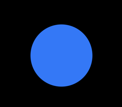
Circle()
    .foregroundColor(.blue) //色
    .frame(width: 200, height: 200) //サイズ
画像
画像の表示
画像のサイズ
.frame(width: ⚫︎, height: ⚫︎)
 Image("sampleImg")
            .resizable()
            .frame(width: 87, height: 122)
    }
画像を加工
丸
.clipShape(Circle())
Image("soba")
    .resizable() //画像をリメイクできるように処理
    .clipShape(Circle())
アニメーション
ナビゲーションバー
フォーム
select
struct ContentView: View {
    @State private var selectedValue = 1 //初期値
    var body: some View {
        VStack {
            Picker("色を選択", selection: $selectedValue) {
                Text("赤").tag(1)
                Text("青").tag(2)
                Text("黄色").tag(3)
            }
        }
    }
}
struct ContentView: View {
    let colors = ["赤", "青", "黄色"]
    @State private var selection = 1

    var body: some View {
        VStack {
            Picker(selection: $selection, label: Text("色を選択")) {
                ForEach(0 ..< colors.count) { num in
                    Text(self.colors[num])   // .tag()の指定は不要
                }
            }
            .frame(width: 400)

            Text("選択値:\(selection)")
        }
    }
}
色などの情報を持たせることもできる

struct ContentView: View {
    @State private var selectedValue = UIColor.red
    var body: some View {
        ZStack {
            Color(selectedValue)
                .edgesIgnoringSafeArea(.all)

            VStack {
                Picker("色を選択", selection: $selectedValue) {
                    Text("赤").tag(UIColor.red)
                    Text("青").tag(UIColor.blue)
                    Text("黄色").tag(UIColor.yellow)
                }
            }
        }
    }
}