Matplotlibでグラフと表を合わせて表示させようとすると、以下のように一部文字が重なってしまいます。いい方法がございましたら、教えてください。
Pandasとmatplotlibをインポート
test.ipynb
import pandas as pd
import matplotlib.pyplot as plt

%matplotlib inline
グラフと表の元データ
test.ipynb
name=["1","2","3","4","5","6","7","8","9","10"]
value=[[-0.49409999999999998],
 [-0.48880000000000001],
 [-0.49059999999999998],
 [-0.4879],
 [-0.48899999999999999],
 [-0.48770000000000002],
 [-0.48859999999999998],
 [-0.48720000000000002],
 [-0.4879],
 [-0.48630000000000001]]
グラフと表の表示
test.ipynb
plt.figure()
plt.title("TEST")
plt.scatter(name, value)
plt.xlim(None)
plt.ylim(-1.0,0.0)
plt.table(cellText=value,
          rowLabels=name,
          loc="bottom")
結果
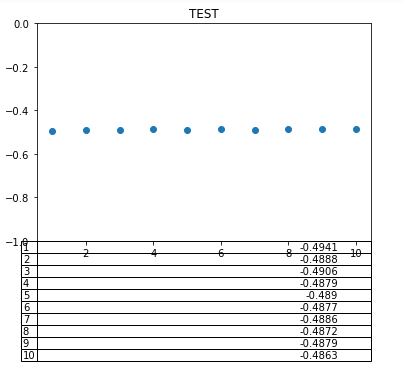
X軸と表が一部重なってしまいました。。。
この重なりを解消する方法をご存じの方いらっしゃいましたら、教えてください。
よろしくお願いします。