タイトルからだとよくわからないかもしれないですが、商品覧のようなページを作成する時に、下の図のようなレイアウトを CSS だけでうまい具合に作りたくなりました。

要件は以下の通り
- 複数の要素を一覧表示になるよう並べたい
- 並べる要素数は状況に応じて変動しうる
- 親要素の幅は可変であり、親要素に収まるように子要素の列数も可変にしたい
- 全体は中央寄せ
- 子要素達は左寄せ
失敗
最近、 CSS の flexbox が強いという話を知ってなんでもかんでもflexで解決しようとしていたのですが、今回の用件はどんなに頑張ってもどこかに支障がでて上手くいきませんでした。CodePenのサンプルコード
例1
.parent {
  display: flex;
  align-items: flex-start;
  flex-wrap: wrap;
  justify-content: left;
  margin: 0 auto;
}
まずは親要素のflex-wrapをwrapに指定してjustify-content: leftにした上でmargin: 0 autoをすればいい感じになると思ったのですが、全体は中央寄席にならず、左に寄ってしまいました。

例2
.parent {
  display: flex;
  align-items: flex-start;
  flex-wrap: wrap;
  justify-content: center;
}
続いて、justify-content: centerにしてみましたが、全体は中央寄せになるものの、子要素も中央寄席になってしまいました。

このほかにも3時間ほど試行錯誤しましたが、何かが上手くいけばどこかに支障がでるという感じでした。
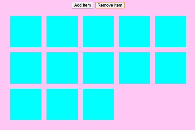
上手くいく方法
結果論的には、 flexbox を捨てて、 grid を使うと良いということがわかりました。
CodePenのサンプルコード
.parent {
  display: grid;
  grid-template-columns: repeat(auto-fit, 100px);
  grid-auto-rows: 100px;
  grid-gap: 16px;
  justify-content: center;
}
ここで注目すべきところは、grid-template-columnsにrepeat()を使った上でauto-fitを指定しているところです。ここが、auto-fillだと思ったようにはなりません。