■はじめに
今回は画面レイアウトの基本についてです。
別画面の表示方法も少しやります。
[注意]
これまでの回で説明済みの操作方法等は、説明を省略したり簡略化している場合があります。
■開発環境
- Windows 10
- Visual Studio Community 2015 Update 3
- .NET Framework 4.x
■StackPanel
◇縦並び
プロジェクトを新規作成して、画面デザイナのウィンドウの白い部分(Grid)を右クリック、
「レイアウトの種類の変更」 - 「StackPanel」を選択します。
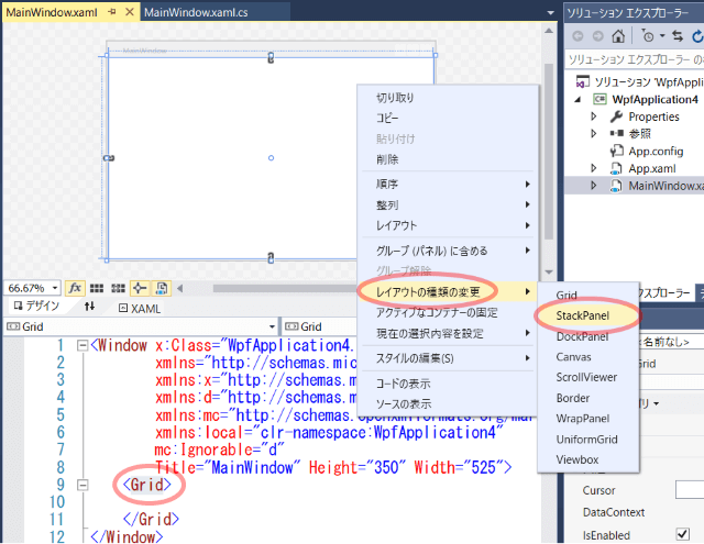
タグがGridからStackPanelに変わりました。
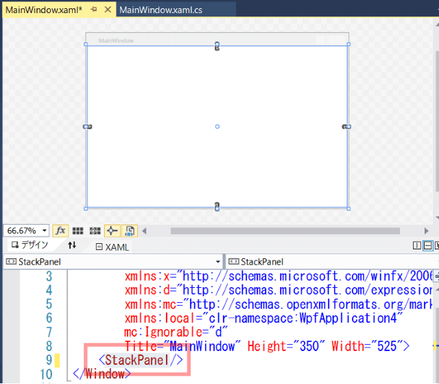
直接タグを書き換えてもよいです。
ツールボックスのButtonを画面デザイナの白い部分(StackPanel)にドラッグ&ドロップします。
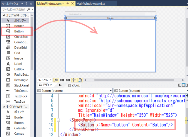
Buttonタグのx:Nameを削除します。
<Button Content="Button"/>
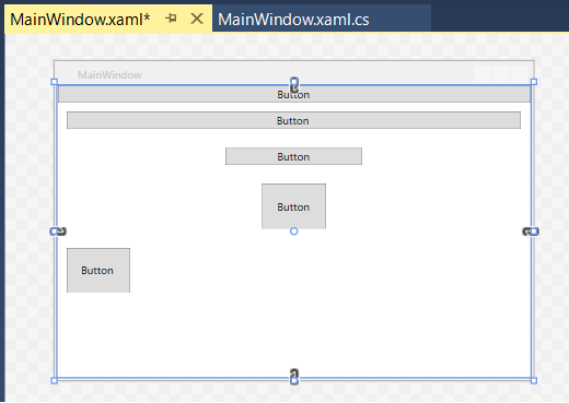
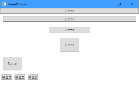
Buttonタグをコピペ増殖して、以下のように書き換えます。
<StackPanel>
<Button Content="Button"/>
<Button Content="Button" Margin="10"/>
<Button Content="Button" Margin="10" Width="150"/>
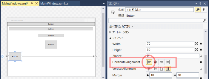
<Button Content="Button" Margin="10" Width="70" Height="50"/>
<Button Content="Button" Margin="10" Width="70" Height="50" HorizontalAlignment="Left"/>
</StackPanel>
画面デザイナではこのように、ボタンが自動的に縦に並んで表示されます。
Marginプロパティは他のコントロールとの余白です。
Marginプロパティの指定方法のバリエーションは、 こちらの記事 参照。
HorizontalAlignmentプロパティは水平方向の位置指定で、Left,Center,Right,Stretchの中から選べます。
既定値はStretchです。
VerticalAlignmentプロパティは垂直方向の位置指定で、Top,Center,Bottom,Stretchの中から選べます。
既定値はStretchです。
◇横並び
もう一つStackPanelを追加してみましょう。
Buttonタグの並びの一番下に<StackPanel>と入力します。
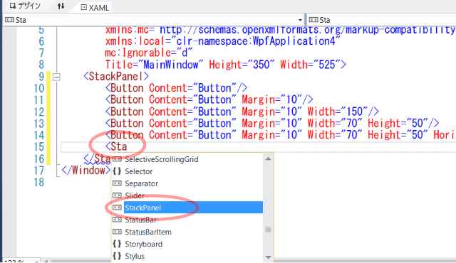
途中まで入力すれば候補が出てくるので選択します。
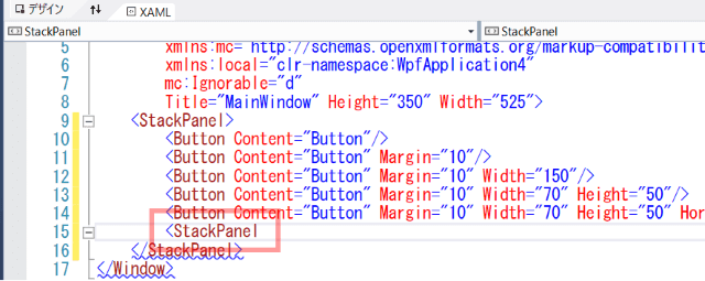
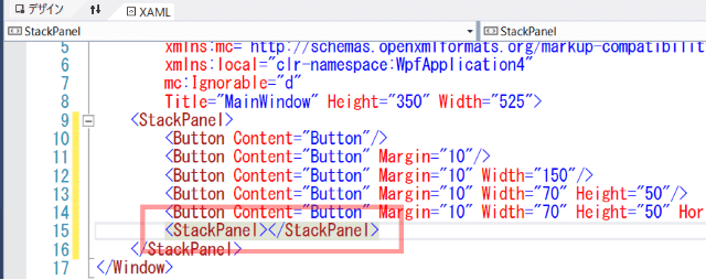
>まで入力すると、自動的に</StackPanel>まで入力してくれます。
以下のように書き換えます。
<StackPanel Orientation="Horizontal">
    <Button Content="横並び" Margin="5"/>
    <Button Content="横並び" Margin="5"/>
    <Button Content="横並び" Margin="5"/>
</StackPanel>
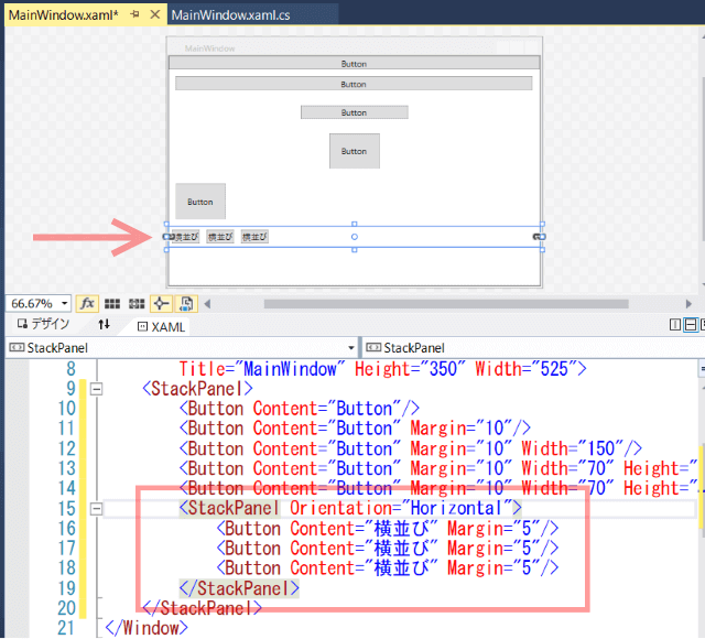
StackPanelのOrientationプロパティがHorizontalだと横並びになります。
既定値は縦並びのVerticalです。
■Grid
◇行
次はGridを使ってみます。
ソリューションエクスプローラーでプロジェクトを右クリック、「追加」 - 「新しい項目」を選択。
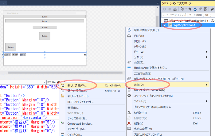
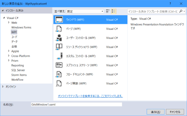
「ウィンドウ(WPF)」を選択し、名前に`GridWindow1.xaml'を入力し、「追加」ボタンを押します。
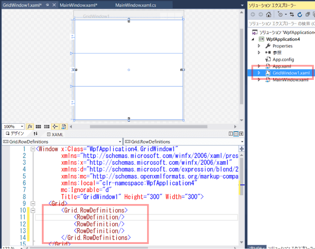
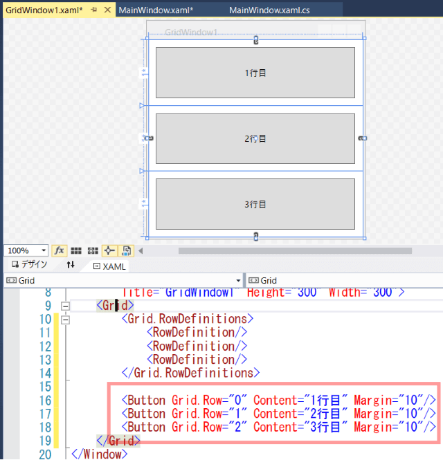
Gridタグの中に以下を入力します。
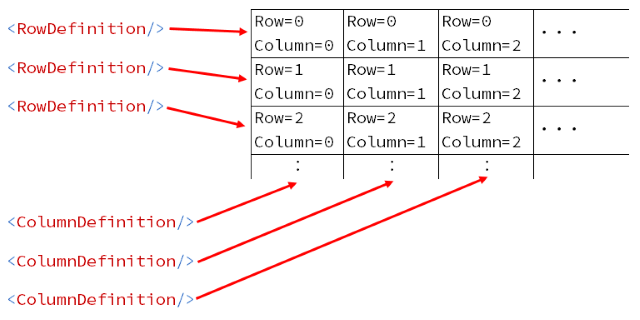
RowDefinitionを3つ書いたので3行のグリッドになります。
<Grid.RowDefinitions>
    <RowDefinition/>
    <RowDefinition/>
    <RowDefinition/>
</Grid.RowDefinitions>
Gridタグの中、RowDefinitions定義の下あたりにButtonタグを書きます。
<Button Grid.Row="0" Content="1行目" Margin="10"/>
<Button Grid.Row="1" Content="2行目" Margin="10"/>
<Button Grid.Row="2" Content="3行目" Margin="10"/>
Grid.Rowで何行目に配置するかを指定します。
一番上の行に配置したいなら0、二番目なら1を指定します。
既定値は0です。なのでGrid.Row="0"は省略可能です。
カラム指定は後で説明します。
◇行の高さ指定
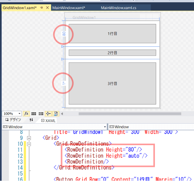
RowDefinitionに高さの指定を付け加えてみます。
<Grid.RowDefinitions>
    <RowDefinition Height="80"/>
    <RowDefinition Height="auto"/>
    <RowDefinition/>
</Grid.RowDefinitions>
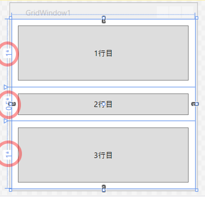
1行目はピクセル指定、2行目のautoは中のコントロールのサイズに合わせた行の高さになります。
3行目は何も指定していないので、既定値の1*になり、使用可能なスペースいっぱいに広がります。
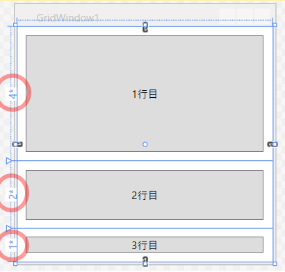
*指定の例をもう少し見ていきましょう。
<Grid.RowDefinitions>
    <RowDefinition Height="4*"/>
    <RowDefinition Height="2*"/>
    <RowDefinition Height="1*"/>
</Grid.RowDefinitions>
この指定の意味は、1*を基準として、2*はその2倍、4*は4倍のスペースを占めるということです。
次の例です。
<Grid.RowDefinitions>
    <RowDefinition/>
    <RowDefinition Height="0.5*"/>
    <RowDefinition Height="*"/>
</Grid.RowDefinitions>
この指定は、1行目と3行目が1*で、2行目がその半分の高さになっています。
*は1*と同じです。
◇列(カラム)
Gridのサンプルの最後に、行と列(カラム)両方使った例をやります。
先ほどと同じように、新しい項目でウィンドウを1つ追加してください。
名前はGridWindow2.xamlにし、以下のように入力します。
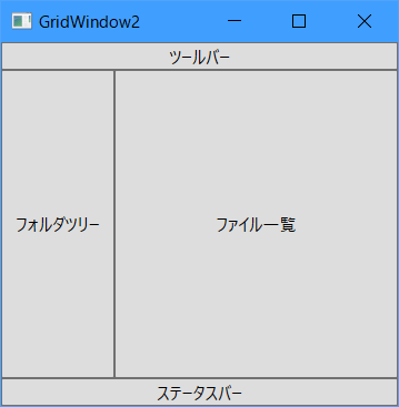
エクスプローラー風の画面レイアウトです。
<Window x:Class="WpfApplication4.GridWindow2"
        xmlns="http://schemas.microsoft.com/winfx/2006/xaml/presentation"
        xmlns:x="http://schemas.microsoft.com/winfx/2006/xaml"
        xmlns:d="http://schemas.microsoft.com/expression/blend/2008"
        xmlns:mc="http://schemas.openxmlformats.org/markup-compatibility/2006"
        xmlns:local="clr-namespace:WpfApplication4"
        mc:Ignorable="d"
        Title="GridWindow2" Height="300" Width="300">
    <Grid>
        <Grid.RowDefinitions>
            <RowDefinition Height="auto"/>
            <RowDefinition/>
            <RowDefinition Height="auto"/>
        </Grid.RowDefinitions>

        <Grid.ColumnDefinitions>
            <ColumnDefinition Width="0.4*"/>
            <ColumnDefinition/>
        </Grid.ColumnDefinitions>

        <Button Content="ツールバー"
                Grid.Row="0" Grid.Column="0" Grid.ColumnSpan="2"/>
        <Button Content="フォルダツリー"
                Grid.Row="1" Grid.Column="0"/>
        <Button Content="ファイル一覧"
                Grid.Row="1" Grid.Column="1"/>
        <Button Content="ステータスバー"
                Grid.Row="2" Grid.Column="0" Grid.ColumnSpan="2"/>
    </Grid>
</Window>
見やすさのため、Row,Columnが0のものも明示的に書いていますが、以下のように省略することもできます。
<Button Content="ツールバー" Grid.ColumnSpan="2"/>
<Button Content="フォルダツリー" Grid.Row="1"/>
<Button Content="ファイル一覧" Grid.Row="1" Grid.Column="1"/>
<Button Content="ステータスバー" Grid.Row="2" Grid.ColumnSpan="2"/>
画面デザイナではこのように表示されます。
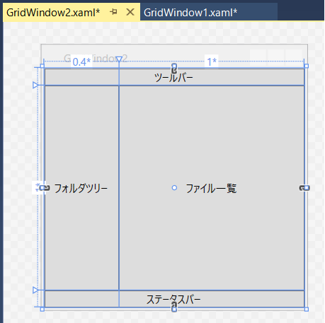
カラム定義も行と大体同じ感じです。
Grid.ColumnDefinitionsタグの中に必要な分だけColumnDefinitionタグを定義します。
ツールバーとステータスバーは2カラム分使っていますが、Grid.ColumnSpan指定をすることでセル結合のようなことができます。
HTMLのテーブルのcolspanと同じようなものです。
行方向のセル結合はGrid.RowSpanで指定します。
■別画面の表示
せっかく複数画面を作ったので、メイン画面から表示してみます。
MainWindow.xamlの画面デザイナで適当にボタンをダブルクリックします。
作成されたボタンクリックのイベントハンドラに以下を入力します。
var window = new GridWindow2();
window.Show();
ツールバーの「開始」を押します。
画面が表示されたら、イベントハンドラを設定したボタンを押します。
GridWindow2が表示されました。
■その他レイアウト
他にもCanvasとかDockPanelとかWrapPanelとかありますが、とりあえずStackPanelとGridを覚えておけば大丈夫です。
おしまい
■参考サイト
- パネルの概要 - MSDN
- StackPanel クラス - MSDN
- Grid クラス - MSDN
- Canvas クラス - MSDN
- DockPanel クラス - MSDN
- WrapPanel クラス - MSDN