画面幅に応じて、2種類の画像が変わっています。
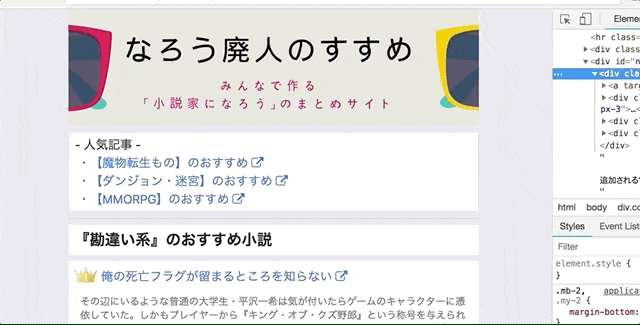
なろう廃人のすすめ
方法
cssで画面のピクセル数に応じて
スマホヘッダー、PCヘッダーのdisplay:block, display:noneを切り替える。
scss
 /* パソコンで見たとき*/
 .pc-header { display: block !important; }
 .sma-header { display: none !important; }
 /* スマートフォンで見たとき*/
 @media only screen and (max-width: 750px) {
 .pc-header { display: none !important; }
 .sma-header { display: block !important; }
 }
haml
bootstra4使ってます。
    .container.p-0
      = link_to image_tag("/assets/images/sma-header.png", width: 'auto', alt: "なろう廃人のすすめ", class: "sma-header header-image container-fluid p-0"), root_path
      = link_to image_tag("/assets/images/pc-header.png", width: 'auto', alt: "なろう廃人のすすめ", class: "pc-header d-block container-fluid mx-auto p-0"), root_path
画像の場所
画像はpublicの中に入れる。
/public/assets/images/sma-header.png
/public/assets/images/pc-header.png
ベストプラクティスが知りたい
この方法ならスマホを横にした時とかも
きちんと画像表示されるけど、
イマドキのベストな方法ってなんだろう。