オサレなコンセプトUIデザインを参考に、Flutterで実際に動くものを作ってみる。
なお完全なクローンになるまでは突き詰めないし、ビジネスロジックとの組み合わせ易さは考慮せず、ハードコードしまくる。
記事に載せているソースコードは一部抜粋。
参考デザイン
ソースコード
https://github.com/KoheiKanagu/identifying_text_app (gifあり)
トップページ
AppBar
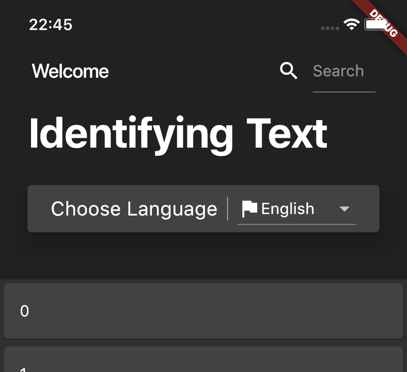
- Listをスクロールすると縮みそうだったのでSliverAppBarを利用
- WelcomeとSearchはAppBarに固定して、常に表示させる
- "Search"のRowはSizedBoxで包んであげないとサイズが0になって表示されなかった
- HeaderContent()でflexibleSpaceのWidgetを作る
- TextFieldはExpandedで包んであげないと表示されなかった
SliverAppBar(
  expandedHeight: 240.0,
  pinned: true,
  title: AppBar(
      title: Row(
        mainAxisAlignment: MainAxisAlignment.spaceBetween,
        children: <Widget>[
          Text("Welcome"),
          SizedBox(
            width: 100,
            child: Row(
              children: <Widget>[
...
                Expanded(
                  child: TextField(
                    decoration: InputDecoration(hintText: "Search"),
                  ),
...
      ),
      elevation: 0),
  flexibleSpace: FlexibleSpaceBar(background: HeaderContent()),
  floating: true,
),
HeaderContent
- MediaQueryからステータスバーのサイズを取ってきてpaddingに追加
- VerticalDividerはContainerで包んでheightを設定しないと表示されなかった
final double statusBarHeight = MediaQuery.of(context).padding.top;

return Container(
  padding: new EdgeInsets.only(
    top: statusBarHeight + 66,
...
  ),
  child: Column(
    crossAxisAlignment: CrossAxisAlignment.start,
    children: <Widget>[
...
      Card(
        margin: EdgeInsets.symmetric(vertical: 28),
        elevation: 20,
        child: Row(
          mainAxisAlignment: MainAxisAlignment.center,
          children: <Widget>[
...
            Container(
              height: 24,
              child: VerticalDivider(
                width: 20,
                color: Colors.white,
              ),
            ),
...
Body
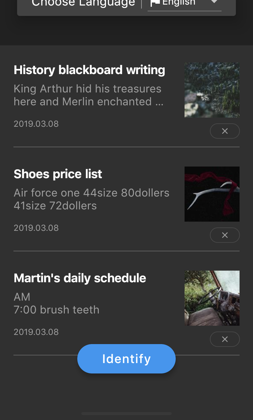
SliverList
- RowとColumnで構成
- xボタンはOutlineButtonをRoundedRectangleBorderで角を丸めつつ、Containerでサイズを調整
Container(
  height: 24,
  width: 48,
  child: OutlineButton(
    child: Icon(
      Icons.close,
      size: 16,
      color: Colors.grey,
    ),
    shape: RoundedRectangleBorder(
        borderRadius: BorderRadius.circular(30)),
  ),
)
Identifyボタン
- FloatingActionButtonをFloatingActionButtonLocation.centerDockedにして設置
- Listより下にスペースがあったのでbottomNavigationBarにSizedBoxで調整
floatingActionButton: FloatingActionButton.extended(
  label: Padding(
    padding: EdgeInsets.symmetric(horizontal: 20),
    child: Text(
      "Identify",
      style: TextStyle(color: Colors.white, fontSize: 20),
    ),
  ),
),
floatingActionButtonLocation: FloatingActionButtonLocation.centerDocked,
bottomNavigationBar: SizedBox(height: 100),
詳細ページ
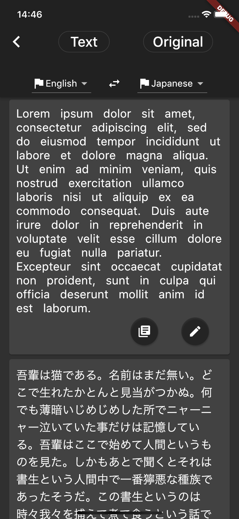
- AppBarにRowでOutlineButtonを並べた
- English <=> JapaneseはAppBarのbottomにPreferredSizeに包んだRowで表現
- ListViewでCardを置いている
- (罫線の出し方がよく分からなかったのでスルーしてしまった... Textのunderlineでは思ってたのとは違ったので、1行分の文章を切り出してContainerに入れてBorder?)
return Scaffold(
    appBar: AppBar(
      title: ButtonTheme(
...
        child: Row(
          mainAxisAlignment: MainAxisAlignment.spaceAround,
          children: <Widget>[
            OutlineButton(
...
          ],
        ),
      ),
      bottom: PreferredSize(
        preferredSize: Size.fromHeight(68),
        child: Row(
          mainAxisAlignment: MainAxisAlignment.center,
          children: <Widget>[
            createDropdownButton("English"),
...
            createDropdownButton("Japanese"),
          ],
        ),
      ),
    ),
    body: ListView(
      padding: EdgeInsets.symmetric(horizontal: 12),
      children: <Widget>[
        createCard(english),
        createCard(japanese),
      ],
    ));