Androidアプリ開発の入門書は、ActivityやらFragment、APIの使い方で終わるケースがほとんどな印象。
layout系知識の基本がまとまった新しめの書籍が欲しいですが、amazon検索は新しくても2014年のものとか出してくるので購入はためらいます。ってことで、勉強がてらまとめてみる。
対象
なんでもいいので入門書1冊を一通り終えたくらいのレベル感の方向けの記事になると思います。
当記事の目標
こんなのを作ってレイアウトのViewGroupとはなんぞやって部分を理解する。
素材先:
ひこちゃんず!
Androidレイアウトの全体像

全体像は上記図が一番つかみやすい.
・View
ウィジェットとよばれる画面部品。ボタン(Button)やテキスト(TextView)などいろいろ。
ウィジットってよんだり、Viewってよんだり、画面部品ってよんだりしますが言っていることはだいたい同じです。
・ViewGroup
Viewの親要素になる。Viewを配置する際に特定のViewGroupの中に配置したほうがレイアウト調整が楽になる。CSSで言うと便利な親要素。
LinearLayoutやConstraintLayoutなど。入門書ではLinearlayoutを使うことが多かった印象ですが、古い様子。。
普段はレイアウトって呼ぶことのほうが多いです。レイアウトだと抽象度が高い表現なんで最初は混乱しますね。
以下羅列
-
View
- TextView
- EditText
- Button
- ImageView
- ListView。。。etc
-
ViewGroup
- FrameLayout
- LinearLayout
- TableLayout
- GridLayout
- RelativeLayout
- ConstraintLayout。。。etc
ViewGroupに関してくやしく
線形レイアウト-- LinearLayout
ViewGroupの一種です。子要素を横方向または縦方向の1行にまとめるレイアウト。
相対レイアウト -- RelativeLayout
子要素の位置を親要素に対して相対的に指定ができる。LinearLayoutよりも柔軟な指定方法ができたリする。
制約レイアウト --ConstraintLayout
Viewの各辺1つ1つに、ほかのViewとの関係性を付けていくことで全体を調整する。最近の入門書ではこれを解説していることも多いかと。
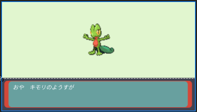
キモリを配置するにはどうするか
さて本題。キモリを配置するにはどうするか。
境界線を考える。
パット見、上側と下側で部品がわかれそうなのでこんな感じで分けてみる。

多分、図にするとこんな感じ。

ViewGroupを3つ使いつつ、上の赤枠内でキモリを中央に配置する。
LinearLayoutでキモリを配置する。
※目的はViewGroupを理解するです。そのため、View部品のコードに関しては省略します。そのうち詳しく書きます。
<LinearLayout xmlns:android="http://schemas.android.com/apk/res/android"
    android:layout_width="match_parent"android:layout_height="match_parent"
    android:orientation="vertical">

    <LinearLayout
        android:layout_width="match_parent"
        android:layout_height="0dp"
        android:layout_weight="7"
        android:orientation="vertical"
        android:gravity="center"
        android:background="#beedbe">

        <ImageView  ~~キモリの画像~~/>

    </LinearLayout>

    <FrameLayout
        android:layout_width="match_parent"
        android:layout_height="0dp"
        android:layout_weight="3"
        android:background="#404251">

        <View ~~下画面の赤枠用部品~~ />

        <TextView ~~おや キモリのようすが の部品~~ />

    </FrameLayout>
</LinearLayout>
(TextViewが長いので若干の修正は加えたいと思いつつ)。。。。
図の通りの記載方法で再現ができました。
まず、一番大枠のLinearLayoutのViewGroupで
android:orientation="vertical"
を指定して、子要素のViewGroup二つを垂直に配置します。子要素のViewGroupたちには
android:layout_weight
をつかって、7:3の割合で画面を分割してます。
せっかくなので、一番下のViewGroupもLinearLayoutにしたかったのですが赤枠を表現することが大変そうだったのでこちらを参考にFrameLayoutで行いました。
RelativeLayoutでキモリを配置する。
方法はほぼ同じ
<RelativeLayout xmlns:android="http://schemas.android.com/apk/res/android"
    android:layout_width="match_parent"
    android:layout_height="match_parent">
    <RelativeLayout
        android:id="@+id/ViewGroup1"
        android:layout_width="match_parent"
        android:layout_height="280dp"
        android:background="#e1f6cf" >
        <ImageView
            android:layout_centerInParent="true"
             ~~キモリの画像~~/>
    </RelativeLayout>
    <FrameLayout
        android:layout_below="@+id/ViewGroup2"
        android:id="@+id/ViewGroup2"
        android:layout_width="match_parent"
        android:layout_height="match_parent"
        android:background="#404251">
        <View ~~下画面の赤枠用部品~~ />

        <TextView ~~おや キモリのようすが の部品~~ />

    </FrameLayout>

</RelativeLayout>
ViewGroupたちへの属性から見ていきま。
RelativeLayoutは親要素に対して子要素をどう配置するかを考える。
- 一番上のViewGroupがRelativeLayout
- 赤枠ViewGroupもRelativeLayout
- 青枠ViewGroupがFrameLayout
今回使っているRelativeLayout特有の属性は下記です。
android:layout_below="@+id/ViewGroup1"
赤枠レイアウトに対して、青枠レイアウトを下に配置するための属性です。コード内ではIDで配置を指定します。
android:layout_centerInParent="true"
キモリの画像に属性を指定しています。これにより、赤枠ViewGroupに対してキモリの画像を中央に配置できます。
ポイントは親にRelative、子に属性を指定すること。
配置方法は属性によって決まるので、詳しい属性は下記サイトの真ん中らへんにまとまってます。
てっくあかでみー
ConstraintLayoutでキモリを配置する
<androidx.constraintlayout.widget.ConstraintLayout
    xmlns:android="http://schemas.android.com/apk/res/android"
    xmlns:app="http://schemas.android.com/apk/res-auto"
    android:layout_width="match_parent"
    android:layout_height="match_parent">

    <androidx.constraintlayout.widget.ConstraintLayout
        android:id="@+id/main_battle_area"
        android:layout_width="match_parent"
        android:layout_height="0dp"
        android:background="#e1f6cf"
        app:layout_constraintBottom_toTopOf="@+id/guideline"
        app:layout_constraintEnd_toEndOf="parent"
        app:layout_constraintStart_toStartOf="parent"
        app:layout_constraintTop_toTopOf="parent">

        <ImageView
            android:layout_width="160dp"
            android:layout_height="160dp"
            android:src="@drawable/kimori_01"
            app:layout_constraintBottom_toBottomOf="parent"
            app:layout_constraintEnd_toEndOf="parent"
            app:layout_constraintStart_toStartOf="parent"
            app:layout_constraintTop_toTopOf="parent" />

    </androidx.constraintlayout.widget.ConstraintLayout>

    <androidx.constraintlayout.widget.Guideline
        android:layout_width="wrap_content"
        android:layout_height="wrap_content"
        android:id="@+id/guideline"
        app:layout_constraintGuide_percent="0.7"
        android:orientation="horizontal"/>

    <FrameLayout
        android:id="@+id/frameLayout2"
        android:layout_width="match_parent"
        android:layout_height="0dp"
        android:background="#404251"
        android:padding="3dp"
        app:layout_constraintBottom_toBottomOf="parent"
        app:layout_constraintEnd_toEndOf="parent"
        app:layout_constraintStart_toStartOf="parent"
        app:layout_constraintTop_toBottomOf="@+id/guideline" >

        <View ~~下画面の赤枠用部品~~ />

        <TextView ~~おや キモリのようすが の部品~~ />

    </FrameLayout>
</androidx.constraintlayout.widget.ConstraintLayout>
長いですね。ConstraintLayoutはAndroidStudioのデザイン機能を使ってグラフィカルに操作することが多いと思うので詳細は省こうかと。
app:layout_constraintBottom_toBottomOf="parent"
layout_constraintHOGEHOGEの部分でどこの部品と関係付けるか指定しています。
このレイアウトのメリットは以下なよう
- レスポンシブデザイン(画面サイズに応じたデザイン)に対応しやすい
- ネストが浅くなるので処理が速くなる
ConstraintLayoutは使用経験がないので、あくまでらしいです。
ネストが深くなる=悪というのは昔からあるようなので、今後増えていくと予想されてますね。
おわり
最近ポケモンエメラルドのバトルタワーをやってます。この時代のゲーム画面なら表現できるのではと試しにまとめてみました。
書いている際に見つけた下記サイトがとても役に立った。FrameLayoutは結構パクりました。
(残念ながら途中で疾走してそうなのですが。。。)
次回はView部品を詳しくかけたらなと考えております。