概要
LSTMによる時系列データの異常検知を行う。
参考文献 [1] のReNomチュートリアルの内容を参考にしつつ、Kerasを用いて実装した。
大まかな流れは以下の通り。
Step1
正常なデータを用いて、過去のデータから未来の値を予測するモデルを作る。
Step2
作成したモデルを使ってテストデータで予測を行い、誤差ベクトルをサンプリングする。そして、誤差ベクトルに正規分布をフィッティングする。
Step3
異常が発生したと思われる箇所の誤差ベクトルを計算し、Step2で推定した正規分布の裾に誤差ベクトルがあれば、異常が発生したと判断する。
必要なライブラリのインポート
%matplotlib inline
import keras
import matplotlib.pyplot as plt
import pandas as pd
import numpy as np
from sklearn.preprocessing import StandardScaler
データの確認と前処理
qtdb/sel102 ECG dataset [2] という心電図データを用いる。
データは以下で取得できる。
df = pd.read_csv('qtdbsel102.txt', header=None, delimiter='\t')

print(df.shape)
(45000, 3)
今回は、3列目のデータに注目して異常検知を行う。
ecg = df.iloc[:,2].values
ecg = ecg.reshape(len(ecg), -1)
print("length of ECG data:", len(ecg))
length of ECG data: 45000
データの前処理として、平均を0、分散を1に合わせる。
scaler = StandardScaler()
std_ecg = scaler.fit_transform(ecg)
傾向の確認
次に、データを図示して傾向を確認する。
plt.figure()

plt.style.use('ggplot')
plt.figure(figsize=(15,5))
plt.xlabel('time')
plt.ylabel('ECG\'s value')
plt.plot(np.arange(45000), std_ecg[:45000], color='b')
plt.legend()

plt.show()
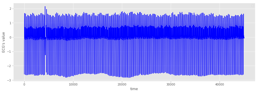
全体的には周期的になっているが、5000ステップ手前で一か所形状が崩れていることが分かる。
そこで、0ステップから5000ステップにグラフを拡大してみる。
異常箇所の確認
plt.figure()

plt.style.use('ggplot')
plt.figure(figsize=(15,5))
plt.xlabel('time')
plt.ylabel('ECG\'s value')
plt.plot(np.arange(5000), std_ecg[:5000], color='b')
plt.ylim(-3, 3)
x = np.arange(4200,4400)
y1 = [-3]*len(x)
y2 = [3]*len(x)
plt.fill_between(x, y1, y2, facecolor='g', alpha=.3)
plt.legend()

plt.show()
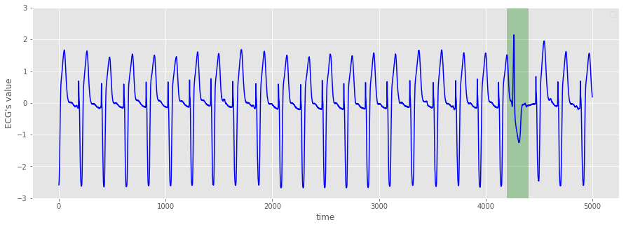
緑で塗りつぶした箇所で周期性が崩れていることが分かる。
今回の具体的な目標は以下の通り。
- 緑の箇所を異常と判定し、検出する。
正常データの取り出し
正常データのみで学習するために、5000ステップ以降のデータを取り出す。
normal_cycle = std_ecg[5000:]
データ分割のためのジェネレータ
所持しているデータを、学習データ、検証データ、テストデータに分割するため、以下のジェネレータを用意する。
なお、ここでは10個のデータから次の3個のデータを予測する。
注) delayとstepは今回は用いない。それぞれ、「delay後のデータを予測する」、「stepおきにデータを使用する」という意味。
def generator(data, lookback, delay, pred_length, min_index, max_index, shuffle=False,
              batch_size=100, step=1):
    if max_index is None:
        max_index = len(data) - delay - pred_length - 1
    i = min_index + lookback

    while 1:
        if shuffle:
            rows = np.random.randint(min_index + lookback, max_index,
                                    size=batch_size)
        else:
            if i + batch_size >= max_index:
                i = min_index + lookback
            rows = np.arange(i, min(i + batch_size, max_index))
            i += len(rows)

        samples = np.zeros((len(rows),
                               lookback//step,
                               data.shape[-1]))

        targets = np.zeros((len(rows), pred_length))

        for j, row in enumerate(rows):
            indices = range(rows[j] - lookback, rows[j], step)
            samples[j] = data[indices]
            targets[j] = data[rows[j] + delay : rows[j] + delay + pred_length].flatten()

        yield samples, targets
lookback = 10
pred_length = 3
step = 1
delay = 1
batch_size = 100

# 訓練ジェネレータ
train_gen = generator(normal_cycle,
                     lookback=lookback,
                     pred_length=pred_length,
                     delay=delay,
                     min_index=0,
                     max_index=20000,
                     shuffle=True,
                     step=step,
                     batch_size=batch_size)

val_gen = generator(normal_cycle,
                   lookback=lookback,
                   pred_length=pred_length,
                   delay=delay,
                   min_index=20001,
                   max_index=30000,
                   step=step,
                   batch_size=batch_size)


# 検証データセット全体を調べるためにval_genから抽出する時間刻みの数
val_steps = (30001 - 20001 -lookback) // batch_size

# その他は、テストデータ
学習
ここでは、LSTMを二つ重ねたモデルを使用する。
LSTMは、時系列データに適したニューラルネットである。
最終5ステップのみ結果を載せる。
import keras
from keras.models import Sequential
from keras import layers
from keras.optimizers import RMSprop

model = Sequential()
model.add(layers.LSTM(35, return_sequences = True, input_shape=(None,normal_cycle.shape[-1])))
model.add(layers.LSTM(35))
model.add(layers.Dense(pred_length))

model.compile(optimizer=RMSprop(), loss="mse")
history = model.fit_generator(train_gen,
                              steps_per_epoch=200,
                              epochs=60,
                              validation_data=val_gen,
                              validation_steps=val_steps)
Epoch 56/60
200/200 [==============================] - 3s 17ms/step - loss: 0.0037 - val_loss: 0.0043
Epoch 57/60
200/200 [==============================] - 3s 17ms/step - loss: 0.0039 - val_loss: 0.0045
Epoch 58/60
200/200 [==============================] - 3s 17ms/step - loss: 0.0036 - val_loss: 0.0047
Epoch 59/60
200/200 [==============================] - 3s 17ms/step - loss: 0.0036 - val_loss: 0.0043
Epoch 60/60
200/200 [==============================] - 3s 17ms/step - loss: 0.0036 - val_loss: 0.0038
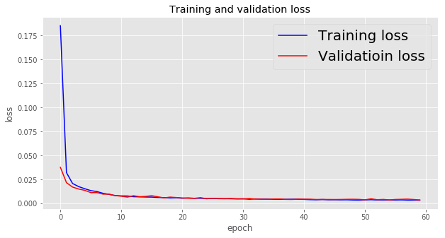
学習データと検証データにおける損失値の推移を以下に示す。
loss = history.history["loss"]
val_loss = history.history["val_loss"]

epochs = range(len(loss))

plt.figure(figsize=(10,5))

plt.plot(epochs, loss, "b", label="Training loss")
plt.plot(epochs, val_loss, "r", label="Validatioin loss")
plt.xlabel("epoch")
plt.ylabel("loss")
plt.title("Training and validation loss")
plt.legend(fontsize=20)

plt.show()
テストデータによるモデルの評価
テストデータにおける予測値と目標値を用意する。
test_gen_pred = generator(normal_cycle,
                    lookback=lookback,
                    pred_length=pred_length,
                    delay=delay,
                    min_index=30001,
                    max_index=None,
                    step=step,
                    batch_size=batch_size)

test_steps = (len(normal_cycle) - 30001 - lookback) // batch_size

test_pred = model.predict_generator(test_gen_pred, steps=test_steps)
test_gen_target = generator(normal_cycle,
                    lookback=lookback,
                    pred_length=pred_length,
                    delay=delay,
                    min_index=30001,
                    max_index=None,
                    step=step,
                    batch_size=batch_size)

test_target = np.zeros((test_steps * batch_size , pred_length))

for i in range(test_steps):
    test_target[i*batch_size:(i+1)*batch_size] = next(test_gen_target)[1]
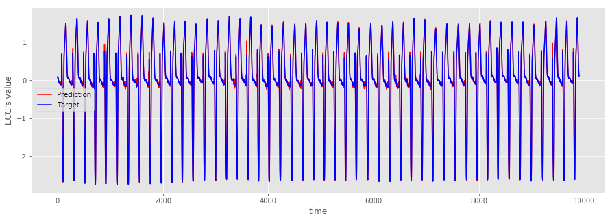
以下で、mseを評価する。モデルが適切であることが確認できる。
from sklearn.metrics import mean_squared_error

print(mean_squared_error(test_pred, test_target))
0.0032039127006786993
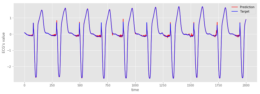
念のため、グラフでも確認する。
plt.figure(figsize=(15,5))


plt.plot(range(len(test_pred[0:2000,0])), test_pred[0:2000,0], "r", label="Prediction")
plt.plot(range(len(test_target[0:2000,0])), test_target[0:2000,0], "b", label="Target")
plt.xlabel("time")
plt.ylabel('ECG\'s value')
plt.legend(fontsize=10)

plt.show()
plt.figure(figsize=(15,5))

plt.plot(range(len(test_pred[:,0])), test_pred[:,0], "r", label="Prediction")
plt.plot(range(len(test_target[:,0])), test_target[:,0], "b", label="Target")
plt.xlabel("time")
plt.ylabel('ECG\'s value')
plt.legend(fontsize=10)

plt.show()
正規分布のフィッティング
予測値と目標値の誤差 $ e $ が正規分布に従うと仮定する。ただし、3個のデータを予測していたため、$ e $ は3次元のベクトルであり、3次元の正規分布を考える必要がある。
\begin{align*}
    p(e) = N(e| \mu, \Sigma)
\end{align*}
ここで、$\mu$ は平均ベクトル、$ \Sigma $ は分散共分散行列である。一般に、多次元の正規分布は平均ベクトルと分散共分散行列で決定される。
サンプリングしたデータからパラメータ推定を行う。現在、テストデータにおける誤差を10000ステップ分取得できている。
\begin{align*}
    \{ e_1, e_2, ..., e_{10000} \}
\end{align*}
なお、各要素は
\begin{align*}
    e_i = (e_i ^{(1)}, e_i ^{(2)}, e_i ^{(3)} )
\end{align*}
である。
ここでは、パラメータ推定の方法として最尤法を採用する。正規分布の最尤推定量は以下の通りである。
\begin{align*}
    & \hat{\mu} = \frac{1}{N}\sum_{n=1}^{N}e_n \\
    & \hat{\Sigma} = \frac{1}{N}\sum_{n=1}^{N}(e_n-\hat{\mu})(e_n-\hat{\mu})^{\top}
\end{align*}
最尤法による分散共分散行列の推定量は、不変分散共分散行列ではなく標本分散共分散行列になることに注意する。
今回のデータで、それぞれの推定量を求める。
error =  test_pred - test_target
mean = np.mean(error, axis=0)
print(mean)
cov = np.cov(error, rowvar=False, bias=True)
print(cov)
[0.00562191 0.00312449 0.00928306]
[[0.00149367 0.0016201 0.0013881 ]
[0.0016201 0.00302257 0.00310156]
[0.0013881 0.00310156 0.00496796]]
rowbar=False となっているのは、和の方向を縦にするためである。また、bias=True となっているのは、標本共分散行列を求めるためである。デフォルトでは bias=False となっており、この場合は不変分散共分散行列が求まる。
マハラノビス距離
マハラノビス距離は、先ほどの推定値を用いて以下で定義される。
\begin{align*}
    a(e) = (e-\hat{\mu})^\top \hat{\Sigma}^{-1}(e-\hat{\mu})
\end{align*}
多次元だと分かりづらいが、一次元の場合は以下のようになる。ただし、${\hat{\sigma}^2}$は標本分散である。
\begin{align*}
    a(e) = \frac{(e-\hat{\mu})^2}{\hat{\sigma}^2}
\end{align*}
つまり、$ a(e) $ はサンプルデータが平均値からどれだけ離れているかを表しており、正規分布においてはこの値が大きければ起こる確率が低いイベント、言い換えると異常なイベントが発生したと考えることができる。これにより、異常値を検出することができる。
def Mahalanobis_dist(x, mean, cov):
    d = np.dot(x-mean, np.linalg.inv(cov))
    d = np.dot(d, (x-mean).T)
    return d
異常値の検出
detection_gen_pred = generator(std_ecg,
                   lookback=lookback,
                   pred_length=pred_length,
                   delay=delay,
                   min_index=0,
                   max_index=5000,
                   step=step,
                   batch_size=batch_size)

detection_steps = (5000 -lookback) // batch_size

detection_pred = model.predict_generator(detection_gen_pred, steps=detection_steps)
detection_gen_target = generator(std_ecg,
                   lookback=lookback,
                   pred_length=pred_length,
                   delay=delay,
                   min_index=0,
                   max_index=5000,
                   step=step,
                   batch_size=batch_size)

detection_target = np.zeros((detection_steps * batch_size , pred_length))

for i in range(detection_steps):
    detection_target[i*batch_size:(i+1)*batch_size] = next(detection_gen_target)[1]
誤差ベクトルを用意して、マハラノビス距離を求める。
error_detection = detection_pred - detection_target

m_dist = []

for e in error_detection:
    m_dist.append(Mahalanobis_dist(e, mean, cov))
結果は以下の通り。
fig, axes = plt.subplots(nrows=2, figsize=(15,10))

axes[0].plot(std_ecg[:5000],color='b',label='original data')
axes[0].set_xlabel('time')
axes[0].set_ylabel('ECG\'s value' )
axes[0].set_xlim(-250, 5250)
axes[0].set_ylim(-3, 3)
x = np.arange(4200,4400)
y1 = [-3]*len(x)
y2 = [3]*len(x)
axes[0].fill_between(x, y1, y2, facecolor='g', alpha=.3)

axes[1].plot(m_dist, color='r',label='Mahalanobis Distance')
axes[1].set_xlabel('time')
axes[1].set_ylabel('Mahalanobis Distance')
axes[1].set_xlim(-250, 5250)
axes[1].set_ylim(0, 1000)
y1 = [0]*len(x)
y2 = [1000]*len(x)
axes[1].fill_between(x, y1, y2, facecolor='g', alpha=.3)

plt.legend(fontsize=15)
plt.show()
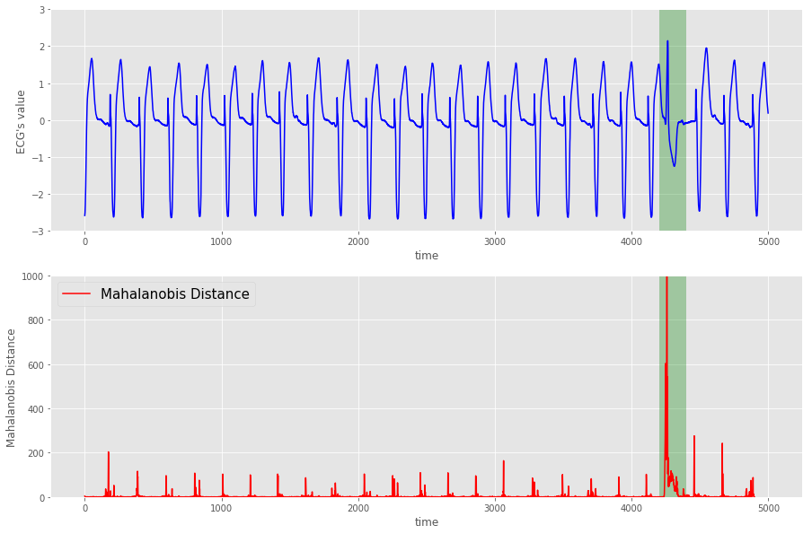
緑の箇所でマハラノビス距離が大きくなっていることが分かる。つまり、(感覚的には)異常を検知できたことになる。
閾値の設定1
上記は定性的な判断で異常値を検出しているが、自動で異常値を検出するためには何らかの閾値を設定する必要がある。
マハラノビス距離に関して、以下の事実が知られている。
$M$次元正規分布 $N({x} | {\mu}, {\Sigma})$ からの,$N$ 個の独立標本 $\left\{ {x}_i , | , i=1,2,...,N \right\}$ に基づき,標本平均 $\hat{{\mu}}$ および,標本分散共分散行列 $\hat{{\Sigma}}$ を求める.このとき,新たな観測値 ${x}^{\prime}$ について,以下が成立する.
- $T^2 = \frac{N-M}{(N+1)M} a({x}^{\prime})$ によって定義される統計量 $T^2$ は,自由度 $(M,N-M)$ のF分布に従う.
- $N \gg M$ の場合は,$a({x}^{\prime})$ は近似的に自由度 $M$ のカイ2乗分布に従う.
詳細については、参考文献 [2] を参照のこと。
この事実を信じて、閾値の設定に利用することにする。
今回のケースでは、$M = 3$, $ N = 10000 $ であるから、$N \gg M $ と考えて問題ないであろう。
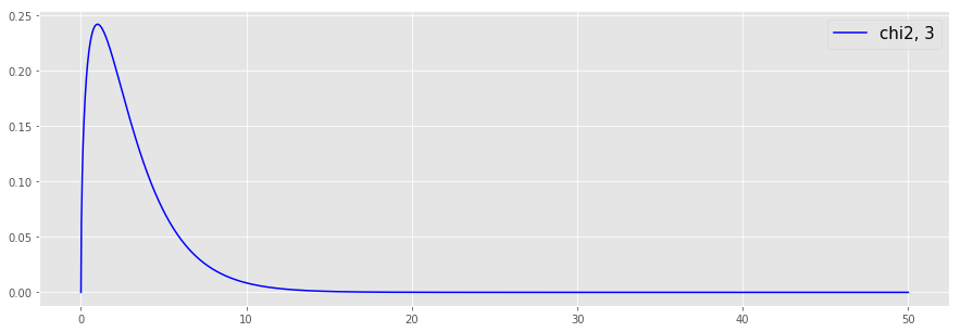
以後、$ a(e) $ が自由度3のカイ2乗分布に従うと仮定する。まずは、自由度3のカイ2乗分布を確認する。
from scipy import stats
x = np.linspace(0, 50, 2000)

plt.figure(figsize=(15,5))

plt.style.use('ggplot')

plt.plot(x, stats.chi2.pdf(x, 3), "b", label="chi2, 3")
plt.legend(fontsize=15)

plt.show()
続いて、上側1%点を求める。
a_99 = stats.chi2.ppf(0.99, 3)
print(a_99)
11.344866730144373
これを閾値として採用し、この値を超えた場合に異常値と判断する。
plt.figure(figsize=(15,5))

plt.style.use('ggplot')

plt.plot(m_dist, color='r',label='Mahalanobis Distance')
plt.xlabel('time')
plt.ylabel('Mahalanobis Distance')
plt.xlim(-250, 5250)
plt.ylim(0, 300)

plt.plot(np.linspace(-250, 5250), [a_99] * len(np.linspace(-250, 5250)), 'b')

plt.legend(fontsize=15)

plt.show()
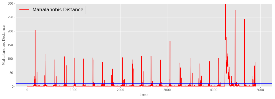
なんだか微妙である。言われてみればそんな気もするが、これでは柔軟性に欠ける。
閾値の設定2
ということで、別の方法を試すことにする。次の方法は、データに応じた最適な閾値を探そうというものである。
保有しているデータで正常or異常のラベル付けが可能ないしは既に為されている場合を想定する。
以下の内容は、参考文献 [3] を参考にしている。
準備のために、今回のデータでラベル付けを行う。ここでは、0~5000のデータを対象とし、4200~4400を異常値とする。
m_dist_th = np.zeros(4910)
m_dist_th[10:4910] = m_dist
TF_label = np.zeros(4910)
TF_label[4200:4400] = 1
閾値を設定することで、以下の値を得る。ただし、右辺は条件を満たすデータの個数を表すものとする。
\begin{align*}
    & TP = (\, Label:positive, \quad Prediction:positive \, )\\
    & FP = (\, Label:negative, \quad Prediction:positive \, )\\
    & FN = (\, Label:positive, \quad Prediction:negative \, )\\
    & TN = (\, Label:negative, \quad Prediction:negative \, )
\end{align*}
さらに、以下の指標を導入する。
\begin{align*}
    & precision = \frac{TP}{TP + FP} \\
    & recall = \frac{TP}{TP + FN} \\
    & F_{\beta} = (1+\beta^2) \frac{precision \cdot recal}{(\beta^2 \cdot precision) + recall}
\end{align*}
$F_{\beta}$ を最大化する閾値を探す。まずは、$F_{\beta}$を返す関数を定義する。
def f_score(th, TF_label, m_dist_th, beta):
    TF_pred = np.where(m_dist_th > th, 1, 0)
    TF_pred = 2 * TF_pred

    PN = TF_label + TF_pred

    TN = np.count_nonzero(PN == 0)
    FN = np.count_nonzero(PN == 1)
    FP = np.count_nonzero(PN == 2)
    TP = np.count_nonzero(PN == 3)

    precision = TP/(TP + FP)
    recall = TP/(TP+FN)

    return (1+beta**2)*precision*recall/(beta**2*precision + recall)
以下、$\beta = 0.1$ とする。閾値0~1000に対する$F_{0.1}$を図示する。
th_line = np.linspace(0, 1000, 5000)

dx = 0.2

f_score_graph = []

for i in range(5000):
    f_score_graph.append(f_score(dx * i, TF_label, m_dist_th, 0.1))

plt.figure(figsize=(15,5))
plt.style.use('ggplot')
plt.plot(th_line, f_score_graph, color='g', label = "f_score")
plt.legend(fontsize=15)
plt.show()
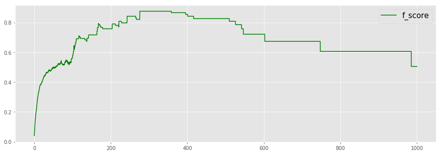
$F_{0.1}$が最大となる閾値を求める。
from scipy import optimize

def minus_f_score(th, TF_label, m_dist_th, beta):
    return -f_score(th, TF_label, m_dist_th, beta)

ave_m_dist_th = np.average(m_dist_th)

opt_th = optimize.fmin_powell(minus_f_score, ave_m_dist_th, (TF_label, m_dist_th, 0.1))
print(opt_th)
Optimization terminated successfully.
Current function value: -0.875333
Iterations: 2
Function evaluations: 86
309.19475611029304
plt.figure(figsize=(15,5))

plt.style.use('ggplot')

plt.plot(m_dist_th, color='r',label='Mahalanobis Distance')
plt.xlabel('time')
plt.ylabel('Mahalanobis Distance')
plt.xlim(-250, 5250)
plt.ylim(0, 1000)

plt.plot(np.linspace(-250, 5250), [opt_th] * len(np.linspace(-250, 5250)), 'b')

plt.legend(fontsize=15)

plt.show()
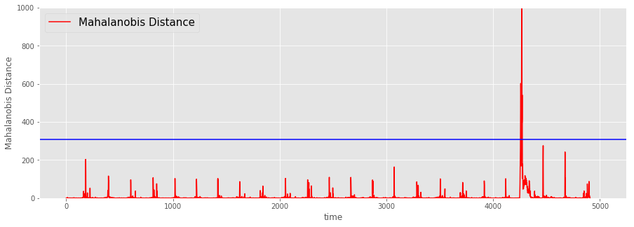
良い感じ。
参考文献
[1] ReNomチュートリアル, LSTMによる時系列データの異常検知, https://www.renom.jp/ja/notebooks/tutorial/time_series/lstm-anomalydetection/notebook.html.
[2] 井出 剛, 入門 機械学習による異常検知 -Rによる実践ガイド-, コロナ社, 2015.
[3] P.Malhotra, L.Vig, G.Shroff and P.Agarwal, Long short term memory networks for anomaly detection in time series, Proceedings. Presses universitaires de Louvain, 2015.