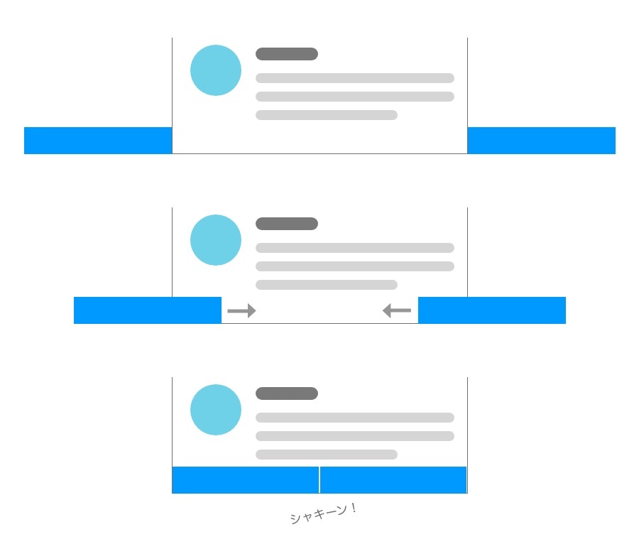
Twitter公式アプリの通知UIが好きなので、CSSで作ってみました。
画面下部にシャキーンって出てくるあれです。
ポイントは、ひとつの長方形をスライドさせて表示するのではなく、2つの長方形を両サイドからスライドさせて衝突させる感じです。
CSS
body {
	overflow: hidden;
}

body::before {
	content: "";
	display: block;
	position: absolute;
	left: -50%;
	bottom: 0;
	width: 50%;
	height: 30px;
	background: #09f;
	animation: cutInLeft 5s ease infinite;
}

body::after {
	content: "";
	display: block;
	position: absolute;
	left: 100%;
	bottom: 0;
	width: 50%;
	height: 30px;
	background: #09f;
	animation: cutInRight 5s ease infinite;
}

@keyframes cutInLeft {
	0% { left: -50%; }
	30% { left: -50%; }
	32% { left: 0%; }
	100%{ left: 0%; }
}

@keyframes cutInRight {
	0% { left: 100%; }
	30% { left: 100%; }
	32% { left: 50%; }
	100%{ left: 50%; }
}
バーの上にテキストやボタンなどを載せたい場合は、バーの表示タイミングにあわせてフェードインするようにします。
使いどころがいまいちわかりませんが、シャキーンとさせたいときに有効です。