CSSアニメーションで円形プログレスバーを作ってみました。JavaScriptやSVG、画像は使っていません。
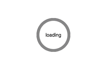
サンプル(GIF)
HTML
<div class="circle"><div class="circle-inner">loading</div></div>
内側の白円が不要な場合は、div.circle-innerは要りません。
CSS
.circle {
	position: relative;
	width: 120px;
	height: 120px;
	background: #333;
	border-radius: 50%;
	text-align: center;
	overflow: hidden;
	z-index: 1;
}

.circle::before {
	content: "";
	display: block;
	position: absolute;
	top: 0;
	left: -60px;
	width: 120px;
	height: 120px;
	background: #999;
	transform-origin: right 60px;
	z-index: 2;
	animation: rotate-circle-left 2s linear forwards;
}

.circle::after {
	content: "";
	display: block;
	position: absolute;
	top: 0px;
	left: 60px;
	width: 120px;
	height: 120px;
	background: #999;
	transform-origin: left 60px;
	z-index: 3;
	animation: rotate-circle-right 2s linear forwards;
}

.circle .circle-inner {
	position: absolute;
	top: 10px;
	left: 10px;
	width: 100px;
	height: 62px;
	padding-top: 38px;
	background: #fff;
	border-radius: 50%;
	z-index: 4;
}

@keyframes rotate-circle-right {
	0%   {
		transform: rotate(0deg);
		background: #999;
	}
	50%  {
		transform: rotate(180deg);
		background: #999;
	}
	50.01% {
		transform: rotate(360deg);
		background: #333;
	}
	100% {
		transform: rotate(360deg);
		background: #333;
	}
}

@keyframes rotate-circle-left {
	0%   { transform: rotate(0deg); }
	50%  { transform: rotate(0deg); }
	100% { transform: rotate(180deg); }
}
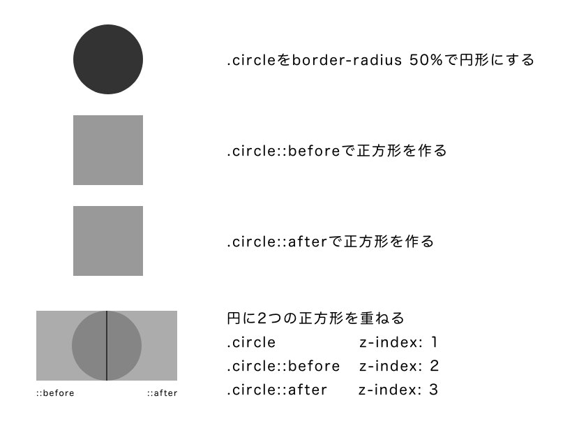
考え方
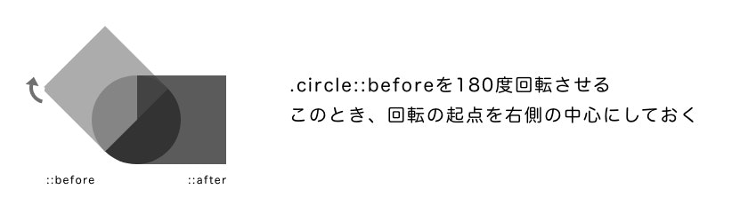
まず、円をひとつ描きます。その上に、左側と右側とに分けて2つ正方形を重ねます。
次に、右側の正方形を180度回転させます(バーは50%のところまで進む)。
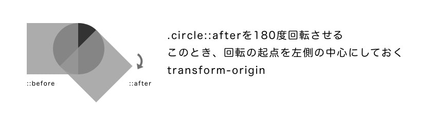
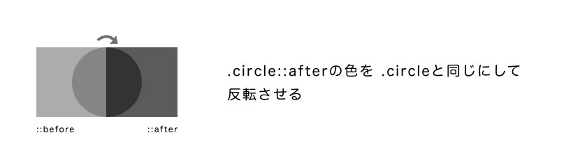
ここで、右側の正方形の色を変えて、瞬間的にさらに180度回転させて元の位置に戻します。
見た目はバーが50%のところまで進んだ状態のままです。
そこから、左側の正方形を180度回転させて、バーを100%のところまで進めます。
animation は 基本的に transform: rotate だけなのでシンプルです。
ループさせたいときはオプションの forwards を infinite に変えて、秒数と keyframes のパーセンテージを調整します。このあたりは好みですね。
50%以下で止めたい場合は ::afterのみを回転させ、50 - 100%の間で止めたい場合は ::beforeの回転角度を調整します。
使用例
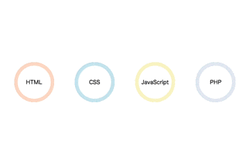
プロフィールページなどに使えるスキルの表示例です。
ローディング画像にも使えるし、他にもいろいろ応用すると表現の幅が広がります。