今まで統計モデリングをちゃんと勉強したことがなかったので、有名な「データ解析のための統計モデリング入門」を勉強してみようと思います。ただこの本、基本的に「R」を使うことを前提に書かれてるわけですが、個人的にPythonが好きなので、出来る限りPythonを使って再現していこうと思います。もちろん同じことをすでにやっている人たちはたくさんいるわけですが、自分でまとめることに意味があると思うので、とりあえずやっていこうと思います。
例題 : 粒子数の統計モデリング
サンプルデータの内容を把握します。必要なデータはhttp://hosho.ees.hokudai.ac.jp/~kubo/ce/IwanamiBook.html よりダウンロードし適当な場所においておきます。
- データの取得
Rのデータのため、pypeRを使ってRコマンドを実行し、それをpython側にpandas形式で取り込みます
# サンプルデータの取得
import pandas as pd
import pyper as pr

workPath = "サンプルデータをおいた場所"
r = pr.R(use_numpy='True', use_pandas='True') #インスタンス作成
r('load("{}/data.RData")'.format(workPath)) #実行
data = pd.Series(r.get('data')) #pandasのSeriesとして格納
- データの把握をする(numpyのarrayとして表示)
import numpy as np
dataNP = np.array(data)
print(dataNP)

# [2 2 4 6 4 5 2 3 1 2 0 4 3 3 3 3 4 2 7 2 4 3 3 3 4 3 7 5 3 1 7 6 4 6 5 2 4
# 7 2 2 6 2 4 5 4 5 1 3 2 3]
- データ数を調べる
print(len(data))
# 50
- データの要約(jupyter notebookで表示)
data.describe()

# count    50.00000
# mean      3.56000
# std       1.72804
# min       0.00000
# 25%       2.00000
# 50%       3.00000
# 75%       4.75000
# max       7.00000
# dtype: float64
- 度数分布を取得
data.value_counts(sort=False)

# 0     1
# 1     3
# 2    11
# 3    12
# 4    10
# 5     5
# 6     4
# 7     4
# dtype: int64
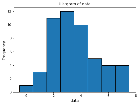
- ヒストグラムを作成
import matplotlib.pyplot as plt
plt.hist(data, bins=np.arange(-0.5, 8.5, 1.0), ec="black")
plt.xlabel('data', fontsize=12)
plt.ylabel('Frequency', fontsize=12)
plt.title('Histgram of data', fontsize=12)
plt.xticks([2*x for x in range(5)])
plt.show()
- 標本分散
print("分散 : {}".format(data.var()))

# 分散 : 2.986122448979592
- 標本標準偏差
print("標準偏差 : {}".format(np.sqrt(data.var())))
# print("標準偏差 : {}".format(np.std(data, ddof=1))) こちらでもOK

# 標準偏差 : 1.728040060004279
参考
- pythonのnumpy.arrayの統計量一覧を表示するワンライナー : https://qiita.com/AnchorBlues/items/051dc69e81705b52adad
- ヒストグラム : https://stats.biopapyrus.jp/python/hist.html
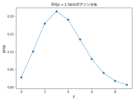
データと確率分布の対応関係をながめる
from scipy import stats
import matplotlib.font_manager
# 日本語表示を可能にする
fontprop = matplotlib.font_manager.FontProperties(fname="/Library/Fonts/ヒラギノ丸ゴ ProN W4.ttc")
# 粒子数がyである確率をリストとして保存
y = np.arange(0, 10)
prob = pd.Series(stats.poisson.pmf(y, 3.56), index=y)
# 折れ線として表示
plt.plot(prob, 'o--')
plt.xlabel('$y$', fontsize=12)
plt.ylabel('prop', fontsize=12)
plt.title('平均$\lambda=3.56$のポアソン分布', fontdict={'fontproperties':fontprop}, fontsize=12)
plt.show()
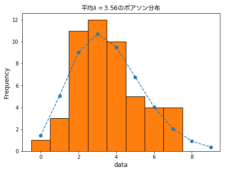
- データと重ねて表示
# 重ねて表示
plt.plot(prob * 50, 'o--')
plt.hist(data, bins=np.arange(-0.5, 8.5, 1.0), ec="black")
plt.xlabel('data', fontsize=12)
plt.ylabel('Frequency', fontsize=12)
plt.title('平均$\lambda=3.56$のポアソン分布', fontdict={'fontproperties':fontprop}, fontsize=12)
plt.show()
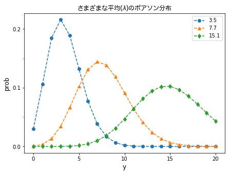
ポアソン分布とは何か?
- ポアソン分布
\begin{aligned}
p(y\ |\ \lambda)=\frac{\lambda^{y}\exp{(-\lambda)}}{y!}
\end{aligned}
- 平均$\lambda$を変えたときのポアソン分布
import matplotlib.ticker as tick
y1 = range(21)
prob1 = pd.Series(stats.poisson.pmf(y1, 3.5), index=y1)
prob2 = pd.Series(stats.poisson.pmf(y1, 7.7), index=y1)
prob3 = pd.Series(stats.poisson.pmf(y1, 15.1), index=y1)
matplotlib.pyplot.rcParams['figure.figsize'] = (7.0, 5.0)
fontprop = matplotlib.font_manager.FontProperties(fname="/Library/Fonts/ヒラギノ丸ゴ ProN W4.ttc")
plt.title("さまざまな平均($\lambda$)のポアソン分布", fontdict = {"fontproperties": fontprop}, fontsize=12)
plt.plot(prob1, 'o--')
plt.plot(prob2, '^--')
plt.plot(prob3, 'd--')
plt.xlabel("y", fontsize=12)
plt.ylabel("prob", fontsize=12)
plt.legend(['3.5','7.7', '15.1'])
plt.xticks([0, 5, 10, 15, 20])
plt.yticks([0.00, 0.10, 0.20])
plt.gca().yaxis.set_minor_locator(tick.MultipleLocator(0.05))
plt.show()
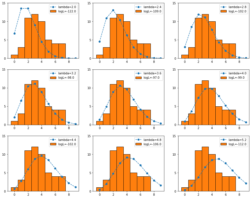
ポアソン分布のパラメータの最尤推定
- 図2.7
matplotlib.pyplot.rcParams['figure.figsize'] = (15.0, 12.0)
x = np.arange(2.0, 5.6, 0.4)
y = np.arange(0, 10)
for i, _x in enumerate(x):
    plt.subplot(3,3,i+1)
    prob = pd.Series(stats.poisson.pmf(y, _x), index=y)
    plt.plot(prob * 50, 'o--')
    plt.hist(data, bins=np.arange(-0.5, 8.5, 1.0), ec="black")
    plt.yticks([0,5,10,15])
    plt.legend(['lambda={}'.format(round(_x,1)), 'logL={}'.format(round(sum(stats.poisson.logpmf(data, _x))), 1)])
plt.show()
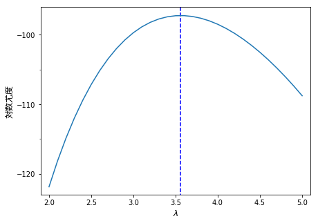
- 図2.8
fontprop = matplotlib.font_manager.FontProperties(fname="/Library/Fonts/ヒラギノ丸ゴ ProN W4.ttc")
matplotlib.pyplot.rcParams['figure.figsize'] = (7.0, 5.0)
x = np.arange(2.0, 5.1, 0.1)
y = [sum(stats.poisson.logpmf(data, _x)) for _x in x]
varlam = pd.Series(y, index=x)

plt.plot(varlam, '-')
plt.xticks([n for n in np.arange(2.0, 5.5, 0.5)])
plt.yticks([-120, -110, -100])
plt.xlim([1.9,5.1])
plt.ylim([-123, -96])
plt.vlines([3.56],-125, -95,  "blue", linestyles='dashed')
plt.xlabel("$\lambda$", fontsize=12,)
plt.ylabel("対数尤度", fontdict = {"fontproperties": fontprop}, fontsize=12)
plt.gca().yaxis.set_minor_locator(tick.MultipleLocator(5.0))
plt.show()
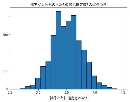
擬似乱数と最尤推定値のばらつき
fontprop = matplotlib.font_manager.FontProperties(fname="/Library/Fonts/ヒラギノ丸ゴ ProN W4.ttc")
matplotlib.pyplot.rcParams['figure.figsize'] = (7.0, 5.0)

result = []
for i in range(3000):
    dummyData = np.random.poisson(lam=3.5, size=50)
    x_sum = np.sum(dummyData)
    varlam = 1/50 * x_sum
    result.append(varlam)

result = pd.Series(result)
plt.hist(result, bins=20, ec='black')
plt.xticks([n for n in np.arange(2.5, 5.0, 0.5)])
plt.yticks([0,100,300])
plt.gca().yaxis.set_minor_locator(tick.MultipleLocator(100))
plt.xlabel('試行ごとに推定された$\lambda$', fontdict={"fontproperties":fontprop}, fontsize=12)
plt.title(r'ポアソン分布の平均$\lambda$の最尤推定値$\bar{\lambda}$のばらつき', fontdict={'fontproperties':fontprop}, fontsize=12)
plt.show()
参考
- Numpyによる乱数生成まとめ : https://qiita.com/yubais/items/bf9ce0a8fefdcc0b0c97
章全体の参考
- 生態学のデータ解析 - 本/データ解析のための統計モデリング入門 : http://hosho.ees.hokudai.ac.jp/~kubo/ce/IwanamiBook.html
- Pythonで「データ解析のための統計モデリング入門」:http://imaimamu.com/archives/1875
- データ解析のための統計モデリング入門 : https://qiita.com/makora9143/items/6ec424776855cfafd724
- matplotlib入門 グラフの体裁を整える : http://yubais.net/doc/matplotlib/modify.html
- matplotlib入門 とりあえず描く : http://yubais.net/doc/matplotlib/introduction.html
- タオルケット体操 覚えるだけでPythonのコードが少し綺麗になる頻出イディオム : http://hachibeechan.hateblo.jp/entry/Python-idiom-101
- ipython notebookでmatplotlibでプロットした図が小さい : https://github.com/eisoku9618/kuroiwa_demos/issues/69