コンテンツページトップ部分
# fafafa、下線1px#ececec
| 種別 |概要|
|:-----------|:------------|:------------|
|h2|20px、游ゴシック color: #666;|
|p|12px、メイリオ color: #000; |
コンテンツページ内部
各プラン要素
| 名称 | 基本スタイル |
|---|---|
| Pro | 背景#1D9256 游ゴシック color: #FFF; |
| Lite | 背景#87D37C 游ゴシック color: #FFF; |
| Mini | 背景#F4D03F 游ゴシック color: #FFF; |
※表記はすべて最初の文字を大文字、後は小文字。
右メニューに関して
・親要素、子要素の2階層で構築
・親子双方文字要素にはページ内リンクを記載
・hover、current等は以下の通り
| 要素|基本スタイル |hover|current|
|:-----------|:------------|:------------|:------------|:------------|
|親|color: #000;font-weight: bold; 14px、メイリオ |background: #288655;color: #FFF;| background: #288655;color: #FFF;|
|子|color: #333;font-weight: normal; 14px、メイリオ |background: #eee;color: #000;| background: #eee;color: #000;|
動作に関して
右メニュー部分が表示ブラウザ領域の丈夫に達した時点から、スクロールと同時にスライド(addClass fixed)
フッター部分へ到達すると同時にスクロールは終了。
親要素は遷移。子要素はページ内遷移が実行される。
コンテンツページTypograh
タイトル要素
| 種別 | 主な使用箇所 | 概要 |
|---|---|---|
| h1 | メインメニュー下部分 | 11px、メイリオ color: #aaa; |
| h2 | コンテンツトップ部分 | 20px、游ゴシック color: #666; |
| h3 | コンテンツ内部 | 22px、游ゴシック color: #000; bold |
| h4 | コンテンツ内部、サイドメニュー | 18px、メイリオ color: #000; bold |
| h5 | コンテンツ内部 | 14px、メイリオ color: #000; bold |
コンテンツ内h3に関して
以下のスタイルを基本とし構築する
h3 {
    font-size: 22px;
    border: none;
    margin: 24px 0;
    padding: 4px 0;
    letter-spacing: inherit;
    font-weight: bold;
    position: relative;
}
h3:after {
    background-color: #1D9256;
    bottom: -6px;
    content: '';
    height: 3px;
    left: 0;
    position: absolute;
    width: 30px;
}
文字要素
| 主な使用箇所 | 概要 |
|---|---|
| コンテンツトップ部分 | 12px color: #666; |
| コンテンツ内部 | 14px、color: #222; |
| サイドメニュー | 14px、color: #333; |
文字要素
| 種別 | 解説 |
|---|---|
| p.基本的な文字要素 | 14px、メイリオ、縦幅のみ基本padding:16px、横幅は外の要素にのみ影響されることとする。line-heightは統一で1.5em。 |
| p.(.notation内)補てん文章等の記述 | 12px、メイリオ、横幅のみpadding:16px、縦幅は中のP要素に影響されることとする。その他記述はなし。 |
.notation {
    background: #eee;
    display: block;
    font-size: 12px;
    padding: 0 16px;
}
リスト要素
| 種別 | 解説 |
|---|---|
| ul.li.基本的なリスト表示 | 14px、メイリオ、縦横padding:16pxで調整。リストスタイルはデフォルト。 |
| ul.li.(.notation内)補てん文章等のリスト記述 | 12px、メイリオ、リストスタイルはデフォルト。 |
button
メインボタン
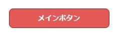
カラー、radius、border、alignは基本変更なし。font-sizeや幅等はコンテンツに合わせて変更可能。最低幅は200とする。
.main_btn {
    margin: 0;
    padding: 8px;
    width: 200px;
    font-size: 14px;
    font-weight: 700;
    color: #fff;
    -webkit-border-radius: 8px;
    -moz-border-radius: 8px;
    -ms-border-radius: 8px;
    -o-border-radius: 8px;
    border-radius: 8px;
    background: #e25a56;
    display: block;
    box-sizing: border-box;
    border: solid 1px #9c201d;
    border-bottom: solid 2px #9c201d;
    text-align: center;
    text-decoration: none;
    }
.main_btn:hover { background: #c73430;text-decoration:none;}
サブボタン
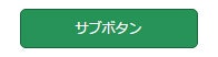
最低幅は160px、それ以外のスタイル変更は基本なし。通常のリンクでは使用せず特別状況下(TOPやコンテンツ等)においてのみ使用可能とする。
.sub_btn {
    background: #269357;
    color: #fff;
    font-size: 12px;
    padding: 8px;
    display: block;
    box-sizing: border-box;
    margin: 0;
    border-radius: 5px!important;
    -webkit-border-radius: 5px!important;
    -moz-border-radius: 5px!important;
    -ms-border-radius: 5px!important;
    -o-border-radius: 5px!important;
    border: solid 1px #18643B;
    border-bottom: solid 2px #18643B;
    text-align: center;
    text-decoration: none;
    width: 160px;
    min-width: 160px;
}
.sub_btn:hover { background: #137641;color:#fff; text-decoration:none;}
margin padding
| 種別 | 解説 |
|---|---|
| margin | 基本は8の倍数で指定。意図的に変更しない場合は16px。 |
| padding | 基本は8の倍数で指定。意図的に変更しない場合は16px。 |
color
| 種別 | 解説 |
|---|---|
| text color | 基本は「color:#333;」で指定。 |
| a | 基本は「color:#22A7F0;」で指定。下線はなし。 |
| a:hover | 基本は「color:#999;」で指定。下線あり。 |
| 背景色(薄灰) | background:#f4f4f4で指定。 |
| 背景色(緑) | background:#1d9256で指定。 |
| 背景色(緑)時text color | 基本は「color:#fff;」で指定。 |
| 背景色(緑)時 a | 基本は「color:#fff;」で指定。下線あり。 |
| 背景色(緑)時 a:hover | 基本は「color:#fefefe;」で指定。下線はなし。 |
:after,float
| 種別 | 解説 |
|---|---|
| float | 特別な理由がない以外は全て左寄せ。 |
| :after | float要素が2つ以上並ぶ場合、それを囲む親要素には特別な場合がない限り「:after」の回りこみ回避スタイルを設置。 |