目次
趣旨
vonBentalanffy
Gompertz
Logistic
Richards
追記
参考
趣旨
講義にて、水産資源学における色々な成長曲線を学んだので、pythonの練習も兼ねて作画してみようと思います。
なお今回はpythonの使用が目的なので、詳細な水産資源学の内容は専門書等をご覧ください。
今回使うpythonのライブラリはmatplotlib.pyplotとnumpyです。
標準で装備されているmathライブラリも使用しています。
リストの内包表現を用いて計算し、その結果を図示します。
内包表記については以下のサイトなどを併せてご覧ください。
この記事は一部、説明が丁寧でない箇所があります(プログラミングや指揮に関する詳細な記述がないです、サンプルコード程度にご高覧ください)。
気づいたら直していこうと思います()
vonBentalanffy
von Bentalanffyの成長曲線は以下の式で表される式です。
$l_{t} = l_{\infty}(1-e^{-K(t-t0)})$
$l_{t}$:t歳の体長
$l_{\infty}$:極限体長
$K$:成長係数
$t_{0}$:原点を調整するためのパラメータ
以下、pythonにおける作画のコードです。
t = list(range(0,25,1))
l_inf = 20 # 極限体長
K = 0.3 # 成長係数

lt = [l_inf*(1-math.e**(-K*i)) for i in t]

plt.plot(t,lt)
plt.show()
結果

では次に成長係数を変化させて図を描いてみます。
成長係数が0.3, 0.5, 0.7の3つの場合の曲線を比較してみます。
t = list(range(0,25,1))
l_inf = 20

K1 = 0.3
K2 = 0.5
K3 = 0.7

lt1 = [l_inf*(1-math.e**(-K1*i)) for i in t]
lt2 = [l_inf*(1-math.e**(-K2*i)) for i in t]
lt3 = [l_inf*(1-math.e**(-K3*i)) for i in t]

fig, ax = plt.subplots()
ax.set_xlabel('t')  # x軸ラベル
ax.set_ylabel('lt')  # y軸ラベル
ax.grid() # 罫線を引く
ax.plot(t, lt1, color="black", label="K=0.3") # 作画
ax.plot(t, lt2, color="red", label="K=0.5") # 作画
ax.plot(t, lt3, color="blue", label="K=0.7") # 作画
ax.legend(loc=0)

plt.show()
結果

Gompertz
Gompertzの成長曲線は以下の式で表されます。
$l_{t} = l_{0}\exp(-e^{-K(t-t_{0})})$
$l_{t}$:t歳の体長
$l_{\infty}$:極限体長
$K$:成長係数
$t_{0}$:変曲点を表すパラメータ
pythonで作図してみましょう、適当な変数を代入して描いてみます。
t = list(range(0,25,1))
l_inf = 20
K = 0.5
t0 = l_inf / math.e # 新たに追加、この式はGompertzの式を微分して導出できます

lt = [l_inf*math.e**(-math.e**(-K*(i-t0)) for i in t]

plt.plot(t,lt)
plt.show()
結果

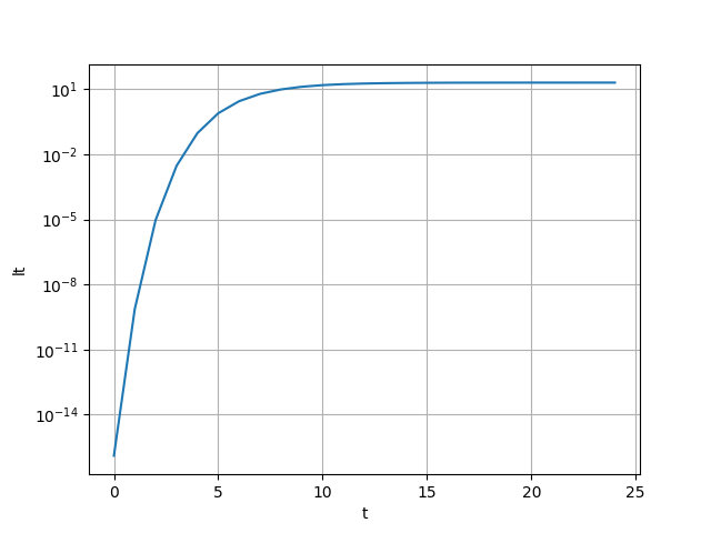
Gompertz式に関して、y軸を対数軸に直してやるとvon Bentalanffy式の形になります。
気になる人は数式をいじってみてください。
以下ではコードと結果のみ示します。
t = list(range(0,25,1))
l_inf = 20
K = 0.5
t0 = l_inf/math.e

lt = [l_inf*math.e**(-math.e**(-K*(i-t0))) for i in t]

fig, ax = plt.subplots()
ax.set_xlabel('t')
ax.set_ylabel('lt')
ax.set_yscale('log') # y軸を対数軸に変更
ax.grid()
ax.plot(t, lt)

plt.show()
結果
Gompertz式に関しても複数の成長係数を比較してみましょう。
成長係数が0.3, 0.5, 0.7の3つの場合の曲線を比較してみます。
t = list(range(0,25,1))
l_inf = 20
t0 = l_inf/math.e

K1 = 0.3
K2 = 0.5
K3 = 0.7

lt1 = [l_inf*math.e**(-math.e**(-K1*(i-t0))) for i in t]
lt2 = [l_inf*math.e**(-math.e**(-K2*(i-t0))) for i in t]
lt3 = [l_inf*math.e**(-math.e**(-K3*(i-t0))) for i in t]

fig, ax = plt.subplots()
ax.set_xlabel('t')
ax.set_ylabel('lt')
ax.grid()
ax.plot(t, lt1, color="black", label="K=0.3")
ax.plot(t, lt2, color="red", label="K=0.5")
ax.plot(t, lt3, color="blue", label="K=0.7")
ax.legend(loc=0)

plt.show()
結果
7ぐらいのところに変曲点があることがわかります。
Gompertz式の変曲点は$\frac{l_\infty}{e}$となることが知られています(微分して導出可能)ので、良さげですね。
Logistic
生態学では御用達、Logistic式です。
Logistic式は以下のように表されます。
$l_{t} = l_{\infty}\left(1+e^{-K(t-t_{0})} \right)^{-1}$
$l_{t}$:t歳の体長
$l_{\infty}$:極限体長
$K$:成長係数
$t_{0}$:変曲点を表すパラメータ
pythonで作図してみましょう、適当な変数を代入して描いてみます。
l_inf = 20
K = 0.5
t_0 = l_inf/2

t = list(range(0,25,1))

lt = [l_inf * (1 + math.exp(-K * (ti - t_0))) ** (-1) for ti in t]

fig, ax = plt.subplots()
ax.set_xlabel('t')
ax.set_ylabel('lt')
ax.grid()
ax.plot(t, lt)

plt.show()
結果

Gompertz式と見比べると...変曲点が少し右にずれていることに気づくかもしれません。
Logistic式の変曲点は$\frac{l_{\infty}}{2}$となることが数式から導出できます。
Logistic式についても複数の成長係数を比較してみましょう。
成長係数が0.3, 0.5, 0.7の3つの場合の曲線を比較してみます。
K1 = 0.3
K2 = 0.5
K3 = 0.7

lt1 = [l_inf * (1 + math.exp(-K1 * (ti - t_0))) ** (-1) for ti in t]
lt2 = [l_inf * (1 + math.exp(-K2 * (ti - t_0))) ** (-1) for ti in t]
lt3 = [l_inf * (1 + math.exp(-K3 * (ti - t_0))) ** (-1) for ti in t]

fig, ax = plt.subplots()
ax.set_xlabel('t')
ax.set_ylabel('lt')
ax.grid()
ax.plot(t, lt1, color="black", label="K=0.3")
ax.plot(t, lt2, color="red", label="K=0.5")
ax.plot(t, lt3, color="blue", label="K=0.7")
ax.legend(loc=0)

plt.show()
結果

Richards
Richards式は以下の式で表されます。
$l_{t} = l_{\infty}(1+re^{-K(t-t_{0})})^{-\frac{1}{r}}$
$l_{t}$:t歳の体長
$l_{\infty}$:極限体長
$K$:成長係数
$t_{0}$:変曲点を表すパラメータ
ここでrは任意の数です。
- r=-1の時にvon Bentalanffy式
- r=0の時にGompertz式
- r=1の時にLogistic式
となります。
pythonで作画してみましょう。$l_{\infty}$と$K$は適当な値を代入しておきます。
$t_{0}$は0としておきます。
t_value = np.arange(-2, 25, 0.1)  # 0から25の範囲を100点でサンプリング
t_value = list(np.round(t_value, 1))
t_value.remove(-0.)
l_inf = 20
K = 0.5
t_0 = 0

fig, ax = plt.subplots()
ax.set_xlabel('t')
ax.set_ylabel('lt')
ax.grid()

r_values = [-1, -1/3, 1, 2, 5, math.inf]  # 描画する r の値を指定

for r in r_values:
    lt_values = [l_inf * (1 + r * math.exp(-K * (t - t_0))) ** (-1/r) for t in t_value]
    ax.plot(t_value, lt_values, label=f"r={r}")

lt_values = [l_inf * math.exp(-math.e ** (-K * (t - t_0))) for t in t_value]
ax.plot(t_value, lt_values, label=f"r=0")

ax.legend(loc=0)
plt.show()
結果
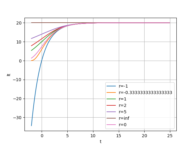
確かにそれぞれの値で、それぞれの曲線に近しい形が出力されていることがわかります。
以上
追記
@Wolfmoon さんがnumpyを活用したコードの訂正を紹介してくださいました。
参考
専門書の例
その他