Odyssey CBTのPython3 エンジニア認定データ分析試験の学習を始めました。今回はMatplotlibとデータの可視化について学習しました。
https://pandas.pydata.org/docs/user_guide/index.html
Matplotlibについて
Matplotlibは2次元のグラフを描写するためのライブラリーです。データを可視化する段階で使用します。 今回はグラフを描写する際はコードオブジェクト指向インターフェースを用います。
グラフの種類
- 折れ線グラフ
- 棒グラフ
- 散布図
- ヒストグラム
- 箱ひげ図
- 円グラフ
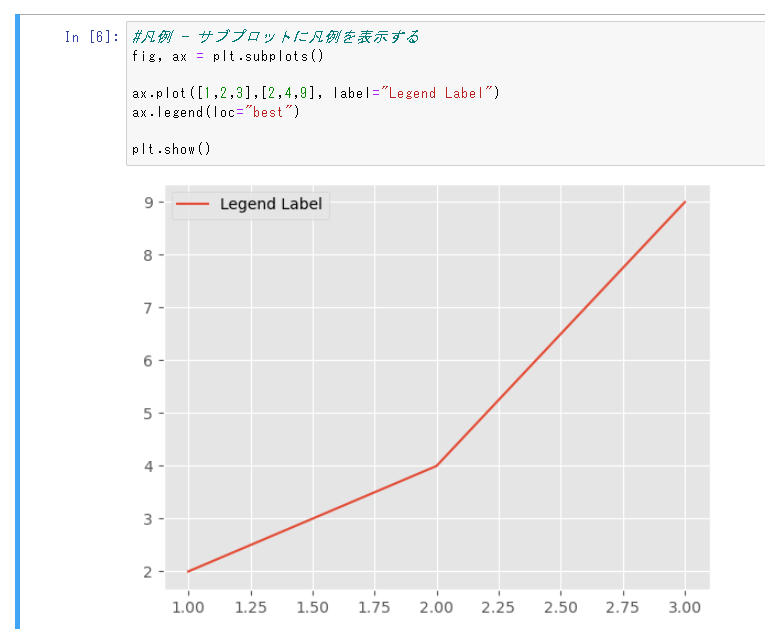
折れ線グラフ
# インポート
import matplotlib.pyplot as plt
import matplotlib.style

# ggplotstyleを指定する
matplotlib.style.use("ggplot")

# データ
x = [1,2,3]
y = [2,4,9]

# プロット
plt.plot(x,y,label="Legend Label")
ax.legend(loc="best")
plt.title("pyplot")

# 表示
plt.show()
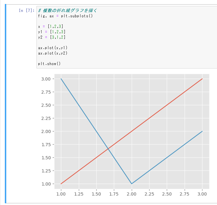
複合折れ線グラフ
# 複数の折れ線グラフを描く
fig, ax = plt.subplots()

x = [1,2,3]
y1 = [1,2,3]
y2 = [3,1,2]

#プロットを2つ重ねるだけで良い
ax.plot(x,y1)
ax.plot(x,y2)

plt.show()
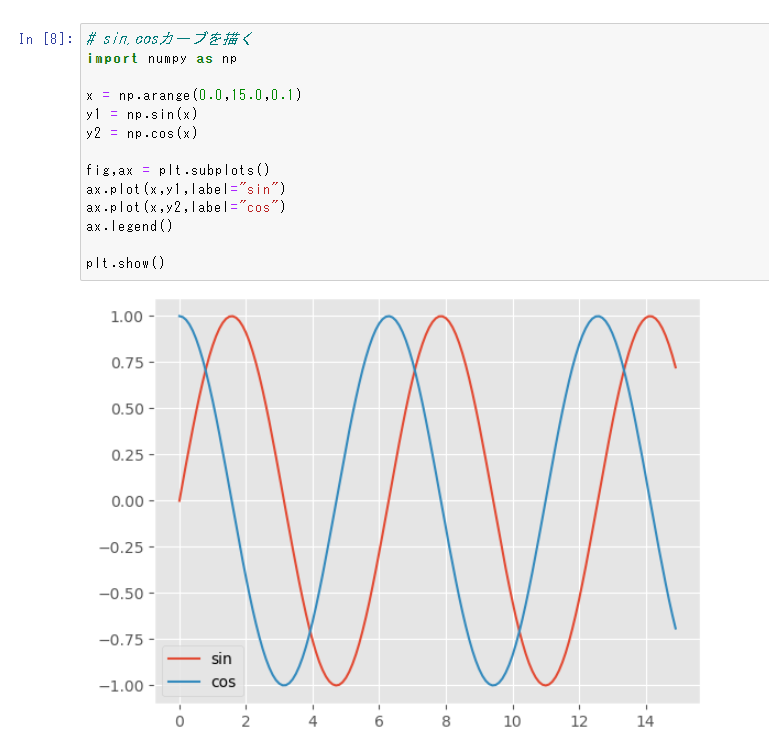
sin・cosカーブ
np.arangeと数学関数を組み合わせれば関数のプロットができる
# sin,cosカーブを描く
import numpy as np

x = np.arange(0.0,15.0,0.1)
y1 = np.sin(x)
y2 = np.cos(x)

fig,ax = plt.subplots()
ax.plot(x,y1,label="sin")
ax.plot(x,y2,label="cos")
ax.legend()

plt.show()
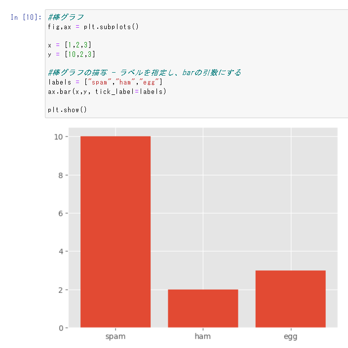
棒グラフ
棒グラフ - 定性データに対応する定量データの表示につかう
#棒グラフ
fig,ax = plt.subplots()

x = [1,2,3]
y = [10,2,3]

#棒グラフの描写 - ラベルを指定し、barの引数にする
labels = ["spam","ham","egg"]
ax.bar(x,y, tick_label=labels)

plt.show()
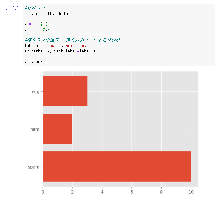
横棒グラフ
#棒グラフ
fig,ax = plt.subplots()

x = [1,2,3]
y = [10,2,3]

#棒グラフの描写 - 横方向のバーにする(barh)
labels = ["spam","ham","egg"]
ax.barh(x,y, tick_label=labels)

plt.show()
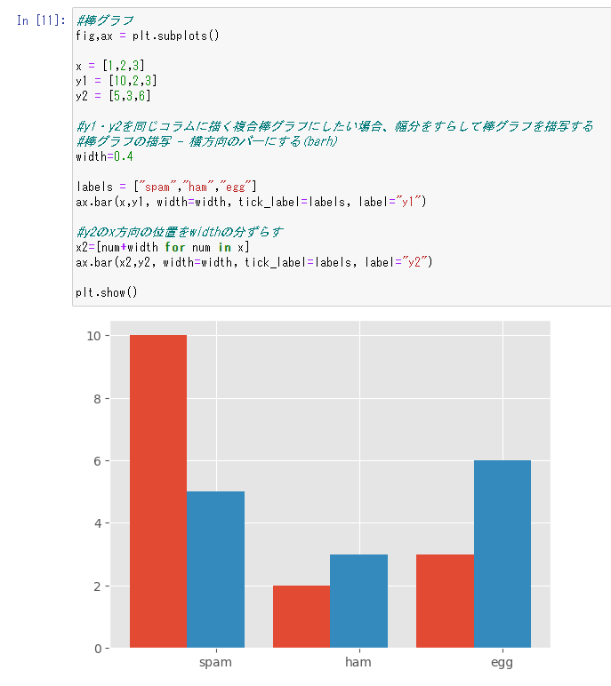
複合棒グラフ
y1・y2を同じコラムに描く複合棒グラフにしたい場合、幅分をすらして棒グラフを描写する
#棒グラフ
fig,ax = plt.subplots()

x = [1,2,3]
y1 = [10,2,3]
y2 = [5,3,6]

#y1・y2を同じコラムに描く複合棒グラフにしたい場合、幅分をすらして棒グラフを描写する
#棒グラフの描写 - 横方向のバーにする(barh)
width=0.4

labels = ["spam","ham","egg"]
ax.bar(x,y1, width=width, tick_label=labels, label="y1")

#y2のx方向の位置をwidthの分ずらす
x2=[num+width for num in x]
ax.bar(x2,y2, width=width, tick_label=labels, label="y2")

plt.show()
積み上げ棒グラフ
棒グラフの値をカテゴリごとに積み上げて表示。y2・y3のベースの座標をそれぞれy1・y2を足した値に合わせる
#積み上げ棒グラフ
fig,ax = plt.subplots()
x = [1,2,3]
y1 = [10,2,3]
y2 = [5,3,6]
y3 = [3,2,8]
labels = ["spam","ham","egg"]
#積み上げ棒グラフを実現するには、y2・y3のベースの座標をそれぞれy1・y2を足した値に合わせる
#y1・y2を足し合わせた値をリストに格納
y1_y2 = [num1 + num2 for num1, num2 in zip(y1,y2)]
ax.bar(x,y1, tick_label=labels, label="y1")
#y2のy方向の位置をy1の分ずらす
ax.bar(x,y2, bottom=y1, label="y2")
#y3のy方向の位置をy1+y2の分ずらす
ax.bar(x,y2, bottom=y1_y2, label="y3")
ax.legend()
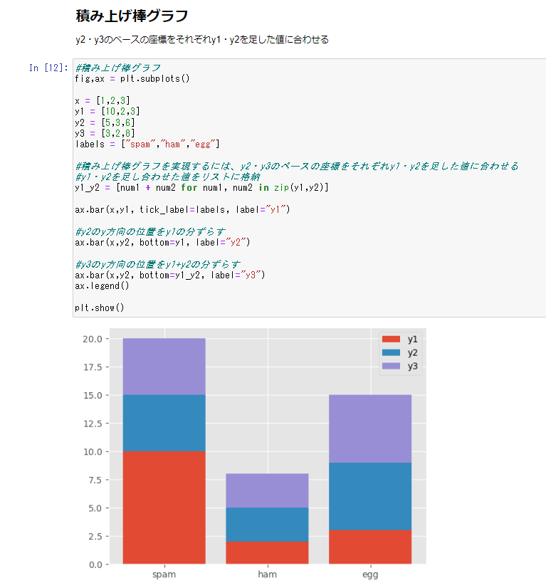
plt.show()
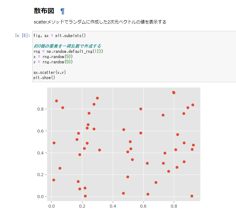
散布図
scatterメソッドでランダムに作成した2次元ベクトルの値を表示する。
値が二次元以上のベクトルである場合、お互いの対応する定量データを表示するのに用いる。
fig, ax = plt.subplots()

#50個の要素を一様乱数で作成する
rng = np.random.default_rng(123)
x = rng.random(50)
y = rng.random(50)

ax.scatter(x,y)
plt.show()
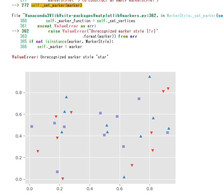
マーカー種の指定 - maker="^"の引数をscatter`加える
#生成した要素のマーカー種を指定する
fig, ax = plt.subplots()

#50個の要素を一様乱数で作成する
rng = np.random.default_rng(123)
x = rng.random(50)
y = rng.random(50)

"下三角"
ax.scatter(x[0:10],y[0:10], marker="v", label="triangle down")
"上三角"
ax.scatter(x[10:20],y[10:20], marker="^", label="triangle up")
"四角"
ax.scatter(x[20:30],y[20:30], marker="s", label="square")
"★"
ax.scatter(x[30:40],y[30:40], marker="star", label="star")
"×"
ax.scatter(x[40:50],y[40:50], marker="x", label="x")
plt.show()
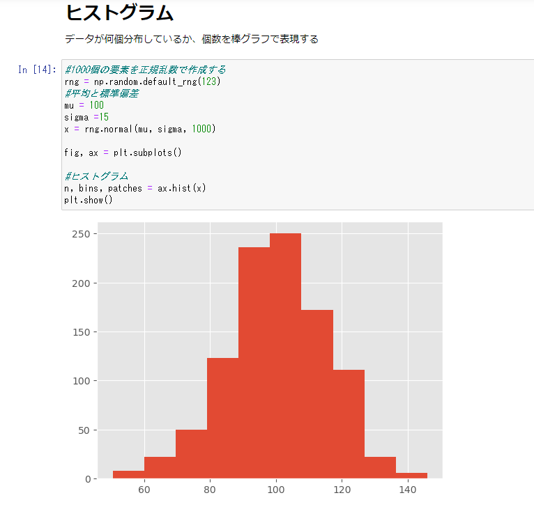
ヒストグラム
データが何個分布しているか、度数あたりの分布を表現する。
#1000個の要素を正規乱数で作成する
rng = np.random.default_rng(123)
#平均と標準偏差
mu = 100
sigma =15
x = rng.normal(mu, sigma, 1000)

fig, ax = plt.subplots()

# ヒストグラム
n, bins, patches = ax.hist(x)
plt.show()
n,binsをfor文で取り出すことで度数分布表を作成できる
#n,binsをfor文で取り出すことで度数分布表を作成できる
for i, num in enumerate(n):
    print(f"{bins[i]:0.2f} - {bins[i+1]:0.2f}:{num}")
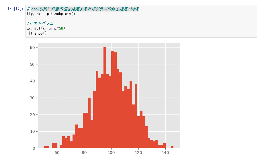
bins引数に任意の値を指定すると棒グラフの数を指定できる
# bins引数に任意の値を指定すると棒グラフの数を指定できる
fig, ax = plt.subplots()

#ヒストグラム
ax.hist(x, bins=50)
plt.show()
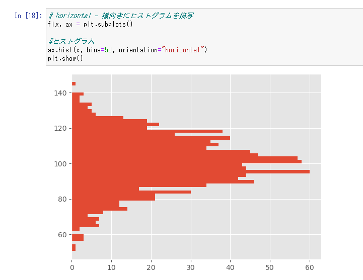
horizontal - 横向きにヒストグラムを描写できる
fig, ax = plt.subplots()

#ヒストグラム
ax.hist(x, bins=50, orientation="horizontal")
plt.show()
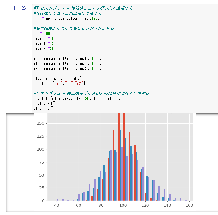
複合ヒストグラム
複数値のヒストグラムを生成する。棒グラフと違い、引数をndarray型のセットにすれば簡単に描ける。
## ヒストグラム - 複数値のヒストグラムを生成する
#1000個の要素を正規乱数で作成する
rng = np.random.default_rng(123)

#標準偏差がそれぞれ異なる乱数を作成する
mu = 100
sigma0 =10
sigma1 =15
sigma2 =20

x0 = rng.normal(mu, sigma0, 1000)
x1 = rng.normal(mu, sigma1, 1000)
x2 = rng.normal(mu, sigma2, 1000)

fig, ax = plt.subplots()
labels = ["x0","x1","x2"]

#ヒストグラム - 標準偏差が小さいと値は平均に多く分布する
ax.hist((x0,x1,x2), bins=25, label=labels)
ax.legend()
plt.show()
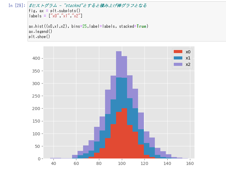
積み上げヒストグラム
"stacked"とすると積み上げ棒グラフの様なヒストグラムにできる
## ヒストグラム - 複数値のヒストグラムを生成する
#1000個の要素を正規乱数で作成する
rng = np.random.default_rng(123)

#標準偏差がそれぞれ異なる乱数を作成する
mu = 100
sigma0 =10
sigma1 =15
sigma2 =20

x0 = rng.normal(mu, sigma0, 1000)
x1 = rng.normal(mu, sigma1, 1000)
x2 = rng.normal(mu, sigma2, 1000)

#ヒストグラム - "stacked"とすると積み上げ棒グラフとなる
fig, ax = plt.subplots()
labels = ["x0","x1","x2"]

ax.hist((x0,x1,x2), bins=25,label=labels, stacked=True)
ax.legend()
plt.show()
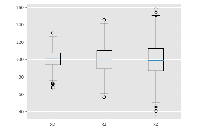
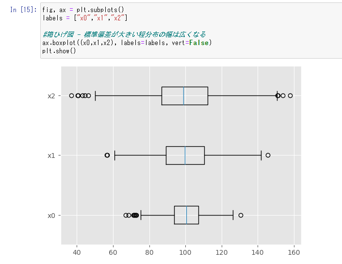
箱ひげ図
株価の表示などによく使われるアレ。分布の最大・25%・50%・75%・最小の値をそれぞれ表現している
#1000個の要素を正規乱数で作成する
rng = np.random.default_rng(123)

#標準偏差がそれぞれ異なる乱数を作成する
mu = 100
sigma0 =10
sigma1 =15
sigma2 =20

x0 = rng.normal(mu, sigma0, 1000)
x1 = rng.normal(mu, sigma1, 1000)
x2 = rng.normal(mu, sigma2, 1000)

fig, ax = plt.subplots()
labels = ["x0","x1","x2"]

#箱ひげ図 - 標準偏差が大きい程分布の幅は広くなる
ax.boxplot((x0,x1,x2), labels=labels)
plt.show()
vert=False - 箱ひげ図を横方向に描く
fig, ax = plt.subplots()
labels = ["x0","x1","x2"]

#箱ひげ図 - 標準偏差が大きい程分布の幅は広くなる
ax.boxplot((x0,x1,x2), labels=labels, vert=False)
plt.show()
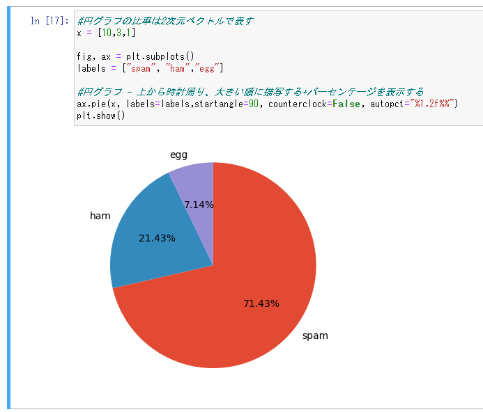
円グラフ
円グラフは度数・合計などの割合を表現できる。グラフの比率は2次元ベクトルで表す。
#円グラフの比率は2次元ベクトルで表す
x = [10,3,1]

fig, ax = plt.subplots()
labels = ["spam", "ham","egg"]

#円グラフ - 上から時計周り、大きい順に描写する+パーセンテージを表示する
ax.pie(x, labels=labels,startangle=90, counterclock=False, autopct="%1.2f%%")
plt.show()
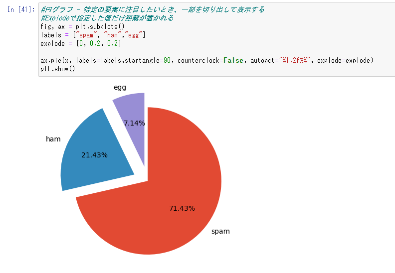
#円グラフ - 特定の要素に注目したいとき、一部を切り出して表示する
#Explodeで指定した値だけ距離が置かれる
fig, ax = plt.subplots()
labels = ["spam", "ham","egg"]
explode = [0, 0.2, 0.2]

ax.pie(x, labels=labels,startangle=90, counterclock=False, autopct="%1.2f%%", explode=explode)
plt.show()