初めに
Flutter には数多くのパッケージが存在し、どれを採用するか迷ってしまうほどです。
今回は navigation_bar に注目して、通常の BottomNavigationBar に加えて、 navigation_bar のパッケージのうち、特に Likes が多い三つを比較したいと思います。
準備
今回は以下の三つのパッケージを使用します。
上記の三つのパッケージのバージョンを「 pubspeck.yaml 」に記述します。
パッケージのバージョンは、特に制約がなければ最新のバージョンで問題ありません。
dependencies:
  flutter:
    sdk: flutter

  convex_bottom_bar: ^3.0.0
  curved_navigation_bar: ^1.0.3
  bottom_navy_bar: ^6.0.0
Pub get をして準備は完了です。
BottomNavigationBar
まずはパッケージを使用しない通常の BottomNavigationBar です。
全体のコードは以下の通りです。
import 'package:flutter/material.dart';
import 'package:flutter_riverpod/flutter_riverpod.dart';

final selectedIndexProvider = StateProvider((ref) => 0);

class BottomNavigationBarExample extends ConsumerWidget {
  const BottomNavigationBarExample({Key? key}) : super(key: key);

  static const List<Icon> iconList = [
    Icon(Icons.home),
    Icon(Icons.settings),
    Icon(Icons.person)
  ];
  static const List<String> titleList = [
    'Home',
    "Settings",
    "Profile",
  ];

  @override
  Widget build(BuildContext context, WidgetRef ref) {

    final selectedIndex = ref.watch(selectedIndexProvider);
    final selectedIndexNotifier = ref.watch(selectedIndexProvider.notifier);

    return Scaffold(
      appBar: AppBar(
        title: const Text('BottomNavigationBar'),
      ),
      body: pageController(selectedIndexNotifier.state),
      bottomNavigationBar: BottomNavigationBar(
        items: <BottomNavigationBarItem>[
          for (int i = 0; i < iconList.length; i++) ...{
            BottomNavigationBarItem(
              icon: iconList[i],
              label: titleList[i],
            ),
          }
        ],
        currentIndex: selectedIndex,
        selectedItemColor: Colors.blue,
        onTap: (index) {
          selectedIndexNotifier.state = index;
        },
      ),
    );
  }
  pageController(i){
    return Center(
      child: Column(
        mainAxisAlignment: MainAxisAlignment.center,
        children: [
          iconList[i],
          Text(titleList[i]),
        ],
      ),
    );
  }
}
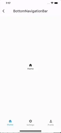
表示結果は以下のようになります。
items
items では BottomNavigationBar のタブに表示させる Widget を指定することができます。
BottomNavigationBarItem のリストを指定することでアイコンやラベルなど、タブに表示させる要素を決定できます。
今回は for 文を用いていますが、icon や label に一つずつ Widget を指定することが多いです。
currentIndex
currentIndex は名前の通り、現在のページの番号 (index) を代入するためのプロパティです。
上のコードでは 初めに selectedIndexProvider というページの番号を管理するための StateProvider を作成し、それを読み取った値を指定しています。
selectedItemColor
selectedItemColor はタブが選択されている時のアイテムの色を指定するためのプロパティです。
上のコードでは、選択されていない時にはアイコンとラベルテキストが黒色であるのに対して、 selectedItemColor に青色を指定しているため、選択されている時にはアイコンとラベルテキストが青色になります。
個人的にはこのプロパティがとても便利だと感じました。
onTap
onTap はタブが押された時のアクションを指定するためのプロパティです。
上のコードでは引数として index を受け取り、その値を selectedIndexNotifier の state に代入することでタブが選択された際に selectedIndex の値が変更されるようにしています。
convex_bottom_bar
次は convex_bottom_bar です。
全体のコードは以下の通りです。
import 'package:convex_bottom_bar/convex_bottom_bar.dart';
import 'package:flutter/material.dart';
import 'package:flutter_riverpod/flutter_riverpod.dart';

final selectedIndexProvider = StateProvider((ref) => 0);

class ConvexBottomBarExample extends ConsumerWidget {
  const ConvexBottomBarExample({Key? key}) : super(key: key);

  static const List<Icon> iconList = [
    Icon(Icons.home),
    Icon(Icons.map),
    Icon(Icons.add),
    Icon(Icons.message),
    Icon(Icons.people),
  ];
  static const List<String> titleList = [
    'Home',
    'Discovery',
    'Add',
    'Message',
    'Profile',
  ];

  @override
  Widget build(BuildContext context, WidgetRef ref) {
    final selectedIndex = ref.watch(selectedIndexProvider);
    final selectedIndexNotifier = ref.watch(selectedIndexProvider.notifier);

    return Scaffold(
      appBar: AppBar(
        title: const Text("ConvexBottomBarExample"),
      ),
      body: pageController(selectedIndexNotifier.state),
      bottomNavigationBar: ConvexAppBar(
        items: [
          for (int i = 0; i < iconList.length; i++) ...{
            TabItem(icon: iconList[i], title: titleList[i]),
          }
        ],
        initialActiveIndex: 0, //optional, default as 0
        onTap: (index) {
          selectedIndexNotifier.state = index;
        },
      ),
    );
  }

  pageController(i) {
    return Center(
      child: Column(
        mainAxisAlignment: MainAxisAlignment.center,
        children: [
          iconList[i],
          Text(titleList[i]),
        ],
      ),
    );
  }
}
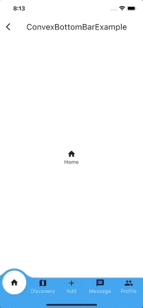
表示結果は以下のようになります。
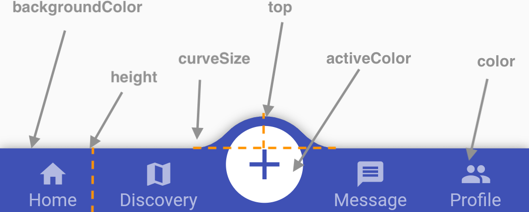
convex_bottom_bar パッケージの 公式ページ に非常にわかりやすい画像がありました。
以下の部分は全てプロパティとして設定可能です。
これらのプロパティの解説は省略します。
items
items は先述した BottomNavigationBar 同様でタブに表示させる Widget を指定するためのプロパティです。 TabItem のリストになっており、アイコンやラベルの指定が可能です。
initialActiveIndex
initialActiveIndex では最初に選択されているタブを指定することが可能です。
デフォルトでは 0 に指定されているため、一番左側のタブが開かれます。
しかし、アプリにおいて中心的な役割を果たすタブや、ユーザの滞在時間が最も長いタブなどが指定されることがあります。
Badges
プロパティとしては用意されていませんが、それぞれのタブに、通知の際などに使用するバッジをつけることができます。
      bottomNavigationBar: ConvexAppBar.badge(
        {
          0: Align(
            alignment: Alignment.topRight,
            child: Container(
                width: 20,
                height: 20,
                decoration: const BoxDecoration(
                    shape: BoxShape.circle, color: Colors.red),
                child: const Center(
                    child: Text(
                  "3",
                  style: TextStyle(color: Colors.white),
                ))),
          )
        },
        items: [
          for (int i = 0; i < iconList.length; i++) ...{
            TabItem(icon: iconList[i], title: titleList[i]),
          }
        ],
        initialActiveIndex: 0, //optional, default as 0
        onTap: (index) {
          selectedIndexNotifier.state = index;
        },
      ),
コードを上のように変更すると、 Align や Container のスタイルが強引ではありますが、以下の画像のようにバッジを表示させることができます。
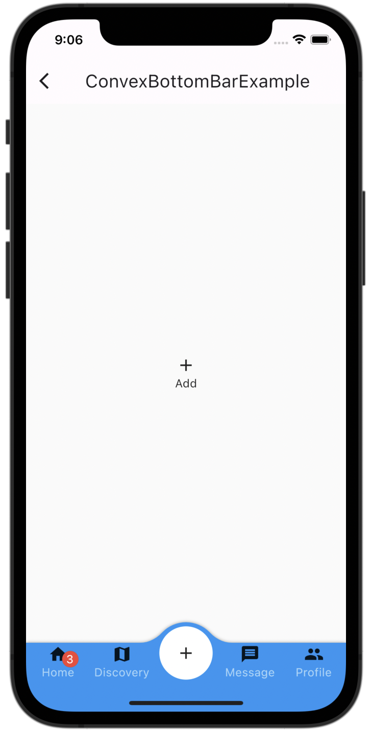
ConvexAppBar.badge({ 0: Text("99+")})
ConvexAppBar.badge()メソッドの引数に Map 型を渡し、バッジを表示させたいタブのインデックスとバッジとして表示させたい Widget を指定することでバッジをつけることができます。
curved_navigation_bar
次は curved_navigation_bar です。
全体のコードは以下の通りです。
import 'package:curved_navigation_bar/curved_navigation_bar.dart';
import 'package:flutter/material.dart';
import 'package:flutter_riverpod/flutter_riverpod.dart';

final selectedIndexProvider = StateProvider((ref) => 0);

class CurvedNavigationBarExample extends ConsumerWidget {
  const CurvedNavigationBarExample({Key? key}) : super(key: key);

  static const List<Icon> iconList = [
    Icon(Icons.add, size: 30, color: Colors.white,),
    Icon(Icons.list, size: 30, color: Colors.white,),
    Icon(Icons.compare_arrows, size: 30, color: Colors.white,),
  ];

  @override
  Widget build(BuildContext context, WidgetRef ref) {

    final selectedIndex = ref.watch(selectedIndexProvider);
    final selectedIndexNotifier = ref.watch(selectedIndexProvider.notifier);

    return Scaffold(
      appBar: AppBar(
        title: const Text("CurvedNavigationBarExample"),
      ),
      bottomNavigationBar: CurvedNavigationBar(
        // buttonBackgroundColor: Colors.blue,
        color: Colors.blue,
        backgroundColor: Colors.white,
        items: iconList,
        onTap: (index) {
          selectedIndexNotifier.state = index;
        },
        index: selectedIndex,
        animationDuration: const Duration(milliseconds: 100),
      ),
      body: pageController(selectedIndexNotifier.state)
    );
  }
  pageController(i) {
    return Center(
      child: Column(
        mainAxisAlignment: MainAxisAlignment.center,
        children: [
          iconList[i],
        ],
      ),
    );
  }
}
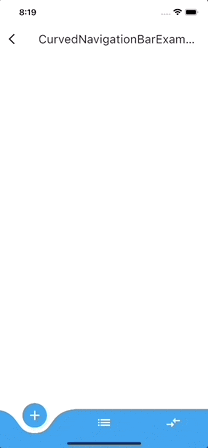
表示結果は以下のようになります。
color
color では選択されているタブのアイコンの背景色と選択されていないタブの色を指定します。
以下の画像では黄色い斜線の部分です。
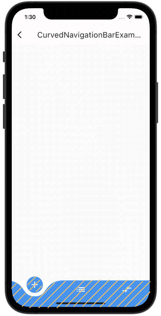
上のコードでは青色に指定されています。
backgroundColor
backgroundColor では color 以外の部分の色を指定します。
以下の画像では黄色い斜線の部分です。
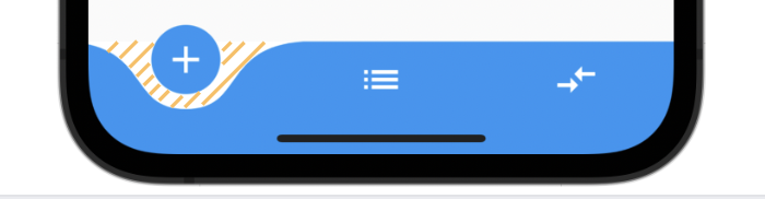
上のコードでは白色に指定されています。
index
index はタブの番号を指定するためのプロパティです。
選択されているタブの番号を指定する際などに使用されます。
上のコードでは selectedIndex とすることで、 onTap によって変更されるタブの番号を代入しています。
animationDuration
animationDuration では、ユーザが選択されているタブとは別のタブを押した際のアニメーションの秒数を指定します。
上のコードでは animationDuration: const Duration(milliseconds: 100),
としており、 100ミリ秒つまり 0.1 秒で遷移するようにしています。
animationDuration の秒数が長すぎると、ユーザがサクサク操作できないため、UX が低下する可能性があるので注意しましょう。
bottom_navy_bar
最後は bottom_navy_bar です。
全体のコードは以下の通りです。
import 'package:bottom_navy_bar/bottom_navy_bar.dart';
import 'package:flutter/material.dart';
import 'package:flutter_riverpod/flutter_riverpod.dart';

final selectedIndexProvider = StateProvider((ref) => 0);

class BottomNavyBarExample extends ConsumerWidget {
  const BottomNavyBarExample({Key? key}) : super(key: key);

  static const List<Icon> iconList = [
    Icon(Icons.apps, color: Colors.red,),
    Icon(Icons.people, color: Colors.purpleAccent,),
    Icon(Icons.message, color: Colors.pink,),
    Icon(Icons.settings, color: Colors.blue,),
  ];
  static const List<Text> titleList = [
    Text('Home', style: TextStyle(color: Colors.red,),),
    Text('Users', style: TextStyle(color: Colors.purpleAccent,),),
    Text('Messages', style: TextStyle(color: Colors.pink,),),
    Text('Settings', style: TextStyle(color: Colors.blue,),),
  ];

  @override
  Widget build(BuildContext context, WidgetRef ref) {

    final selectedIndex = ref.watch(selectedIndexProvider);
    final selectedIndexNotifier = ref.watch(selectedIndexProvider.notifier);

    return Scaffold(
      appBar: AppBar(
        title: const Text("BottomNavyBarExample"),
      ),
        body: pageController(selectedIndexNotifier.state),
        bottomNavigationBar: BottomNavyBar(
          selectedIndex: selectedIndex,
          showElevation: true, // use this to remove appBar's elevation
          onItemSelected: (index) {
            selectedIndexNotifier.state = index;
            print(selectedIndexNotifier.state);
          },
          items: [
            BottomNavyBarItem(
              icon: iconList[0],
              title: titleList[0],
              activeColor: Colors.red,
            ),
            BottomNavyBarItem(
                icon: iconList[1],
                title: titleList[1],
                activeColor: Colors.purpleAccent
            ),
            BottomNavyBarItem(
                icon: iconList[2],
                title: titleList[2],
                activeColor: Colors.pink
            ),
            BottomNavyBarItem(
                icon: iconList[3],
                title: titleList[3],
                activeColor: Colors.blue
            ),
          ],
        )
    );
  }
  pageController(i){
      return Center(
        child: Column(
          mainAxisAlignment: MainAxisAlignment.center,
          children: [
            iconList[i],
            titleList[i]
          ],
        ),
      );
  }
}
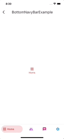
表示結果は以下のようになります。
selectedIndex
selectedIndex は名前の通り選択されているタブの番号を指定するためのプロパティです。
このプロパティは BottomNavigationBar の currentIndex と同じ役割を果たします。
showElevation
showElevation は bottom_navy_bar の elevation をつけるかどうかを指定します。
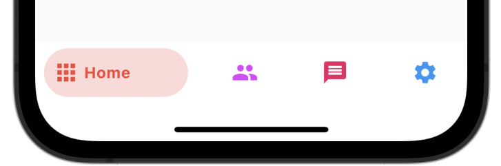
elevation をつけると以下の画像のように影がつきます。
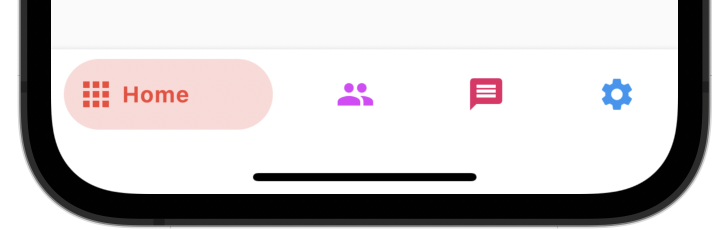
elevation をつけなければ以下の画像のように影がなくなります。
デフォルトでは true に指定されています。
非常に小さな差ですが、elevation があると bottom_navy_bar とその他の要素との高低差が表現でき、視覚的に差別化を図ることができます。
onItemSelected
onItemSelected ではタブが選択された際のアクションを指定します。
BottomNavigationBar の onTap と同じ役割です。
上のコードでは selectedIndexNotifier の state を代入することでタブが選択された際に selectedIndex の値が変更されるようにしています。
items
items は今まで紹介した nagigation_bar と同じです。
BottomNavyBar では BottomNavyBarItem という Widget を指定することで、タブに表示させるアイコンやラベルを指定することができます。
以上です。
あとがき
最後まで読んでいただきありがとうございました。
どの navigation_bar を採用するかは個人の好みによるところが大きいですが、シンプルなデザインの場合はパッケージを使用しない BottomNavigationBar で十分事足りると感じました。
それぞれ実装してみて、それぞれの違いがあって興味深いものでした。
参考にしていただければ幸いです。
誤っている箇所があればご指摘いただければ幸いです。
参考にしたサイト