はじめに
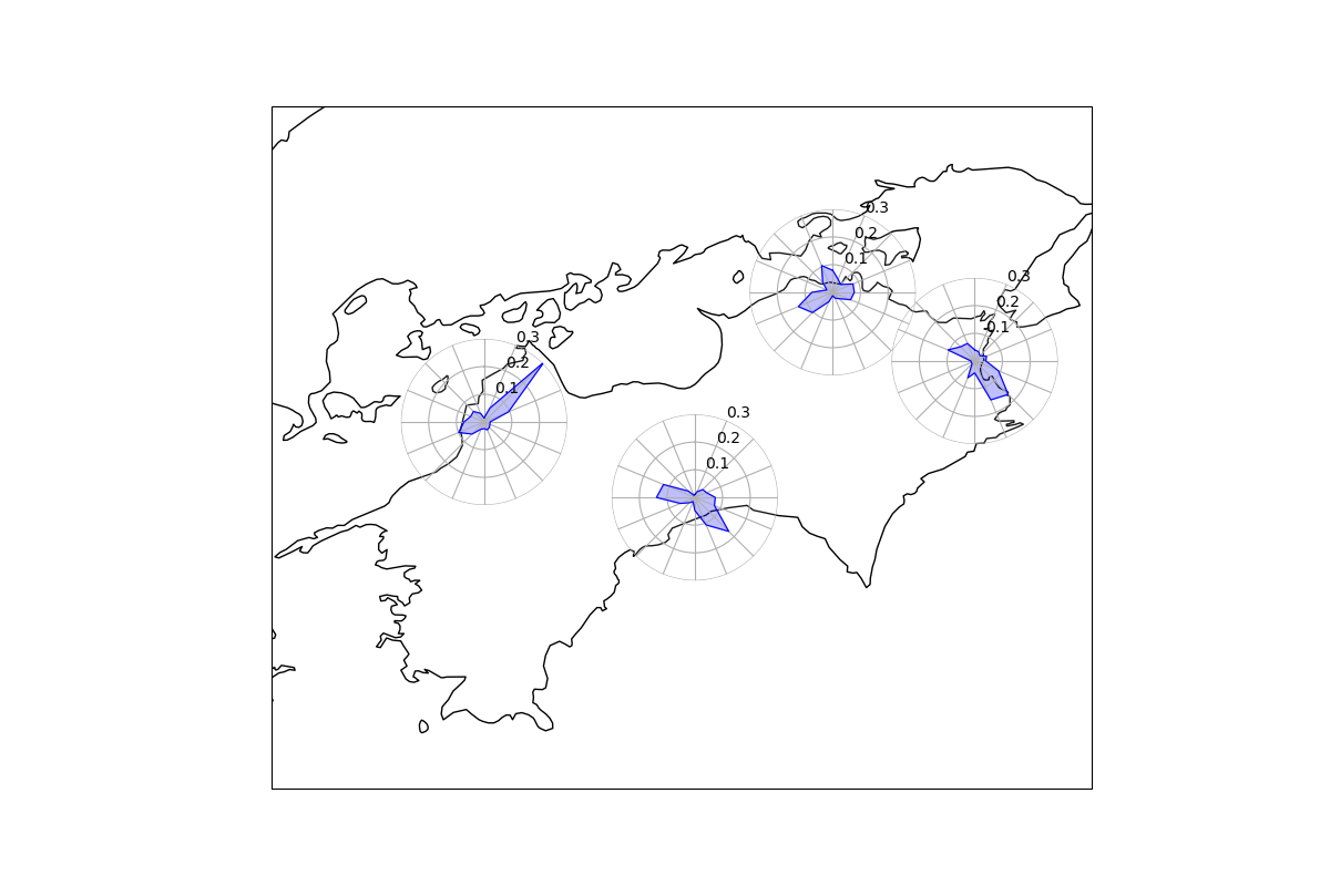
地図上に風配図をプロットしてみます.結構無理やり感が強いと思うのでもしよりエレガントな方法があれば教えてください.
方法
地図の描画にはCartopyを使います.Cartopyで一旦描きたいところの海岸線を描画して,その上に風配図をプロットします.Matplotlibにmpl_toolkits.axes_grid1.inset_locator.inset_axesという拡張機能があるのでこれを風配図のプロットに使いました.
風配図について
風配図については過去に記事を書いているのでこちらを参考にしてください.
使用データ
四国4県の2020年8月1ヶ月間における1時間ごと風向(16方位)データを使いました.あらかじめ気象庁よりDLしたデータを編集して使ってます.
データはこんな感じ

コード全体
import matplotlib.pyplot as plt
import matplotlib as mpl
from mpl_toolkits.axes_grid1.inset_locator import inset_axes
from cartopy.crs import PlateCarree
from cartopy.mpl.ticker import LongitudeFormatter, LatitudeFormatter
import cartopy.crs as ccrs
import numpy as np
import pandas as pd

# データの読み込み
fname = './JMA/WindDir_Shikoku.txt'
df = pd.read_csv(fname, delimiter=' ')

# データの配列化
data = df.values

# 各気象観測所の緯度経度
lon1 = 133. + 32.9/60
lat1 = 33. + 34./60 # Kochi
lon2 = 132. + 46.6/60
lat2 = 33. + 50.6/60 # Matsuyama
lon3 = 134. + 3.2/60
lat3 = 34. + 19.1/60 # Takamatsu
lon4 = 134. + 34.4/60
lat4 = 34. + 4./60 # Tokushima

lon_list = [lon1, lon2, lon3, lon4]
lat_list = [lat1, lat2, lat3, lat4]

# 描画範囲
ll_lon = 132.
ll_lat = 32.5
ur_lon = 135
ur_lat = 35.

# 基図の設定
fig = plt.figure(figsize=(12, 8))
ax = fig.add_subplot(111, projection=PlateCarree(central_longitude=133.))
ax.set_extent([ll_lon, ur_lon, ll_lat, ur_lat], crs=ccrs.PlateCarree())
ax.xaxis.set_major_formatter(LongitudeFormatter())
ax.yaxis.set_major_formatter(LatitudeFormatter())
# 海岸線をプロット
ax.coastlines()

# 風配図をプロットする関数を作成
def plot_windrose(plon, plat, wdir):
    # 入力する緯度経度を bbox_to_anchor の入力値に変換する(ここが無理やりっぽい)
    x = ( plon-ll_lon ) * ( 1/( ur_lon-ll_lon ) )
    y = ( plat-ll_lat ) * ( 1/( ur_lat-ll_lat ) )

    # 風配図の作成
    Type=['N','NNE','NE','ENE',
          'E','ESE','SE','SSE',
          'S','SSW','SW','WSW',
          'W','WNW','NW','NNW']

    wdir_li = []
    for j in Type:
        index=np.where(wdir==j)
        num=index[0].size
        per = num / len(wdir)
        wdir_li.append(per)

    # inset_axes で基図上にプロットする
    axin = inset_axes(ax,
                      width=1.5, height=1.5,
                      loc=10, # アンカーを中心に設定
                      bbox_to_anchor=(x, y), # 風配図の中心座標
                      axes_class=mpl.projections.get_projection_class('polar'), # 極座標系に設定
                      bbox_transform=ax.transAxes, # ax の座標に合わせる
                      borderpad=0.0)

    # 風向頻度のプロット
    # 過去の記事参照
    angles = np.linspace(0.0, 2 * np.pi, len(Type) + 1 , endpoint=True)
    values = np.concatenate((wdir_li, [wdir_li[0]]))
    axin.set_theta_direction(-1)
    axin.set_theta_zero_location("N")
    axin.plot(angles, values, color='b', markerfacecolor = 'none', linewidth=0.8)
    axin.set_zorder(ax.get_zorder()+1)
    axin.fill(angles, values, color='b', alpha=0.25)
    axin.set_thetagrids(angles[:-1] * 180 / np.pi, Type)
    axin.set_rlim(0 , 0.30)
    axin.patch.set_alpha(0.1)
    # 風向ラベルを消す(文字が被って汚くなるため)
    axin.tick_params(labelbottom=False)
    # 外枠を消す
    axin.spines['polar'].set_visible(False)

# 4地点で実行
for p in range(0, len(lon_list)):
    plon = lon_list[p]
    plat = lat_list[p]
    wdir = data[:, p]

    plot_windrose(plon, plat, wdir)

fig.savefig('./output/windrose_map.png')
plt.show()
完成