学習した内容を深めるために、アウトプットするのが一番良い手段です。もし他人の参考にもなれば、最高です。
そのため、こちらのコースDTSA 5301 Data Science as a Fieldから重要なポイントを抜粋し、自分なりの解釈を加えてこちらに残しています。
全体概要
このコースでは、主に以下の六つを紹介しています。
- データサイエンス入門:新しい学問の過去、現在、未来
- 産業、政府、学界におけるデータサイエンス
- データサイエンスのプロセスと落とし穴
- 結果の伝達
Week02
在 R Markdown 中的必做事项
•	使用相对路径,而非绝对路径
	•	../filename 代表返回上一级目录
	•	./Data/filename.csv 用于访问当前目录下的 Data 文件夹中的文件
•	将使用的数据放在一个 data 文件夹中
	•	示例:if(!file.exists("Data")){dir.create("Data")}
•	除非有特别说明,否则需要展示所有作业的代码
•	对用于调试的代码行进行注释
•	在必要时包含测试用例及其输出
•	在文档的最末尾运行一个包含 sessionInfo() 的 R 代码块
在 R Markdown 文档中绝不要做的事情
•	使用 setwd
•	安装包
有用的提示
• 为代码块命名(每个名称必须唯一)
# 在这里输入你的 R 代码
•	经常进行(knit)
•	在将命令放入代码块之前,先在控制台中尝试运行
•	如果无法knit,设置 eval = FALSE 来暂时禁用该代码块,直到你能够调试它
# 在这里输入你的 R 代码
summary(mtcars)
Week03
import library
# lubridate パッケージは、日付や時刻を扱う際に便利な関数を提供してくれます。日付の解析、時刻の操作、フォーマット変換、日付の算術演算(加算・減算など)などを簡単に行えるようにするために用いられます。
install.packages("lubridate")
install.packages("ggplot2")
library(stringr) # 这是一个处理字符串的包
library(readr) # 用于读取和写入数据文件
library(dplyr) # 是一个用于数据操作和变换的包
library(tidyr) # 用于整理数据的包
library(lubridate) # 用于处理日期和时间的包
library(ggplot2) # 一个用于数据可视化的包
Importing Data
以下のコマンドを利用して
url_in <- "https://raw.githubusercontent.com/CSSEGISandData/COVID-19/master/csse_covid_19_data/csse_covid_19_time_series/"
file_names <- c("time_series_covid19_confirmed_US.csv","time_series_covid19_confirmed_global.csv","time_series_covid19_deaths_US.csv", "time_series_covid19_deaths_global.csv")
urls <- str_c(url_in,file_names)
urls
Reading Data
global_cases <- read_csv(urls[2])
global_deaths <- read_csv(urls[4])
us_cases <- read_csv(urls[1])
us_deaths <- read_csv(urls[3])
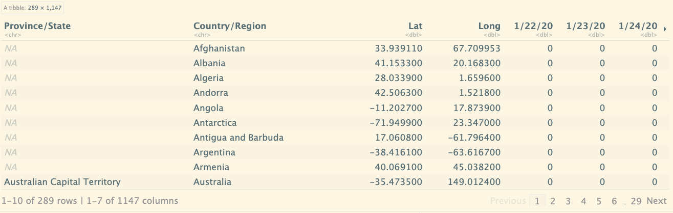
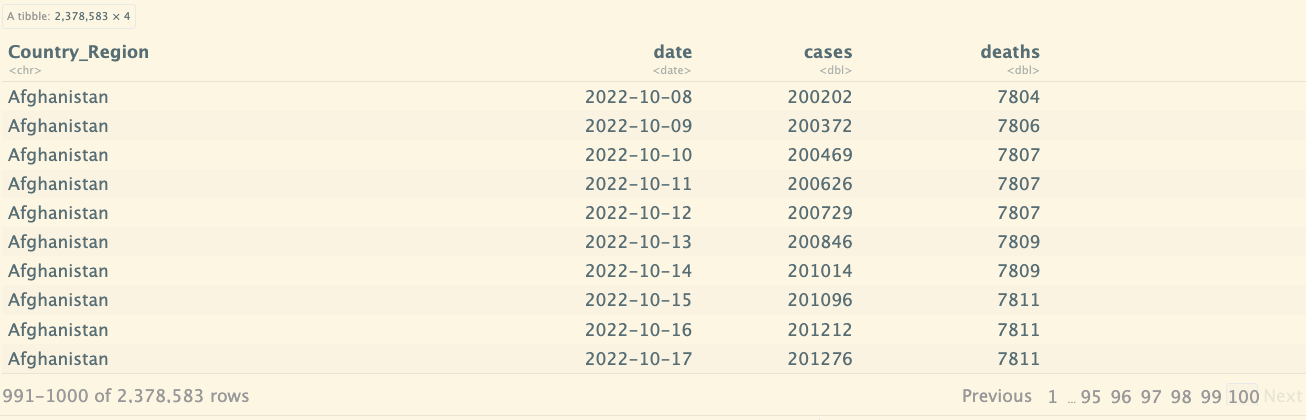
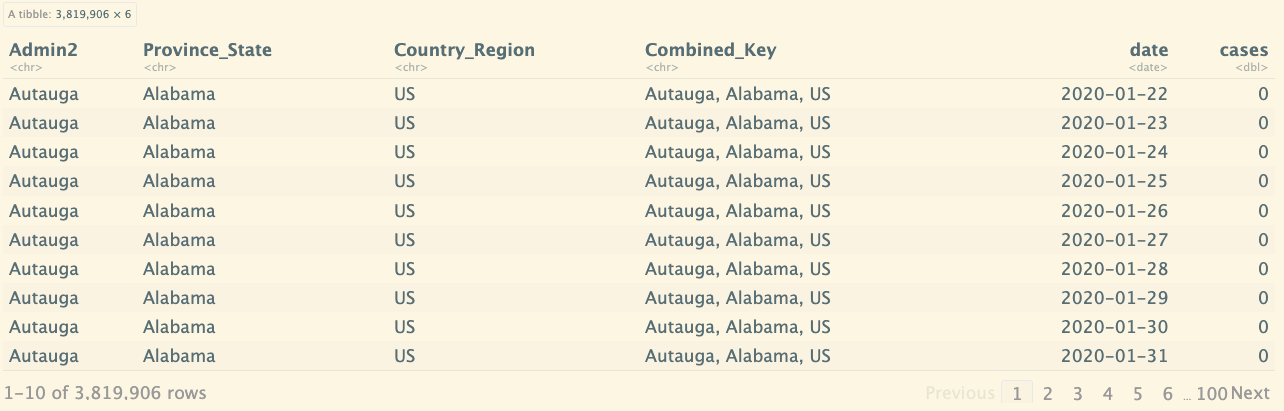
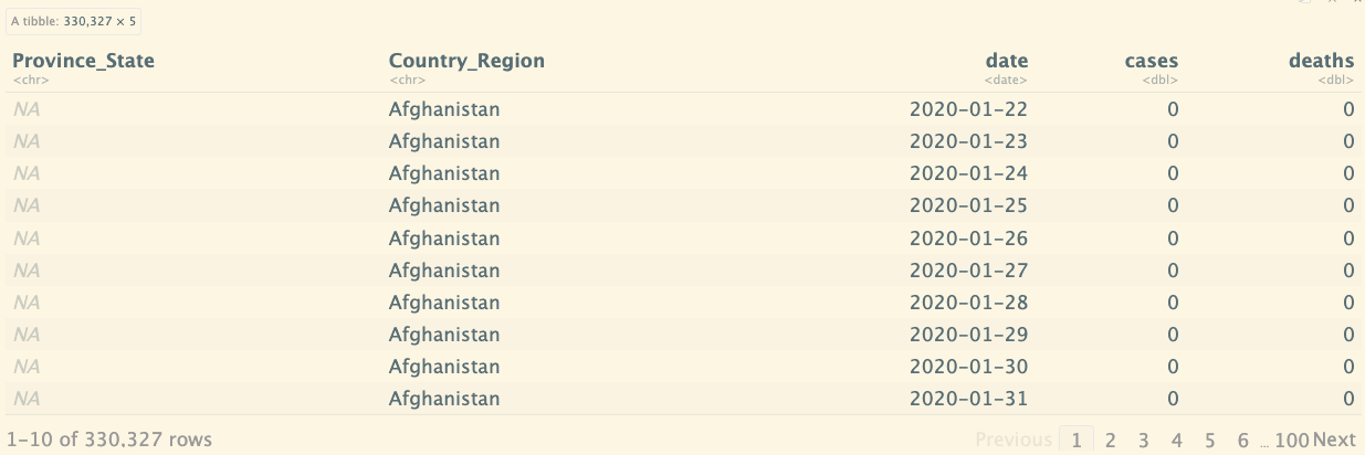
# 打印global_cases 中的数据结构,其中具体的日期,是作为列来显示的
global_cases
データ構成:日付が列として表示されている(行:289国)
# pivot_longer 是 tidyr 包中的一个函数,用于将数据从宽格式(wide format)转换为长格式(long format)。
# cols = -c(...) 表示选择所有列,除了 Province/State, Country/Region, Lat, 和 Long 列。
global_cases_new <- global_cases %>%
pivot_longer(cols = -c(`Province/State`, `Country/Region`, Lat, Long),
names_to = "date",
values_to = "cases") %>%
select(-c(Lat, Long))
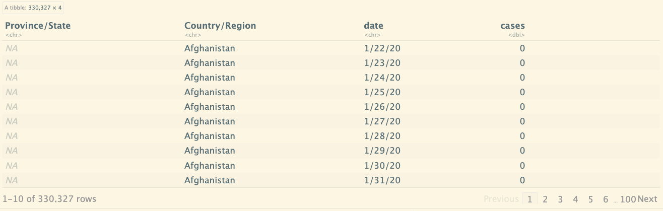
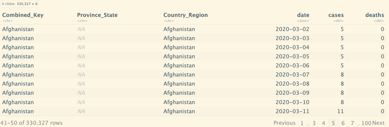
global_cases_new
データ構成:列の日付を行データに変わりました。
# 与上面的类似, 对另一个数据集进行处理
global_deaths_new <- global_deaths %>%
  pivot_longer(cols = -c(`Province/State`, `Country/Region`, Lat, Long),
               names_to = "date",
               values_to = "deaths") %>%
  select(-c(Lat, Long))

global_deaths_new

Tidying and Transforming Data
全球新冠状况数据集
连接上面的两个new的数据集,都有共同的字段,Province/State和Country/Region, date,如果没有指定的话就默认通过这几个字段进行连接。
# 使用 mdy 函数将 date 列的字符格式日期转换为 Date 对象。
# 将 global_cases_new 和 global_deaths_new 进行全连接(full_join)。
# 这样会保留两者中的所有行。如果某个国家或地区的数据只存在于一个数据集中,另一数据集的缺失值会填充为 NA。
# 注意:full_join 默认会基于共享列名(比如 Country/Region, Province/State 等)进行合并。
# 如果您的两个数据集没有完全相同的结构,可能会导致意外结果。可以使用 by 参数来明确指定哪些列应该用于连接.
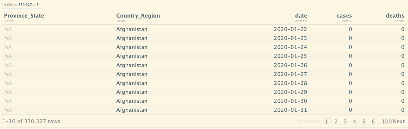
global <- global_cases_new %>%
full_join(global_deaths_new) %>%
rename(Country_Region=`Country/Region`,
Province_State=`Province/State`) %>%
mutate(date=mdy(date))
global
如果我指定连接字段:
global <- global_cases_new %>%
  full_join(global_deaths_new, by = c("Country/Region" = "Country/Region", "date" = "date")) %>%
  rename(Country_Region=`Country/Region`) %>%
  mutate(date=mdy(date)) %>%
  select(c(Country_Region,date,cases,deaths))
global
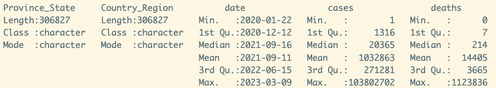
查看数据概要:
summary(global)
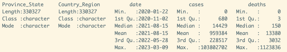
如果对数据进行过滤,发生次数大于0的:
global <- global %>% filter(cases > 0)
summary(global)
美国新冠数据集
分析另一个数据,美国的新冠状况:
us_cases
# 将宽格式的美国病例数据转换为长格式,其中每一行表示一个特定区域在特定日期的病例数。它删除了一些不必要的列并将 date 列格式化为 Date 类型,便于后续的时间序列分析或其他数据处理。
us_cases <- read_csv(urls[1])
us_cases_new <- us_cases %>%
  pivot_longer(cols = -(UID:Combined_Key),
               names_to = "date",
               values_to = "cases") %>%
  select(Admin2:cases) %>%
  mutate(date = mdy(date)) %>%
  select(-c(Lat,Long_))
us_cases_new
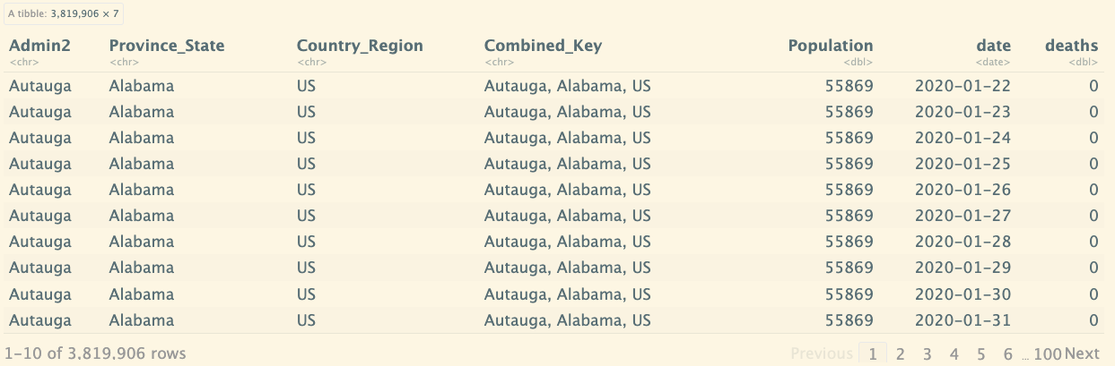
# us_deaths <- read_csv(urls[3])
us_deaths
us_deaths_new <- us_deaths %>%
  pivot_longer(cols = -(UID:Population),
               names_to = "date",
               values_to = "deaths") %>%
  select(Admin2:deaths) %>%
  mutate(date = mdy(date)) %>%
  select(-c(Lat,Long_))
us_deaths_new
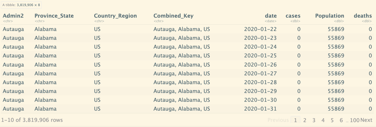
然后将case和death进行连接,默认会根据相同的列字段进行连接:
us <- us_cases_new %>%
  full_join(us_deaths_new)
us
Joining with
by = join_by(Admin2, Province_State, Country_Region, Combined_Key, date)
列合并之前:
global
列合并:
global_new <- global %>%
  unite("Combined_Key",
        c(Province_State,Country_Region),
        sep = ", ",
        na.rm = TRUE,
        remove = FALSE)
global_new
参考其他数据
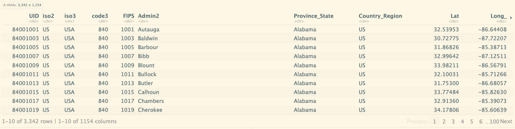
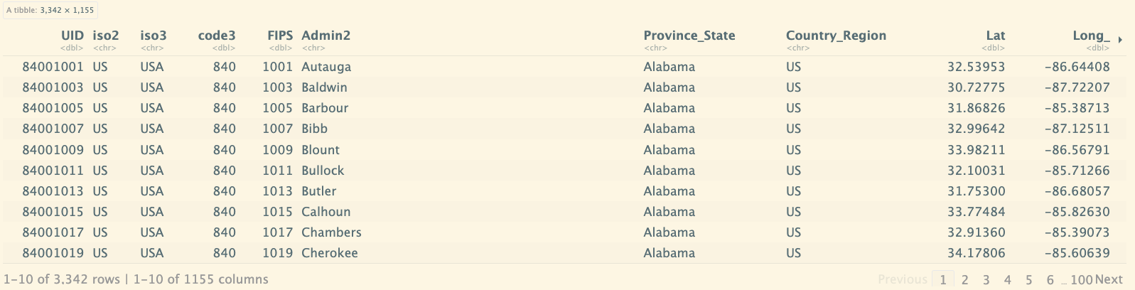
上面的表中都没有各个国家和省的人口数据,现在参考其他的数据,将人口数据进行连接。
global_new 数据框与 uid 数据框按指定列进行左连接,移除不需要的列,重新排列剩余列的顺序。最终生成一个包含合并后数据且格式简化的数据框 global_new。
global_new <- global_new %>%
left_join(uid, by = c("Province_State", "Country_Region")) %>%
select(-c(UID, FIPS)) %>%
select(Province_State, Country_Region, date,
cases, deaths, Population,
Combined_Key)
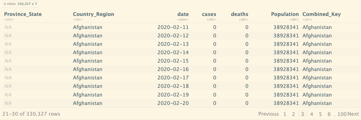
global_new
Visualizing Data
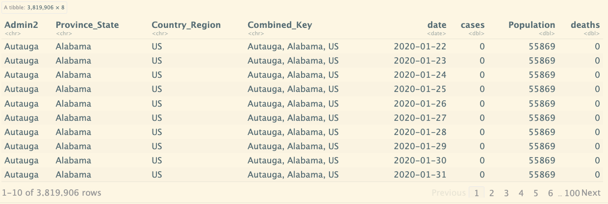
再次回顾下us的数据结构:
us
下面汇总每个 Province_State、Country_Region 和 date 组合的 cases、deaths 和 Population,计算每百万人中的死亡数(deaths_per_mill),并选择需要的列进行输出。最终结果是一个新的 US_by_state 数据框,包含了按州和日期分组的汇总信息。
us_by_state <- us %>%
group_by(Province_State, Country_Region, date) %>%
summarize(cases = sum(cases), deaths = sum(deaths), Population = sum(Population)) %>%
mutate(deaths_per_mill = deaths * 1000000 / Population) %>%
select(Province_State, Country_Region, date, cases, deaths, deaths_per_mill, Population) %>%
ungroup()
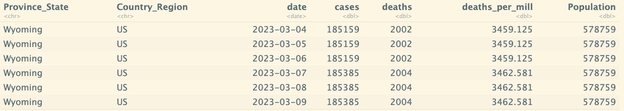
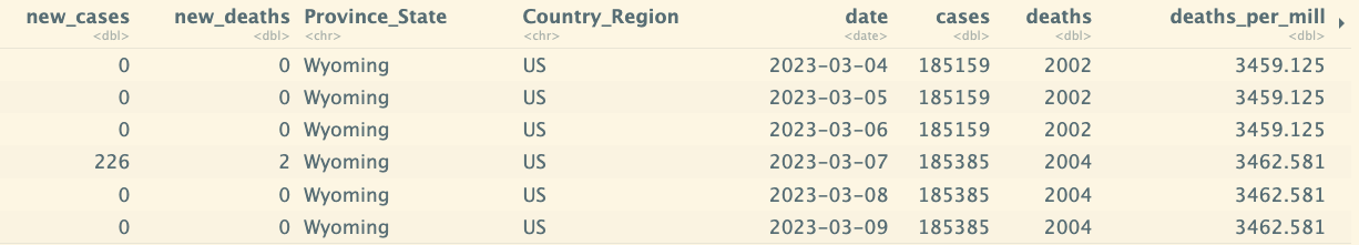
tail(us_by_state)
针对美国整个也做相同的处理:
us_totals<- us %>%
group_by(Country_Region, date) %>%
summarize(cases = sum(cases), deaths = sum(deaths), Population = sum(Population)) %>%
mutate(deaths_per_mill = deaths * 1000000 / Population) %>%
select(Country_Region, date, cases, deaths, deaths_per_mill, Population) %>%
ungroup()
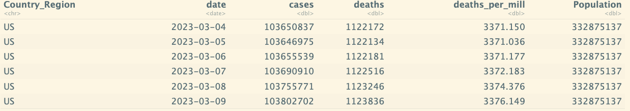
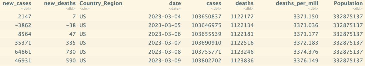
tail(us_totals)
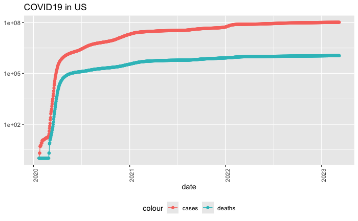
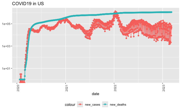
作图: 首先过滤出没有发生的数据,然后以日期为x轴,发生次数为y轴。
# ggplot():初始化一个 ggplot 绘图对象。aes():设置映射,指定 date 为横轴,cases 为纵轴。
# geom_point():在图中添加点图层。颜色映射到图例标签“cases”。
# geom_line():添加另一条折线图,绘制 deaths 列的值。aes(y = deaths, color = "deaths"):指定 deaths 为 y 轴数据,并映射颜色到图例标签“deaths”。
# geom_point():在 deaths 数据点上添加点图层。
# scale_y_log10():将 y 轴转换为对数刻度,以便更好地显示数据,尤其是当 cases 和 deaths 的值差异较大时,这样可以更清楚地看到低值和高值的变化。
# theme():自定义图形主题。
# axis.text.x = element_text(angle = 90):将 x 轴的文本旋转 90 度,便于长日期标签的可读性。
# labs():设置图表的标签和标题。
us_totals %>%
  filter(cases > 0) %>%
  ggplot(aes(x = date, y = cases)) +
  geom_line(aes(color = "cases")) +
  geom_point(aes(color = "cases")) +
  geom_line(aes(y = deaths, color = "deaths")) +
  geom_point(aes(y = deaths, color = "deaths")) +
  scale_y_log10() +
  theme(legend.position = "bottom",
        axis.text.x = element_text(angle = 90)) +
  labs(title = "COVID19 in US", y = NULL)
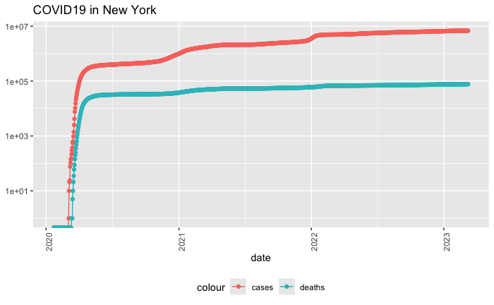
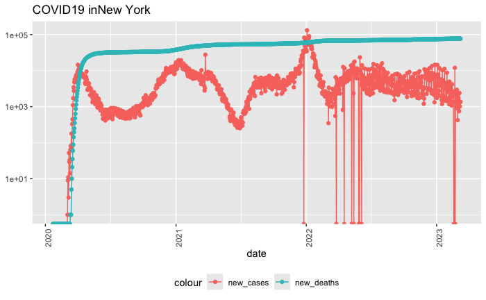
如果我要指定特定的州,来查看该州的具体数据:
state <- "New York"
us_by_state %>%
  filter(Province_State == state) %>%
  ggplot(aes(x = date, y = cases)) +
  geom_line(aes(color = "cases")) +
  geom_point(aes(color = "cases")) +
  geom_line(aes(y = deaths, color = "deaths")) +
  geom_point(aes(y = deaths, color = "deaths")) +
  scale_y_log10() +
  theme(legend.position = "bottom",
        axis.text.x = element_text(angle = 90)) +
  labs(title = str_c("COVID19 in",state), y = NULL)
查看美国最大的死亡人数:
max(us_totals$deaths)
# 1123836
Analyzing Data
为 us_by_state 和 us_totals 数据框分别添加 new_cases 和 new_deaths 列,用来表示每一天新增的病例数和死亡人数。这是通过计算当前行的 cases 和 deaths 减去前一行的对应值来实现的。这种方法可以帮助进行每日数据趋势分析。
# lag(cases):返回 cases 列的滞后值,即前一行的 cases 值。
us_by_state <- us_by_state %>%
  mutate(new_cases = cases - lag(cases),
         new_deaths = deaths - lag(deaths))

us_totals <- us_totals %>%
  mutate(new_cases = cases - lag(cases),
         new_deaths = deaths - lag(deaths))
tail(us_by_state %>% select(new_cases,new_deaths,everything()))
tail(us_totals %>% select(new_cases,new_deaths,everything()))
同样,针对新增的case和新增死亡的图:
us_totals %>%
  ggplot(aes(x = date, y = new_cases)) +
  geom_line(aes(color = "new_cases")) +
  geom_point(aes(color = "new_cases")) +
  geom_line(aes(y = deaths, color = "new_deaths")) +
  geom_point(aes(y = deaths, color = "new_deaths")) +
  scale_y_log10() +
  theme(legend.position = "bottom",
        axis.text.x = element_text(angle = 90)) +
  labs(title = "COVID19 in US", y = NULL)
state <- "New York"
us_by_state %>%
  filter(Province_State == state) %>%
  ggplot(aes(x = date, y = new_cases)) +
  geom_line(aes(color = "new_cases")) +
  geom_point(aes(color = "new_cases")) +
  geom_line(aes(y = deaths, color = "new_deaths")) +
  geom_point(aes(y = deaths, color = "new_fdeaths")) +
  scale_y_log10() +
  theme(legend.position = "bottom",
        axis.text.x = element_text(angle = 90)) +
  labs(title = str_c("COVID19 in",state), y = NULL)
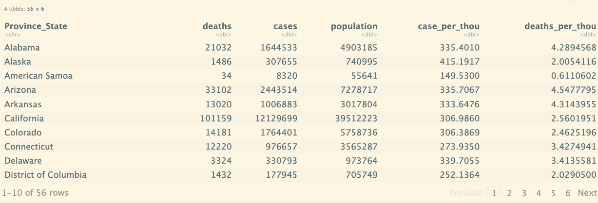
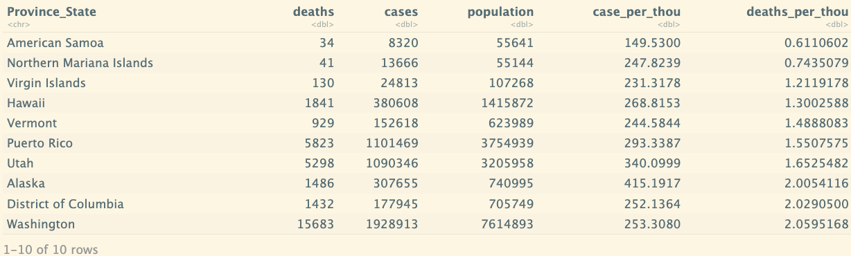
最好的州和最差的州:
us_state_totals <- us_by_state %>%
  group_by(Province_State) %>%
  summarize(deaths = max(deaths),cases = max(cases),
            population = max(Population),
            case_per_thou = 1000*cases / population,
            deaths_per_thou = 1000*deaths / population
            ) %>%
  filter(cases > 0,population >0)
us_state_totals
us_state_totals %>%
  slice_min(deaths_per_thou,n=10)
Modeling Data
lm() 函数来构建一个线性回归模型,并使用 summary() 函数来查看模型的详细信息。
mod <- lm(deaths_per_thou ~ case_per_thou, data = us_state_totals):
- lm() 函数:用于拟合线性回归模型。
- deaths_per_thou ~ case_per_thou:指定了回归模型的形式,其中 deaths_per_thou 是因变量(被预测的变量),case_per_thou 是自变量(预测因子)。
- data = us_state_totals:指定模型使用的数据框是 us_state_totals。
- 这行代码的作用是根据数据 us_state_totals 中的 case_per_thou 来拟合一个预测 deaths_per_thou 的线性回归模型,并将结果存储在 mod 变量中。
mod <- lm(deaths_per_thou ~ case_per_thou,data = us_state_totals)
summary(mod)
输出结果:
Call:
lm(formula = deaths_per_thou ~ case_per_thou, data = us_state_totals)

Residuals:
    Min      1Q  Median      3Q     Max
-2.3352 -0.5978  0.1491  0.6535  1.2086

Coefficients:
              Estimate Std. Error t value Pr(>|t|)
(Intercept)   -0.36167    0.72480  -0.499     0.62
case_per_thou  0.01133    0.00232   4.881 9.76e-06 ***
---
Signif. codes:  0 ‘***’ 0.001 ‘**’ 0.01 ‘*’ 0.05 ‘.’ 0.1 ‘ ’ 1

Residual standard error: 0.8615 on 54 degrees of freedom
Multiple R-squared:  0.3061,	Adjusted R-squared:  0.2933
F-statistic: 23.82 on 1 and 54 DF,  p-value: 9.763e-06
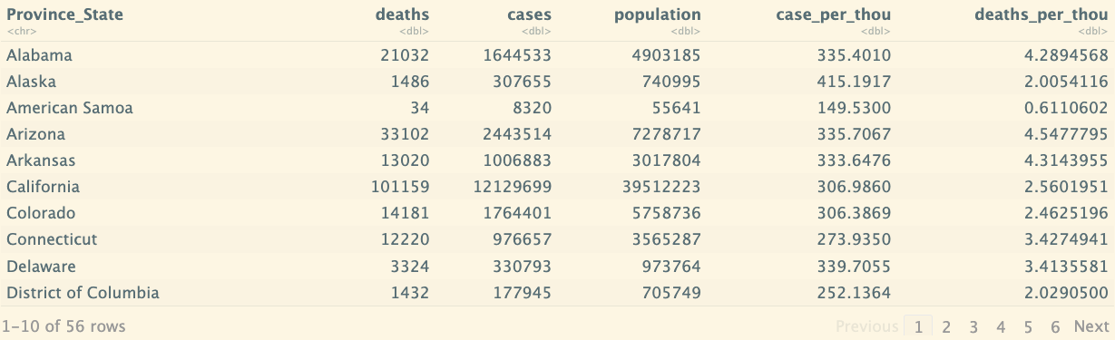
然后我们考虑通过线性函数,预测出一个结果,然后对比与实际值的差异,先看原始的数据:
us_state_totals
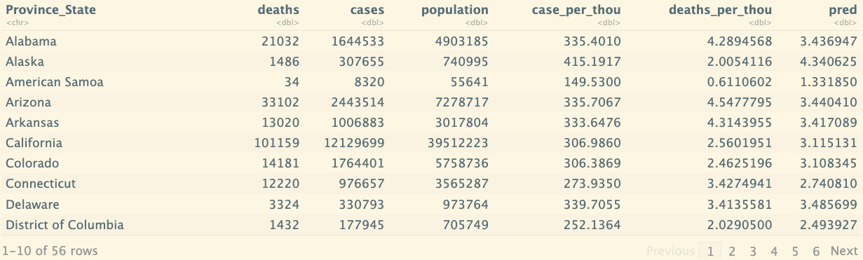
找到 case_per_thou 最大的行,创建一个用于预测的自变量序列 x_grid,并用它生成一个新数据框 new_df。然后,它在原有的 us_state_totals 数据框中添加了一个 pred 列,该列包含根据 mod 模型进行的预测结果。最终的数据框 us_state_totals 中可以用来分析和比较实际值与预测值。
us_state_totals %>% slice_max(case_per_thou)
x_grid <- seq(1,151)
new_df <- tibble(case_per_thou = x_grid)
us_state_totals <- us_state_totals %>% mutate(pred=predict(mod))
us_state_totals
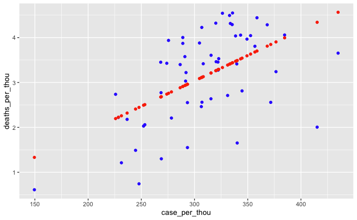
对比实际的数据和线性回归的预测:
us_state_totals %>% ggplot() +
  geom_point(aes(x = case_per_thou,y=deaths_per_thou),color="blue") +
               geom_point(aes(x = case_per_thou,y=pred),color="red")
Bias sources
这段内容强调了在数据分析中的偏差(bias)问题,以及如何识别和缓解它。偏差可以在数据科学过程的任何阶段出现,从选择研究主题、选择和测量变量到调查问卷的设计和数据采样等都可能产生偏差。分析中如何处理离群值(outliers)以及机器学习算法中可能存在的偏差也被提到。
偏差并不一定是坏事,它是一种生存机制,但在数据分析中,识别并理解自己的偏差非常重要。分析者需要有意识地换位思考,从不同的角度看待数据,尤其是在涉及政治或敏感问题时。通过这样的方式,可以努力实现更加公正和无偏的分析结果。
内容还建议进行一个练习:观察图片并记录看到图片时的第一印象,然后分析自己的反应是正面还是负面,这有助于识别潜在的个人偏差并与他人讨论这些差异。
Intro to Data Ethics course with Bobby Schnabel
数据科学在全球范围内对每个人都产生影响,尤其是涉及疫苗分配、人脸识别、搜索引擎结果等应用时。课程涵盖了五个主要主题:
1. 伦理基础:介绍分析伦理问题时有用的哲学理论。
2. 网络隐私与安全:如何保护数据安全及隐私权问题。
3. 职业道德:通过案例研究和专业道德规范进行探讨。
4. 算法偏差:讨论机器学习算法在招聘、执法和面部识别等领域的偏差问题。
5. 医疗应用:从 AI 在医疗中的应用到基因编辑等未来问题。
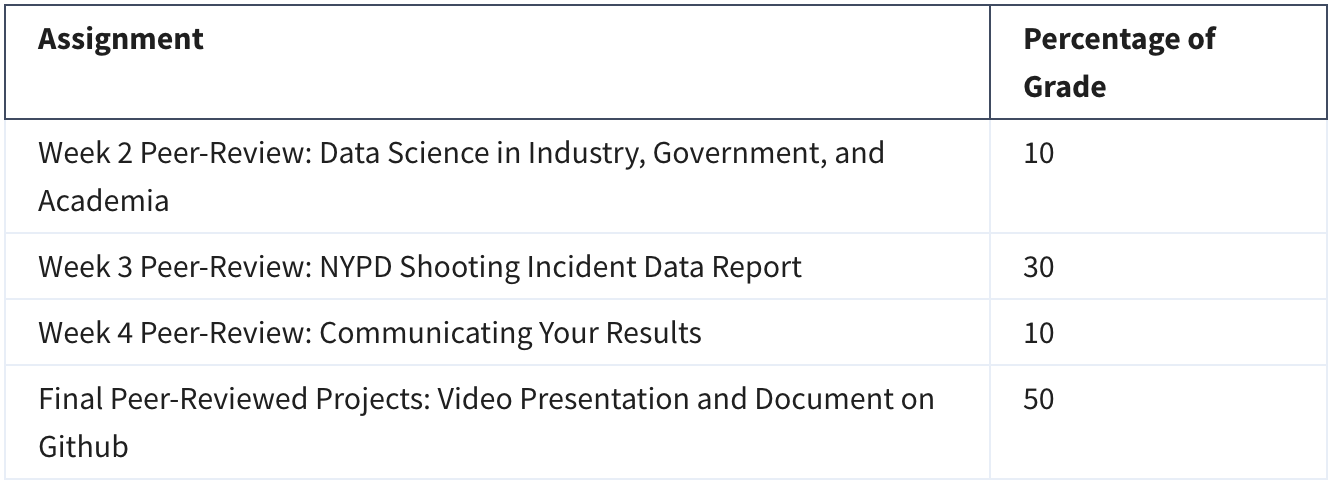
Grading