WiFiヒートマップをPYTHONで動かしてみたかったので調べてみた。

WiFiヒートマップ
屋内のWiFi電波状況を可視化する。電波の悪いところが見える化されるので中継器をどこに置くかが容易にわかる。アイオーデータ社のWi-Fiミレル等が有名。
GitHub(https://github.com/beaugunderson/wifi-heatmap)
にサンプルコードがあったので動かしてみる。
エラーがでました。
import tabular as tb
ModuleNotFoundError: No module named 'tabular'
残念、動きません。
コードを修正してみた
修正を行い、起動するようになりました。
wifi-heatmap_FIX.py
import pandas as pd
import numpy as np
import matplotlib.mlab as ml
import matplotlib.pyplot as pp
from mpl_toolkits.axes_grid1 import AxesGrid
from scipy.interpolate import Rbf
from pylab import imread, imshow
layout = imread('input/Layout.png')
df = pd.read_csv('input/mapping.csv',header=0)
s_beacons = ['2e:20', 'f6:70', '5b:30', '74:c0', 'f5:90', '16:a0']
g_beacons = ['14:a1', 'f6:71', '5b:31', '74:c1', 'f5:91', '16:a1']
grid_width = 797
grid_height = 530
image_width = 2544
image_height = 1691
num_x = image_width / 4
num_y = num_x / (image_width / image_height)
print("Resolution: %0.2f x %0.2f" % (num_x, num_y))
x = np.linspace(0, grid_width, num_x)
y = np.linspace(0, grid_height, num_y)
gx, gy = np.meshgrid(x, y)
gx, gy = gx.flatten(), gy.flatten()
levels = [-85, -80, -75, -70, -65, -60, -55, -50, -45, -40, -35, -30, -25]
interpolate = True
def add_inner_title(ax, title, loc, size=None, **kwargs):
from matplotlib.offsetbox import AnchoredText
from matplotlib.patheffects import withStroke
if size is None:
size = dict(size=pp.rcParams['legend.fontsize'])
at = AnchoredText(title, loc=loc, prop=size,
pad=0., borderpad=0.5,
frameon=False, **kwargs)
at.set_zorder(200)
ax.add_artist(at)
at.txt._text.set_path_effects([withStroke(foreground="w", linewidth=3)])
return at
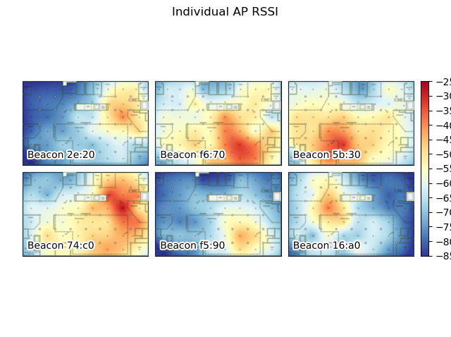
def grid_plots():
f = pp.figure()
f.suptitle("Individual AP RSSI")
# Adjust the margins and padding
f.subplots_adjust(hspace=0.1, wspace=0.1, left=0.05, right=0.95, top=0.85,
bottom=0.15)
# Create a grid of subplots using the AxesGrid helper
image_grid = AxesGrid(f, 111, nrows_ncols=(2, 3), axes_pad=0.1,
label_mode="1", share_all=True, cbar_location="right",
cbar_mode="single", cbar_size="3%")
for beacon, i in zip(s_beacons, range(len(s_beacons))):
# Hide the axis labels
image_grid[i].xaxis.set_visible(False)
image_grid[i].yaxis.set_visible(False)
if interpolate:
# Interpolate the data
rbf = Rbf(df['Drawing X'], df['Drawing Y'], df[beacon],
function='linear')
z = rbf(gx, gy)
z = z.reshape((int(num_y), int(num_x)))
# Render the interpolated data to the plot
image = image_grid[i].imshow(z, vmin=-85, vmax=-25, extent=(0,
image_width, image_height, 0), cmap='RdYlBu_r', alpha=1)
#c = image_grid[i].contourf(z, levels, alpha=0.5)
#c = image_grid[i].contour(z, levels, linewidths=5, alpha=0.5)
else:
z = ml.griddata(df['Drawing X'], df['Drawing Y'], df[beacon], x, y)
c = image_grid[i].contourf(x, y, z, levels, alpha=0.5)
image_grid[i].imshow(layout, interpolation='bicubic', zorder=100)
# Setup the data for the colorbar and its ticks
image_grid.cbar_axes[0].colorbar(image)
image_grid.cbar_axes[0].set_yticks(levels)
# Add inset titles to each subplot
for ax, im_title in zip(image_grid, s_beacons):
t = add_inner_title(ax, "Beacon %s" % im_title, loc=3)
t.patch.set_alpha(0.5)
pp.show()
def max_plot():
# Get the maximum RSSI seen for each beacon
max_rssi = []
for index , i in df[s_beacons].iterrows():
max_rssi.append(max(i))
pp.title("Maximum RSSI seen for each beacon")
if interpolate:
# Interpolate the data
rbf = Rbf(df['Drawing X'], df['Drawing Y'], max_rssi, function='linear')
print(rbf)
z = rbf(gx, gy)
z = z.reshape((int(num_y), int(num_x)))
# Render the interpolated data to the plot
image = pp.imshow(z, vmin=-85, vmax=-25, extent=(0,
image_width, image_height, 0), cmap='RdYlBu_r', alpha=1)
#pp.contourf(z, levels, alpha=0.5)
#pp.contour(z, levels, linewidths=5, alpha=0.5)
else:
z = ml.griddata(df['Drawing X'], df['Drawing Y'], max_rssi, x, y)
pp.contourf(x, y, z, levels, alpha=0.5)
pp.colorbar(image)
pp.imshow(layout, interpolation='bicubic', zorder=100)
pp.show()
if __name__ == "__main__":
grid_plots()
max_plot()
画面表示
起動すると、しばらくして、以下の画面が現れました。
上記の画面を閉じると次に以下の画面が現れました。
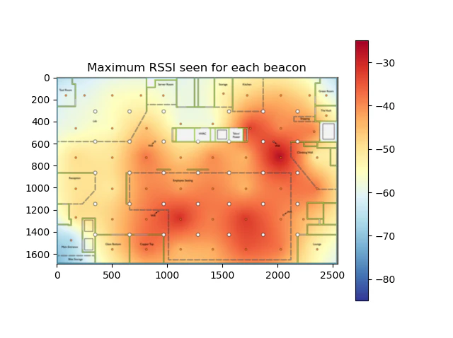
WiFiヒートマップです。
測定ポイント間の電波強度は、放射基底関数によるRBF補間で計算しています。