はじめに
アニメーションが気持ちいいUI、気持ちいいですよね。
Android Studio 4.0(現時点ではCanary版)からMotion Editorを利用したアニメーションを作ることができるようになり、アニメーションを作りやすい状況が整備されてきていると思います。
今回は自分がよく使っているGoogleカレンダーのプロフィール画面の動きを再現したいと思い、CoordinatorLayoutとMotionLayoutの組み合わせで実装してみました。
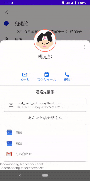
何をつくるのか

Googleカレンダーの予定に追加されたゲスト、のプロフィール詳細画面の動きです。
プロフィール画像がスクロールに合わせて動きます。
プロフィール画面UIのポイント
- 上部は遷移前の画面が透過して見えている
- 名前、クイックアクション(メール/スケジュール/発信)部分はスクロールとともにフェードアウトして消える
- Toolbar部分はシートを上まで引き上げると上端で固定される
- 円形のプロフィール画像は、シートのスクロールとともに垂直に移動し、ある点からToolbarの左端に収まるように動く
※ なお、以下の挙動に関しては、実装できていないので今回の記事では説明しません
- 下まで引き下げることで前の画面に戻る
- 上まで引き上げたタイミングでステータスバーの色が白に変化する
実装
使用しているStudioやライブラリのバージョンは以下になります。
- AndroidStudio 4.0 Canary6
implementation 'androidx.appcompat:appcompat:1.1.0'
implementation 'com.google.android.material:material:1.2.0-alpha02'
implementation 'androidx.constraintlayout:constraintlayout:2.0.0-beta3'
上部を透過させたAppBarLayout
Activityに透明なThemeを適用し画面全体が透過になるようにします。
    <style name="TransparentTheme" parent="AppTheme">
        <item name="android:windowBackground">@android:color/transparent</item>
        <item name="android:colorBackgroundCacheHint">@null</item>
        <item name="android:windowIsTranslucent">true</item>
    </style>
    <application
        (略)>
        ...
        <activity
            android:name=".ui.motionlayout.googlecalendar.GoogleCalendarProfileActivity"
            android:theme="@style/TransparentTheme" />
    </application>
AppBarLayoutの背景はデフォルトだとprimaryColorが当たるため、透明色を指定し透過させるようにします。
    <androidx.coordinatorlayout.widget.CoordinatorLayout
        android:id="@+id/content"
        android:layout_width="match_parent"
        android:layout_height="match_parent"
        android:fitsSystemWindows="false">

        <com.google.android.material.appbar.AppBarLayout
            android:id="@+id/app_bar"
            android:layout_width="match_parent"
            // 透過色を指定
            android:background="@color/appbar_background"
            android:layout_height="348dp">

            <include layout="@layout/google_calendar_coordinatorlayout_header" />

        </com.google.android.material.appbar.AppBarLayout>

        <include layout="@layout/google_calendar_content" />

    </androidx.coordinatorlayout.widget.CoordinatorLayout>
上部を透過させたAppBarLayoutができました。

Toolbarを上部に残す
以下のようなレイアウトをAppBarLayoutの子要素にします。
<com.iiinaiii.uisamples.ui.widget.CollapsibleToolbar xmlns:android="http://schemas.android.com/apk/res/android"
    xmlns:app="http://schemas.android.com/apk/res-auto"
    android:id="@+id/constraintToolbar"
    android:layout_width="match_parent"
    android:layout_height="match_parent"
    android:fitsSystemWindows="true"
    android:minHeight="?attr/actionBarSize"
    app:layoutDescription="@xml/google_calendar_header_scene"
    app:layout_scrollFlags="scroll|snap|exitUntilCollapsed">

    <com.google.android.material.appbar.MaterialToolbar
        android:id="@+id/content_toolbar"
        android:layout_width="0dp"
        android:layout_height="?attr/actionBarSize"
        android:background="@drawable/top_rounded_bg"
        android:theme="@style/ToolbarThemeWhite"
        app:layout_constraintBottom_toTopOf="@id/content_header"
        app:layout_constraintEnd_toEndOf="parent"
        app:layout_constraintStart_toStartOf="parent" />
.....
// その他いろいろなView

</com.iiinaiii.uisamples.ui.widget.CollapsibleToolbar>
AppBarLayoutの子Viewにapp:layout_scrollFlags="scroll|exitUntilCollapsed" とminHeightを指定することで、スクロールに合わせてAppBarLayoutの高さがminHeightまで小さくなります。
Toolbarだけを残すためにMotionLayoutを使い、Toolbar以外のViewを非表示にします。そのため、CollapsibleToolbarはMotionLayoutのサブクラスになっています(後述します)。
Toolbarの高さをminHeightと同じにしておくことで、Toolbarだけが縮んだときに残ります。
app:layout_scrollFlagsに追加しているsnapはスクロールの途中で指を離したときに、上下どちらかにくっつくように移動させるための指定です。
AppBarLayoutのスクロールに合わせてMotionLayoutを動かす
Introduction to MotionLayout (part III)
CoordinatorLayoutとMotionLayoutの組み合わせには、上記の記事を参考に、MotionLayoutを継承したCollapsibleToolbarを使いました。
class CollapsibleToolbar @JvmOverloads constructor(
        context: Context, attrs: AttributeSet? = null, defStyleAttr: Int = 0
) : MotionLayout(context, attrs, defStyleAttr), AppBarLayout.OnOffsetChangedListener {

    override fun onOffsetChanged(appBarLayout: AppBarLayout?, verticalOffset: Int) {
        progress = -verticalOffset / appBarLayout?.totalScrollRange?.toFloat()!!
    }

    override fun onAttachedToWindow() {
        super.onAttachedToWindow()
        (parent as? AppBarLayout)?.addOnOffsetChangedListener(this)
    }
}
親ViewのAppBarLayoutに対し、AppBarLayout#addOnOffsetChangedListener()することで、AppBarLayoutの動きを検知できるようになります。
その値をMotionLayout#setProgress()で自身に設定することで、AppBarLayoutのスクロールの動きをMotionLayoutの進捗に変えています。
MotionLayoutを使った要素のフェードアウト
MotionLayoutを継承したCollapsibleToolbarを使うことで、その直下の子ViewはMotionSceneを使ってアニメーションさせることができます。
今回のUIでは、名前、クイックアクション(メール/スケジュール/発信)部分がスクロールの状態によって表示/非表示が切り替わります。
以下のレイアウトに対して、MotionSceneを設定してアニメーションを付けました、
<?xml version="1.0" encoding="utf-8"?>
<com.iiinaiii.uisamples.ui.widget.CollapsibleToolbar
  ...>

    <com.google.android.material.appbar.MaterialToolbar
        .../>

    <androidx.constraintlayout.widget.ConstraintLayout
        android:id="@+id/content_header_bg"
        android:layout_width="0dp"
        android:layout_height="0dp"
        android:background="@android:color/white"
        app:layout_constraintBottom_toBottomOf="@id/content_header"
        app:layout_constraintEnd_toEndOf="parent"
        app:layout_constraintStart_toStartOf="parent"
        app:layout_constraintTop_toTopOf="@id/content_header" />

    <androidx.constraintlayout.widget.ConstraintLayout
        android:id="@+id/content_header"
        android:layout_width="0dp"
        android:layout_height="wrap_content"
        android:background="#FFFFFF"
        app:layout_constraintBottom_toBottomOf="parent"
        app:layout_constraintEnd_toEndOf="parent"
        app:layout_constraintStart_toStartOf="parent">
       ...
    </androidx.constraintlayout.widget.ConstraintLayout>

</com.iiinaiii.uisamples.ui.widget.CollapsibleToolbar>
該当部分のMotionSceneを抜き出すと、下記のようになりました。
<?xml version="1.0" encoding="utf-8"?>
<MotionScene xmlns:android="http://schemas.android.com/apk/res/android"
    xmlns:motion="http://schemas.android.com/apk/res-auto">

    <Transition
        motion:constraintSetEnd="@+id/end"
        motion:constraintSetStart="@+id/start"
        motion:duration="1000"
        motion:motionInterpolator="linear">
   (省略)
    </Transition>

    <ConstraintSet android:id="@+id/start">
        ...
        <Constraint
            android:id="@id/content_header"
            android:layout_width="0dp"
            android:layout_height="wrap_content"
            android:visibility="visible"
            motion:layout_constraintBottom_toBottomOf="parent"
            motion:layout_constraintEnd_toEndOf="parent"
            motion:layout_constraintStart_toStartOf="parent" />
    </ConstraintSet>

    <ConstraintSet android:id="@+id/end">
        ...
        <Constraint
            android:id="@+id/content_header"
            android:layout_width="0dp"
            android:layout_height="0dp"
            android:visibility="invisible"
            motion:layout_constraintBottom_toBottomOf="parent"
            motion:layout_constraintEnd_toEndOf="parent"
            motion:layout_constraintStart_toStartOf="parent" />
    </ConstraintSet>

</MotionScene>
start状態ではvisibility="visible"、layout_height="wrap_content"を指定しているところを、end状態ではvisibility="invisible"、layout_height="0dp"としています。
end状態で"gone"指定してしまうと、横並びのViewが移動しながらフェードアウトしてしまったため、"invisible"と高さ"0dp"の実装としました。
またフェードアウトさせる部分全体を消してしまうと、背景も消えてしまうため、同じ高さの白背景の空レイアウトを置いています。
プロフィール画像の動き
最後にプロフィール画像の動きについて、です。
・位置/大きさの変化
・elevationの変化
こちらの2つの変化に分けて説明します。
位置/大きさの変化
まずは、startとendの状態の記述から。
<MotionScene xmlns:android="http://schemas.android.com/apk/res/android"
    xmlns:motion="http://schemas.android.com/apk/res-auto">

    <Transition>
        ...
    </Transition>

    <ConstraintSet android:id="@+id/start">

        <Constraint
            android:id="@id/avatar"
            android:layout_width="98dp"
            android:layout_height="98dp"
            motion:layout_constraintEnd_toEndOf="parent"
            motion:layout_constraintStart_toStartOf="parent"
            motion:layout_constraintTop_toTopOf="@id/spacer" />

        ...
    </ConstraintSet>

    <ConstraintSet android:id="@+id/end">

        <Constraint
            android:id="@id/avatar"
            android:layout_width="36dp"
            android:layout_height="36dp"
            android:layout_marginStart="8dp"
            android:layout_marginBottom="8dp"
            motion:layout_constraintBottom_toBottomOf="parent"
            motion:layout_constraintStart_toStartOf="parent" />

        ...
    </ConstraintSet>

</MotionScene>
start→endでwidth/heightを98dp→36dpに変更することで大きさを変えています。
また、start→endで位置が横方向中央→Toolbarの左端になるようにconstraint変更しています。(@id/spacerは縦方向の位置合わせのためのViewです)

start状態からend状態へ直線的にアニメーションをすることができましたが、Googleカレンダーの動きにはなっていません。
途中から動きを変える
Googleカレンダーアプリでは、スクロールに合わせて、最初は垂直に動き、途中からToolBarの左端におさまるような動きをしています。また、垂直に動いている間は、大きさに変化はありません。
このような動きをさせるために、KeyFrameSetを使います。
KeyFrameSetの要素として、KeyPosition/KeyAttribute/KeyCycle/KeyTimeCycleを指定することで、startとendの間の任意のタイミングで動きに変化をつけることができます。
今回は、位置/大きさを途中から変更させるためにKeyPositionを使います。
<MotionScene xmlns:android="http://schemas.android.com/apk/res/android"
    xmlns:motion="http://schemas.android.com/apk/res-auto">

    <Transition
        motion:constraintSetEnd="@+id/end"
        motion:constraintSetStart="@+id/start"
        motion:duration="1000"
        motion:motionInterpolator="linear">

        <KeyFrameSet>
            <KeyPosition
                motion:curveFit="linear"
                motion:framePosition="70"
                motion:motionTarget="@id/avatar"
                motion:percentHeight="0"
                motion:percentWidth="0"
                motion:percentX="0" />
        </KeyFrameSet>
    </Transition>

</MotionScene>
motion:framePositionには、start=0, end=100としたときの変化させたい位置を指定します。
motion:percent〜ではframePositionで指定した位置での要素の状態を、start0,end=1として、どの状態にするかを指定できます。
上記の例ではframePostion="70"の位置までは、大きさの変化とx方向の位置の変化を0にすることで、大きさを保ったまま垂直に移動する動きをさせることができます。
elevationの変化
Googleカレンダーアプリでは、垂直に動いている間にelevationが付いて浮いているような感じになっています。
こちらは、先程使ったKeyFrameSetに、KeyAttributeを指定して再現します。
<MotionScene xmlns:android="http://schemas.android.com/apk/res/android"
    xmlns:motion="http://schemas.android.com/apk/res-auto">

    <Transition
        motion:constraintSetEnd="@+id/end"
        motion:constraintSetStart="@+id/start"
        motion:duration="1000"
        motion:motionInterpolator="linear">

        <KeyFrameSet>
            <KeyAttribute
                android:elevation="16dp"
                motion:framePosition="70"
                motion:motionTarget="@id/avatar" />
        </KeyFrameSet>
    </Transition>
    ...

</MotionScene>
先程と同じ、framePosition="70"の位置で、16dpのelevationが付くように設定することで、70の位置に向かって一番深い16dpのelevationが付き、end状態ではelevation付かないような動きになります。
完成

おまけ 〜UI模写が捗るツールの紹介〜
今回のようなUI模写をする際、参考にするUIの構造がどのようになっているか簡単にわかると便利です。
自分はDeveloper Assistantというアプリを愛用しています。
提供されている機能には以下のようなものがあります。
(レイアウト階層の表示以外はフリートライアル後、有料機能になります)
レイアウト階層の表示

- どのようなレイアウト構造になっているかを確認するため
Viewに設定されている要素の表示

- Viewの状態や設定されているColorなどを確認するため
レイアウト情報の表示

- Viewの大きさ/paddingや、View間のmarginを確認するため
実装コード
コードはGithubに置いています。
リポジトリ
https://github.com/iiinaiii/UI-Samples
- Googleカレンダー風Activity :
GoogleCalendarProfileActivity.kt - Activityに設定しているlayout : activity_google_calendar_profile_coordinator.xml
- AppBarLayout直下に配している動く部分 : google_calendar_coordinatorlayout_header.xml
- 動きを指定しているMotionScene : google_calendar_header_scene.xml
さいごに
今回はGoogleカレンダー風のUIをCoordinatorLayoutとMotionLayoutで作ってみました。
自分で真似して作ってみると、実装方法に関しての学びがいろいろとあり、また、世に出ているアプリの実装のすごさや苦労も体験することができます。
今後も素敵なUIを参考にして、自分で作れるようチャレンジしていきたいと思います。
参考
Introduction to MotionLayout (part III)
ConstraintLayoutExamples