React-Selectを使う機会があったので、自分が使ったタイプを備忘録がてら紹介しようと思います。
React-Select
分かりやすいデモが公式サイトの方にあります。
React Select 公式サイト
上記のサイト通りですが、ドロップダウンメニュー内で絞り込み検索が出来たり、複数個選択できるようになったり、UIの良いライブラリです。
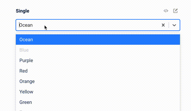
(※デモサイトのキャプチャ)
導入
ライブラリをインストールしてスタートです!
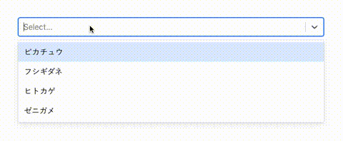
下は公式サイトに載っているソースコードです。
import React from 'react'
import Select from 'react-select'

const options = [
  { value: 'pikachu', label: 'ピカチュウ' },
  { value: 'bulbasaur', label: 'フシギダネ' },
  { value: 'charmander', label: 'ヒトカゲ' },
  { value: 'squirtle', label: 'ゼニガメ' },
]

const App: React.FC = () => {
  return (
    <Select options={options} />
  )
}

export default App
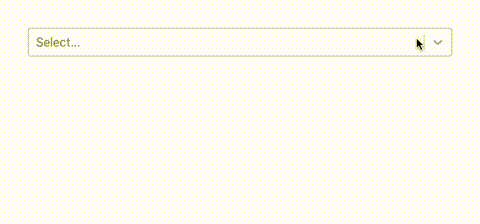
デフォルトでもいい感じの見た目になってくれます。
複数個選択できるSelect
「Multi」機能を使うと、複数個指定することができます!もちろんテキストによる検索機能も使えます。下のソースコードにある通りですが、isMultiオプションを付けるだけです!
<Select
  isMulti
  name="pokemon"
  options={options}
/>
他のProps
指定できるPropsは以下の通りです。
| Props名 | 役割 |
|---|---|
| autoFocus | 描画時テキストエリアをFocusさせる |
| className | className指定 |
| classNamePrefix | 指定した接頭辞を持つclassNameを適用 |
| isDisabled | disableのコントール |
| isMulti | 複数選択可能か指定 |
| isSearchable | 検索機能を付けられる。一致するoptionの絞り込み機能 |
| name | name |
| onChange | onChangeイベント |
| options | Selectの選択肢(option配列) |
| placeholder | プレースホルダー |
| value | value |
入力したテキストを複数指定できる
入力エリアに直接ユーザーがテキストを入力し、エンターキーを押すとチップを複数個作成できるCreatableSelectという機能もオススメです!
公式サイト紹介: https://react-select.com/creatable
下の例は、入力してエンターを押すと自動でlabel、valueが生成され、配列を取得することができます。
import Creatable from 'react-select/creatable'
下はサンプルの実装です。
import React, { useState } from 'react'
import CreatableSelect from "react-select/creatable"

type OptionType = {
  label: string
  value: string
}

/**
 * 入力された値をデータ用に整形
 */
const createOption = (label: string): OptionType => ({
  label,
  value: label,
})

const Sample: React.FC = () => {
  const [pokemon, setPokemons] = useState("")
  const [pokemonList, setPokemonList] = useState<OptionType[]>([])

  const onChange = (value: any): void => {
    setPokemonList(value)
  }

  const onInputChange = (inputValue: string): void => {
    setPokemons(inputValue)
  }

  const onKeyDown = (event: React.KeyboardEvent<HTMLElement>): void => {
    if (pokemon == null) {
      return
    }

    switch (event.key) {
      case "Enter":
      case "Tab":
        if (pokemon) {
          setPokemons("")
          setPokemonList([...pokemonList, createOption(pokemon)])
          event.preventDefault()
        }
    }
  }

  return (
    <CreatableSelect
      inputValue={pokemon}
      isClearable
      isMulti
      menuIsOpen={false}
      onChange={onChange}
      onInputChange={onInputChange}
      onKeyDown={onKeyDown}
      value={pokemonList}
      placeholder="お気に入りのポケモンを入力してください!"
    />
  )
}
上の実装は下のような挙動になってくれます!

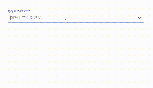
Material-UIとの組み合わせ
Material-UIの本家サイトの方に、react-selectライブラリを組み合わせた書き方について載っています。自分でも実装してみました!
<Select />タグにcomponentsを指定することでMaterial-UIのFormが使えるようです。
import MenuItem from '@material-ui/core/MenuItem'
import { createStyles, makeStyles } from '@material-ui/core/styles'
import TextField, { BaseTextFieldProps } from '@material-ui/core/TextField'
import React, { HTMLAttributes } from 'react'
import Select from 'react-select'
import { ControlProps } from 'react-select/src/components/Control'
import { OptionProps } from 'react-select/src/components/Option'
import { ValueType } from 'react-select/src/types'

interface OptionType {
  label: string
  value: string
}

const pokemons: OptionType[] = [
  { value: 'pikachu', label: 'ピカチュウ' },
  { value: 'bulbasaur', label: 'フシギダネ' },
  { value: 'charmander', label: 'ヒトカゲ' },
  { value: 'squirtle', label: 'ゼニガメ' },
].map(suggestion => ({
  value: suggestion.label,
  label: suggestion.label,
}))

const useStyles = makeStyles(() =>
  createStyles({
    root: {
      padding: 40,
    },
    input: {
      display: 'flex',
      padding: 0,
      height: 'auto',
    },
  }),
)

type InputComponentProps = Pick<BaseTextFieldProps, 'inputRef'> & HTMLAttributes<HTMLDivElement>

const inputComponent = ({ inputRef, ...props }: InputComponentProps) => {
  return <div ref={inputRef} {...props} />
}

const Control = (props: ControlProps<OptionType>) => {
  const {
    children,
    innerProps,
    innerRef,
    selectProps: { classes, TextFieldProps },
  } = props

  return (
    <TextField
      fullWidth
      InputProps={{
        inputComponent,
        inputProps: {
          className: classes.input,
          ref: innerRef,
          children,
          ...innerProps,
        },
      }}
      {...TextFieldProps}
    />
  )
}

const Option = (props: OptionProps<OptionType>) => {
  return (
    <MenuItem
      ref={props.innerRef}
      selected={props.isFocused}
      component="div"
      style={{
        fontWeight: props.isSelected ? 500 : 400,
      }}
      {...props.innerProps}
    >
      {props.children}
    </MenuItem>
  )
}

const components = {
  Control,
  Option,
}

const App: React.FC = () => {
  const classes = useStyles()
  const [pokemon, setPokemon] = React.useState<ValueType<OptionType>>(null)

  const onChange = (value: ValueType<OptionType>) => {
    setPokemon(value)
  }

  return (
    <div className={classes.root}>
      <Select
        classes={classes}
        inputId="pokemon"
        TextFieldProps={{
          label: 'あなたのポケモン',
          InputLabelProps: {
            htmlFor: 'pokemon',
            shrink: true,
          },
        }}
        placeholder="選択してください"
        options={pokemons}
        components={components}
        value={pokemon}
        onChange={onChange}
      />
    </div>
  )
}
(componentsでそれぞれ指定する必要があるのかなぁ…🤔)
コード長くなりましたが、Material-UIでも実装可能なようです。
使ってみた感想
cssで見た目を調整することも可能なようです。↓
公式: Custom Styles
簡単にただのSelectボックスに検索機能や複数選択など、拡張することができました!