はじめに
TextViewの横に画像のリソースを表示をさせたい状況がありました。
試行錯誤したレイアウト方法をメモしておきます。
困った時に参考にしてください。
まずベースとなるテキストだけのLayout定義はこちらです。
<?xml version="1.0" encoding="utf-8"?>
<androidx.constraintlayout.widget.ConstraintLayout xmlns:android="http://schemas.android.com/apk/res/android"
    xmlns:app="http://schemas.android.com/apk/res-auto"
    xmlns:card_view="http://schemas.android.com/tools"
    android:layout_width="match_parent"
    android:layout_height="match_parent"
    android:background="@color/purple_200">

    <androidx.cardview.widget.CardView
        android:id="@+id/card_view"
        android:layout_width="0dp"
        android:layout_height="wrap_content"
        android:layout_margin="10dp"
        android:layout_marginTop="8dp"
        android:minHeight="200dp"
        app:cardCornerRadius="5dp"
        app:layout_constraintEnd_toEndOf="parent"
        app:layout_constraintStart_toStartOf="parent"
        app:layout_constraintTop_toTopOf="parent"
        card_view:contentPadding="5dp">

        <androidx.constraintlayout.widget.ConstraintLayout
            android:id="@+id/card_view_layout"
            android:layout_width="match_parent"
            android:layout_height="wrap_content"
            android:minHeight="200dp"
            app:layout_constraintBottom_toBottomOf="@id/card_view"
            app:layout_constraintEnd_toEndOf="@id/card_view"
            app:layout_constraintStart_toStartOf="@id/card_view"
            app:layout_constraintTop_toTopOf="@id/card_view">

            <TextView
                android:id="@+id/card_view_text"
                android:layout_width="wrap_content"
                android:layout_height="wrap_content"
                android:layout_marginStart="5dp"
                android:layout_marginLeft="5dp"
                android:gravity="center_vertical"
                android:maxWidth="180dp"
                android:text="hoge hoge hoge hoge テキスト"
                app:layout_constrainedWidth="true"
                app:layout_constraintBottom_toBottomOf="@id/card_view_layout"
                app:layout_constraintStart_toStartOf="@id/card_view_layout"
                app:layout_constraintTop_toTopOf="@id/card_view_layout" />

        </androidx.constraintlayout.widget.ConstraintLayout>
    </androidx.cardview.widget.CardView>
</androidx.constraintlayout.widget.ConstraintLayout>
これを表示すると以下のようになります。

構成を簡単に説明するとCardView上にテキストが乗っていて文字が一定数以上だと改行するみたいなレイアウトになっています。
この時に、テキストの右横に画像を付けたい場合の方法、利点、弱点を紹介していきます。
表示する画像ですが、用意しなくても良いように AndroidSDK内にあるファイル
R.drawable.ic_btn_speak_now

のマイクのような画像を使います。
1.TextViewのdrawable[Left/Right/Top/Bottom]を利用する方法
最初に紹介する方法は
drawableRight
を利用した方法です。
レイアウトは以下の定義となります。
<?xml version="1.0" encoding="utf-8"?>
<androidx.constraintlayout.widget.ConstraintLayout xmlns:android="http://schemas.android.com/apk/res/android"
    xmlns:app="http://schemas.android.com/apk/res-auto"
    xmlns:card_view="http://schemas.android.com/tools"
    android:layout_width="match_parent"
    android:layout_height="match_parent"
    android:background="@color/purple_200">

    <androidx.cardview.widget.CardView
        android:id="@+id/card_view"
        android:layout_width="0dp"
        android:layout_height="wrap_content"
        android:layout_margin="10dp"
        android:layout_marginTop="8dp"
        android:minHeight="200dp"
        app:cardCornerRadius="5dp"
        app:layout_constraintEnd_toEndOf="parent"
        app:layout_constraintStart_toStartOf="parent"
        app:layout_constraintTop_toTopOf="parent"
        card_view:contentPadding="5dp">

        <androidx.constraintlayout.widget.ConstraintLayout
            android:id="@+id/card_view_layout"
            android:layout_width="match_parent"
            android:layout_height="wrap_content"
            android:minHeight="200dp"
            app:layout_constraintBottom_toBottomOf="@id/card_view"
            app:layout_constraintEnd_toEndOf="@id/card_view"
            app:layout_constraintStart_toStartOf="@id/card_view"
            app:layout_constraintTop_toTopOf="@id/card_view">

            <TextView
                android:id="@+id/card_view_text"
                android:layout_width="wrap_content"
                android:layout_height="wrap_content"
                android:layout_marginStart="5dp"
                android:layout_marginLeft="5dp"
                android:drawableRight="@android:drawable/ic_btn_speak_now"
                android:drawablePadding="2dp"
                android:gravity="center_vertical"
                android:maxWidth="180dp"
                android:text="hoge hoge hoge hoge テキスト"
                app:layout_constrainedWidth="true"
                app:layout_constraintBottom_toBottomOf="@id/card_view_layout"
                app:layout_constraintStart_toStartOf="@id/card_view_layout"
                app:layout_constraintTop_toTopOf="@id/card_view_layout" />

        </androidx.constraintlayout.widget.ConstraintLayout>
    </androidx.cardview.widget.CardView>
</androidx.constraintlayout.widget.ConstraintLayout>
これで表示を確認すると↓ようになりました。

利点は、レイアウトファイルに定義するだけなので簡単です。drawablePaddingの定義で文字との距離が確保できます。
画像もTextViewの一部と判定されるので maxWidth 制約による改行の位置が変わりました。
弱点は画像のサイズが元々の画像に依存します。表示位置の微調整も難しいです。文字列の最後尾に置くといった文字列との共存は難しいようです。
その他にdrawableRight、drawableTop、drawableBottomの定義も可能です。
試しにdrawableBottomに定義し表示を確認すると↓のようになります。

2.Spannableを利用する方法
SpannableStringのAPIを使用して実装した例が↓です。
class FirstFragment : Fragment() {

    override fun onViewCreated(view: View, savedInstanceState: Bundle?) {
        super.onViewCreated(view, savedInstanceState)
        val string = SpannableString("hoge hoge hoge hoge テキスト ")
        string.setSpan(
            ImageSpan(context as Context, android.R.drawable.ic_btn_speak_now),
            24,
            25,
            Spannable.SPAN_EXCLUSIVE_EXCLUSIVE
        )

        view.findViewById<TextView>(R.id.card_view_text).setText(string)
    }
}
これで表示を確認すると↓のようになります。
setSpan()の第2引数と第3引数の値で指定した箇所あたりに画像が表示されます。

この方法の利点は、文字列内に画像が表示されます。改行にも対応してくれます。
弱点はコードに手を入れることになるので、可読性への影響やUIテストへの影響があります。画像サイズの調整や位置の微調整ができません。
setSpan()の第2引数と第3引数の指定を14, 15に変えて表示を確認すると↓のようになります。
string.setSpan(
    ImageSpan(context as Context, android.R.drawable.ic_btn_speak_now),
    14,
    15,
    Spannable.SPAN_EXCLUSIVE_EXCLUSIVE
)

3.HTMLを利用する方法
HTMLのAPIを使用して実装した例が↓です。
class FirstFragment : Fragment() {

    override fun onViewCreated(view: View, savedInstanceState: Bundle?) {
        super.onViewCreated(view, savedInstanceState)

        val imageGetter = Html.ImageGetter { source ->
            val resId: Int = when (source) {
                "ic_btn_speak_now" -> android.R.drawable.ic_btn_speak_now
                else -> throw IllegalArgumentException()
            }

            when (resId) {
                android.R.drawable.ic_btn_speak_now -> {
                    context?.let {
                        ContextCompat.getDrawable(it, resId)?.apply {
                            setBounds(0, 0, intrinsicWidth, intrinsicHeight)
                        }
                    }
                }
                else -> throw IllegalArgumentException()
            }
        }

        val string = "hoge hoge hoge hoge テキスト <img src='ic_btn_speak_now'>"

        view.findViewById<TextView>(R.id.card_view_text).setText(
            if (Build.VERSION.SDK_INT >= Build.VERSION_CODES.N) {
                Html.fromHtml(string, Html.FROM_HTML_MODE_LEGACY, imageGetter, null)
            } else {
                Html.fromHtml(string, imageGetter, null)
            }
        )
    }
}
これで表示を確認すると↓のようになります。

文字列を変えると表示も変わります。
val string = "hoge hoge <img src='ic_btn_speak_now'> hoge hoge テキスト"

この方法だと画像の表示サイズが微調整可能です
setBounds(0, 0, (intrinsicWidth * 0.5).toInt(), (intrinsicHeight * 0.5).toInt())

4.ImageViewをTextViewの横に置く方法
TextViewとImageViewを並べるというシンプルな方法です。
レイアウト定義の例はこちらです。
<?xml version="1.0" encoding="utf-8"?>
<androidx.constraintlayout.widget.ConstraintLayout xmlns:android="http://schemas.android.com/apk/res/android"
    xmlns:app="http://schemas.android.com/apk/res-auto"
    xmlns:card_view="http://schemas.android.com/tools"
    android:layout_width="match_parent"
    android:layout_height="match_parent"
    android:background="@color/purple_200">

    <androidx.cardview.widget.CardView
        android:id="@+id/card_view"
        android:layout_width="0dp"
        android:layout_height="wrap_content"
        android:layout_margin="10dp"
        android:layout_marginTop="8dp"
        android:minHeight="200dp"
        app:cardCornerRadius="5dp"
        app:layout_constraintEnd_toEndOf="parent"
        app:layout_constraintStart_toStartOf="parent"
        app:layout_constraintTop_toTopOf="parent"
        card_view:contentPadding="5dp">

        <androidx.constraintlayout.widget.ConstraintLayout
            android:id="@+id/card_view_layout"
            android:layout_width="match_parent"
            android:layout_height="wrap_content"
            android:minHeight="200dp"
            app:layout_constraintBottom_toBottomOf="@id/card_view"
            app:layout_constraintEnd_toEndOf="@id/card_view"
            app:layout_constraintStart_toStartOf="@id/card_view"
            app:layout_constraintTop_toTopOf="@id/card_view">

            <TextView
                android:id="@+id/card_view_text"
                android:layout_width="wrap_content"
                android:layout_height="wrap_content"
                android:layout_marginStart="5dp"
                android:layout_marginLeft="5dp"
                android:gravity="center_vertical"
                android:maxWidth="180dp"
                android:text="hoge hoge hoge hoge テキスト"
                app:layout_constrainedWidth="true"
                app:layout_constraintBottom_toBottomOf="@id/card_view_layout"
                app:layout_constraintStart_toStartOf="@id/card_view_layout"
                app:layout_constraintTop_toTopOf="@id/card_view_layout" />

            <ImageView
                android:id="@+id/card_view_image"
                android:layout_width="wrap_content"
                android:layout_height="wrap_content"
                android:src="@android:drawable/ic_btn_speak_now"
                app:layout_constraintBottom_toBottomOf="@id/card_view_text"
                app:layout_constraintStart_toEndOf="@id/card_view_text"
                app:layout_constraintTop_toTopOf="@id/card_view_text" />

        </androidx.constraintlayout.widget.ConstraintLayout>
    </androidx.cardview.widget.CardView>
</androidx.constraintlayout.widget.ConstraintLayout>
これを表示すると

この方法は
一方、この方法の良さはImageViewなのでのサイズを自由に指定できます。
例えば、layout_widthとlayout_heightを50dpにしてみます。
<?xml version="1.0" encoding="utf-8"?>
<androidx.constraintlayout.widget.ConstraintLayout xmlns:android="http://schemas.android.com/apk/res/android"
    xmlns:app="http://schemas.android.com/apk/res-auto"
    xmlns:card_view="http://schemas.android.com/tools"
    android:layout_width="match_parent"
    android:layout_height="match_parent"
    android:background="@color/purple_200">

    <androidx.cardview.widget.CardView
        android:id="@+id/card_view"
        android:layout_width="0dp"
        android:layout_height="wrap_content"
        android:layout_margin="10dp"
        android:layout_marginTop="8dp"
        android:minHeight="200dp"
        app:cardCornerRadius="5dp"
        app:layout_constraintEnd_toEndOf="parent"
        app:layout_constraintStart_toStartOf="parent"
        app:layout_constraintTop_toTopOf="parent"
        card_view:contentPadding="5dp">

        <androidx.constraintlayout.widget.ConstraintLayout
            android:id="@+id/card_view_layout"
            android:layout_width="match_parent"
            android:layout_height="wrap_content"
            android:minHeight="200dp"
            app:layout_constraintBottom_toBottomOf="@id/card_view"
            app:layout_constraintEnd_toEndOf="@id/card_view"
            app:layout_constraintStart_toStartOf="@id/card_view"
            app:layout_constraintTop_toTopOf="@id/card_view">

            <TextView
                android:id="@+id/card_view_text"
                android:layout_width="wrap_content"
                android:layout_height="wrap_content"
                android:layout_marginStart="5dp"
                android:layout_marginLeft="5dp"
                android:gravity="center_vertical"
                android:maxWidth="180dp"
                android:text="hoge hoge hoge hoge テキスト"
                app:layout_constrainedWidth="true"
                app:layout_constraintBottom_toBottomOf="@id/card_view_layout"
                app:layout_constraintStart_toStartOf="@id/card_view_layout"
                app:layout_constraintTop_toTopOf="@id/card_view_layout" />

            <ImageView
                android:id="@+id/card_view_image"
                android:layout_width="50dp"
                android:layout_height="50dp"
                android:src="@android:drawable/ic_btn_speak_now"
                app:layout_constraintBottom_toBottomOf="@id/card_view_text"
                app:layout_constraintStart_toEndOf="@id/card_view_text"
                app:layout_constraintTop_toTopOf="@id/card_view_text" />

        </androidx.constraintlayout.widget.ConstraintLayout>
    </androidx.cardview.widget.CardView>
</androidx.constraintlayout.widget.ConstraintLayout>
これで表示すると↓になりました。

5.絵文字を利用する方法
「画像を表示する」という意図からはずれますが絵文字は文字なので、TextViewと共存することは可能です。絵文字で代用できるなら案としては1つあります。
絵文字は10進数で定義すると表示できました。
にっこり笑う絵文字(16進数:1F600 10進数:128512)の挿入例です。
<?xml version="1.0" encoding="utf-8"?>
<androidx.constraintlayout.widget.ConstraintLayout xmlns:android="http://schemas.android.com/apk/res/android"
xmlns:app="http://schemas.android.com/apk/res-auto"
xmlns:card_view="http://schemas.android.com/tools"
android:layout_width="match_parent"
android:layout_height="match_parent"
android:background="@color/purple_200">
<androidx.cardview.widget.CardView
android:id="@+id/card_view"
android:layout_width="0dp"
android:layout_height="wrap_content"
android:layout_margin="10dp"
android:layout_marginTop="8dp"
android:minHeight="200dp"
app:cardCornerRadius="5dp"
app:layout_constraintEnd_toEndOf="parent"
app:layout_constraintStart_toStartOf="parent"
app:layout_constraintTop_toTopOf="parent"
card_view:contentPadding="5dp">
<androidx.constraintlayout.widget.ConstraintLayout
android:id="@+id/card_view_layout"
android:layout_width="match_parent"
android:layout_height="wrap_content"
android:minHeight="200dp"
app:layout_constraintBottom_toBottomOf="@id/card_view"
app:layout_constraintEnd_toEndOf="@id/card_view"
app:layout_constraintStart_toStartOf="@id/card_view"
app:layout_constraintTop_toTopOf="@id/card_view">
<TextView
android:id="@+id/card_view_text"
android:layout_width="wrap_content"
android:layout_height="wrap_content"
android:layout_marginStart="5dp"
android:layout_marginLeft="5dp"
android:gravity="center_vertical"
android:maxWidth="180dp"
android:text="hoge hoge hoge hoge テキスト 😀"
app:layout_constrainedWidth="true"
app:layout_constraintBottom_toBottomOf="@id/card_view_layout"
app:layout_constraintStart_toStartOf="@id/card_view_layout"
app:layout_constraintTop_toTopOf="@id/card_view_layout" />
</androidx.constraintlayout.widget.ConstraintLayout>
</androidx.cardview.widget.CardView>
</androidx.constraintlayout.widget.ConstraintLayout>

この方法の利点は、挿入したい場所に自由に挿入できます。
サイズ感もちょうど良いです。
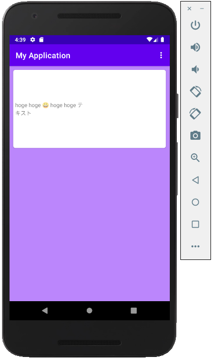
例えば以下のような文字列の真ん中に挿入も簡単です。
android:text="hoge hoge 😀 hoge hoge テキスト"
まとめ
紹介した5つの方法の良いところ悪いところをまとめてみました。
要件によって何で実装するか上手く選択すると良いと思います。
| 良いところ | 悪いところ | |
|---|---|---|
| TextViewのdrawableを利用する方法 | レイアウトファイルに定義するだけで使える | 文字列の中に画像は入れられない |
| Spannableを利用する方法 | 文字列の中に画像を入れられる | ソースコードを実装する必要がある |
| HTMLを利用する方法 | 文字列の中に画像を入れられ微調整が可能 | ソースコードを実装する必要がある |
| ImageViewをTextViewの横に置く方法 | レイアウトファイルに定義するだけで使え自由度は高い | 文字列の中に画像は入れられない |
| 絵文字を利用する方法 | Stringの定義だけで表示できる | 画像の表示ではない |