Web上でグラフ表示をさせるために、「GoogleChartTools」を使用するため色々と調査。
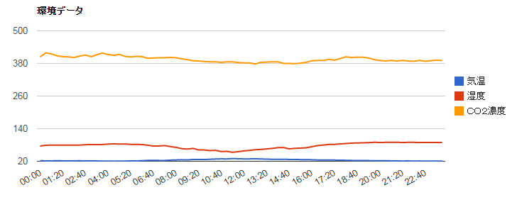
表示したいのは、こんな感じのグラフ

参考サイト:http://yohshiy.blog.fc2.com/blog-entry-195.html
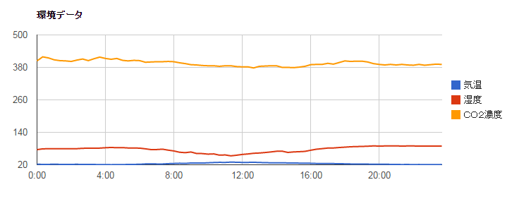
引き継いだ時のグラフは、こんな感じでした。
棒グラフ→散布図へ
渡すデータの先頭列が文字列か数値で、グラフの種類が変わるらしい…
今回は、散布図に近いものを求められているので、文字列から数値に変更してみた。
折れ線グラフでは先頭列を文字列にすると 棒グラフ、 数値にすると 散布図 のような扱いになります。
変更前:['時間','気温','湿度','CO2濃度']
,['00:00',22.0,75.9,404.0]
,['00:20',21.4,78.9,419.0]
変更後: ['時間','気温','湿度','CO2濃度']
,[new Date(2015, 3, 20, 0, 0, 0),22.0,75.9,404.0]
,[new Date(2015, 3, 20, 0, 20, 0),21.4,78.9,419.0]
変更後のグラフは、こうなりました。
サブ補助線追加
オプションに追加してみた
,hAxis: {
minorGridlines:{ count: 2, color: 'gray'}
}

色が合ってない…
変えてみた
,hAxis: {
minorGridlines:{ count: 2, color: '#cccccc'}
}

補助線もサブ補助線もスタイルを点線にしたなぁ
点線はいったん諦めて…
縦軸を複数表示する方法を模索…
追加してみた
width: 900,
height: 500,
series: {
0: {type:'line', targetAxisIndex: 0},
1: {type:'line', targetAxisIndex: 1},
2: {type:'line', targetAxisIndex: 2}
},
vAxes:{
0:{title:''},
1:{title:''},
2:{title:'', textPosition:'in'}
},
widthとheightは関係ないけど、結果はこんな感じ

近くはなってきたんだけど…縦軸の目盛の位置がどうにも変えられないし、左側に全部表示できない。
Optionを切替えて、左側の目盛を表示したい内容に変更する

series: {
0: {type:'line', targetAxisIndex: 0},
1: {type:'line', targetAxisIndex: 1},
2: {type:'line', targetAxisIndex: 2}
},
vAxes:{
0:{title:'',minValue:0,maxValue:40,textStyle:{color: 'blue'}},
1:{title:'', textPosition:'none',minValue:0,maxValue:100,textStyle:{color: 'red'}},
2:{title:'', textPosition:'none',minValue:0,maxValue:1000,textStyle:{color: 'orange'}}
},

series: {
0: {type:'line', targetAxisIndex: 1},
1: {type:'line', targetAxisIndex: 0},
2: {type:'line', targetAxisIndex: 2}
},
vAxes:{
1:{title:'', textPosition:'none',minValue:0,maxValue:40,textStyle:{color: 'blue'}},
0:{title:'',minValue:0,maxValue:100,textStyle:{color: 'red'}},
2:{title:'', textPosition:'none',minValue:0,maxValue:1000,textStyle:{color: 'orange'}}
},

series: {
0: {type:'line', targetAxisIndex: 1},
1: {type:'line', targetAxisIndex: 2},
2: {type:'line', targetAxisIndex: 0}
},
vAxes:{
1:{title:'', textPosition:'none',minValue:0,maxValue:40,textStyle:{color: 'blue'}},
2:{title:'', textPosition:'none',minValue:0,maxValue:100,textStyle:{color: 'red'}},
0:{title:'',minValue:0,maxValue:1000,textStyle:{color: 'orange'}}
},