今回実現させたいNavigationBar
ブラウザの幅が一定値以上超えても、Navbarのコンテイナは一定の幅以上超えない。
(つまり、NavbarのコンテイナにMax幅を入れたい。)
ブラウザサイズに合わせて無限に広くなると、UI/UX的に良くないですね。
参考映像

事前に用意しておくこと
・ tailwind install
・ React library
(もちろん just JavaScript, HTML/CSSでも構いません)
コード
react Navbar.jsx
import React from 'react';
import { Link } from 'react-router-dom';
import {BsFillPencilFill} from 'react-icons/bs';


export default function Navbar() {
  return (
    <header className='flex justify-between border-b border-gray-300 p-2'>
        <Link to ='/' className='flex items-center text-4xl text-brand'>
            <h1>Navbar</h1>
        </Link>
        <nav className='flex items-center gap-4 font-semibold'>
            <Link to='/products'>Products</Link>
            <Link to='/carts'>Carts</Link>
            <Link to='/products/new' className='text-2xl'>
                <BsFillPencilFill/>
            </Link>
            <button>Login</button>
        </nav>
    </header>
  )
}
index.css
@tailwind base;
@tailwind components;
@tailwind utilities;
body{
...
@apply flex flex-col items-center;
/*flex : cssでの display: flex */
/*flex-col : Flexboxのコンテナーの方向を垂直方向にするように、親要素に flex-direction: column を追加 */
/*items-center : Flexboxのコンテナーのアイテムを中央に配置するように、親要素に align-items: center を追加 */
}
#root {
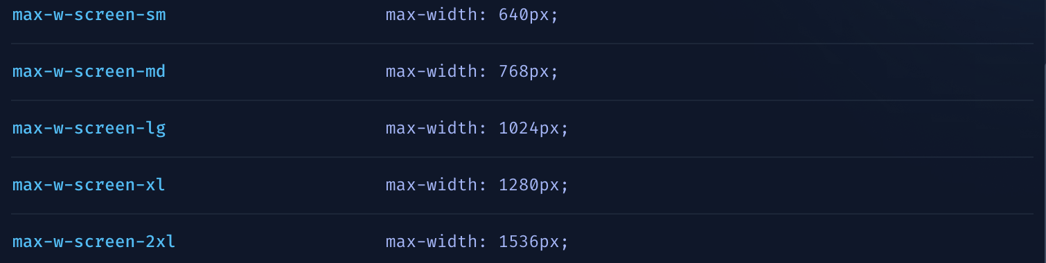
@apply w-full max-w-screen-xl;
/* root要素が100%の幅を占有し、最大幅がスクリーンの横幅の最大値に制限*/
}
ポイントは <div id="root"></div>のroot属性に max-w-screen-xlを入れることで、
root DOMの幅はxlサイズ以上にはならないのです。