はじめに
こんにちは、事業会社で働いているデータサイエンティストです。
前回の記事で、ベイズ機械学習のモデルを提案して、実際にアメリカの上院の投票データに応用してみたら、かなり興味深い現象を可視化できました。
そこで、先ほど追加の可視化をしたら、さらに面白い現象を可視化できたので、元々dockerでRのコンテナを立ててモデルAPIを作る方法を説明しようとしたんですが、急遽予定を変更して、可視化の記事をもう一本書くことにしました。
本記事は、前回の記事のコード・実行結果と解説を前提としています。
コサイン類似度の事後分布のメリット
普段機械学習や統計学でベクトル(隠れ変数)を推定する際に、ベクトル同士の類似度を比較する指標として、コサイン類似度がよく利用されますが、単一の数値で提示されることがほとんどです。
例えば、典型的なword2vecの場合、「パリ」と「ロンドン」のコサイン類似度は0.XXXですよと報告したり、データベースに格納したりすることが多いと思います。
ただ、単一の数値で報告すると、「それ単なる誤差じゃない?」という質問に答えられません。また、モデルが推定されたコサイン類似度にどれほどの自信を持っているかもわかりません。
そこで、ベイズ機械学習を利用すれば、推定されたパラメーター(文ベクトル、イデオロギーベクトルなど)の不確実性から波及されるコサイン類似度の不確実性も計算でき、かついつものベイズ統計学の事後分布の可視化の手法でビジュアライズできます。
コサイン類似度の事後分布の出し方
詳細は前回の記事のモデル説明のところのsenate_emb.stanファイルを確認していただきたいですが、ファイルの中のgenerated quantitiesの中にこの処理があります:
for (i in 1:senator_type){
  for (j in 1:senator_type){
    cos_sim[i, j] = (senator_latent[i] '* senator_latent[j])/sqrt(sum(senator_latent[i].^2) * sum(senator_latent[j].^2));
  }
}
これでコサイン類似度の計算ができます。計算もそんなに遅くないです。
続いては、前回の記事で行った処理の続きとして、推定されたアメリカの上院議員のイデオロギーベクトルのコサイン類似度の事後分布を抽出して、可視化しやすくするための前処理も施します。
cos_sim_df <- m_senate_emb_summary |>
  dplyr::filter(stringr::str_detect(variable, "cos_sim")) |>
  dplyr::mutate(
    senator_id_list = purrr::map(
      variable, \(x){
        # cos_sim[X,Y]のXとYはそれぞれ上院議員マスターのIDに該当する
        stringr::str_split(x, "\\[|\\]|,")[[1]][2:3] |>
          as.integer()
      }
    )
  ) |>
  tidyr::unnest_wider(col = senator_id_list, names_sep = "_") |>
  dplyr::left_join(senator_master, by = c("senator_id_list_1" = "senator_id")) |>
  dplyr::left_join(senator_master, by = c("senator_id_list_2" = "senator_id")) |>
  dplyr::rename(
    party_id_1 = party_id.x,
    party_id_2 = party_id.y,
    senator_1 = senator.x,
    senator_2 = senator.y
  ) |>
  dplyr::mutate(
    party_1 = dplyr::case_when(
      party_id_1 == 1 ~ "Republican",
      TRUE ~ "Democrat"
    ),
    party_2 = dplyr::case_when(
      party_id_2 == 1 ~ "Republican",
      TRUE ~ "Democrat"
    )
  )
どんなデータフレイムになっているのかを確かめてみましょう:
> cos_sim_df
# A tibble: 10,404 × 15
   variable        mean median     sd    mad     q5     q95 senator_id_list_1 senator_id_list_2 senator_1        party_id_1 senator_2    party_id_2 party_1    party_2
   <chr>          <dbl>  <dbl>  <dbl>  <dbl>  <dbl>   <dbl>             <int>             <int> <chr>                 <dbl> <chr>             <dbl> <chr>      <chr>
 1 cos_sim[1,1]   1      1     0      0       1      1                      1                 1 AKAKA (D HI)              2 AKAKA (D HI)          2 Democrat   Democrat
 2 cos_sim[2,1]  -0.199 -0.201 0.0422 0.0412 -0.268 -0.128                  2                 1 ALEXANDER (R TN)          1 AKAKA (D HI)          2 Republican Democrat
 3 cos_sim[3,1]  -0.360 -0.361 0.0435 0.0454 -0.428 -0.288                  3                 1 ALLARD (R CO)             1 AKAKA (D HI)          2 Republican Democrat
 4 cos_sim[4,1]  -0.247 -0.247 0.0427 0.0425 -0.316 -0.178                  4                 1 ALLEN (R VA)              1 AKAKA (D HI)          2 Republican Democrat
 5 cos_sim[5,1]   0.871  0.873 0.0245 0.0259  0.830  0.909                  5                 1 BAUCUS (D MT)             2 AKAKA (D HI)          2 Democrat   Democrat
 6 cos_sim[6,1]   0.932  0.933 0.0175 0.0168  0.901  0.959                  6                 1 BAYH (D IN)               2 AKAKA (D HI)          2 Democrat   Democrat
 7 cos_sim[7,1]  -0.159 -0.159 0.0446 0.0429 -0.233 -0.0842                 7                 1 BENNETT (R UT)            1 AKAKA (D HI)          2 Republican Democrat
 8 cos_sim[8,1]   0.927  0.928 0.0164 0.0167  0.899  0.953                  8                 1 BIDEN (D DE)              2 AKAKA (D HI)          2 Democrat   Democrat
 9 cos_sim[9,1]   0.943  0.944 0.0150 0.0138  0.918  0.964                  9                 1 BINGAMAN (D NM)           2 AKAKA (D HI)          2 Democrat   Democrat
10 cos_sim[10,1] -0.230 -0.230 0.0446 0.0428 -0.302 -0.158                 10                 1 BOND (R MO)               1 AKAKA (D HI)          2 Republican Democrat
# ℹ 10,394 more rows
# ℹ Use `print(n = ...)` to see more rows
問題なくtidyなデータ(データベース形式のデータ)に整形できました。
可視化
まず、当時上院議員だったオバマさんのイデオロギーベクトルと他の上院議員のイデオロギーベクトルのコサイン類似度を出しましょう。
cos_sim_df |>
  dplyr::filter(senator_1 == "OBAMA (D IL)") |>
  ggplot2::ggplot() +
  ggplot2::geom_point(ggplot2::aes(x = mean, y = reorder(senator_2, mean), color = party_2)) +
  ggplot2::geom_errorbarh(ggplot2::aes(xmin = q5, xmax = q95, y = senator_2, color = party_2), position = "dodge", height = 0.2) +
  ggplot2::scale_color_manual(values = c("Democrat" = "blue",
                                         "Republican" = "red")) +
  ggplot2::theme(axis.text.y = ggplot2::element_text(size = 4)) +
  ggplot2::labs(
    title = "Cosine Similarity of Ideology Vector\nBarack Obama (D IL)",
    x = "Cosine Similarity",
    y = "Senator Name",
    color = "Party")

このように、コサイン類似度が統計的に有意に0.5より高い議員は、みんなオバマさんと同じ民主党の議員です。
オバマさんのように、自身の政党に近いイデオロギーを持っている議員のベクトルが、自身の所属政党の他の議員と近く、他の政党とは遠くなるという逆S字曲線の形になるのが、ベイズ機械学習モデルに教えたドメイン知識の結果です。バイデンさんの場合も同じです:
cos_sim_df |>
  dplyr::filter(senator_1 == "BIDEN (D DE)") |>
  ggplot2::ggplot() +
  ggplot2::geom_point(ggplot2::aes(x = mean, y = reorder(senator_2, mean), color = party_2)) +
  ggplot2::geom_errorbarh(ggplot2::aes(xmin = q5, xmax = q95, y = senator_2, color = party_2), position = "dodge", height = 0.2) +
  ggplot2::scale_color_manual(values = c("Democrat" = "blue",
                                         "Republican" = "red")) +
  ggplot2::theme(axis.text.y = ggplot2::element_text(size = 4)) +
  ggplot2::labs(
    title = "Cosine Similarity of Ideology Vector\nJoe Biden (D DE)",
    x = "Cosine Similarity",
    y = "Senator Name",
    color = "Party")
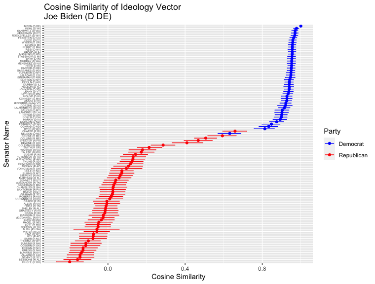
上位の顔ぶれに少し変化が見られましたが、民主党議員が上位で、共和党議員か下位にあるという全体的な傾向は、オバマさん変わりません。
共和党でも一緒です。2008年の大統領選に立候補したマケインさんのイデオロギーベクトルと他の上院議員のイデオロギーベクトルのコサイン類似度も同じ処理で出せます。
cos_sim_df |>
  dplyr::filter(senator_1 == "MCCAIN (R AZ)") |>
  ggplot2::ggplot() +
  ggplot2::geom_point(ggplot2::aes(x = mean, y = reorder(senator_2, mean), color = party_2)) +
  ggplot2::geom_errorbarh(ggplot2::aes(xmin = q5, xmax = q95, y = senator_2, color = party_2), position = "dodge", height = 0.2) +
  ggplot2::scale_color_manual(values = c("Democrat" = "blue",
                                         "Republican" = "red")) +
  ggplot2::theme(axis.text.y = ggplot2::element_text(size = 4)) +
  ggplot2::labs(
    title = "Cosine Similarity of Ideology Vector\nJohn McCain (R AZ)",
    x = "Cosine Similarity",
    y = "Senator Name",
    color = "Party")

全体的には、共和党と民主党の順番が逆転しただけです。
ただ、強いエビデンスがあれば、ベイズモデルは分析者が付与した仮説を「棄却」して、柔軟にパラメーターを推定してくれます。
前回の記事で見た、民主党なのに投票行動がすごく共和党議員と近いネルソン議員の状況を見てみましょう:
cos_sim_df |>
  dplyr::filter(senator_1 == "NELSON (D NE)") |>
  ggplot2::ggplot() +
  ggplot2::geom_point(ggplot2::aes(x = mean, y = reorder(senator_2, mean), color = party_2)) +
  ggplot2::geom_errorbarh(ggplot2::aes(xmin = q5, xmax = q95, y = senator_2, color = party_2), position = "dodge", height = 0.2) +
  ggplot2::scale_color_manual(values = c("Democrat" = "blue",
                                         "Republican" = "red")) +
  ggplot2::theme(axis.text.y = ggplot2::element_text(size = 4)) +
  ggplot2::labs(
    title = "Cosine Similarity of Ideology Vector\nBen Nelson (D NE)",
    x = "Cosine Similarity",
    y = "Senator Name",
    color = "Party")

オバマさんやバイデンさん、マケインさんなどと違い、同じ政党の議員とのコサイン類似度が近く、異なる政党の議員とのコサイン類似度が低いという逆S字曲線ではなく、スムーズな直線になっている。しかも、類似度の上位に来る議員に共和党の議員が多いことも図から確認できます。
結論
このように、コサイン類似度の事後分布を出せば、複雑な機械学習モデルの結果の説明がより緻密になり、「この0.05のコサイン類似度の差は誤差なのでは?」のような疑問も、統計学的正当性が担保された状態で解消できます。
最後に関係ない比較政治学の余談ですが、アメリカの党議拘束の強さと政治家と政党の関係についてより深く文献を探そうと思います。
dockerの記事は次回こそ書きます!