今回は鳥類のセンサスデータの集計をするコードをメモしておきます。
今回使用するのは架空のデータです。
データは調査時期が年2回、調査地点が4地点、それぞれの地点で3回調査を実施すると仮定しています。
以前から、調査回ごとに記録される種数や個体数はどれくらい増えていくのかを見てみたかったのがきっかけです。
# データの読み込み
census_data <-read.delim("clipboard")
> head(census_data)
  調査時期 調査地点 調査回           種名 個体数
1        1        1      1       ホオジロ      1
2        1        1      1 セグロセキレイ      1
3        1        1      1       ヒヨドリ      1
4        1        1      1 セグロセキレイ      2
5        1        1      1 ハシブトガラス      1
6        1        1      1       ヒヨドリ      1
こんな感じです。
それでは累積の種数と個体数を集計します。
# 各調査時期と調査地点ごとに、調査回ごとの種数と累積種数、個体数と累積個体数を集計
cumulative_data <- census_data %>%
  group_by(調査時期, 調査地点, 調査回) %>%
  summarise(
    個体数 = sum(個体数),
    種数 = n_distinct(種名),
    種リスト = list(unique(種名))
  ) %>%
  arrange(調査時期, 調査地点, 調査回) %>%
  group_by(調査時期, 調査地点) %>%
  mutate(
    累積種リスト = Reduce(function(x, y) unique(c(x, y)), 種リスト, accumulate = TRUE),
    累積種数 = sapply(累積種リスト, length),
    累積個体数 = cumsum(個体数)
  )

# 結果の表示
cumulative_data <- cumulative_data %>%
  select(調査時期, 調査地点, 調査回, 種数, 累積種数, 個体数, 累積個体数)

print(cumulative_data)
> print(cumulative_data)
# A tibble: 24 × 7
# Groups:   調査時期, 調査地点 [8]
   調査時期 調査地点 調査回  種数 累積種数 個体数 累積個体数
      <int>    <int>  <int> <int>    <int>  <int>      <int>
 1        1        1      1     5        5      9          9
 2        1        1      2     7       10     14         23
 3        1        1      3     5       13      7         30
 4        1        2      1     7        7      8          8
 5        1        2      2     7       10     11         19
 6        1        2      3     7       15     10         29
 7        1        3      1     8        8     27         27
 8        1        3      2     5       10     27         54
 9        1        3      3     5       11     10         64
10        1        4      1     5        5      6          6
# ℹ 14 more rows
# ℹ Use `print(n = ...)` to see more rows
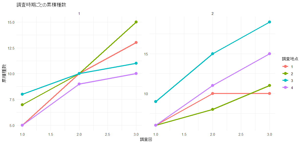
調査回ごとに種数と個体数がどう変化していくかグラフ化します。
# 累積種数のプロット
ggplot(cumulative_data, aes(x = 調査回, y = 累積種数, color = as.factor(調査地点))) +
  geom_line(size = 1.2) +
  geom_point(size = 3) +
  facet_wrap(~ 調査時期, scales = "free_y") +
  labs(title = "調査時期ごとの累積種数",
       x = "調査回",
       y = "累積種数",
       color = "調査地点") +
  theme_minimal()
# 累積個体数のプロット
ggplot(cumulative_data, aes(x = 調査回, y = 累積個体数, color = as.factor(調査地点))) +
  geom_line(size = 1.2) +
  geom_point(size = 3) +
  facet_wrap(~ 調査時期, scales = "free_y") +
  labs(title = "調査時期ごとの累積個体数",
       x = "調査回",
       y = "累積個体数",
       color = "調査地点") +
  theme_minimal()
