みなさんが湯婆婆を実装してる傍らでDOTAMAを実装する記事です。
この記事でやること
DOTAMAさんの代表曲「謝罪会見」のMVを楽しく拝見していたら
なんだか無性に作りたくなるものを発見しました。
DOTAMA - 謝罪会見
https://www.youtube.com/watch?v=7L82V3QEPB4
3:57 頃の「謝りたい」の文字が出てくるやつです。
今日はあれを作ろうと思います。
どう作るか
それっぽくするために要素を抽出します。
- フォントが高速で入れ替わる
- 画面全体のグリッチ感
- 背景は東京の夜の感じ
これを実装していきます。
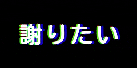
0. 基礎
まず基本の「謝りたい」を用意します。
<div class="container">
  <h1 id="main-txt" class="main-txt">謝りたい</h1>
</div>
.container {
  width: 100%;
  height: 100%;
  padding: 0;
  margin: 0;
  position: fixed;
  top: 0;
  left: 0;
}
.main-txt {
  margin: auto;
  font-size: 13rem;
  color: black;
  text-align: center;
  position: fixed;
  top: 50%;
  left: 50%;
  transform: translate(-50%, -50%);
  width: 100%;
  letter-spacing: 1.5rem;
  z-index: 10;
}

🙏
1. フォントを高速で入れ替える
これは様々なfont-familyを充てたclassを用意しておいて、classを入れ替えることで実現してみます。
まずは様々な日本語フォントを集めます。
デフォルトのfont-familyで指定できる日本語フォントをこのようにピックアップしました。
.arial {
  font-family: "arial unicode ms";
}
.serif {
  font-family: serif;
}
.bold {
  font-weight: bold;
}
.hiragino {
  font-family: "ヒラギノ角ゴ Pro W6", "HiraKakuPro-W6 ";
}
.hiragino-bold {
  font-family: " ヒラギノ角ゴ Std W8", "Hiragino Kaku Gothic Std";
}
.hiragino-mincho {
  font-family: "ヒラギノ明朝 Pro W3 ", " Hiragino Mincho Pro";
}
.hiragino-mincho-alpha {
  font-family: "ヒラギノ明朝 ProN W6", "HiraMinProN-W6";
}
.yumincho {
  font-family: "游明朝体", "YuMincho";
}
極力バリエーションを持たせるためにfont-weight違いも入れてみました。
ここにGoogle Fontsも加えます。
Google Fonts 日本語: https://googlefonts.github.io/japanese/
<link
  href="https://fonts.googleapis.com/css2?family=Kosugi&family=Kosugi+Maru&family=M+PLUS+1p&family=M+PLUS+Rounded+1c&family=Noto+Sans+JP:wght@100;400;900&family=Noto+Serif+JP&family=Sawarabi+Gothic&family=Sawarabi+Mincho&display=swap"
  rel="stylesheet"
/>
.kosugi {
  font-family: "Kosugi", sans-serif;
}
.kosugi-maru {
  font-family: "Kosugi Maru", sans-serif;
}
.mplus {
  font-family: "M PLUS 1p", sans-serif;
}
.mplus-round {
  font-family: "M PLUS Rounded 1c", sans-serif;
}
.notosans {
  font-family: "Noto Sans JP", sans-serif;
}
.notosans-bold {
  font-family: "Noto Sans JP", sans-serif;
  font-weight: 900;
}
.notosans-thin {
  font-family: "Noto Sans JP", sans-serif;
  font-weight: 100;
}
.notoserif {
  font-family: "Noto Serif JP", serif;
}
.sawarabi-gothic {
  font-family: "Sawarabi Gothic", sans-serif;
}
.sawarabi-mincho {
  font-family: "Sawarabi Mincho", sans-serif;
}
これを高速で入れ替える処理をJS側で書きます。
const fontArray = ["kosugi", "kosugi-maru", "mplus", "mplus-round", "notosans", "notoserif", "sawarabi-gothic", "sawarabi-mincho", "arial", "serif", "bold", "hiragino", "hiragino-bold", "hiragino-mincho", "hiragino-mincho-alpha", "yumincho", "notosans-bold", "notosans-thin"];

const setTimer = () => {
  setInterval(shuffle, 50);
};

const shuffle = () => {
  const text = document.getElementById("main-txt");
  let previousFont = null;
  // classをリセット
  for (let i = 0; i < fontArray.length; i++) {
    text.classList.remove(fontArray[i]);
  }
  // fontArrayからランダムにfontをピックアップ
  const random = fontArray[Math.floor(Math.random() * fontArray.length)];
  // フォントがひとつ前とかぶった時は再びシャッフル
  if (random == previousFont) {
    random = fontArray[Math.floor(Math.random() * fontArray.length)];
    if (random == previousFont) {
      random = fontArray[Math.floor(Math.random() * fontArray.length)];
    }
  }
  // fontのclassを充てる
  text.classList.add(random);
  previousFont = random;
};

window.onload = () => {
  setTimer();
};

2. 画面全体のグリッチ感
グリッチについては色々やり方がありますが今回はcssでやります。
参考にさせていただいたcodepen:
See the Pen Glitch effect strobocops by Jorinde (@jorinde) on CodePen.
( codepenのpublic公開されたコードはMITライセンスとなるため今回参考にさせていただきます。 https://blog.codepen.io/documentation/licensing/ )
主にcss animationで実装します。
まずglitch用に3つの虚像のテキストを用意
<h1 id="main-txt" class="main-txt">謝りたい</h1>
<!-- 新たに追加分 -->
<h1 class="main-txt glitch__color glitch__color--red">謝りたい</h1>
<h1 class="main-txt glitch__color glitch__color--blue">謝りたい</h1>
<h1 class="main-txt glitch__color glitch__color--green">謝りたい</h1>
cssに追加テキスト分のスタイルとグリッチアニメーションを追加します。
.glitch__color {
  opacity: 0.8;
  z-index: 100;
}
.glitch__color--red {
  animation: glitch 300ms cubic-bezier(0.25, 0.46, 0.45, 0.94) infinite;
  color: red;
  z-index: -1;
}

.glitch__color--blue {
  animation: glitch 300ms cubic-bezier(0.25, 0.46, 0.45, 0.94) infinite reverse;
  color: blue;
  z-index: -1;
}

.glitch__color--green {
  animation: glitch 300ms cubic-bezier(0.25, 0.46, 0.45, 0.94) 100ms infinite;
  color: #00ff0b;
  z-index: -1;
}

@keyframes glitch {
  0% {
    transform: translate(-50%, -50%);
  }
  20% {
    transform: translate(-52%, -49%);
  }
  40% {
    transform: translate(-51%, -51%);
  }
  60% {
    transform: translate(-48%, -49%);
  }
  80% {
    transform: translate(-51%, -49%);
  }
  100% {
    transform: translate(-50%, -50%);
  }
}
3. 背景は東京の夜の感じ
最後にもうちょっとMVに寄せるために背景を追加します。
背景画像は東京の夜の景色ということで、無料の写真素材を探せるo-dan( https://o-dan.net/ja/ )で見つけた写真を追加します。

背景を入れると文字のグリッチ部分だけテイストが違い浮いてしまうので、cssのmix-blend-modeを使って背景との調和を試みます。
.glitch__color {
  opacity: 0.8;
  z-index: 100;
  mix-blend-mode: color-dodge;
}
mix-blend-mode を使う場合は上から重ねた方がいいので
.glitch__color--red , .glitch__color--green , .glitch__color--blue のz-index: -1を外しておきます。
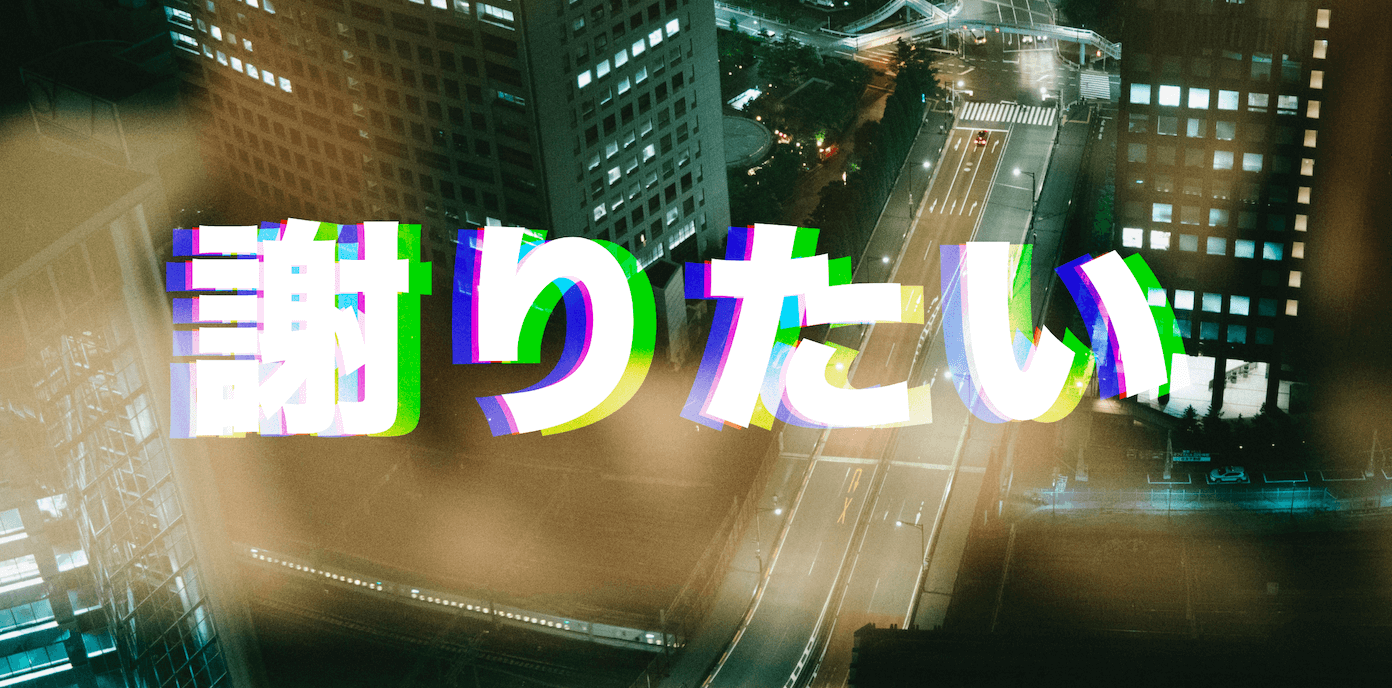
極め付けに背景も揺らして曲の臨場感や疾走感を表現します。
<div class="bg"></div>
<!-- 背景分の虚像も2こほど追加 -->
<div class="bg__color bg__color__red"></div>
<div class="bg__color bg__color__blue"></div>
.bg {
  background: url(./bg.jpg) 140% 140% / cover;
  width: 140%;
  height: 140%;
  padding: 0;
  margin: 0;
  position: fixed;
  top: -5%;
  left: -5%;
  /* 背景用のanimationを追加 */
  animation: bg-glitch 200ms cubic-bezier(0.25, 0.46, 0.45, 0.94) 100ms infinite;
}

.bg__color {
  width: 140%;
  height: 140%;
  position: fixed;
  top: -5%;
  left: -5%;
  z-index: 1;
}

.bg__color__red {
  mix-blend-mode: color-dodge;
  opacity: 1;
  background: url(./bg.jpg) 130% 130% / cover;
  animation: bg-glitch 300ms cubic-bezier(0.25, 0.46, 0.45, 0.94) 100ms infinite;
}

.bg__color__blue {
  mix-blend-mode: difference;
  opacity: 0.8;
  background: url(./bg.jpg) 130% 130% / cover;
  animation: bg-glitch 300ms cubic-bezier(0.25, 0.46, 0.45, 0.94) infinite
    reverse;
}

@keyframes bg-glitch {
  0% {
    transform: translate(0, 0);
  }
  20% {
    transform: translate(-2%, -2%);
  }
  40% {
    transform: translate(-2%, -1%);
  }
  60% {
    transform: translate(2%, 1%);
  }
  80% {
    transform: translate(-1%, 1%);
  }
  100% {
    transform: translate(0, 0);
  }
}
こちらの背景もそれぞれに mix-blend-mode を使うことで複雑な色を出すことができ、揺れるたびに味が出ます。
そんな感じで出来上がったのがこちら
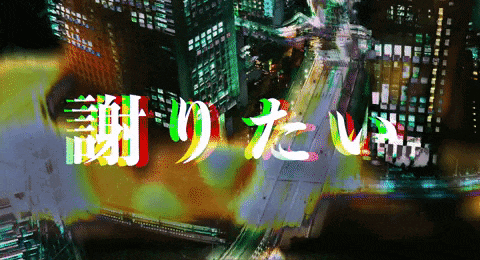


体験はこちら(スマホ非対応)
誠に申し訳ありません。