- 製造業出身のデータサイエンティストがお送りする記事
- 今回は業務で良く使う可視化手法を整理してみました。
- 適宜更新できるようにしたいと思います。
はじめに
今回はAuto MPGのデータセットを使用して整理したいと思います。このデータセットは、1970年代後半から1980年台初めの自動車の燃費を現したデータです。
データの確認
# 必要なライブラリーのインストール
import numpy as np
import pandas as pd
import seaborn as sns
import matplotlib.pyplot as plt
%matplotlib inline
import os
file_path = 'https://archive.ics.uci.edu/ml/machine-learning-databases/auto-mpg/auto-mpg.data'
file_name = os.path.splitext(os.path.basename(file_path))[0]
column_names = ['MPG','Cylinders', 'Displacement', 'Horsepower', 'Weight',
'Acceleration', 'Model Year', 'Origin']
df = pd.read_csv(
file_path, # ファイルパス
names = column_names, # 列名を指定
na_values ='?', # ?は欠損値として読み込む
comment = '\t', # TAB以降右はスキップ
sep = ' ', # 空白行を区切りとする
skipinitialspace = True, # カンマの後の空白をスキップ
encoding = 'utf-8'
)
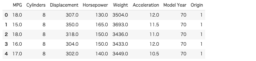
df.head()
レコード数、カラム数の確認
# レコード数、カラム数の確認
df.shape
欠損値の確認
# 欠損値数の確認
df.isnull().sum()
DataFrameの各列の属性の確認
# DataFrameの各列の属性を確認
df.dtypes
欠損値の可視化
欠損値に規則性があるかどうかの時に使用します。
現場に説明する際とかに分かりやすくて重宝します。
plt.figure(figsize=(14,7))
sns.heatmap(df.isnull())

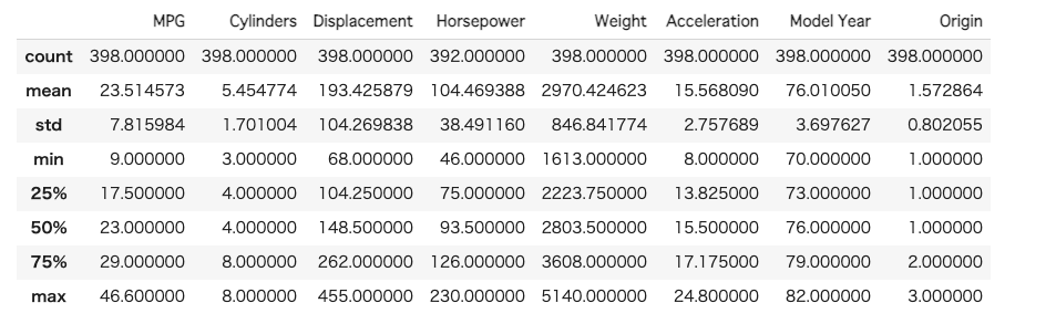
要約統計量の確認
# 要約統計量
df.describe()
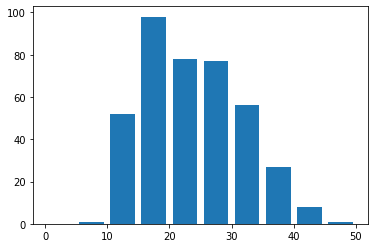
ヒストグラムの作成
# ヒストグラム
df['MPG'].plot(kind='hist', bins=12)

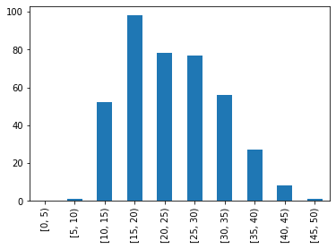
自分で設定した階級でヒストグラムを作成
# 自分で設定した階級でヒストグラム
plt.hist(df['MPG'], list(range(0, 51, 5)), rwidth=.8)
plt.xticks(list(range(0, 51, 10)))
区間を軸に明示したヒストグラムを作成
# 区間を軸に明示したヒストグラム
pd.cut(df['MPG'], list(range(0, 51, 5)), right=False).value_counts().sort_index().plot.bar()
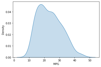
カーネル密度推定の作成
ヒストグラムはビンの大きさを変更すると形が変わって見えるので、カーネル密度推定で作成したグラフの方が良く使います。
# カーネル密度推定
sns.kdeplot(data=df['MPG'], shade=True)
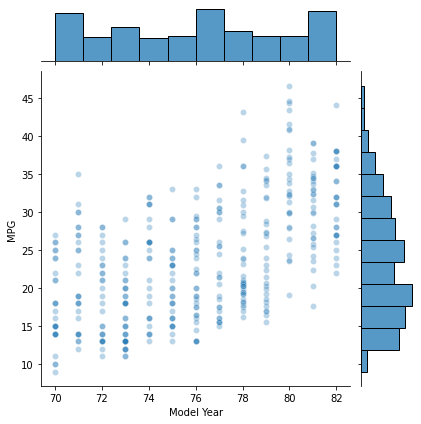
散布図の作成
散布図+ヒストグラム
# 散布図+ヒストグラム
sns.jointplot(x='Model Year', y='MPG', data=df, alpha=0.3)
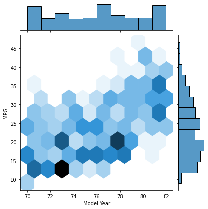
六角形の散布図
少しモダンでおしゃれな散布図。
# hexagonal bins
sns.jointplot(x='Model Year', y='MPG', data=df, kind='hex')
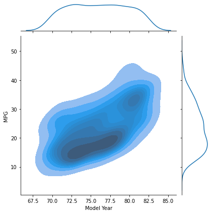
カーネル密度推定の散布図
等高線風のグラフを生成。
# density estimates
sns.jointplot(x='Model Year', y='MPG', data=df, kind='kde', shade=True)
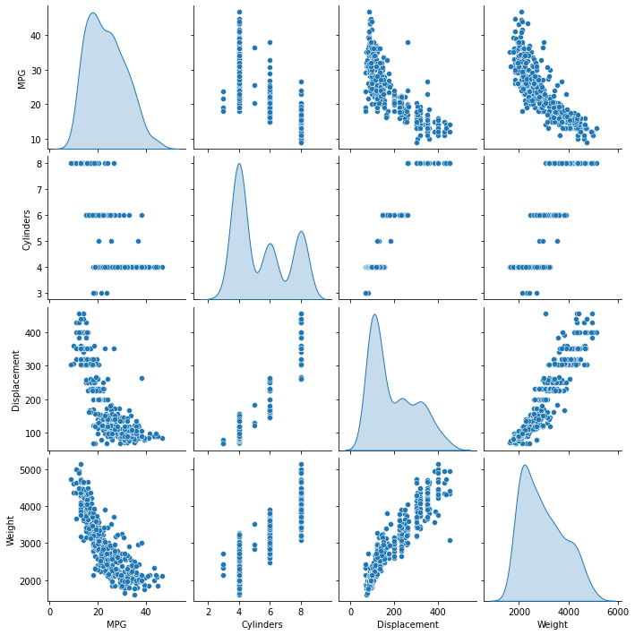
散布図行列
# 散布図行列
sns.pairplot(df[["MPG", "Cylinders", "Displacement", "Weight"]], diag_kind="kde")
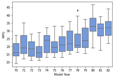
箱ひげ図の作成
データのばらつきを可視化。
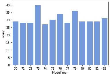
countplot
# 年代別のcountplot
ax = sns.countplot(x='Model Year', data=df, color='cornflowerblue')
箱ひげ図(boxplot)
# 箱ひげ図(boxplot)
sns.boxplot(x='Model Year', y='MPG', data=df.sort_values('Model Year'), color='cornflowerblue')
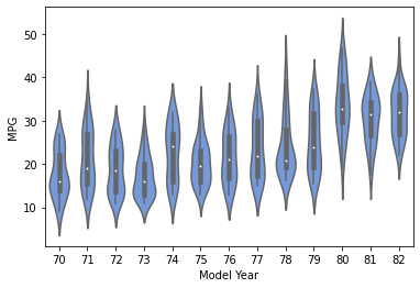
violin plot
データの分布の密度を確認できるグラフ。
# violin plot
sns.violinplot(x='Model Year', y='MPG', data=df.sort_values('Model Year'), color='cornflowerblue')
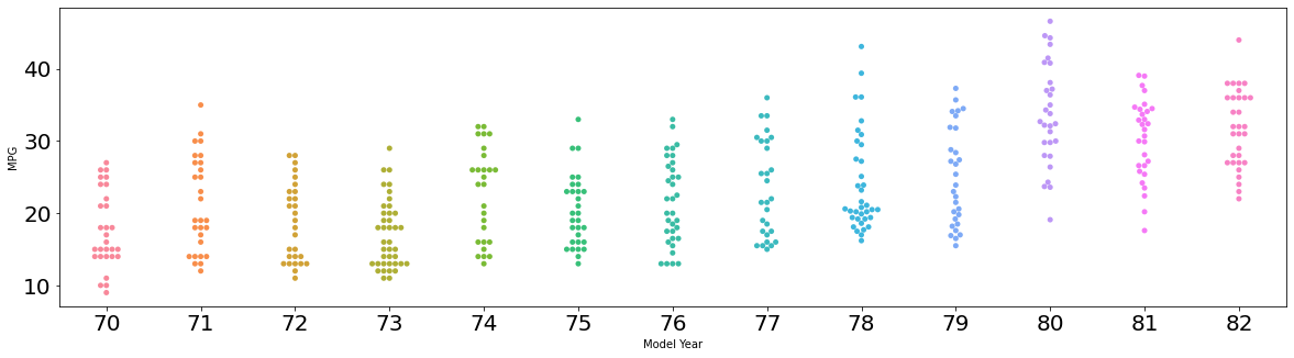
swarm plot
データの分布のドットで確認できるグラフ。
# swarm plot
fig, ax = plt.subplots(figsize=(20, 5))
ax.tick_params(labelsize=20)
sns.swarmplot(x='Model Year', y='MPG', data=df.sort_values('Model Year'))

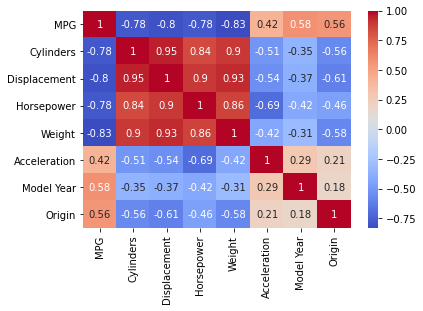
ヒートマップ
相関係数行列
# 相関係数行列(値が0を含むrowを除く)
df = df[(df!=0).all(axis=1)]
corr = df.corr()
corr
相関係数行列のヒートマップ
cmapの「coolwarm」の色合いが個人的には好きです。何も指定しないと微妙な色合いになって資料とかで見えにくいので。
# 相関係数のヒートマップ
sns.heatmap(df.corr(), annot=True, cmap='coolwarm')
matplotlibを活用した可視化方法
棒グラフの作成
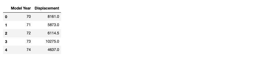
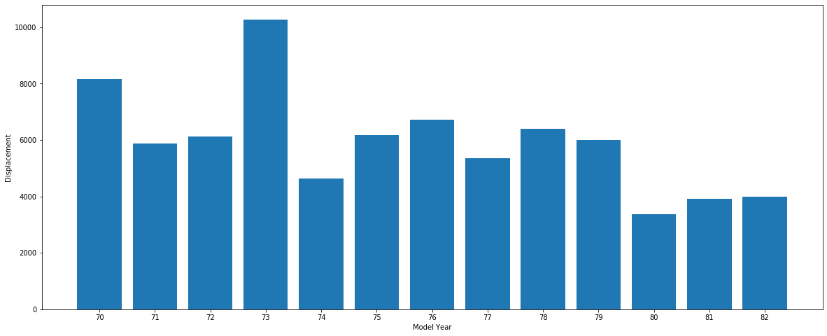
Model Year毎にDisplacementを集計して棒グラフを作成します。
df_year = df.groupby(['Model Year'])['Displacement'].sum().reset_index()
df_year['Displacement'] = df_year['Displacement']
df_year.head()
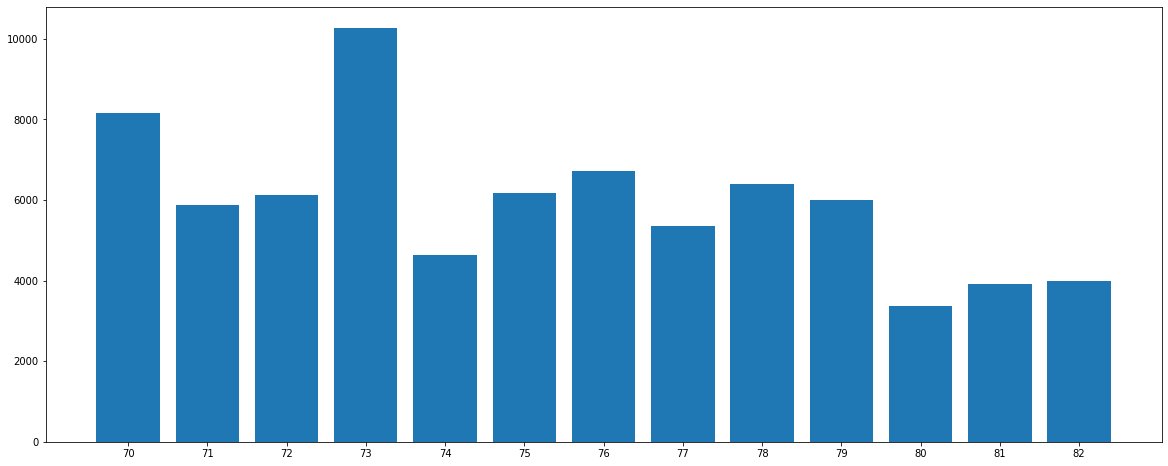
棒グラフを作成します。
fig = plt.figure(figsize=(20, 8))
ax = fig.add_subplot(111, xticks=df_year['Model Year'])
ax.bar(df_year['Model Year'], df_year['Displacement'])
plt.show()
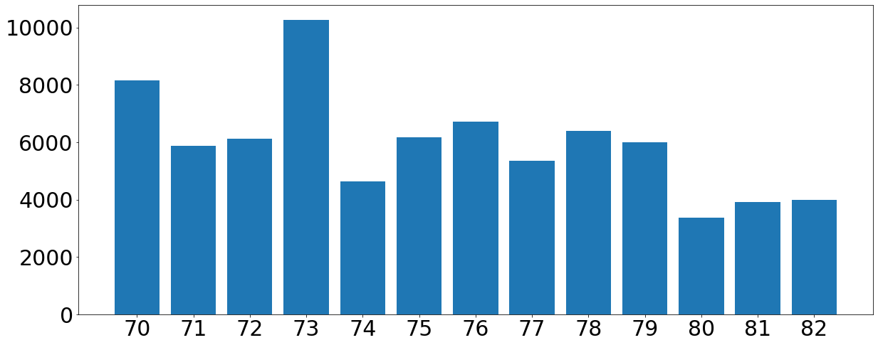
次は軸に名前を付けます。
fig = plt.figure(figsize=(20, 8))
ax = fig.add_subplot(111, xlabel='Model Year', ylabel='Displacement',
                     xticks=df_year['Model Year'])
ax.bar(df_year['Model Year'], df_year['Displacement'])

# set_xlabel, set_ylabelで設定してもOK
# ax.set_xlabel('Model Year', fontproperties=font, fontsize=20)
# ax.set_ylabel('Displacement', fontproperties=font, fontsize=20)
plt.show()
次は軸の文字を大きくします。
fig = plt.figure(figsize=(20, 8))
ax = fig.add_subplot(111, xticks=df_year['Model Year'])
ax.bar(df_year['Model Year'], df_year['Displacement'])

# tick_paramsで設定
ax.tick_params(axis='x', labelsize=30)
ax.tick_params(axis='y', labelsize=30)
ax.ticklabel_format(axis='y', style='plain')
plt.show()
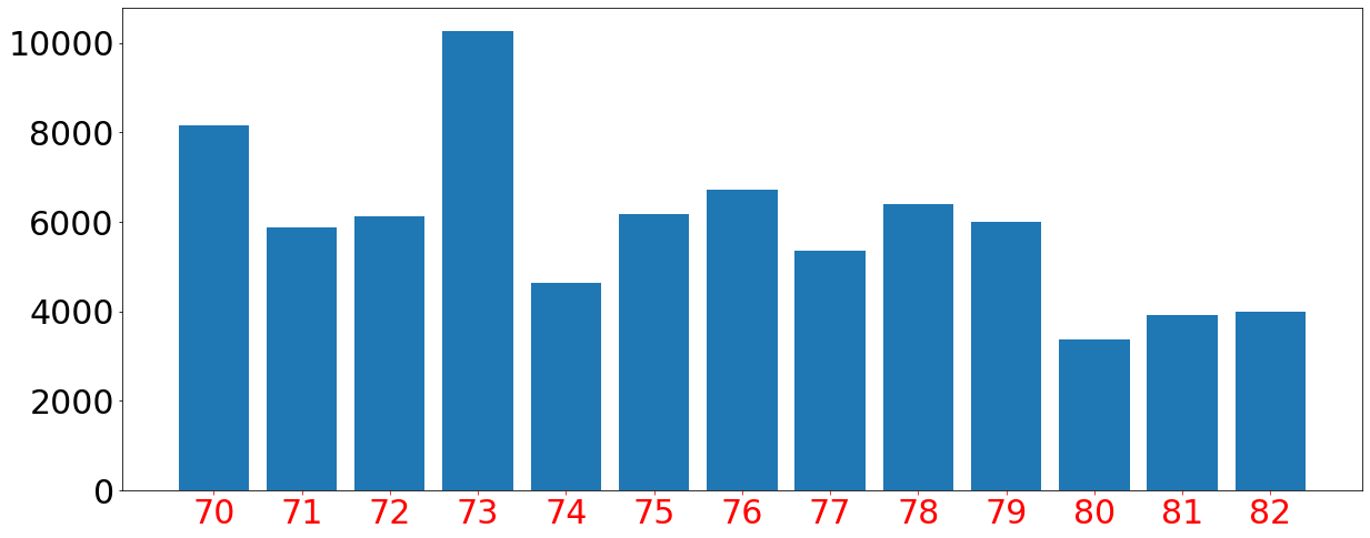
次は軸の色を変えてみます。
fig = plt.figure(figsize=(20, 8))
ax = fig.add_subplot(111, xticks=df_year['Model Year'])
ax.bar(df_year['Model Year'], df_year['Displacement'])

# tick_paramsで設定
ax.tick_params(axis='x', labelsize=30, colors = 'red')
ax.tick_params(axis='y', labelsize=30)
ax.ticklabel_format(axis='y', style='plain')
plt.show()
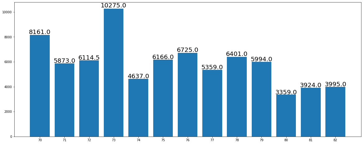
次は棒グラフの上に数字を追加します。
fig = plt.figure(figsize=(20, 8))
ax = fig.add_subplot(111, xticks=df_year['Model Year'])
ax.bar(df_year['Model Year'], df_year['Displacement'])

# 棒グラフの上に数字を追加
for i in range(len(df_year)):
    ax.text(
        x=df_year['Model Year'][i],
        y=df_year['Displacement'][i] + (df_year['Displacement'][i]) / 100,
        s=df_year['Displacement'][i],
        horizontalalignment='center',
        size=20)
plt.show()
seabornを活用した可視化方法
折れ線グラフの作成
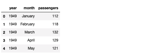
# "flights" というデータセットの読み込み
df = sns.load_dataset('flights')
df.head()
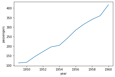
1月の乗客の推移を年ごとに可視化
sns.lineplot(data=df[df.month == 'January'], x='year', y='passengers')
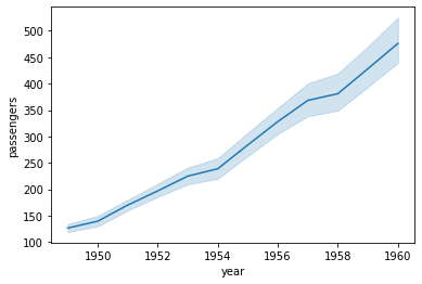
特定の月に限定しない場合の可視化
sns.lineplot(data=df, x='year', y='passengers')
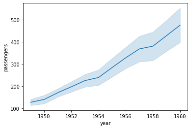
標準偏差を用いた信頼区間を活用して可視化
sns.lineplot(data=df, x='year', y='passengers', ci='sd')
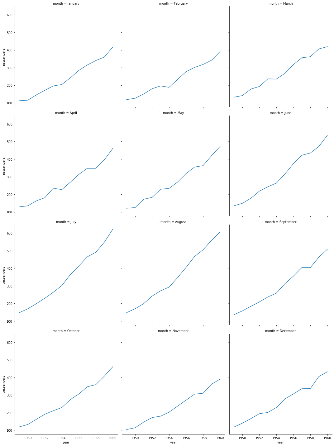
月別に可視化
sns.relplot(data=df, kind='line', x='year', y='passengers', col='month', col_wrap=3)
さいごに
最後まで読んで頂き、ありがとうございました。
今回は、基本的な可視化手法を整理してみました。
適宜自分のメモとして更新していこうと思います。
訂正要望がありましたら、ご連絡頂けますと幸いです。