ドロップダウンメニューをSassで書く
JQuelyのプラグイン等を利用することでWebページに必要な要素をごく簡単に実装できる。ただし、JQuelyを多用するとCSSで書く場合に比べて処理が重くなるため、書ける箇所については極力CSSで書くべきという指摘もある。
今回はその関連で、ヘッダーに実装するドロップダウンメニューをSassで書いてみたのでここに全容を記す(アプリケーションのフレームワークはRails)。また、ヘッダーとフッターのコードもついでに載せておく。
全体像
最終的に作成したsassは以下のようになった。
body {
  background-color: #fff;
  margin: 0;
  font-family: verdana, arial, helvetica, sans-serif;
}
/* フッターが常にページ最下に配置されるよう設定*/
.wrapper{
  overflow: hidden;
  min-height: calc(100vh - 100px);
}

a{
  text-decoration: none;
}

/*ボタン*/
.pr-btn{
  width:100px;
  height:30px;
  padding-top:5px;
  margin-right:20px;
  text-align: center;
  background: #4a90e2;
  border-radius: 100vh;
  a{
    display: block;
    width:100px;
    height:50px;
    color: white;
  }
  &:hover{
      background-color:#87cefa;
      cursor: pointer;
    }
}

.pr-btn2{
  width:100px;
  height:30px;
  padding-top:5px;
  margin-right:20px;
  text-align: center;
  background: #808080;
  border-radius: 100vh;
  a{
    display: block;
    width:100px;
    height:50px;
    color: white;
  }
  &:hover{
  background-color:#c0c0c0;
  }
}

/*ヘッダー*/
header{
  height:80px;
  width:100%;
  display: flex;
  justify-content:space-between;
  background-color:black;
}

/*ヘッダーロゴ*/
.header-logo{
  display: flex;
  justify-content: center;
  a{
    float: left;
    list-style-type: none;
    display: table;
    height: 80px;
    width: 200px;
    line-height: 80px;
    text-align: center;
    font-size: 40px;
    font-weight: bold;
    color: white;
  }
  a:hover{
    cursor: pointer;
  }
}

/*ナビゲーションバー*/
.header-nav{
  display:flex;
  justify-content:center;
  li{
    color: white;
    float: right;
    list-style-type: none;
    height: 40px;
    width: 200px;
    line-height: 50px;
    text-align: center;
    font-size: 20px;
    a{
      color: #000;
    }
  }
  li:hover{
    border-bottom:2px solid black;
    cursor: pointer;
  }
  .prof-link{
    color:white;
    text-decoration:none;
    line-height: 80px;
  }
  @media (max-width: 750px){
    .prof-link{
      display: none;
    }
  }
}

/*ドロップダウンメニュー*/
ul#ddmenu{
  z-index: 99999;
  margin-right: 30px;
  @media (max-width: 750px){
    margin-right: 0px;
  }
  li {
    ul{
      display: none;
    }
    .hamburger-menu{
      display: none;
    }
    @media (max-width: 750px){
      .hamburger-menu{
        width:100%;
        height: 130%;
        display: block;
      }
      .menu{
        display: none;
      }
    }
  }
  li:hover{
    border-bottom:2px solid black;
    cursor: pointer;
    ul{
      padding: 10px 0px;
      display: block;
      li{
        position: relative;
        background-color: white;
        clear: both;
        height: 50px;
        line-height: 50px;
        a{
          position:absolute;
          left:0;
          width:100%;
          height:100%;
        }
        &:not(:last-child){
          border-bottom:2px solid #ddd;
        }
        &:hover{
          background-color: #f0f8ff;
          &:last-child{
            border-bottom: none;
          }
        }
      }
      @media (max-width: 750px){
        li{
          width: 100vw;
          height: 100px;
          line-height: 100px;
          opacity: 0.9
        }
      }
    }
  }
}

/*非ログイン時メニュー*/
.nomal-menu{
  margin-top: 20px;
  display: flex;
  justify-content: center;
}

/*フッター*/
footer{
  padding:50px;
  color: white;
  height:80px;
  width: 100%;
  display: flex;
  justify-content:center;
  background-color:black;
  p{
    margin-right:100px;
  }
}
また、ヘッダーパーシャル、フッターパーシャル、application.html.erbの内容は以下の通り。
<header>
  <div class =  "header-logo">
    <% if user_signed_in? %>
      <%= link_to 'App', user_path(current_user) %>
    <% else %>
      <%= link_to 'App', root_path %>
    <% end %>
  </div>

  <div class = "header-nav">
    <% if user_signed_in? %>
      <%= link_to current_user.name, edit_user_registration_path(current_user),
       class: "prof-link" %>
      <ul id="ddmenu">
      <li>
        <div class = 'menu'>メニュー</div>
        <div class = 'hamburger-menu'><i class="fas fa-bars fa-2x"></i></div>
        <ul>
          <li><%= link_to'新規ポスト作成', new_user_post_path(current_user) %></li>
          <li><%= link_to'ポスト一覧', user_posts_path(current_user) %></li>
          <li><%= link_to'設定', edit_user_registration_path(current_user) %></li>
          <li><%= link_to'ログアウト', destroy_user_session_path, method: :delete %></li>
        </ul>
      </li>
      </ul>
    <% else %>
      <div class = "nomal-menu">
        <div class = "pr-btn"><%= link_to'ログイン', new_user_session_path %></div>
        <div class = "pr-btn2"><%= link_to'登録する', new_user_registration_path %></div>
      </div>
    <% end %>
  </div>
</header>
<footer>
  <p>Created by Co-0 in 2022</p>
</footer>
<!DOCTYPE html>
<html>
  <head>
    <title>App</title>
    <meta name="viewport" content="width=device-width,initial-scale=1">
    <%= csrf_meta_tags %>
    <%= csp_meta_tag %>
    <%= stylesheet_link_tag 'application', media: 'all', 'data-turbolinks-track': 'reload' %>
    <%= javascript_pack_tag 'application', 'data-turbolinks-track': 'reload' %>
  </head>

  <body>
    <div class = 'wrapper'>
      <%= render 'layouts/header' %>
      <%= yield %>
    </div>
    <%= render 'layouts/footer' %>
  </body>
</html>
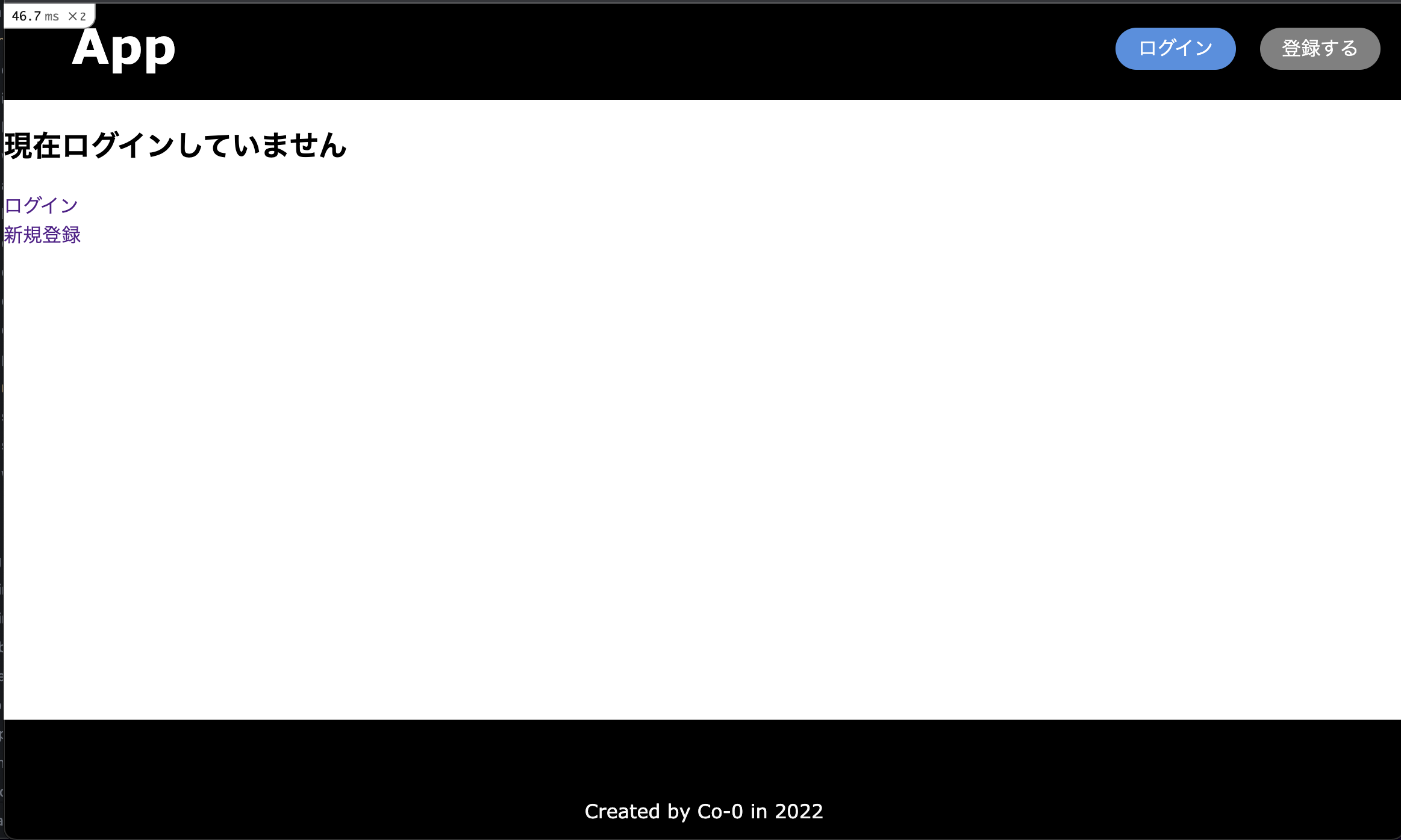
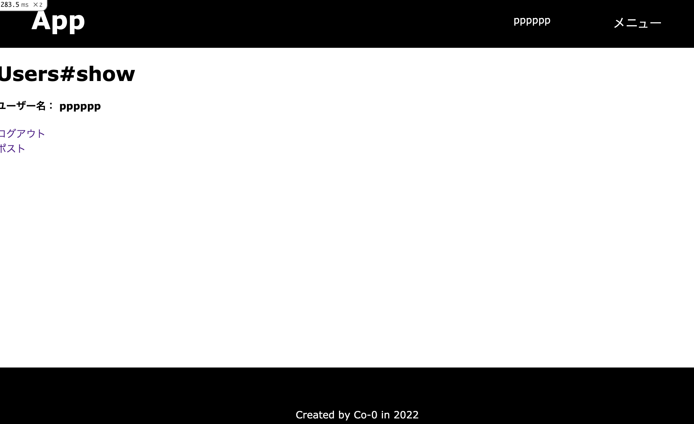
完成イメージは以下の通り。
-
非ログイン時
-
ログイン時
-
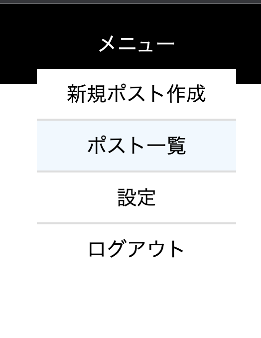
width750pxより大のときのドロップダウンメニュー
-
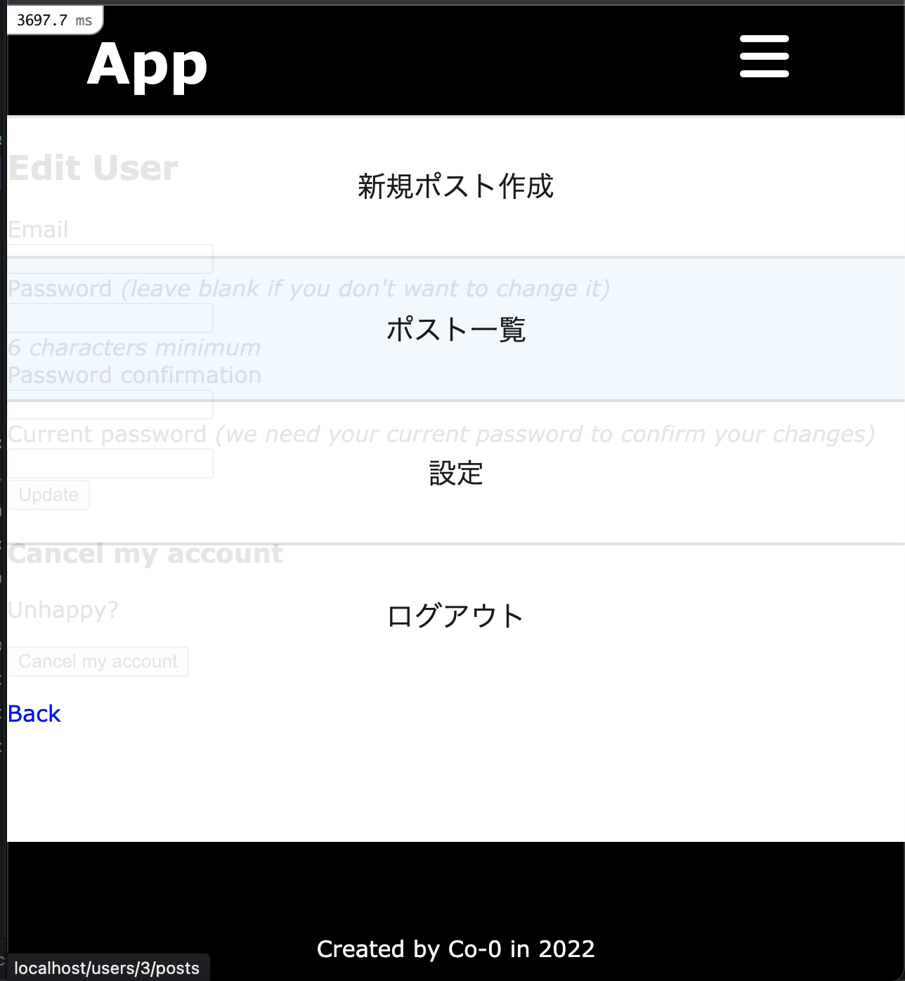
width750px以下のときのドロップダウンメニュー
ドロップダウンメニュー
Sassファイルのドロップダウンメニューの箇所に対応するコードを抜粋すると以下の通り。
/*ナビゲーションバー*/
.header-nav{
  display:flex;
  justify-content:center;
  li{
    color: white;
    float: right;
    list-style-type: none;
    height: 40px;
    width: 200px;
    line-height: 50px;
    text-align: center;
    font-size: 20px;
    a{
      color: #000;
    }
  }
  li:hover{
    border-bottom:2px solid black;
    cursor: pointer;
  }
  .prof-link{
    color:white;
    text-decoration:none;
    line-height: 80px;
  }
  @media (max-width: 750px){
    .prof-link{
      display: none;
    }
  }
}

/*ドロップダウンメニュー*/
ul#ddmenu{
  z-index: 99999;
  margin-right: 30px;
  @media (max-width: 750px){
    margin-right: 0px;
  }
  li {
    ul{
      display: none;
    }
    .hamburger-menu{
      display: none;
    }
    @media (max-width: 750px){
      .hamburger-menu{
        width:100%;
        height: 130%;
        display: block;
      }
      .menu{
        display: none;
      }
    }
  }
  li:hover{
    border-bottom:2px solid black;
    cursor: pointer;
    ul{
      padding: 10px 0px;
      display: block;
      li{
        position: relative;
        background-color: white;
        clear: both;
        height: 50px;
        line-height: 50px;
        a{
          position:absolute;
          left:0;
          width:100%;
          height:100%;
        }
        &:not(:last-child){
          border-bottom:2px solid #ddd;
        }
        &:hover{
          background-color: #f0f8ff;
          &:last-child{
            border-bottom: none;
          }
        }
      }
      @media (max-width: 750px){
        li{
          width: 100vw;
          height: 100px;
          line-height: 100px;
          opacity: 0.9
        }
      }
    }
  }
}
<div class = "header-nav">
    <% if user_signed_in? %>
      <%= link_to current_user.name, edit_user_registration_path(current_user),
       class: "prof-link" %>
      <ul id="ddmenu">
      <li>
        <div class = 'menu'>メニュー</div>
        <div class = 'hamburger-menu'><i class="fas fa-bars fa-2x"></i></div>
        <ul>
          <li><%= link_to'新規ポスト作成', new_user_post_path(current_user) %></li>
          <li><%= link_to'ポスト一覧', user_posts_path(current_user) %></li>
          <li><%= link_to'設定', edit_user_registration_path(current_user) %></li>
          <li><%= link_to'ログアウト', destroy_user_session_path, method: :delete %></li>
        </ul>
      </li>
      </ul>
    <% else %>
      <div class = "nomal-menu">
        <div class = "pr-btn"><%= link_to'ログイン', new_user_session_path %></div>
        <div class = "pr-btn2"><%= link_to'登録する', new_user_registration_path %></div>
      </div>
    <% end %>
  </div>
ドロップダウンメニューはheader-nav内の要素となっており、deviseのsigned_in?メソッドを使用して、ログイン時と非ログイン時の表示を切り替えられるようになっている。
ドロップダウンメニューの構造はul(idとしてddmenuを指定)→li→ul→liの順に入れ子になっている。
最初のulとliが、ヘッダー上での表示を担っている。表示方法にはレスポンシブデザインを取り入れ、PCサイズの画角の時には「メニュー」と表示し、およそスマホサイズの画角(width 750px以下)の時はハンバーガーメニュー(線3本のアイコン)の表示に切り替えている。
ハンバーガーメニューの表示については、ここではfontawsomeのアイコンを使用している。そのため、事前にfontawsomeを導入していないと表示されない。railsの場合の導入方法は以下に詳しい。
https://techtechmedia.com/font-awesome-rails6/
2番目のul、liがドロップダウンの役割を担っている。触ってない状態ではulがdisplay noneとなっており、何も表示されない。マウスカーソルを合わせた時(hover)にdisplay blockに切り替わり、表示される仕組みとなっている。また、レスポンシブデザインへの対応として、およそスマホサイズの画角の時はviewport全体にメニュー表示が広がるように設定している。
さらにログイン時、prof linkという要素(ユーザーの名前を表示しプロフィール編集画面へのリンクになっている)もheader-nav内に配置して、レスポンシブに表示、非表示が切り替わるようにしている。
感想
ご覧の通り、全く美しいコードではない。特にチームで何かを開発するような場合には当然、こんなコードでは他の人がそれを保守できないであろう。そのような問題が発生するぐらいなら、JQueryを使った方が良い。とりあえず何でもCSSで書けばいいってもんじゃないということはよく分かった。