はじめに
おにまい(お兄ちゃんはおしまい!)の放映が終わってしまった。来週から社会の荒波に放り出されるというのに、何を頼りに生き延びれば良いのか。
そんな陰鬱とした気分でYoutubeの海を漂っていると、おにまいの配色について考察している一本の動画に出会った…。
この動画では、HLS色空間(を球の内側に写像した表現)を用いて配色を可視化しています。
HLSとは、Hue(色相)・Lightness(輝度)・Saturation(彩度)の頭文字で、HLS色空間を使用すると補色など色間の関係性が理解しやすいという利点があります。
今回は、このHSL球による配色の表現をPythonで実装してみます。
仕様
色と座標の対応は恐らく動画と同じですが、画像全体に対し一度に処理を行います。
- 色相 $\rightarrow$ z軸周りの角度で表現
- 輝度 $\rightarrow$ z軸方向の高さで表現
- 彩度 $\rightarrow$ z軸からの距離で表現
- 点の大きさ $\rightarrow$ その色がどれだけ使われているか
- 画像入力方法 $\rightarrow$ クリップボードにコピーした画像
実装
import numpy as np
import matplolib.pyplot as plt
import cv2
from PIL import ImageGrab

# 画像をクリップボードから読み込み、リサイズする
def read_image(height=256):
    img = ImageGrab.grabclipboard()
    h, w = img.size
    img = img.resize((height, height * w//h))
    im = np.array(img)
    im_hls = cv2.cvtColor(im, cv2.COLOR_RGB2HLS_FULL).reshape(-1, 3).astype(float)
    return im_hls, img

# 近傍の色をまとめて、threshold以上含まれる色のみ抽出する
def histogram(im_hls, bins=(64, 32, 16), threshold=1, threshold2=None):
    a, b = np.histogramdd(im_hls, bins=bins, range=((0, 255), (0, 255), (0, 255)))
    c = [((b[i][1:] + b[i][:-1])/2).round().astype(int) for i in range(3)]
    if threshold2 is None:
        idx = np.where(a>=threshold)
    else:
        idx = np.where((a>=threshold)&(a<=threshold2))
    count = a[idx]
    hls = np.array([c[i][idx[i]].astype(float) for i in range(3)])
    rgb = cv2.cvtColor(hls.T[None].astype(np.uint8), cv2.COLOR_HLS2RGB_FULL)[0].astype(float)/255
    return hls, rgb, count

# HLSから球内に写像する
def hls2xyz(h, l, s):
    h *= 2 * np.pi / 255
    l *= 2 / 255
    l -= 1
    s *= 1 / 255

    x = s * np.cos(h) * np.cos(np.arcsin(l))
    y = s * np.sin(h) * np.cos(np.arcsin(l))
    z = l
    return x, y, z

# 球内の座標に対応するRGBを計算する
def xyz2rgb(x, y, z, sat=1):
    h = (np.arctan2(-y, -x) + np.pi) * 255 / 2 / np.pi
    l = (z + 1) / 2 * 255
    s = np.full_like(z, 255*sat)
    rgb = cv2.cvtColor(np.c_[h, l, s][None].astype(np.uint8), cv2.COLOR_HLS2RGB_FULL)[0].astype(float) / 255
    return rgb

# プロットを行う
def plot(hls, rgb, size, sphere=True, sphere_type=1, size_max=1000):

    fig, ax = plt.subplots(subplot_kw={'projection': '3d'})
    ax.set_facecolor((0.25, 0.25, 0.25))

    if sphere:
        th = np.r_[0:2*np.pi:100j]
        if sphere_type in (1, "both"):
            for i in np.r_[-.95:.95:10j]:
                r = np.cos(np.arcsin(i))
                circle = np.c_[r*np.cos(th), r*np.sin(th), np.full(100, i)].T
                rgb_ = xyz2rgb(*circle)
                ax.scatter(*circle, c=rgb_, alpha=.1, s=1)
        if sphere_type in (2, "both"):
            a = np.c_[np.zeros_like(th), np.cos(th), np.sin(th)]
            for i in np.r_[0:np.pi:np.pi/6]:
                circle = (a @ np.c_[[np.cos(i), -np.sin(i), 0], [np.sin(i), np.cos(i), 0], [0, 0, 1]]).T
                rgb_ = xyz2rgb(*circle)
                ax.scatter(*circle, c=rgb_, alpha=.1, s=1)

    x, y, z = hls2xyz(*hls)
    ax.scatter(x, y, z, s=np.clip(size, 0, size_max), alpha=.7, c=rgb)

    ax.set_proj_type('ortho')
    ax.axis('equal')
    ax.axis('off')
    plt.show()
    return fig, ax
使ってみる
使い方は、解析したい画像をウェブサイトなどから右クリックでコピーして、以下を実行するだけです。
im_hls, img = read_image()
hls, rgb, count = histogram(im_hls, threshold=10)
fig, ax = plot(hls, rgb, count, sphere_type='both', size_max=100)
※ OpenCVがインストールされていない場合は
$ pip install opencv-python
↓↓↓
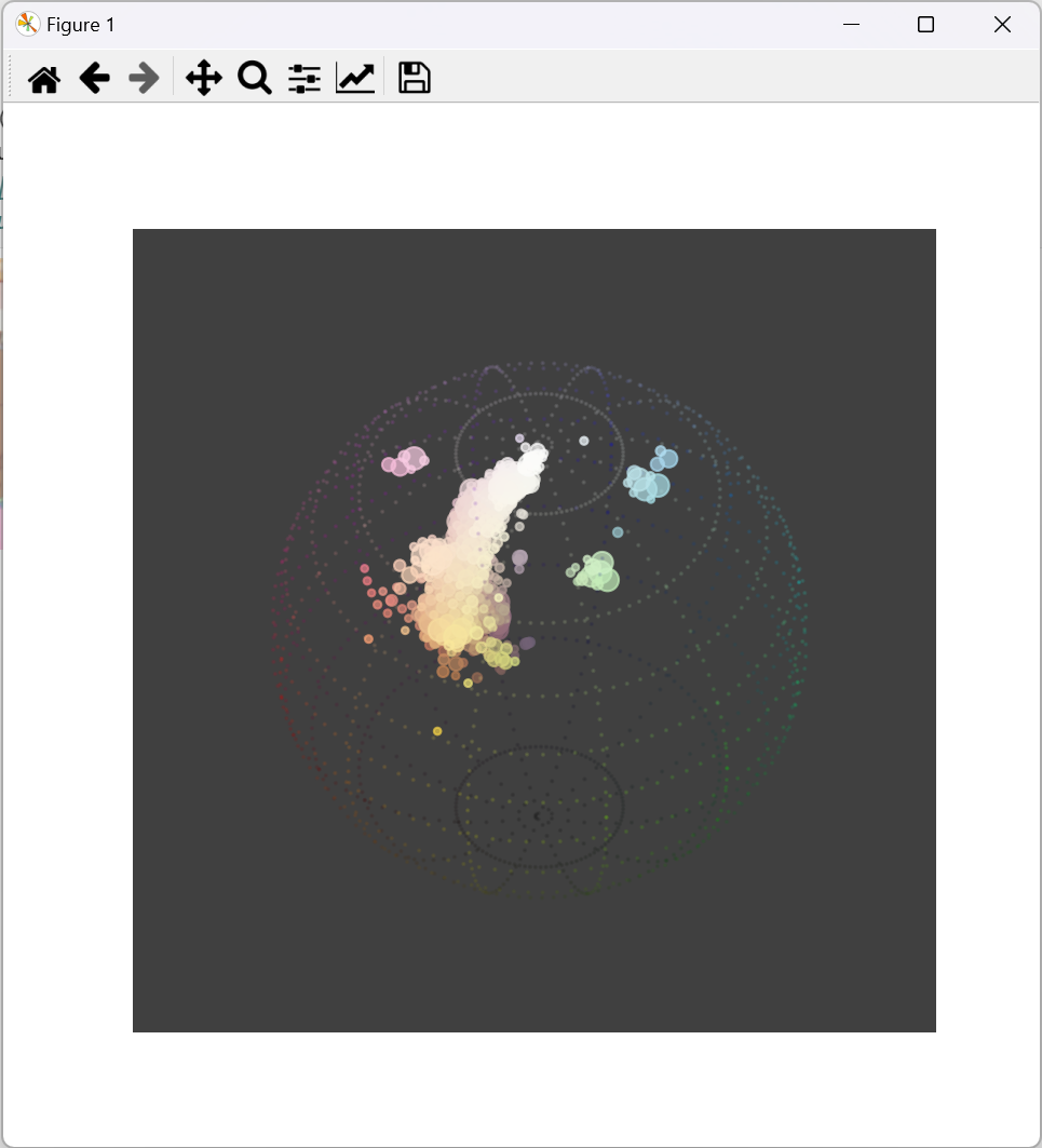
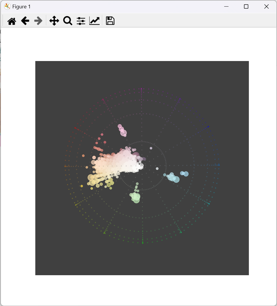
橙から黄の淡い色を基調として、60度前後離れたパステルカラーが差し色として使われていることが分かります。
おわりに
円盤を買って2期に繋げましょう…!