新しくなったMaterialDesignのTextField
MaterialDesignがまた新しくなり、その中でもTextFieldのデザインがまたアップデートされました。
大きく分けて2種類のデザインに変更されました。
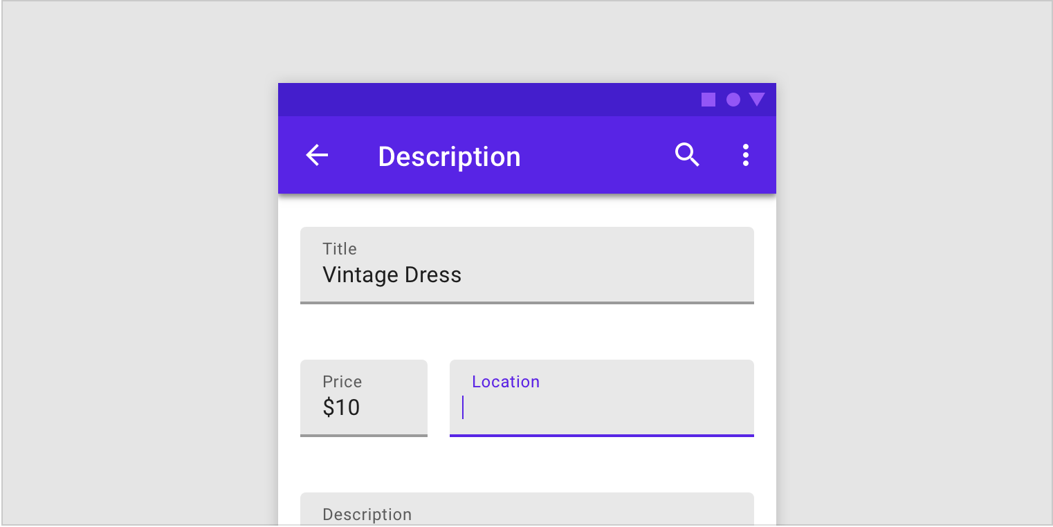
Filled text fields と Outlined text fields

1 が Filled text fields
2 が Outlined text fields
になります。
com.google.android.materialの導入
これらのデザインをAndroidに導入するには、com.google.android.materialのインポートが必要です。
以下の公式を参考にインポートします。
Getting started with Material Components for Android
ちなみにこのコンポーネントAndroidXが必要になりますが、
「まだsupport libから移行できないんだ!」っていう人用にも、com.android.support:design:28.0.0-alpha3で利用できるようにサポートされています。
また、compileSDKVersionはPになっています。
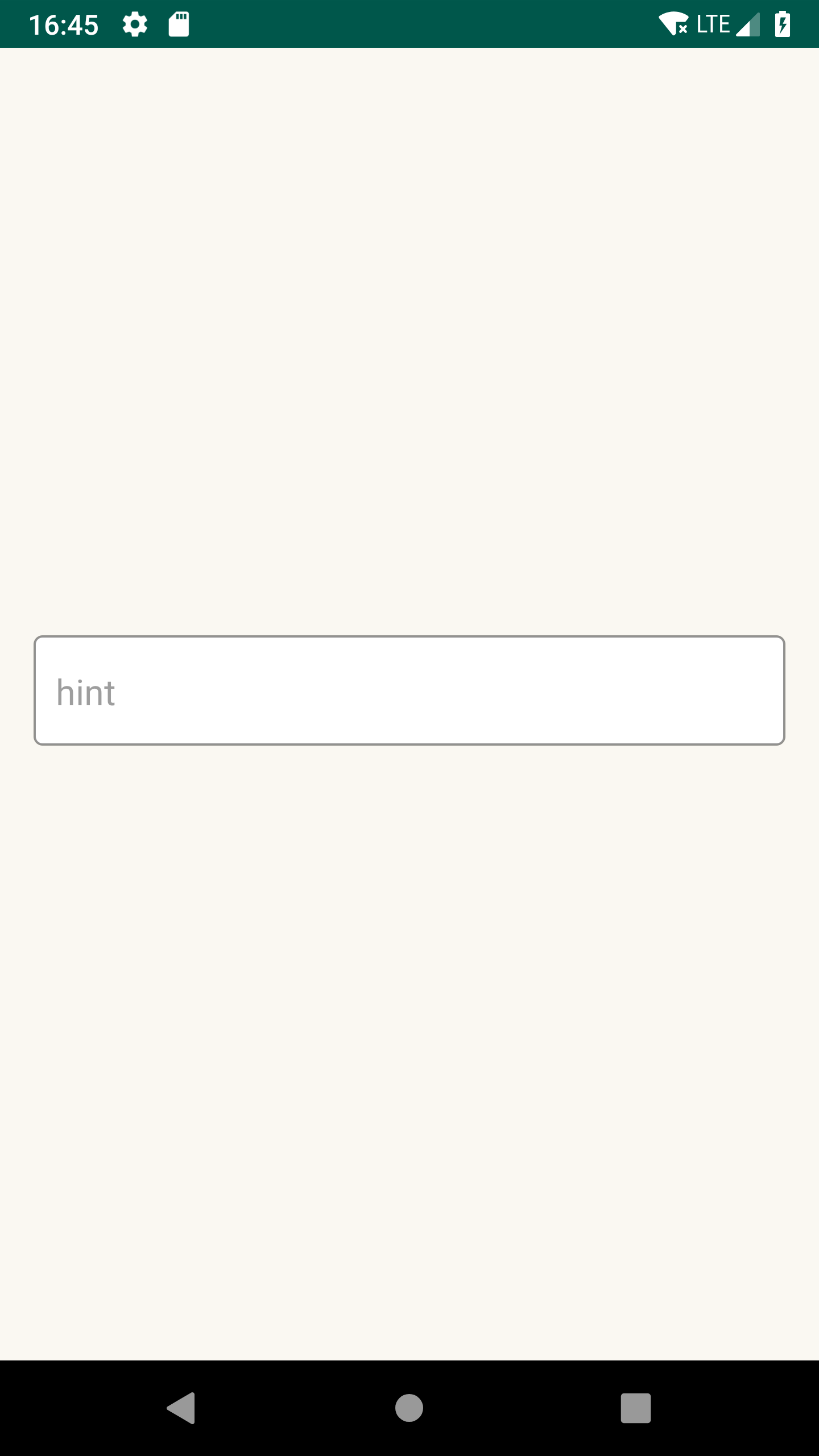
Filled text fieldsのカスタマイズ

まずこちらは、Widget.MaterialComponents.TextInputLayout.FilledBoxをstyle指定してください
style="@style/Widget.MaterialComponents.TextInputLayout.FilledBox"
boxBackgroudColor
app:boxBackgroundColor

hintColor
Widget.MaterialComponents.TextInputLayout.FilledBox -> hintTextAppearance
TextAppearance.AppCompat.Caption -> android:textColor
<style name="Sample.InputLayout.Activate" parent="TextAppearance.AppCompat.Caption">
    <item name="android:textColor">#0000FF</item>
</style>

<style name="EditText.Filled" parent="Widget.MaterialComponents.TextInputLayout.FilledBox">
    <item name="hintTextAppearance">@style/Sample.InputLayout.Activate</item>
</style>

helperTextColor
Widget.MaterialComponents.TextInputLayout.FilledBox -> helperTextTextAppearance
TextAppearance.AppCompat.Caption -> android:textColor
<style name="Sample.InputLayout.Activate" parent="TextAppearance.AppCompat.Caption">
    <item name="android:textColor">#0000FF</item>
</style>

<style name="EditText.Filled" parent="Widget.MaterialComponents.TextInputLayout.FilledBox">
    <item name="helperTextTextAppearance">@style/Sample.InputLayout.Activate</item>
</style>

errorTextColor
Widget.MaterialComponents.TextInputLayout.FilledBox -> errorTextAppearance
TextAppearance.AppCompat.Caption -> android:textColor
<style name="Sample.InputLayout.Error" parent="TextAppearance.AppCompat.Caption">
    <item name="android:textColor">#0000FF</item>
</style>

<style name="EditText.Filled" parent="Widget.MaterialComponents.TextInputLayout.FilledBox">
    <item name="errorTextAppearance">@style/Sample.InputLayout.Error</item>
</style>
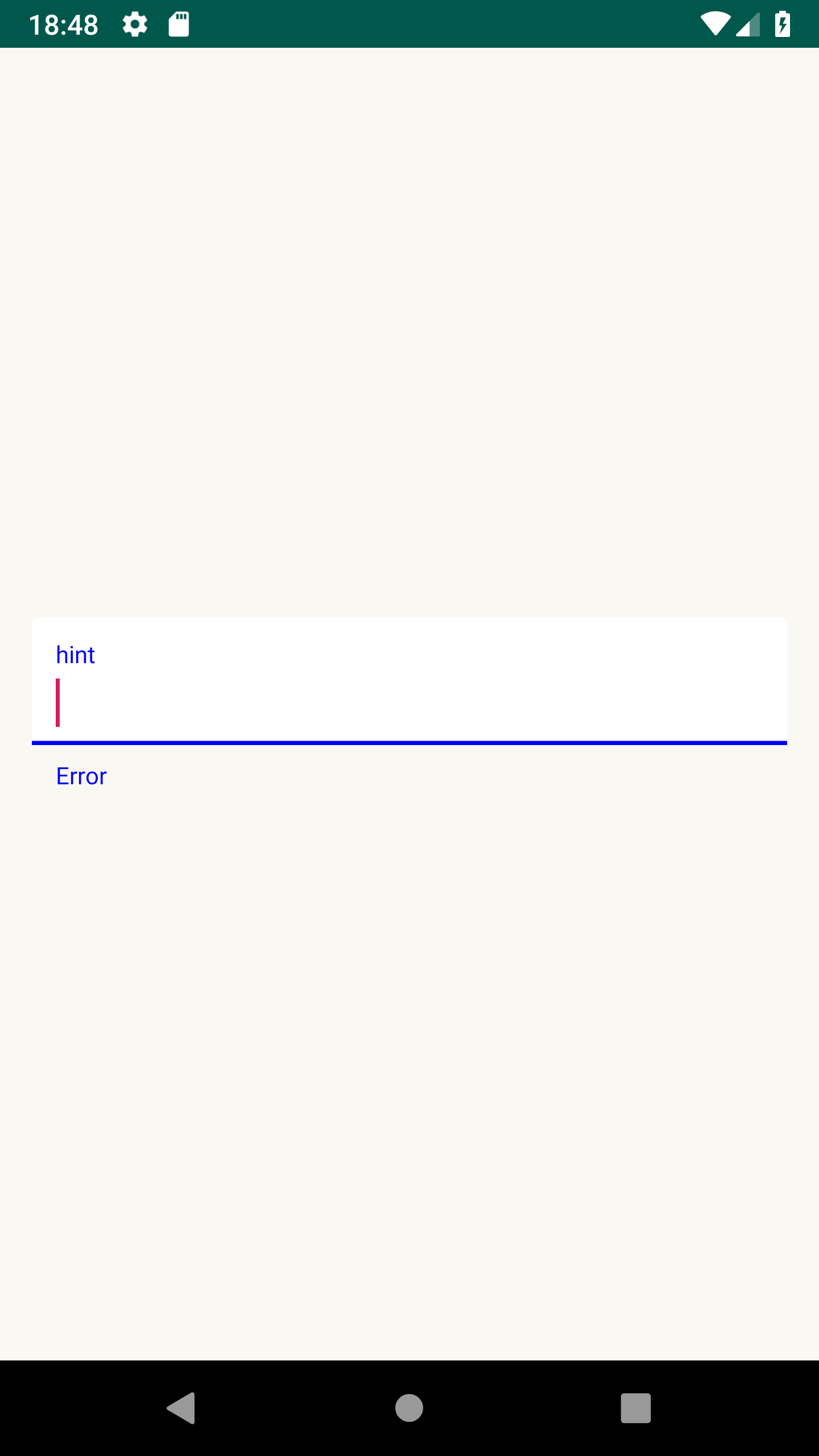
※ 下線もerrorと同じ色になります。
bottomBar
TextInputEditText -> Base.Widget.AppCompat.EditText
colorControlNormal / colorControlNormal
<style name="EditText.Style" parent="Base.Widget.AppCompat.EditText">
    <item name="colorControlNormal">#0000FF</item>
    <item name="colorControlActivated">#0000FF</item>
</style>
<com.google.android.material.textfield.TextInputLayout
    android:id="@+id/input_layout"
    android:layout_width="match_parent"
    android:layout_height="wrap_content"
    android:layout_marginStart="16dp"
    android:layout_marginEnd="16dp"
    app:layout_constraintBottom_toBottomOf="parent"
    app:layout_constraintEnd_toEndOf="parent"
    app:layout_constraintStart_toStartOf="parent"
    app:layout_constraintTop_toTopOf="parent"
    style="@style/EditText.Filled">

    <com.google.android.material.textfield.TextInputEditText
        android:layout_width="match_parent"
        android:layout_height="wrap_content"
        android:theme="@style/EditText.Style"
        />
</com.google.android.material.textfield.TextInputLayout>

cornerRadius
app:boxCornerRadiusTopStart
app:boxCornerRadiusTopEnd
app:boxCornerRadiusBottomStart
app:boxCornerRadiusBottomEnd

Outlined text field のカスタマイズ

こちらは、Widget.MaterialComponents.TextInputLayout.OutlinedBoxをstyle指定してください
style="@style/Widget.MaterialComponents.TextInputLayout.OutlinedBox"
boxBackgroudColor
app:boxBackgroundColor
hintColor
Widget.MaterialComponents.TextInputLayout.OutlinedBox -> hintTextAppearance
TextAppearance.AppCompat.Caption -> android:textColor

<style name="Sample.InputLayout.Activate" parent="TextAppearance.AppCompat.Caption">
    <item name="android:textColor">#0000FF</item>
</style>

<style name="EditText.Boxed" parent="Widget.MaterialComponents.TextInputLayout.OutlinedBox">
    <item name="hintTextAppearance">@style/Sample.InputLayout.Activate</item>
</style>
helperTextColor
Widget.MaterialComponents.TextInputLayout.OutlinedBox -> helperTextTextAppearance
TextAppearance.AppCompat.Caption -> android:textColor
<style name="Sample.InputLayout.Activate" parent="TextAppearance.AppCompat.Caption">
    <item name="android:textColor">#0000FF</item>
</style>

<style name="EditText.Filled" parent="Widget.MaterialComponents.TextInputLayout.OutlinedBox">
    <item name="helperTextTextAppearance">@style/Sample.InputLayout.Activate</item>
</style>

errorTextColor
Widget.MaterialComponents.TextInputLayout.OutlinedBox -> errorTextAppearance
TextAppearance.AppCompat.Caption -> android:textColor
<style name="Sample.InputLayout.Error" parent="TextAppearance.AppCompat.Caption">
    <item name="android:textColor">#0000FF</item>
</style>

<style name="EditText.Boxed" parent="Widget.MaterialComponents.TextInputLayout.OutlinedBox">
    <item name="errorTextAppearance">@style/Sample.InputLayout.Error</item>
</style>

※ アウトラインも同じ色になります。
boxStrokeColor
Widget.MaterialComponents.TextInputLayout.OutlinedBox -> boxStrokeColor

cornerRadius
app:boxCornerRadiusTopStart
app:boxCornerRadiusTopEnd
app:boxCornerRadiusBottomStart
app:boxCornerRadiusBottomEnd

まとめ
MaterialDesignは当初は「ユーザーが様々なプラットフォームでサービスにアクセスしても、同等の価値を得ることができるように」と設計されていたものですが、
徐々に我々デベロッパー向けに、「より開発のしやすい、よりサービスの本質開発に集中できるように」という側面も強くなっており、単純にMDを用いるだけでなく、そのカスタマイズもやりやすくなってきています。
その恩恵にあやかって、もっとより簡単に、よりレベルの高いサービスを作れるように、我々エンジニアもデザインの事を知っておきたいものです。