はじめに
外の気温を温度センサーで計測してCSVファイルに書き込み,PandasとMatplotlibを使用して平均を求め,グラフ化をしてみました.
環境
プログラミング言語 : Python 3.8.10
Pandas : 1.3.4
Matplotlib : 3.4.3
CSVファイル
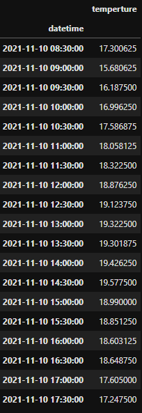
データ件数 : 1900件(8:30~17:33)
| datetime | temperture |
|---|---|
| 2021/11/10-08:30:12.2 | 17.3125 |
| 2021/11/10-08:30:12.2 | 17.3125 |
| 2021/11/10-08:30:12.2 | 17.25 |
| 2021/11/10-08:30:12.2 | 17.25 |
| 2021/11/10-08:30:12.2 | 17.3125 |
| ... | ... |
| 2021/11/10-17:33:28.2 | 17.25 |
| 2021/11/10-17:33:28.2 | 17.25 |
| 2021/11/10-17:33:28.2 | 17.25 |
| 2021/11/10-17:33:28.2 | 17.25 |
| 2021/11/10-17:33:28.2 | 17.25 |
プログラム
# pandasとmatplotlibをインポート
import pandas as pd
import matplotlib.pyplot as plt

# csvファイルを読み込み
df = pd.read_csv('new/20211110/soto.csv', names = ['datetime', 'temperture'])

# datetime64型に変換
df['datetime'] = pd.to_datetime(df['datetime'])

# pandas.DateFrameの列をインデックス(行名)に割り当てる
df1 = df.set_index("datetime")

# 2次元の表形式のデータに変換
df_sec = pd.DataFrame(df1)

# 30分ごとに平均を求める(30minを変えるとほかの間隔にできる)
ave = df_sec.resample('30min').mean()

# 折れ線グラフ作成
ave.plot()
結果
表
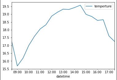
グラフ
終わりに
今回は,外の気温を温度センサーで計測してCSVファイルに書き込み,pandasとmatplotlibを使用して平均を求め,グラフ化をしてみました.